The History and Cultural Significance of Chocolate Color in Design

Introduction
Chocolate is one of the most beloved flavors in the world, and its rich, decadent hues have inspired artists and designers for centuries. In the world of graphic design, chocolate color, much like burnt sienna or amber, is a warm, earthy tone that can add depth, sophistication, and a touch of indulgence to any project. Whether you're designing a website, creating a logo, or working on a packaging project, the right shade of chocolate can convey a range of emotions and ideas. In this blog, we'll explore the world of chocolate color in graphic design, from its history and cultural significance to its technical aspects and practical applications. Get ready to indulge in the deliciously decadent world of chocolate color in graphic design!
Table of Content
- Introduction
- The Importance of Chocolate Color in the World of Graphic Design
- An Exhaustive Manual for Crafting Color Palettes with Chocolate
- The Relevance of Chocolate Color in the Designing World
- The Historical Development of Chocolate Color from Antiquity to Present Day
- Using Complementary Colors to Achieve Design Harmony with Chocolate
- A Comprehensive Guide to HEX Codes for Chocolate Color Shades
- Enhance Your Design Skills and Craft Stunning Graphics with Appy Pie's AI Image Color Picker
- Conclusion
The Importance of Chocolate Color in the World of Graphic Design
Chocolate color is a versatile and powerful tool in the world of graphic design. With its warm, earthy tones, it can evoke a sense of luxury, indulgence, and sophistication, and it's no wonder that it's such a popular choice for designers across a range of industries. Whether you're creating a logo, designing packaging, or working on a website, the right shade of chocolate can help you convey the emotions and ideas you want to express.
One of the most important things about chocolate color is its ability to create contrast and add depth to a design. It can be paired with lighter or brighter colors to create a striking visual impact, or it can be used on its own to create a sense of warmth and comfort. Its versatility, much like that of the universal black or classic navy, makes it a go-to choice for designers who want to create a variety of moods and emotions in their work.
In addition to its aesthetic appeal, chocolate color also has cultural significance. Historically, chocolate has been associated with luxury and indulgence, and this association has carried over into the world of design. By using chocolate color in your work, you can tap into these cultural connotations and create a sense of elegance and sophistication that resonates with your audience.
An Exhaustive Manual for Crafting Color Palettes with Chocolate

Crafting a color palette can be a challenging task, but it's a crucial step in any design project. One color that can be particularly useful in creating striking color palettes is chocolate. Its warm, earthy tones make it a versatile and powerful tool for designers across a range of industries.
This comprehensive guide will take you through the process of crafting a color palette using chocolate color. From the technical aspects of color theory to the emotional impact of different shades of chocolate, you'll learn everything you need to know to create a palette that resonates with your audience.
One of the key aspects of creating a successful color palette with chocolate is understanding the impact of contrast. By pairing chocolate with lighter or brighter colors, you can create a striking visual impact that draws the eye and creates a sense of depth and complexity.
Another important consideration when crafting a chocolate color palette is the emotions and ideas that different shades of chocolate can convey. From rich, indulgent brown to warm, comforting beige, each shade of chocolate has its own unique associations and connotations.
With this exhaustive manual, you'll learn how to create a color palette that's both visually striking and emotionally resonant. Whether you're working on a branding project or designing a website, chocolate color can be an essential tool for creating a successful and impactful design.
The Relevance of Chocolate Color in the Designing World
Chocolate color is an essential element in the world of design. Its warm, earthy tones can add depth, sophistication, and a touch of indulgence to any project. From logo design to packaging and branding, the right shade of chocolate can convey a range of emotions and ideas.
One of the reasons the chocolate color, much like versatile shades of charcoal or mocha, is so relevant in the designing world is its adaptability. It can be paired with a range of other colors from the vibrant cerulean blue to the soft blush pink, to create striking contrasts and depth. Alternatively, used on its own or in harmony with similar tones like cognac or chestnut, it can generate a sense of warmth and comfort. Chocolate color is a popular choice for many designers because of its ability to create a mood and evoke an emotional response from viewers.
Another reason why chocolate color matters in the designing world is its cultural significance. Historically, chocolate has been associated with luxury and indulgence, and this association has carried over into the world of design. By using chocolate color in your designs, you can tap into these cultural connotations and create a sense of elegance and sophistication that resonates with your audience.
The Historical Development of Chocolate Color from Antiquity to Present Day

The rich history of chocolate color dates back to antiquity, where it was first used by the Mayans and Aztecs for medicinal and ceremonial purposes. The color was made by roasting cocoa beans and grinding them into a powder, creating a warm, earthy hue that was often used to represent the sacred nature of chocolate in their cultures.
As chocolate became more popular and widely traded throughout Europe, it began to be used in art and design. In the 17th and 18th centuries, chocolate color was a popular choice for interior design and was often used to create a sense of warmth and comfort in homes and public spaces.
In the modern era, chocolate color has continued to evolve and adapt to the changing needs and tastes of designers and consumers. Today, it remains a popular choice for a wide range of design projects, from branding and packaging to web design and advertising.
One of the reasons chocolate color has remained so popular over the years is its ability to evoke a range of emotions and ideas. From indulgence and luxury to warmth and comfort associated with hues such as champagne and caramel, chocolate color can be used to create a variety of moods and themes in design.
Using Complementary Colors to Achieve Design Harmony with Chocolate

Using complementary colors is an effective way to achieve design harmony with chocolate color. Complementary colors are colors that are opposite each other on the color wheel, and when used together, they create a vibrant and balanced color palette.
When designing with chocolate color, complementary colors such as shades of blue, green, or pink can be used to create a sense of contrast and balance. Blue can add a sense of calmness and serenity to chocolate color, while green can bring a touch of nature and freshness. Pink, on the other hand, can add a feminine and playful touch to chocolate color designs.
Another approach to using complementary colors with chocolate is to use lighter or darker shades of the same color family. This can create a more subtle contrast and add depth and dimension to the design.
Ultimately, the key to using complementary colors with chocolate color is to find the right balance between contrast and harmony. By experimenting with different color combinations and playing with saturation and tone, designers can create dynamic and impactful designs that are sure to leave a lasting impression on viewers.
A Comprehensive Guide to HEX Codes for Chocolate Color Shades

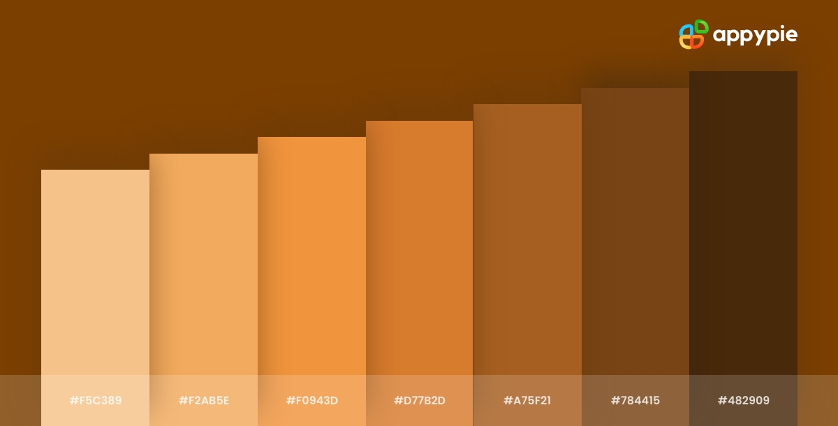
As a designer, having access to the correct HEX codes for chocolate color shades is crucial. HEX codes are a six-digit combination of letters and numbers used to define specific colors in digital design.
Here is a comprehensive guide to HEX codes for chocolate color shades:
- Dark Chocolate: #3c1f1f
- Milk Chocolate: #8b5a2b
- White Chocolate: #f5deb3
- Chocolate Brown: #7b3f00
- Chocolate Truffle: #6b3e2e
These HEX codes can be used for a variety of design projects, including branding, web design, and print materials. By incorporating these chocolate color shades into your designs, you can create a warm and inviting color palette that will resonate with your target audience.
It's important to note that HEX codes are not standardized across all design software and platforms. Therefore, it's always a good idea to double-check the HEX codes for the specific software or platform you're using.
Enhance Your Design Skills and Craft Stunning Graphics with Appy Pie's AI Image Color Picker
Designing visually appealing graphics can be a daunting task, especially if you're not familiar with color theory. However, with Appy Pie's Image Color Picker, enhancing your design skills and creating gorgeous graphics has never been easier. Here's a step-by-step guide to using Appy Pie's AI Image Color Picker tool to create stunning graphics:
- Choose an Image
- Pick a Color
- Analyze Color Codes
- Preview Your Color Palette
- Save and Export Your Design
Either choose an image from your computer or enter an image URL, and the image will be uploaded to the screen.
You can now pick any color on this image using your mouse pointer.
Once you choose the color, you will have HEX, RGB, HSL, and CMYK codes for the color displayed on your screen.
As you scroll down, you will also get an entire palette curated for you directly from the image!
Save and export your design - Finally, save your color palette and use it in your design. Appy Pie's AI Image Color Picker tool allows you to export your color palette as a PNG or SVG file, making it easy to use in your design software of choice.
With Appy Pie's AI Image Color Picker tool, enhancing your design skills and creating stunning graphics has never been easier. By following these simple steps, you can create a visually appealing color palette that will take your designs to the next level.
Conclusion
Chocolate has a rich and fascinating history in the world of design, with its warm and inviting tones often used to create a sense of comfort and familiarity. From the HEX codes used to create the perfect shade to the complementary colors that help to achieve harmony in design, we have explored a wide range of topics related to chocolate color in graphic design. By understanding the significance of this color and the techniques used to create impactful designs with it, designers can elevate their work to new levels and create visual experiences that truly resonate with their audience.
Related Articles
- Mastering Your Insta DP: The Ultimate Guide to Instagram Profile Picture Size
- Customer Support: Definition, Importance, Benefits + Best Strategies for Customer Satisfaction
- Chat with URL and Site
- Why Businesses Need to Integrate Salesforce DX Now?
- How Job Search Apps Help You Find Your Dream Job?
- Rosy Dew Color: Significance, Uses and Color Combinations
- Importance of Workflow Automation for Businesses in 2023
- The Ultimate Customer Service Training Manual
- Conquer the “DNS Server Not Responding” Error with These Hacks!
- Workflow Automation Planning: Tips, Tricks & Strategies for Efficient Automated Workflows


