
Champagne Color as a Versatile and Timeless Element in Graphic Design

Introduction
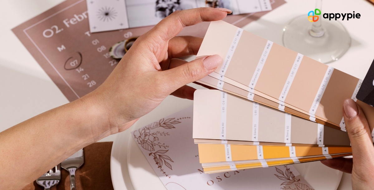
Get ready to explore the captivating world of champagne color through our blog, where we delve into the many facets of this luxurious and sophisticated hue. Champagne color is more than just a color; it's a symbol of celebration, elegance, and refinement. Its spectrum ranges from the lightest shades of ivory to the warmest tones of amber and rosé, making it a versatile and timeless element in art, design, fashion, and beyond. In this blog, we'll explore the history, science, psychology, and creativity of champagne color, and showcase its many applications and trends in graphic designing. So grab a glass of bubbly and join us on this journey to discover the magic of champagne color. Cheers!
Table of Content
- Introduction
- The Meaning of Champagne Color in Graphic Design
- How to Create Color Palettes with Champagne: A Comprehensive Guide
- The Importance of Champagne Color in the Design Industry
- The Evolution of Champagne Color: From Ancient Times to Modern Times Traced
- How to Use Complementary Colors to Create Harmonious Designs with Champagne Color
- Using HEX Codes: A Comprehensive Guide to Champagne Color Shades
- Enhance Your Design Skills and Craft Stunning Graphics with Appy Pie's AI Image Color Picker
- Conclusion
The Meaning of Champagne Color in Graphic Design
In graphic design, color is a powerful tool that can evoke emotions, communicate messages, and influence perceptions. One of the most elegant and versatile colors in the designer's palette is champagne, a warm and muted shade of gold that has been associated with luxury, sophistication, and celebration for centuries.
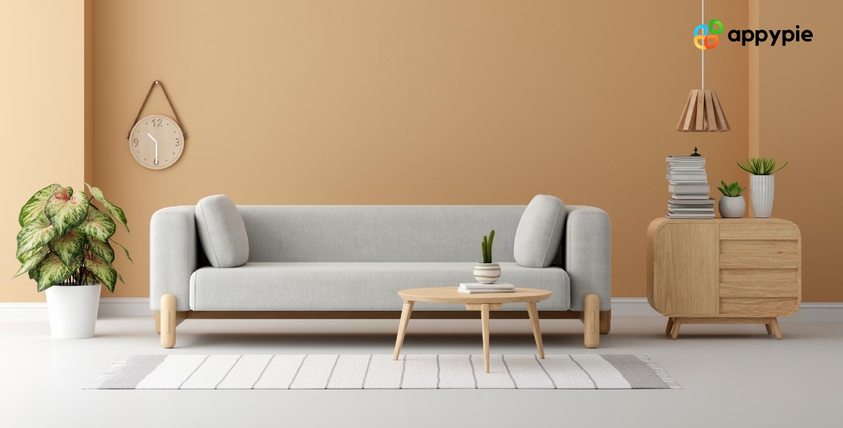
Champagne color in graphic design can symbolize a range of concepts, from opulence and glamor to refinement and subtlety. It is often used in branding, packaging, advertising, and print design for products or services that cater to upscale or exclusive markets, such as jewelry, fashion, hospitality, and beauty.
Champagne color can also evoke a sense of timelessness and tradition, making it a popular choice for vintage or retro designs. It can be paired with a variety of other colors, such as black, white, pink, or navy, to create contrasting or complementary effects that enhance the visual impact of a design.
Furthermore, champagne color can convey a sense of warmth and comfort, making it a suitable choice for designs related to food, beverages, or lifestyle products. It can also represent positive qualities such as optimism, success, and achievement, making it a popular color in motivational or inspirational designs.


How to Create Color Palettes with Champagne: A Comprehensive Guide
Creating a color palette is a fundamental step in graphic design, as it sets the tone and mood of a project, and helps to establish a cohesive visual identity. When it comes to choosing colors, champagne is an excellent option due to its versatility and timeless elegance. Let’s explore how to create color palettes with champagne that can enhance the impact and appeal of any design.
Firstly, it's essential to understand the color properties of champagne, which is a warm and muted shade of gold with a slight hint of pink or peach. Champagne color can be paired with a range of other hues, such as white, black, gray, navy, pink, or green, to create a variety of effects, from classic and sophisticated to playful and modern.
Secondly, it's important to consider the context and purpose of a design when selecting a color palette with champagne. For example, a monochromatic palette with different shades of champagne can create a sense of luxury and refinement for a high-end brand, while a complementary palette with champagne and blue or green can evoke a natural and calming vibe for a wellness or beauty product.
Thirdly, it's useful to experiment with different color combinations and ratios, and to test them in various contexts, such as digital or print media, lighting conditions, and screen resolutions. It's also essential to consider accessibility and inclusivity when designing with color, and to ensure that the color palette is readable and legible for all users.
Thus, creating color palettes with champagne is an exciting and rewarding process that requires both creativity and technical skills. By following these guidelines and experimenting with different options, designers can create stunning and memorable designs that reflect the timeless elegance and versatility of champagne color.
The Importance of Champagne Color in the Design Industry
Champagne color is an essential element in the design industry, as it adds a touch of sophistication, elegance, and timelessness to any project. Whether it's branding, packaging, advertising, web design, or print media, champagne color can be used in a variety of applications and contexts to create a cohesive and memorable visual identity.
One of the most significant advantages of champagne color in the design industry is its versatility. Champagne color can be paired with a wide range of other colors, such as black, white, navy, pink, green, or cinnamon, to create contrasting or complementary effects that enhance the impact and appeal of a design. It can also be used in various shades and intensities, from light ivory to deep amber, to create different moods and styles.
Another key advantage of champagne color is its association with luxury, refinement, and celebration. Champagne color is often used in designs related to high-end products or services, such as fashion, jewelry, beauty, or hospitality, to convey a sense of exclusivity and prestige. It can also be used in vintage or retro designs, to evoke a sense of nostalgia and tradition.
Moreover, champagne color has a strong psychological impact on viewers, as it can evoke positive emotions such as joy, optimism, and success. Champagne color can be used in motivational or inspirational designs, such as posters, quotes, or social media graphics, to inspire and uplift people.
The Evolution of Champagne Color: From Ancient Times to Modern Times Traced
Champagne color is a timeless and classic hue that has evolved over the centuries, from ancient times to modern times. Its evolution is a reflection of the changing cultural, social, and technological contexts in which it has been used, and the shifting meanings and associations that have been attached to it:
- Ancient Times
- Renaissance Periods
- Modern Era
In ancient times, champagne color was used primarily as a symbol of luxury, wealth, and power. It was associated with the ruling classes, who used it in their clothing, jewelry, and artifacts to convey their status and prestige. Champagne color was also used in religious and ceremonial contexts, as a sign of divine or spiritual significance.
During the medieval and Renaissance periods, champagne color continued to be associated with luxury and wealth, but also gained new meanings and associations. It became associated with love, romance, and beauty, as well as with art, literature, and music. Champagne color was used in clothing, textiles, and paintings, to evoke a sense of refinement and elegance.
In the modern era, champagne color has taken on new meanings and associations, reflecting the changing values and trends of the times. It has been used in fashion, interior design, advertising, and branding, to convey a sense of sophistication, style, and glamor. Champagne color has also been associated with sustainability, eco-friendliness, and organic products, reflecting the growing awareness and concern for the environment and social responsibility.
The story of the champagne color, which can be likened to a light beige or muted gold, from its early use to the present day is quite captivating. It showcases the rich past and culture attached to this adaptable and sophisticated shade. Its consistent popularity in design, much like the timeless appeal of navy blue, charcoal, or even the versatility of lavender, reflects its enduring charm and flexibility, and its capacity to evolve with shifting trends.
How to Use Complementary Colors to Create Harmonious Designs with Champagne Color
Champagne color is a versatile and elegant hue that can be used in a variety of designs to create a sense of sophistication and timelessness. When used in combination with complementary colors, it can create visually striking and harmonious designs that capture the attention and imagination of viewers.
To use complementary colors with champagne color, it's essential to understand the color wheel and the principles of color theory. Complementary colors are those that are opposite each other on the color wheel, such as blue and orange, green and red, or purple and yellow. When these colors are used together, they create a strong contrast that can make each color stand out and enhance the overall impact of the design.
One effective way to use complementary colors with champagne color is to create a monochromatic color scheme, using shades and tints of the same hue. For example, pairing champagne color with a darker shade of brown or beige can create a warm and inviting atmosphere, while pairing it with a lighter shade of pink or lavender can create a romantic and feminine mood.
Another way to use complementary colors with champagne color is to create a triadic color scheme, using three colors that are equidistant on the color wheel. This can create a bold and dynamic effect, while still maintaining a sense of harmony and balance.
Using HEX Codes: A Comprehensive Guide to Champagne Color Shades
Using HEX codes is an essential skill for designers who want to create precise and consistent color palettes with champagne color. By following these tips and experimenting with different combinations, designers can create visually appealing designs that capture the elegance and sophistication of this timeless hue.
Here is a comprehensive guide to using HEX codes for champagne color shades:
- Understanding HEX Codes
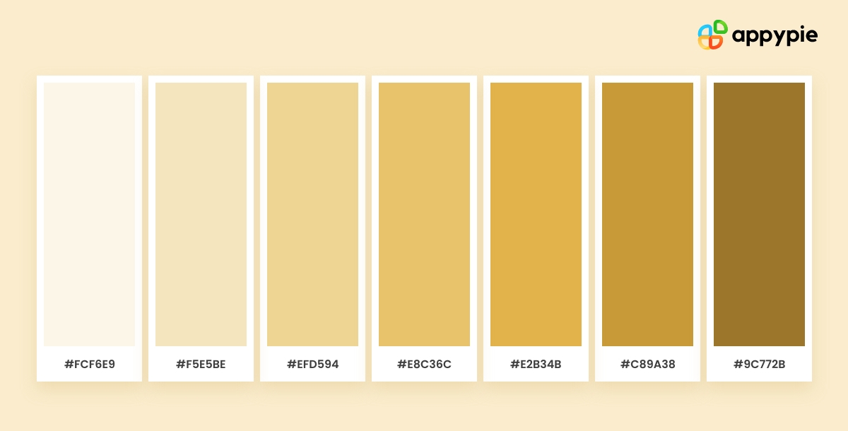
HEX codes are six-digit codes that represent a specific color in the RGB color model. Each digit represents a different intensity level of red, green, and blue light. For champagne color, the HEX code is typically a combination of light beige, cream, and ivory tones.
- Finding the right shade
To find the perfect champagne color shade, you can use online tools like Appy Pie Design. These tools allow you to input the RGB values or HEX code of a particular shade and generate complementary and analogous color palettes.
- Testing the color
- Combining with other colors
- Implementing the Color
Once you've identified the champagne color shade you want to use, it's important to test it in different lighting conditions and on different devices. This will ensure that the color appears consistent and accurate across different platforms and mediums.
Champagne color can be used in combination with other complementary or analogous colors to create a harmonious color palette. Some popular combinations include champagne and rose gold, champagne and navy blue, and champagne and chocolate color.
Once you've selected the right champagne color shade and color palette, it's time to implement it into your design. This can be done using design software like Appy Pie Design, or by inputting the HEX code directly into HTML and CSS code for web design.
Enhance Your Design Skills and Craft Stunning Graphics with Appy Pie's AI Image Color Picker
Designing visually appealing graphics can be a daunting task, especially if you're not familiar with color theory. However, with Appy Pie's AI Image Color Picker, enhancing your design skills and creating gorgeous graphics has never been easier. Here's a step-by-step guide to using Appy Pie's AI Image Color Picker tool to create stunning graphics:
- Choose an Image
- Pick a Color
- Analyze Color Codes
- Preview Your Color Palette
- Save and Export Your Design
Either choose an image from your computer or enter an image URL, and the image will be uploaded to the screen.
You can now pick any color on this image using your mouse pointer.
Once you choose the color, you will have HEX, RGB, HSL, and CMYK codes for the color displayed on your screen.
As you scroll down, you will also get an entire palette curated for you directly from the image!
Save and export your design - Finally, save your color palette and use it in your design. Appy Pie's AI Image Color Picker tool allows you to export your color palette as a PNG or SVG file, making it easy to use in your design software of choice.
With Appy Pie's AI Image Color Picker tool, enhancing your design skills and creating stunning graphics has never been easier. By following these simple steps, you can create a visually appealing color palette that will take your designs to the next level.
Conclusion
Champagne color is a versatile and timeless hue that can elevate any design project. From its historical significance to its modern-day applications, this warm and muted shade is the perfect choice for those seeking elegance, sophistication, and refinement. Through this comprehensive guide, we've explored everything you need to know about champagne color in graphic design, from its meaning and symbolism to its application in creating harmonious color palettes. Armed with this knowledge, you can now confidently incorporate champagne color into your design projects and create visually stunning designs that capture the essence of this timeless hue.
Related Articles
- How to Create a Minimalistic Poster Design [9 Tips & Tricks]
- Mastering Omnichannel Customer Service: Tools, Strategies, and Impact
- How to Use the OpenAI Playground with GPT-3 and GPT-4?
- What is NFT Art? Exploring the Digital Art Revolution
- 12 Best Calendar Apps for Android & iOS in 2024
- 22 Free Add-ins for Word, Excel, and PowerPoint Online
- Typeface vs. Font: What’s the Difference and Does It Matter?
- How to Use Midjourney to create AI-generated Images: Step-by-Step Guide
- How to Build Your Brand with Mood Board Using AI
- Best AI Writing Tools for Professionals and Amateurs in 2023