
Uncovering the mysteries of Charcoal Color: A comprehensive exploration of its Significance, History, and Exploration

Introduction
Welcome to a world of mystery, sophistication, and depth - the world of Charcoal Color. Charcoal color is not just another shade in the color spectrum; it is a color that holds a unique allure that draws people in. With its deep, dark hue and versatile nature, charcoal color has captured the imagination of artists, designers, and fashion enthusiasts alike. It embodies both simplicity and complexity, evoking a sense of depth and intensity that is hard to match.
This color has a long and fascinating history, which has contributed to its symbolism and cultural significance. In this blog, we'll explore everything about charcoal color, from its scientific properties to its artistic roots, and how it's used in the world of fashion and design. As we navigate through the world of charcoal color, we'll also uncover its fascinating interplay with other colors - how it enhances the blush of rose or contrasts sharply with the freshness of cool-gray color. Get ready to dive deep into the world of charcoal color and discover the captivating mysteries that lie within.
Table of Content
- Introduction
- Charcoal Color in Graphic Design: Understanding its Definition and Application
- Charcoal: Exploring the Colors That Blend to Create this Vibrant Hue
- The Significance of Charcoal Color in the World of Design
- Tracing the Origins of Charcoal Color: Its Evolution from Ancient Art to Contemporary Design
- Top Color Combinations to Pair with Charcoal
- Enhance Your Graphic Designs with Appy Pie's Color Wheel Tool
- Enhance Your Design Skills and Craft Stunning Graphics with Appy Pie's AI Image Color Picker
- Conclusion
Charcoal Color in Graphic Design: Understanding its Definition and Application
Charcoal color is one of the most powerful and versatile hues in the world of graphic design. It's a color that can convey a wide range of emotions and has the ability to evoke feelings of depth, power, and sophistication. As a graphic designer, understanding the definition and application of charcoal color is crucial in creating successful designs that convey your desired message effectively.
In graphic design, charcoal color is often used to create contrast and depth in a composition. It's a color that can be used to create drama and interest in a design, and can also be used to convey a sense of sophistication and elegance. Charcoal color is especially useful in creating designs with a monochromatic color scheme, as it can add depth and variety to an otherwise one-dimensional composition.
When used in combination with other colors, charcoal can also create striking contrasts and interesting color harmonies. For example, combining charcoal with shades of blue can create a calming and serene design, while pairing it with warmer colors like bright yellow or burnt orange can create a bold and energetic design.


Charcoal: Exploring the Colors That Blend to Create this Vibrant Hue
Charcoal color is a complex hue that is created by blending different colors together. The color can be created by blending various shades of gray and black, but it's important to understand the specific colors that make up this sophisticated and elegant hue.
Charcoal color is typically created by combining black with varying amounts of white. The more white that is added to the black, the lighter the charcoal color becomes. Charcoal can also be created by mixing equal parts of red, blue, and yellow to create a shade of gray, which can then be combined with black to create a deeper hue.
In addition to its base colors, charcoal color can also be created by blending other hues together. For example, mixing shades of blue and purple with black can create a deep and rich charcoal color with a blue or purple undertone.
Understanding the colors that blend to create charcoal is essential in using this hue effectively in design. It allows designers to create a range of different shades and tones, which can be used to add depth, contrast, and interest to a composition. Whether used as the primary color or as an accent, charcoal color has the power to create a sophisticated and elegant design when used correctly.
The Significance of Charcoal Color in the World of Design

The significance of charcoal color in the world of design is undeniable. Its ability to create depth and contrast, its versatility, and its psychological implications make it a valuable asset for any designer. Whether used as the primary color or as an accent, charcoal color adds an element of sophistication and elegance to any composition.
Its depth, sophistication, and versatility make it a popular choice for many designers across different industries. From fashion to interior design, charcoal color is a staple that adds a sense of drama and elegance to any composition.
One of the significant benefits of charcoal color in design is its ability to create depth and contrast. It's a color that can add an element of sophistication to any composition, especially when combined with other hues. Charcoal color can also create a sense of balance and harmony in a design when used correctly. One of the significant benefits of charcoal color in design is its ability to create depth and contrast. It's a color that can add an element of sophistication to any composition, especially when combined with other hues. Charcoal color can also create a sense of balance and harmony in a design when used correctly.
Another significant advantage of charcoal color is its versatility. It can be used as a primary color, an accent color, or even as a background color. Charcoal color can also be used to create monochromatic designs, adding depth and variety to an otherwise one-dimensional composition.
In addition to its aesthetic benefits, charcoal color also has psychological implications. It's a color that is often associated with elegance, power, and sophistication. Indeed, beyond its aesthetic appeal, the charcoal color, much like electric blue or regal purple, carries profound psychological implications. These associations can be beneficial when creating designs that require a sense of authority and strength.
Tracing the Origins of Charcoal Color: Its Evolution from Ancient Art to Contemporary Design
Charcoal color has a rich history, and its evolution can be traced back to ancient times. From the earliest cave paintings to contemporary design, charcoal color has played a significant role in art and design.
The use of charcoal as a drawing material can be traced back to the prehistoric era, where it was used to create cave paintings. It was also commonly used in ancient Egypt and Greece to create artwork, where it was often combined with other pigments to create various shades and tones.
In the Middle Ages, charcoal was used as a primary drawing material, and it was often combined with other pigments to create a range of colors, including charcoal color. The charcoal color, akin to the divine gold or the somber grey, was extensively used in religious art. Much like the way luminous white was employed to signify purity or ethereal green to symbolize nature and rebirth, charcoal was often used to create a sense of drama and depth.
In modern times, charcoal color continues to be a popular choice for designers across different industries. It's a color that adds a sense of sophistication and elegance to any composition, and its versatility makes it a valuable asset in design.
Top Color Combinations to Pair with Charcoal
The versatility of charcoal color makes it a popular choice for designers across different industries. The color combinations mentioned above are just a few examples of the many possibilities that exist for pairing charcoal with other hues. By experimenting with different color combinations, designers can create compositions that are unique, striking, and unforgettable.
Whether used as the primary color or as an accent, charcoal color can add depth, contrast, and sophistication to any composition. Let’s explore some of the top color combinations that work well with charcoal color.
- White
- Beige
- Red
- Gray
One of the best color combinations to pair with charcoal color is white. This pairing creates a sleek and modern look that is perfect for contemporary design. It also creates a high contrast that can be used to highlight specific elements in the composition.
Another popular color combination is charcoal and beige. This pairing creates a warm and inviting look that is perfect for creating a cozy and comfortable atmosphere. The beige softens the intensity of the charcoal and creates a sense of balance and harmony.
For a bolder look, charcoal can be paired with bright and vibrant colors like red or yellow. This pairing creates a striking contrast that can be used to create a sense of energy and excitement in a composition.
Charcoal can also be paired with other shades of gray, creating a monochromatic composition that adds depth and variety to the design.
Enhance Your Graphic Designs with Appy Pie's Color Wheel Tool
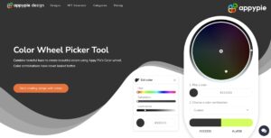
If you're a graphic designer, you know that choosing the right color scheme for your design is crucial. A good color combination can enhance the visual appeal of your design and make it stand out, while a poor color choice can make your design look dull and unappealing. That's where Appy Pie's Color Wheel Tool comes in handy.
Appy Pie's Color Wheel Tool is a powerful tool that can help you create stunning graphic designs by choosing the right colors for your composition. With this tool, you can easily create harmonious color combinations that complement each other and create a balanced look.
The Color Wheel Tool allows you to choose colors from a vast range of options, including complementary, triadic, and analogous colors. You can also adjust the hue, saturation, and brightness of each color to create the perfect blend for your design.
The tool is user-friendly and easy to use, making it accessible to designers of all skill levels. It's an excellent resource for anyone looking to enhance their graphic designs and create compositions that are visually appealing and striking.
Enhance Your Design Skills and Craft Stunning Graphics with Appy Pie's AI Image Color Picker

Designing visually appealing graphics can be a daunting task, especially if you're not familiar with color theory. However, with Appy Pie's AI Image Color Picker, enhancing your design skills and creating gorgeous graphics has never been easier. Here's a step-by-step guide to using Appy Pie's AI Image Color Picker tool to create stunning graphics:
- Choose an Image:Either choose an image from your computer or enter an image URL, and the image will be uploaded to the screen.
- Pick a Color:You can now pick any color on this image using your mouse pointer.
- Analyze Color Codes:Once you choose the color, you will have HEX, RGB, HSL, and CMYK codes for the color displayed on your screen.
- Preview Your Color Palette:As you scroll down, you will also get an entire palette curated for you directly from the image!
- Save and Export Your Design: Finally, save your color palette and use it in your design. Appy Pie's AI Image Color Picker tool allows you to export your color palette as a PNG or SVG file, making it easy to use in your design software of choice.
With Appy Pie's AI Image Color Picker tool, enhancing your design skills and creating stunning graphics has never been easier. By following these simple steps, you can create a visually appealing color palette that will take your designs to the next level.
Conclusion
Charcoal color is a versatile and powerful hue that has been used in various forms of art and design for centuries. From ancient cave paintings to contemporary graphic designs, charcoal has proven to be a popular choice among artists and designers alike. In this blog post, we have explored the history, definition, and application of charcoal color, as well as the best color combinations that complement this hue. By understanding the unique properties and characteristics of charcoal color, designers can create compositions that are visually appealing, dynamic, and unforgettable. Whether used as the primary color or as an accent, charcoal color is sure to make a lasting impression.
Related Articles
- How to Install Windows 11 from an ISO File: A Complete Guide
- Top 9 AI Video Generator Tools in 2023: Ranked as the Best
- A Beginner’s Guide to Create a Great Survey [+7 Survey Platforms to Consider]
- 11 Excellent Examples of Omni-Channel Experiences in 2021
- The Top 7 Newsletter Platforms in 2023: Elevate Your Email Marketing
- Best Restaurant Logos for Creative Inspiration
- How Does ChatGPT Work? A Deep Dive into OpenAI’s Conversational AI
- Mastering Email Signature Design – Tips and Tricks for Professionals
- Top 10 Best Shopping Websites for Every Shopaholic
- Apple Fall Event, 2018: A Bigger iPhone & An Improved Apple Watch
Most Popular Posts
- Nike Logo: The Meaning and History Behind the Swoosh
- 10 Best Vend Integrations for POS & Inventory Management
- What is a Brand Color- How to choose your Brand Colors?
- Contact Center Mastery: A Comprehensive Guide to Enhancing Customer Service
- Website Design Tips to make more Sales and Build Brand Loyalty