
Burnt Sienna Color Combinations in Graphic Designing: What Works Best

Introduction
Burnt Sienna, a color that evokes warmth and richness, is a classic hue with a timeless appeal. It's a shade that has been used by artists for centuries, thanks to its versatility and ability to blend seamlessly with other colors. This earthy tone is a true representation of nature's beauty, and it has become a popular choice for creatives in various industries, including art, fashion, interior design, and graphic design. Burnt Sienna, rivaling the sophistication of black or the elegance of pearl white, brings a sense of depth and refinement to any project it's used in, and it's no wonder why it continues to captivate and inspire designers and artists around the world.
Table of Content
- Introduction
- The Significance of Burnt Sienna Color in Graphic Designing
- A Comprehensive Guide to Creating Color Palettes using Burnt Sienna
- Why Burnt Sienna Color matters in the Design Industry
- Tracing the Evolution of Burnt Sienna Color from Ancient Times to Modern Times
- Creating Harmonious Designs with Burnt Sienna through the Use of Complementary Colors
- A Comprehensive Guide to Burnt Sienna Color shades Using HEX Codes
- Enhance Your Design Skills and Craft Stunning Graphics with Appy Pie's AI Image Color Picker
- Conclusion
The Significance of Burnt Sienna Color in Graphic Designing
The significance of Burnt Sienna color in graphic designing is undeniable. This rich, earthy tone exudes warmth and depth, making it a versatile choice for designers across various industries. In graphic designing, Burnt Sienna is known for its ability to bring a sense of sophistication and elegance to any design project, from logos to branding, web design, print, and packaging design.
One of the most significant aspects of Burnt Sienna in graphic designing is its ability to create a sense of balance and harmony. This color blends effortlessly with other earthy and neutral tones, creating a cohesive and visually appealing design. Its versatility also allows designers to use it as a contrasting color to create depth and interest in a design.
In branding and logo design, Burnt Sienna color is often used to create a sense of reliability and trustworthiness. It is also associated with warmth, stability, and a connection to nature, making it a popular choice for companies in industries such as healthcare, food, and beauty.
In website design, Burnt Sienna, much like a warm amber, helps make the user experience friendly and welcoming. It often goes well with other natural colors like leafy green or stony gray to build a relaxing and comforting color mix, similar to the calm feeling that soft lavender or light white brings.


A Comprehensive Guide to Creating Color Palettes using Burnt Sienna
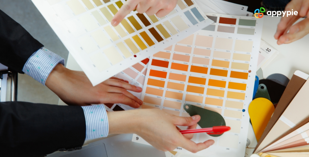
Creating a color palette is an essential aspect of any design project, and using Burnt Sienna as a base color can add depth, warmth, and sophistication to your designs. Here's a comprehensive guide to creating color palettes using Burnt Sienna:
- Understand the Color Theory
- Explore variations of Burnt Sienna
- Use Burnt Sienna as a Base Color
- Experiment with Color Combinations
- Use Burnt Sienna in Small doses
Burnt Sienna is a warm, earthy tone, and it's best paired with other earthy and neutral colors. Understanding color theory will help you choose the right colors to create a cohesive color palette.
Burnt Sienna has various shades and variations, and exploring these will give you more options to create a unique and versatile color palette.
Burnt Sienna can serve as a base color, and you can use it as a starting point to create a color palette that compliments your design project.
Pairing Burnt Sienna with other colors can create a striking contrast and add depth to your designs. Experiment with color combinations to see what works best.
Burnt Sienna is a bold color, and using it in small doses can create a subtle yet impactful effect in your designs.
That means, creating a color palette using Burnt Sienna can add depth, warmth, and sophistication to your designs, much like the richness of a burgundy or the lushness of a forest green. By understanding color theory, exploring variations of Burnt Sienna, using it as a base color, experimenting with color combinations, and using it in small doses, you can create a cohesive and visually appealing color palette.
Why Burnt Sienna Color matters in the Design Industry
Burnt Sienna is a color that holds significant importance in the design industry. Its warm, earthy tone is both versatile and timeless, making it a popular choice among designers and creatives. Here are some reasons why Burnt Sienna color matters in the design industry:
- Versatility
- Timelessness
- Association with nature
- Warmth and Depth
- Emotional connection
Burnt Sienna is a versatile color that can be used in various design projects. It pairs well with other earthy and neutral tones and can be used as a base color to create a cohesive color palette.
Burnt Sienna has been used by artists and designers for centuries, and it continues to hold relevance in contemporary design. Its timeless appeal makes it a reliable choice for any design project.
Burnt Sienna is associated with nature and earth, making it a popular choice for designs that promote sustainability, eco-friendliness, and a connection to the environment.
Burnt Sienna adds warmth and depth to any design project it's used in. It evokes a sense of sophistication and elegance, making it a popular choice for branding, packaging, and print design.
Colors have a significant impact on our emotions, and Burnt Sienna is no exception. Its warm, earthy tone creates a sense of comfort, stability, and reliability, making it a popular choice for designs that aim to establish an emotional connection with their audience, similar to how a soft lavender might evoke tranquility or a vibrant coral might inspire joy.
Tracing the Evolution of Burnt Sienna Color from Ancient Times to Modern Times
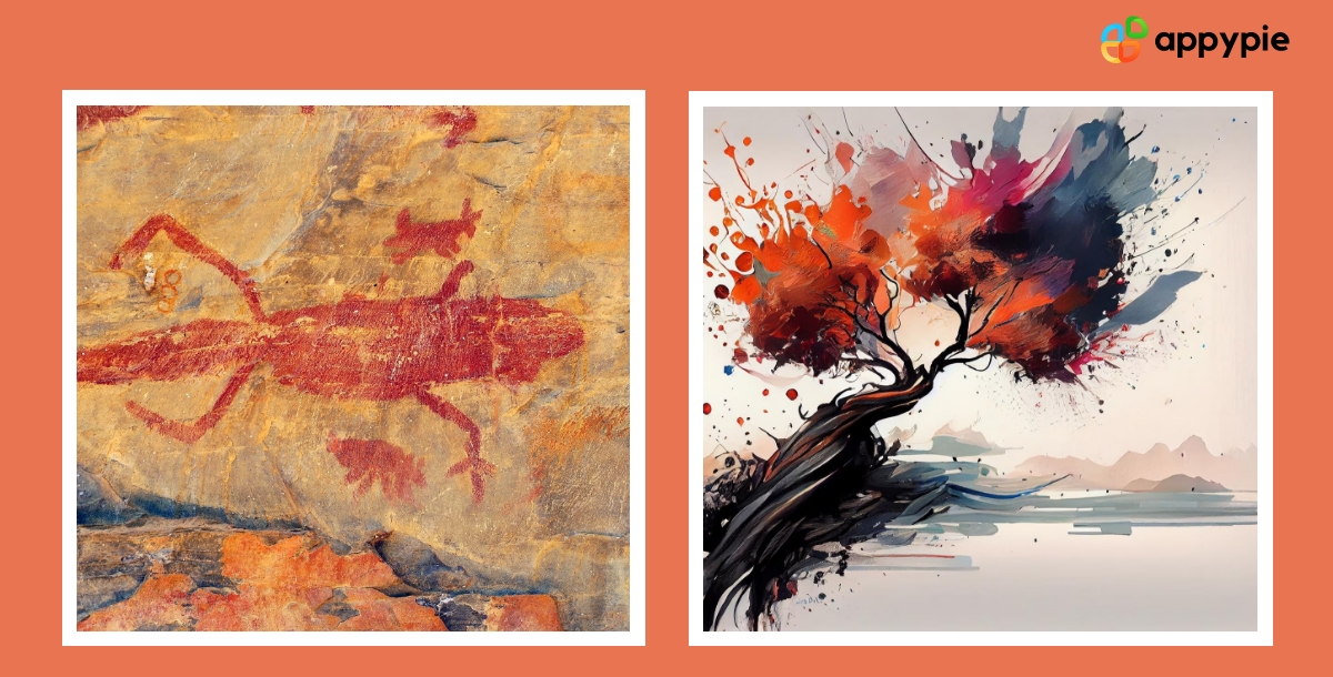
Burnt Sienna is a color that has been used by artists and designers for centuries. Tracing the evolution of this warm, earthy tone from ancient times to modern times reveals its timeless appeal and versatility. Here's a glimpse into the history of Burnt Sienna color:
- Ancient times
- Renaissance Period
- Modern Times
- Popularity
- Continued Evolution
Burnt Sienna pigment was first used in ancient times by the Greeks and Romans for fresco paintings. The pigment was made from natural earth deposits found in the region of Sienna, Italy, and was burnt to create a rich, reddish-chocolate color.
Burnt Sienna became a popular color during the Renaissance period, where it was used by artists such as Leonardo da Vinci and Michelangelo. The color was used to create a sense of depth and realism in their paintings.
Burnt Sienna continues to hold relevance in contemporary design. It's used in various industries, including fashion, interior design, and graphic design. Its warm, earthy tone adds sophistication and elegance to any design project.
Burnt Sienna has remained a popular color throughout the ages, and its versatility has made it a favorite among designers and artists. Its association with nature and the environment has made it a popular choice for designs that promote sustainability and eco-friendliness.
Burnt Sienna color continues to evolve with time, and new variations of the color are being discovered and used in design. Its timeless appeal and versatility make it a reliable choice for any design project.
Creating Harmonious Designs with Burnt Sienna through the Use of Complementary Colors
Creating harmonious designs with Burnt Sienna color can be achieved through the use of complementary colors. Complementary colors are colors that are opposite to each other on the color wheel. When used together, they create a sense of harmony and balance in a design. Here are some tips for using complementary colors with Burnt Sienna:
- Pair with Blue
- Combine with Green
- Use purple accents
- Add pops of Bright Yellow
- Balance with neutral tones
Burnt Sienna and blue are complementary colors that work well together. Blue adds a cool and calming effect to the warm and earthy tones of Burnt Sienna, creating a balanced and harmonious design.
Burnt Sienna and green are also complementary colors that create a natural and earthy feel. This combination works well in designs that promote sustainability, eco-friendliness, and a connection to the environment.
Burnt Sienna and purple are complementary colors that add depth and richness to a design. Purple accents can be used sparingly to create a sense of sophistication and elegance.
Burnt Sienna and bright yellow are complementary colors that create a warm and inviting atmosphere. Bright Yellow can be used as a pop of color in a Burnt Sienna-based design to create a lively and energetic feel.
When using complementary colors with Burnt Sienna, it's essential to balance them with neutral tones such as white, black, or gray. This creates a sense of harmony and balance in the overall design.
Therefore, creating harmonious designs with Burnt Sienna color through the use of complementary colors is a great way to add depth, richness, and balance to a design. When paired with the right complementary colors, Burnt Sienna can create a warm, natural, and sophisticated feel in any design project.
A Comprehensive Guide to Burnt Sienna Color shades Using HEX Codes
If you're a graphic designer, you know how important it is to have a thorough understanding of color shades and the HEX codes associated with them. When it comes to Burnt Sienna color, understanding the different shades and their corresponding HEX codes is crucial for creating cohesive designs. Here's a comprehensive guide to Burnt Sienna color shades using HEX codes:
- Burnt Sienna (#E97451)
- Light Burnt Sienna (#ECAB88)
- Dark Burnt Sienna (#8B2500)
- Burnt Sienna Brown (#AA4F37)
- Burnt Sienna Red (#9A311F)
This is the most common Burnt Sienna shade and is a warm, earthy color with a hint of burnt orange. Its HEX code is #E97451.
This shade is a lighter version of Burnt Sienna and is perfect for creating a softer, more feminine look. Its HEX code is #ECAB88.
This shade is a darker version of Burnt Sienna and has a rich, deep tone. It's perfect for creating a bold, dramatic look. Its HEX code is #8B2500.
This shade is a mix of Burnt Sienna and brown and is perfect for creating a warm, inviting look. Its HEX code is #AA4F37.
This shade is a mix of Burnt Sienna and red and is perfect for creating a vibrant, energetic look. Its HEX code is #9A311F.
Understanding these different Burnt Sienna color shades and their corresponding HEX codes is crucial for creating cohesive designs that evoke the desired emotions and convey the intended message. By using this comprehensive guide, you'll be able to choose the right Burnt Sienna shade for your next design project with ease.
Enhance Your Design Skills and Craft Stunning Graphics with Appy Pie's AI Image Color Picker
Designing visually appealing graphics can be a daunting task, especially if you're not familiar with color theory. However, with Appy Pie's Image Color Picker, enhancing your design skills and creating gorgeous graphics has never been easier. Here's a step-by-step guide to using Appy Pie's AI Image Color Picker tool to create stunning graphics:
- Choose an Image
- Pick a Color
- Analyze Color Codes
- Preview Your Color Palette
- Save and Export Your Design
Either choose an image from your computer or enter an image URL, and the image will be uploaded to the screen.
You can now pick any color on this image using your mouse pointer.
Once you choose the color, you will have HEX, RGB, HSL, and CMYK codes for the color displayed on your screen.
As you scroll down, you will also get an entire palette curated for you directly from the image!
Save and export your design - Finally, save your color palette and use it in your design. Appy Pie's AI Image Color Picker tool allows you to export your color palette as a PNG or SVG file, making it easy to use in your design software of choice.
With Appy Pie's AI Image Color Picker tool, enhancing your design skills and creating stunning graphics has never been easier. By following these simple steps, you can create a visually appealing color palette that will take your designs to the next level.
Conclusion
Understanding the Burnt Sienna color and its various shades is crucial for graphic designers looking to create cohesive and striking designs. From its ancient origins to its modern-day applications in graphic design, Burnt Sienna has a rich history that has stood the test of time. With a comprehensive guide to creating color palettes using Burnt Sienna, understanding its significance in the design industry, and using complementary colors to create harmonious designs, designers can take their designs to the next level. By using tools like Appy Pie's color wheel, designers can explore the different shades of Burnt Sienna and unleash their creativity in designing eye-catching graphics.
Related Articles
- 15 Awesome Instagram Birthday Story Ideas
- Chatbot Applications: How are Top Industries Using Chatbots?
- How to get your app published to the iOS store?
- FESTIVALS OF THE WORLD
- How to Create a Lead Generation Chatbot
- AI and User Experience: Enhancing Tomorrow’s Digital World
- ViDiT-Q: Efficient and Accurate Quantization of Diffusion Transformers for Image and Video Generation
- Top Typeform Integrations: Streamline Your Data Collection
- How to Integrate Microsoft Teams With GSuite Software?
- How to Enhance a Photo Using AI: Simple Ways to Enhance Image Quality
Most Popular Posts
- Rose Gold Color Secrets: Hex Code, Combinations, and Enduring Appeal
- GoHighLevel Review: The Pros, Cons, and Everything in Between
- How to Increase Facebook Business Page Likes – Strategies and Measures
- How to Drop a Pin on Google Maps on Mobile and Desktop?
- GeneAvatar: Generic Expression-Aware Volumetric Head Avatar Editing from a Single Image