
The Power of Bright Yellow Color: Exploring its Science, Symbolism, and Emotional Impact

Introduction
Yellow, the color of sunshine and warmth, is a vibrant hue that exudes positivity, energy, and optimism. And when it comes to bright yellow, it's like having a slice of sunshine in your life. This bold and dynamic color, rivaling even the intensity of neon color or the fieriness of red, can't help but grab your attention, evoking feelings of happiness, enthusiasm, and creativity. From the fluttering petals of a buttercup to the vibrant plumage of a canary, the natural world is filled with examples of this radiant color. In art and design, bright yellow has been used to express a range of emotions and ideas, from joy and hope to caution and warning. Let's explore the wonderful world of bright yellow color together!
Table of Content
- Introduction
- Unveiling the Meaning of Bright Yellow Color in Graphic Design
- A Comprehensive Guide to Designing Bright Yellow Color Palettes
- The Importance of Bright-Yellow in the World of Design
- A Historical Journey of the Evolution of Bright Yellow Color from Ancient AI to Contemporary Design
- Design in Harmony with Bright Yellow by Using Complementary Colors
- Understanding HEX Codes: A Guide to Bright Yellow Color Shades
- Enhance Your Design Skills and Craft Stunning Graphics with Appy Pie's AI Image Color Picker
- Conclusion
Unveiling the Meaning of Bright Yellow Color in Graphic Design
Bright yellow is a striking color that commands attention and creates a sense of enthusiasm and optimism. In graphic design, it is a popular choice for conveying a sense of happiness, positivity, and warmth. From logos and packaging to marketing materials and advertisements, bright yellow has been used in a variety of ways to grab the audience's attention and evoke a positive response.
However, the meaning of bright yellow in graphic design can vary depending on the context and the intended message. In some cases, it is used to signify playfulness, creativity, and innovation. In others, it can represent caution, warning, or danger.
For example, in children's products or designs, bright yellow can suggest a playful, whimsical, and joyful tone. On the other hand, in safety-related products or designs, such as road signs or construction equipment, it can communicate a sense of caution, alertness, and awareness.
In branding, bright yellow can help a company stand out from the competition and create a memorable and positive impression. When combined with other colors, such as blue or black, it can also convey a sense of professionalism, trustworthiness, and reliability.


A Comprehensive Guide to Designing Bright Yellow Color Palettes
When it comes to designing with bright yellow, creating the perfect color palette can be a fun and creative challenge. Bright yellow is a bold and dynamic color that can either stand on its own or pair beautifully with other hues. A well-designed color palette can enhance the visual appeal of any project and convey a specific mood or message.
To create a bright yellow color palette, one must first consider the intended use of the design. For example, a children's brand may opt for a playful and whimsical palette that includes bright yellow, pink, and green. Alternatively, a luxury brand may choose to use bright yellow as an accent color with gold and black to convey a sense of elegance and sophistication.
One approach to creating a bright yellow color palette is to use analogous colors, such as orange and yellow-green. These colors are adjacent to bright yellow on the color wheel and create a harmonious and cohesive look. Another option is to use complementary colors, such as blue or purple, which create a striking contrast with bright yellow.
When designing with bright yellow, it is also essential to consider the color's saturation and tone. Pairing bright yellow with a lighter or darker shade of yellow can create depth and dimension within the color palette.
Thus, a well-designed bright yellow color palette can add vibrancy, energy, and warmth to any project. With a little creativity and experimentation, designers can create a color scheme that perfectly conveys their desired mood and message.
The Importance of Bright-Yellow in the World of Design
Bright yellow is an essential color in the world of graphic design software, as it can add vibrancy, energy, and warmth to any project. From logos and branding to packaging and advertising, bright yellow has been used by designers for decades to grab attention and evoke positive emotions.
One of the main reasons bright yellow is so important in design is its versatility. It pairs well with a wide range of colors, including black, white, gray, blue, green, and purple. It can be used as an accent color to add a pop of excitement, or it can be the main color to create a bold and dynamic statement.
Another reason bright yellow is so vital in design is its ability to convey specific emotions and messages. It is commonly associated with happiness, joy, optimism, and creativity. Therefore, brands that want to create a sense of positivity and enthusiasm often use bright yellow in their branding and marketing materials.
Bright yellow can also be used to convey caution, warning, or danger when paired with black or red. For example, traffic signs and safety equipment often use bright yellow to alert people to potential hazards.
A Historical Journey of the Evolution of Bright Yellow Color from Ancient AI to Contemporary Design
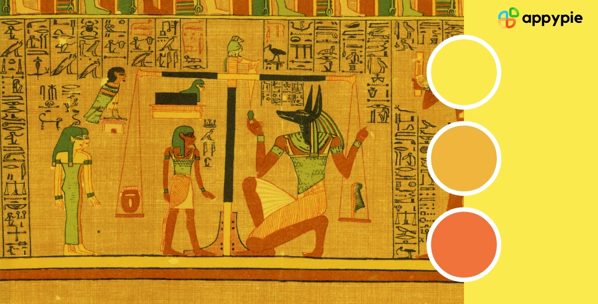
The color bright yellow has been used in art and design for thousands of years, with a rich and diverse history that spans cultures and continents. From ancient Egyptian murals and Greek pottery to medieval illuminated manuscripts and modern graphic design, bright yellow has been a popular color choice throughout history.
In ancient Egypt, bright yellow was associated with gold, which was considered a symbol of the gods and a source of power and wealth. The Egyptians used bright yellow in their art and architecture to convey a sense of luxury and grandeur.
In ancient Greece, bright yellow was used on pottery to depict natural scenes and mythology, often in combination with other bright colors such as red and electric blue. The Greeks also used bright yellow in their clothing and textiles, with yellow-dyed wool being a popular choice.
During the medieval period, bright yellow was often used in illuminated manuscripts to highlight important text and decorations. The bright yellow pigment was made from saffron, a rare and expensive spice that was prized for its vibrant color.
In contemporary design, bright yellow is still a popular color choice for a variety of applications, from logos and branding to product design and packaging. It is often used to convey a sense of energy, positivity, and warmth.
Design in Harmony with Bright Yellow by Using Complementary Colors
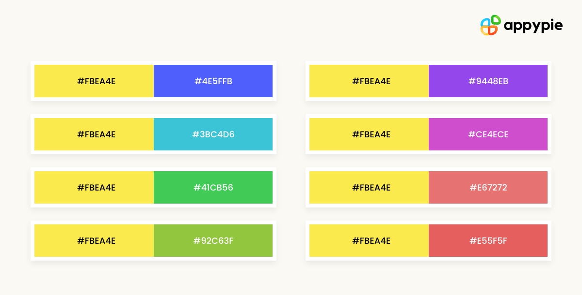
Bright yellow is a bold and vibrant color that can add a lot of energy and excitement to a design project. However, it can also be a challenging color to work with, as it can easily overwhelm other colors in a design. One effective way to use bright yellow in a design is by pairing it with complementary colors.
Complementary colors are colors that are opposite each other on the color wheel, such as purple and yellow or blue and burnt orange. When used together, they create a dynamic contrast that can enhance each other's intensity and create a sense of harmony.
One way to use complementary colors with bright yellow is to pair it with shades of purple or violet. These colors create a stunning contrast that can add depth and dimension to a design. Another option is to pair bright yellow with shades of blue or green, which can create a more balanced and calming effect.
When working with complementary colors, it's important to consider the balance of the design. Too much of one color can overwhelm the other, so it's important to use each color in moderation. Also, consider the context of the design and the emotions you want to convey. Bright yellow paired with complementary colors can create a sense of energy and excitement, but it can also be used to convey a more subdued or sophisticated tone.
Overall, using complementary colors with bright yellow is an effective way to create a harmonious and eye-catching design that evokes a strong emotional response.
Understanding HEX Codes: A Guide to Bright Yellow Color Shades
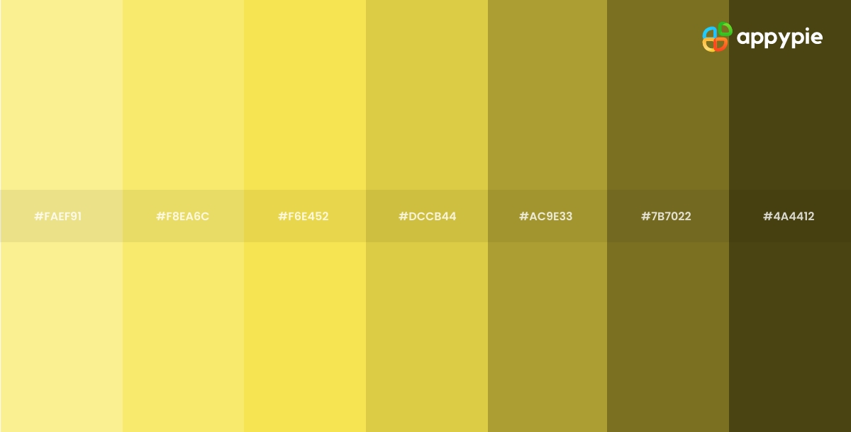
Understanding HEX codes is essential for any designer looking to work with bright yellow color shades. HEX codes are a six-digit code that represents a specific color in the RGB color model. Here's a guide to understanding HEX codes for bright yellow color shades:
HEX codes are a combination of six numbers and letters, starting with the pound symbol (#).
The first two digits represent the red value, the second two digits represent the green value, and the last two digits represent the blue value.
Bright yellow can be represented by a variety of HEX codes, depending on the shade and intensity desired. For example, the HEX code for a bright, pure yellow is #FFFF00, while a lighter shade of yellow may be represented by #FFFFE0.
When using bright yellow in a design, it's important to consider the surrounding colors, such as deep indigo or earthy browns, and the emotions you want to convey. Bright yellow paired with complementary colors can create a sense of energy and excitement, while softer shades of yellow can create a more calming effect.
In addition to understanding HEX codes, designers should also consider the color profile of their project, such as RGB or CMYK, to ensure that the colors are accurately represented across different mediums.
By understanding HEX codes and the nuances of bright yellow color shades, designers can create stunning and effective designs that evoke the desired emotional response.
Enhance Your Design Skills and Craft Stunning Graphics with Appy Pie's AI Image Color Picker
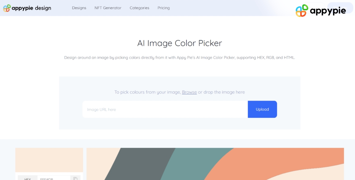
Designing visually appealing graphics can be a daunting task, especially if you're not familiar with color theory. However, with Appy Pie's AI Image Color Picker, enhancing your design skills and creating gorgeous graphics has never been easier. Here's a step-by-step guide to using Appy Pie's AI Image Color Picker tool to create stunning graphics:
- Choose an Image
- Pick a Color
- Analyze Color Codes
- Preview Your Color Palette
- Save and Export Your Design
Either choose an image from your computer or enter an image URL, and the image will be uploaded to the screen.
You can now pick any color on this image using your mouse pointer.
Once you choose the color, you will have HEX, RGB, HSL, and CMYK codes for the color displayed on your screen.
As you scroll down, you will also get an entire palette curated for you directly from the image!
Save and export your design - Finally, save your color palette and use it in your design. Appy Pie's AI Image Color Picker tool allows you to export your color palette as a PNG or SVG file, making it easy to use in your design software of choice.
With Appy Pie's AI Image Color Picker tool, enhancing your design skills and creating stunning graphics has never been easier. By following these simple steps, you can create a visually appealing color palette that will take your designs to the next level.
Conclusion
In conclusion, bright yellow is a powerful and versatile color that can add vibrancy and energy to any design project. Throughout this blog, we have explored the historical and cultural significance of bright yellow, its impact on human psychology and emotions, and how to use it effectively in graphic design. We have also delved into the importance of complementary colors, understanding HEX codes, and using color theory to create harmonious and impactful designs. By understanding the nuances of bright yellow and its role in design, designers can create stunning and effective visuals that evoke a strong emotional response and leave a lasting impression on their audience.
Related Articles
- How to Use Notion AI [A Complete Guide]
- Choosing the Right Fit: Workflow Automation Software vs. Project Management Software
- How to Design a T-Shirt: A Simple Guide
- Best Podcast Hosting Platforms and Sites You Need To Know
- How to Create a Recipe Book in Notion
- Top 20 Best Used Car Websites in India & Around the World
- 8 Top NFT Memes – Classic Memes That Sold Extremely Well
- DeiT-LT Distillation Strikes Back for Vision Transformer Training on Long-Tailed Datasets
- What is Cyber Monday? Tips to Score the Best Cyber Monday Deals
- 16 Effective Ways To Generate More Real Estate Leads in 2024