
Exploring The World Of Burnt Orange: From Origins And Meanings To Fashion, Art, And Future Trends

Introduction
The color Burnt Orange is a captivating blend of fiery oranges and burnt sienna, reminiscent of the changing seasons and nature's most stunning sunsets. From fashion runways to home decor, this versatile hue has made its mark in numerous areas of design, art, and culture. As a warm, comforting color, Burnt Orange conveys a sense of earthiness and stability, while also being bold and adventurous. In this blog, we'll delve into the many facets of this fascinating color, exploring its origins, symbolism, cultural significance, and more. Whether you're a fan of fashion, art, or simply love the warmth of Burnt Orange, join us on this colorful journey to discover everything this vibrant hue has to offer.
Table of Content
- Introduction
- Decoding the Significance of Burnt Orange Color in Graphic Design
- An In-Depth Look at Creating Burnt Orange Color Combinations
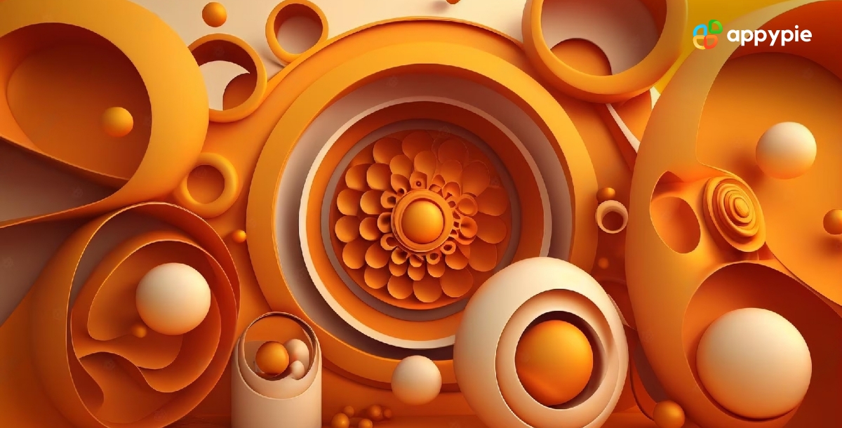
- Why Burnt Orange is Vital in the World of Design
- The Evolution of Burnt Orange Color: A Historical Journey from Ancient Ancient Art to Contemporary Design
- Create Harmonious Designs with Complementary Colors for Burnt Orange
- A Guide to Burnt Orange Color Shades: Understanding HEX Codes
- Enhance Your Design Skills and Craft Stunning Graphics with Appy Pie's AI Image Color Picker
- Conclusion
Decoding the Significance of Burnt Orange Color in Graphic Design
Burnt Orange is a striking color that is both bold and sophisticated, making it a popular choice in graphic design. As a warm, earthy tone, it evokes feelings of coziness and comfort, yet it also possesses a sense of adventure and excitement. Understanding the significance of this color is crucial for graphic designers who wish to create compelling and effective designs.
When it comes to branding and marketing, Burnt Orange can convey a sense of reliability, trustworthiness, and stability. This makes it an excellent choice for companies that want to establish a sense of longevity and dependability. Burnt Orange can also be used to convey warmth, friendliness, and approachability, making it an ideal choice for brands that wish to build a more personal connection with their audience.
In graphic design, Burnt Orange can be used in a variety of ways. It can be used as a primary color, or as an accent to add depth and interest to a design. Burnt Orange works well with other warm colors, such as bright yellows and reds, as well as cooler tones such as blues and greens. In addition to its versatility, Burnt Orange can also add a touch of sophistication and elegance to any design.
Overall, understanding the significance of Burnt Orange in graphic design is key to creating visually appealing and effective designs. Whether you're designing a logo, website, or marketing materials, this warm and inviting color can help you connect with your audience in a meaningful way.


An In-Depth Look at Creating Burnt Orange Color Combinations
Burnt Orange is a warm and earthy color that can be used to create striking and sophisticated color combinations in design. Understanding how to mix Burnt Orange with other colors is crucial for creating visually appealing designs that evoke specific emotions and moods.
When it comes to creating Burnt Orange color combinations, there are a few different approaches that designers can take. One popular method is to pair Burnt Orange with other warm tones, such as golden yellows or chili pepper color, to create a rich and inviting color scheme. This type of color combination is often used in home decor, as it creates a cozy and welcoming atmosphere.
Another approach is to pair Burnt Orange with cooler tones, such as blues or greens, to create a more balanced and sophisticated color scheme. This type of combination is often used in branding and marketing materials, as it can convey a sense of stability, trustworthiness, and professionalism.
In addition to pairing Burnt Orange with other colors, designers can also experiment with different shades and tones of Burnt Orange itself. For example, using a lighter, more subdued shade of Burnt Orange can create a more relaxed and calming mood, while using a darker, more intense shade can create a more dramatic and bold effect.
Thus, creating Burnt Orange color combinations requires a deep understanding of color theory and design principles. By experimenting with different shades, tones, and pairings, designers can create visually stunning designs that evoke specific emotions and moods.
Why Burnt Orange is Vital in the World of Design
Burnt Orange is a color that has gained immense popularity in recent years and has become a vital element in the world of design. It's a warm and earthy color that has the power to evoke strong emotions and create unique design combinations.
One of the key reasons why Burnt Orange is so essential in the world of design is because of its versatility. It's a color that can be used in a wide range of design styles, from modern to traditional, and everything in between. This versatility allows designers to experiment with different design elements and create unique designs that stand out.
Another reason why Burnt Orange is so important in design is because of its ability to evoke specific emotions and moods. It's a color that can create a sense of warmth and comfort, making it perfect for use in home decor or cozy branding. It can also convey a sense of passion and excitement, making it ideal for use in advertising and marketing materials.
In addition to its versatility and emotional impact akin to the serenity of blue gray or the vibrancy of teal, Burnt Orange is also a color that can complement a wide range of other colors. It can be paired with warm and cool tones alike, creating unique and eye-catching color combinations that draw the eye and make a statement.
The Evolution of Burnt Orange Color: A Historical Journey from Ancient Art to Contemporary Design
Burnt Orange is a color that has a rich and diverse history, dating back to ancient times. The color has evolved over the centuries, and has been used in various forms of art and design, from ancient cave paintings to modern-day fashion.
In ancient times, Burnt Orange was derived from natural pigments, such as clay and ochre. It was often used in cave paintings and other forms of ancient art, and was prized for its earthy and warm tone.
As civilization progressed, the use of Burnt Orange in art and design continued to evolve. In the Middle Ages, Burnt Orange was often used in tapestries and other forms of textile art, and was a popular color for religious iconography.
In the Renaissance era, Burnt Orange became more widely used in paintings, and was often paired with other warm colors, such as reds and yellows. It was a popular choice for clothing and home decor, and was considered a sign of wealth and status.
In the modern era, Burnt Orange has become a popular color in fashion and interior design. It's a color that is associated with warmth, comfort, and coziness, and is often used in home decor and branding materials.
Overall, tracing the evolution of Burnt Orange color, as vibrant as a summer sunflower or as muted as a twilight lavender, has been a fascinating journey. It's a color that has stood the test of time, and continues to inspire artists and designers today.
Create Harmonious Designs with Complementary Colors for Burnt Orange
When it comes to designing with Burnt Orange, choosing the right complementary colors can be the key to creating a harmonious and visually stunning design. Complementary colors are colors that sit opposite each other on the color wheel, and when used together, they create a striking contrast that can add depth and dimension to any design.
Creating harmonious designs with complementary colors is an effective way to make your Burnt Orange design stand out. By choosing the right complementary colors, you can create a visually stunning design that evokes the desired emotions and moods.
One complementary color scheme that works particularly well with Burnt Orange is the blue-green scheme. Blue and green are cool colors that balance out the warmth of Burnt Orange, creating a harmonious and balanced design. This color combination can be used in a range of design styles, from modern to traditional, and is especially effective in home decor and branding materials.
Another complementary color scheme that pairs well with Burnt Orange is the blue-purple scheme. This color combination creates a sense of sophistication and elegance, and can be used to create a range of moods and styles. It's an excellent choice for graphic design, fashion, and branding, and can be used to create a distinctive and memorable visual identity.
In addition to blue-green and blue-purple, Burnt Orange can also be paired with a range of other complementary colors, including yellow-green, red-violet, and blue-yellow. The key is to experiment with different color combinations and find the ones that work best for your design.
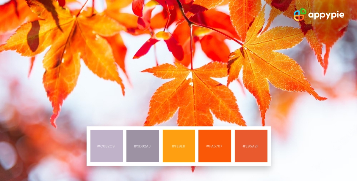
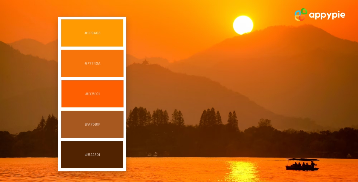
A Guide to Burnt Orange Color Shades: Understanding HEX Codes
Understanding the HEX codes for Burnt Orange color shades can be helpful when creating designs for branding, marketing materials, or any project that requires a specific color scheme. Here is a guide to Burnt Orange color shades and their corresponding HEX codes:
- Burnt Orange: HEX code #CC5500
This is the most common Burnt Orange shade and is warm and rich in tone.
- Light Burnt Orange: HEX code #FFA07A
- Dark Burnt Orange: HEX code #A93226
- Pale Burnt Orange: HEX code #FFDAB9
This is a soft and muted version of Burnt Orange that works well as a background color.
- Terracotta: HEX code #E2725B
This is a cinnamon-red shade of Burnt Orange that is commonly used in home decor and fashion design.
Whether you are creating a logo, a website, or a marketing campaign, knowing the right HEX codes can help you create a consistent and cohesive design that effectively communicates your message.
This is a lighter and more subtle version of Burnt Orange, perfect for creating a softer and more delicate design.
This is a darker and deeper version of Burnt Orange that evokes a sense of intensity and drama.
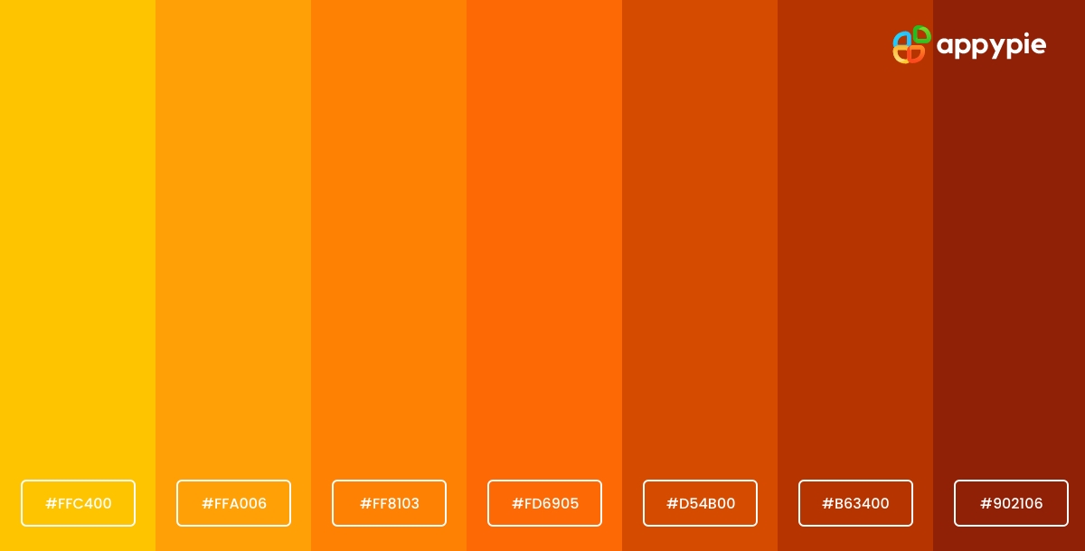
Enhance Your Design Skills and Craft Stunning Graphics with Appy Pie's AI Image Color Picker
Designing visually appealing graphics can be a daunting task, especially if you're not familiar with color theory. However, with Appy Pie's AI Image Color Picker, enhancing your design skills and creating gorgeous graphics has never been easier. Here's a step-by-step guide to using Appy Pie's AI Image Color Picker tool to create stunning graphics:
- Choose an Image
- Pick a Color
- Analyze Color Codes
- Preview Your Color Palette
- Save and Export Your Design
Either choose an image from your computer or enter an image URL, and the image will be uploaded to the screen.
You can now pick any color on this image using your mouse pointer.
Once you choose the color, you will have HEX, RGB, HSL, and CMYK codes for the color displayed on your screen.
As you scroll down, you will also get an entire palette curated for you directly from the image!
Save and export your design - Finally, save your color palette and use it in your design. Appy Pie's AI Image Color Picker tool allows you to export your color palette as a PNG or SVG file, making it easy to use in your design software of choice.
With Appy Pie's AI Image Color Picker tool, enhancing your design skills and creating stunning graphics has never been easier. By following these simple steps, you can create a visually appealing color palette that will take your designs to the next level.
Conclusion
We have explored everything about Burnt Orange color, from its history to its significance in graphic design. We have delved into the psychology of this color and how it can be used to evoke specific emotions and create stunning designs. We have also discussed the importance of understanding color combinations and HEX codes when working with Burnt Orange color shades. By following the tips and guidelines outlined in this blog, you can enhance your design skills and create beautiful graphics that stand out. With its warmth and richness, Burnt Orange is a versatile color that can add depth and sophistication to any project. So go ahead and experiment with this fascinating color, and create designs that truly capture your vision.
Related Articles
- Top 10 Web Design Certifications to Elevate Your Career
- How to Build an NFT Marketplace like OpenSea
- Understanding ERP vs. CRM: Differences & Benefits
- How to Design a Progress Report: Importance, Checklist & Templates
- How Omnichannel Marketing Strategy Can Improve Customers Experience?
- 4 Effective Ways to Automate Your Bookkeeping
- Top 10 IT Ticketing System Best Practices & Tips
- What is AI Helpdesk Software and How It is Revolutionizing Customer Support Services?
- Discover 10 Best Study Apps & Learn to Make an App
- Key Ad Design Tips to Help Your Brand Make Good Advertisements