One Piece Logo: History and Meaning Behind the Symbols

One Piece is one of the comic franchises started in 1997 by Eiichiro Oda. Since its inception, One piece manga has been published weekly in the Shonen Manga journal. The comic depicts the story of a teen adventurer, 'Monkey D. Luffy,' who wears a distinctive thatch hat. His body has been granted rubber features because of eating Devil fruits. These mysterious fruits give you superpowers but take away your capability to swim.
Along with his friends, the boy explores the planet and gets a gem called One Piece. This helps him become the leader of the pirates. Also, there's a TV show named 'One Piece,' based on the comics.
Meaning and History of One Piece Logo
The One Piece symbol designer, Eiichiro Oda, had always been interested in pirates and curious about them. Since his childhood, he had fantasized about pirates. With the help of real pirates' life descriptions, Oda was inspired to create a manga about a young boy who builds a team of adventurers and goes with them on a trip in order to declare himself as a new leader of pirates and get the ultimate treasure. The gem name helped give the franchise name, i.e., One Piece.
Eiichiro Oda partnered with another manga artist named, 'Nobuhiro Watsuki,' and started working on the series in 1996. The series was launched with two short stories. The first one is Romance Dawn; in this one, Oda explains the personage of Monkey along with his primary attributes. Later, the name Romance Dawn became the initial chapter's title and the name of the book One Piece. All these works were published in the summer of 1996. After that, the manga production was on stream, and one-piece cartoons were posted weekly in Shonen Jump magazine.
Description of One Piece Logo: 1996- Today
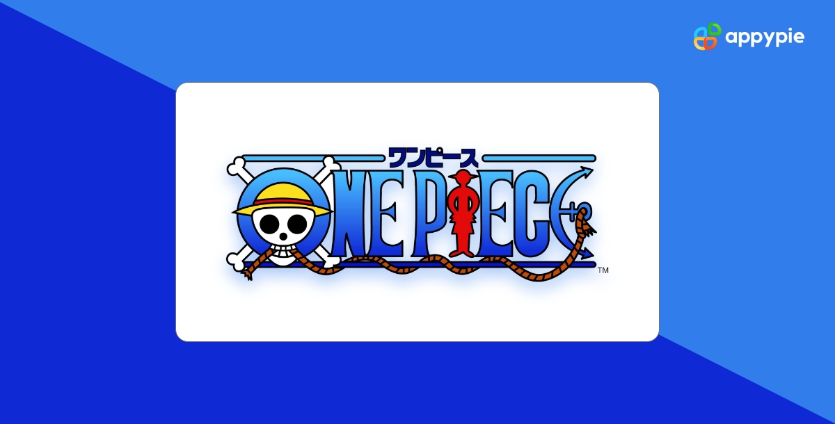
The One Piece logo has never changed since its inception, nor did its logotype. The logo depicts a nameplate outlined by two lines from up & down. The one-piece skull wears a hat and glimpses the inner area of the 'O' letter. The skull also featured two hand bones crossing each other behind it. The 'i' in the logo is tailored as a silhouette of the lead character, 'Monkey Luffy,' of the series. And the last letter, 'e,' is styled as an anchor bound with a rope. The rope entwines the lower outline of the logotype, and the skull's teeth hold the other end of the rope.
Though this is the primary One Piece logo or icon, various variations are available on the internet. In some cases, the logotypes are used episodically in some series of anime One Piece or some volumes of book covers. These logotypes have different shades, features, and elements, but the pirate concept has always existed.


One Piece Logo- Color Scheme & Font
The color palette of the One Piece Logo consists of red, black, yellow, blue, and white shades. And that's how the logo is set up, where most letters are in blue hues along with a black outline; however, the letter' i' is styled as a silhouette of the lead character, Monkey, in red. The color red has also been used to depict a thin line on the thatch yellow hat worn by the one-piece skull. The eyes and nose of the head are in black shades. The hand bones behind the crown are white along with black contour. Lastly, the rope is brown with a few black lines.
Except for the stylized letters such as 'o', 'e,' and 'i', the inscription is in a custom serif typeface. The characters have bold bars, sharp serifs, and intervals in between. The letters are narrowed but elongated.
Different Versions of the One Piece Logo
Over the years, there have been various One Piece logos with various depictions for different purposes. For example, the Japanese logo consists of the Japanese name of the series at the top of the logo. Also, there's a black-and-white version of the same, used for both English and Japanese adaptations of the series.
Some following franchise components have also been intended for adapted versions of the One Piece logo. For instance, the initial logo used for Shonen Jump magazine between 2004 to 2007 had a little different image color scheme.
A new version of the Shonen Jump magazine logo was created by Funimation, which used gold wordmarks instead of multi-toned blue. Some variations were also used for DVD collection sets, featuring a simple black & white wordmark in the textured font.

Netflix Unveils logo for "One Piece"
The popular anime “One Piece” was released on Netflix Japan in 2021, and its logo got revised. Netflix Japan started streaming the anime “One Piece” on April 15, 2017, and the logo was changed at that time. The new logo was designed by a Japanese digital artist Shigenori Soejima, who is famous for designing the character in “The Persona” series.
This time, Netflix Japan decided to be involved in the logo design process of “One Piece” and had a contest for it. The new logo was designed by 4 Japanese digital artists from different generations. The one who won the contest was Tohru Nishimura, who is the oldest one among them. His name is not familiar to many people, though he is a legendary figure in his field. He has been designing logos for “Lupin III”, “Mobile Suit Gundam” and “Ultraman” since the 1970s.
The idea of this contest was to decide how far the anime goes into the 21st century. Netflix Japan wanted to redesign the logo while keeping its tradition as much as possible. The new logo started to appear on official things such as posters after 2021.
Wrapping Up
The One Piece logo is known to be one of the excellent depictions of compelling and unique elements in the story. With just a glance at the logo, you can quickly get an insight into the One Piece story, and that's why it's no wonder that it is considered the most famous logo in the world of manga.
How to Create your own Logo with Appy Pie's Logo Maker for Free?
Creating your own logo online using Appy Pie's Logo Maker is really simple and easy. With our easy-to-use interface, you can easily create your logo with your brand or company name in just three simple steps.
Choose a Logo Template you like: To start creating your logo, you need to choose a logo template. You can either upload an image from your computer or take a picture of your desired logo using your webcam on your computer. You can also use Appy Pie's free logo templates, which are available to all registered users of the site.
Customize your chosen Logo Template: Once you have chosen a Logo template, you can add text to it and customize it according to your needs. You can add any text, like company name, slogan, tagline, etc. In addition, you can also choose the color of the text and its size.
Download and Use your Customized Logo: Once you are happy with the design, click the Download button to download your logo. Your logo will be automatically saved as a .zip file to your computer.
Related Articles
- Adidas Logo: History and Evolution
- History and Evolution of Apple Logo: Journey from Fruit to Fame
- Doritos Logo: A Glorious History of Little Bits of Gold
- Nike Logo: History and Evolution
- Bank of America Logo: From Monogram to American Flag
- Squid Game Logo: Meaning Behind Hidden Symbol
- TikTok Logo: The Meaning Behind the Colorful Note
- Domino’s Logo: History and what Domino’s has to do with Pizza
- AT&T Logo History: Journey From Bell to Globe
- Bitcoin logo and its Crypto History
- FedEx Logo History: What’s so special about FedEx Logo