History and Evolution of Apple Logo: Journey from Fruit to Fame

As far as perfection is concerned, the Apple logo is just the right example of it and one of the major reasons why is the way it reflects the brand. Though the logo is one of the most common fruits with a bite taken off, it is considered to be clean, and minimalistic and looks modern and premium. However, this hasn’t always been the case. Despite not being through various major changes, whatever little changes have been made, the transformation has been tremendous.
The Apple Company started in April 1976 and the first logo was nothing like the current one we all know. The tech giant brand is known for the logo it is associated with, however, the initial logo was actually totally different from that. It was fussy and looked old-fashioned. Also, somewhere it depicted the 19th-century vibe.
So, to learn more details regarding the history and evolution of the captivating logo of Apple, keep reading the blog.
The Apple Logo History and Evolution
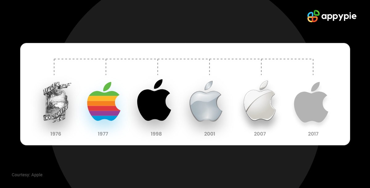
The Apple logo is considered to be one of the most recognizable logos in the world. And it is really surprising that only a few people have knowledge about the history and evolution of the logo. Since the introduction of the logo in 1976, it has gone through various changes. The very first logo was elegant and simple, featuring the name of the company alongside the signature of one of the founders. It was designed by one of the founders,i.e. Ronald Wayne. As far as the current logo is concerned, it is actually completely different from 1976 one, but that has to be expected.
In this blog, you’ll find about the glorious history and evolution of the Apple logo over the years.
1976: The Newton Appearance
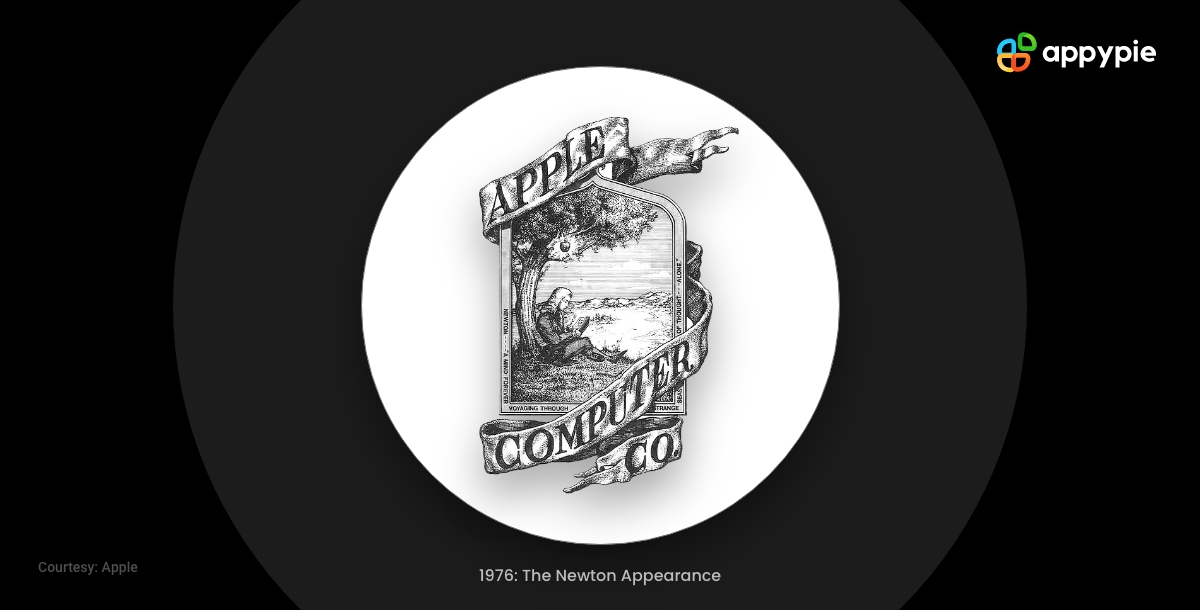
What do you think? Is that Steve Jobs , who is sitting under a tree? Obviously not, it's Issac Newton, and he's waiting for the gravitational law to hit him. Yes, the very first Apple logo was more like a bookshop logo or somewhat like a pub logo but not at all like one of the world's leading tech companies. The logo also featured 'Apple Computing Co' all in uppercase in a ribbon muffled around it.
Was Newton's Apple moment inspired Steve Jobs to take his brand name? Well, we don't think so. In 1981, Jobs said in one of the press conferences that he really likes Apples, so it looks Newton's connection was basically an afterthought. The first Apple logo was designed by a slot machine entrepreneur named Ronald Wayne, who actually left the company a few days after it was founded. However, the logo design didn't last much longer.
1977: The Rainbow
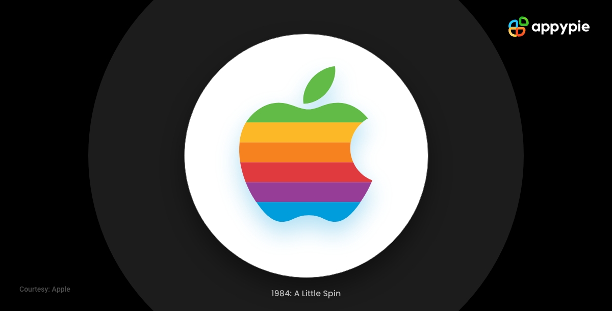
Just a year later, the remaining founders of Apple, Steve Wozniak and Steve Jobs, had wisely decided to give a more modern look to the Apple logo in order to match it with their company's brand personality. Can you imagine scaling down that original Apple logo on mobile devices? This time Jobs brought Rob Janoff as a graphic designer for the task, and the process of launching Apple's first computer was completed in two weeks in April 1977.
The new logo was considered to be remarkable, especially for its simplicity. It was an apple in 2D design with a bite taken out. This apple logo looked quite minimalist then; however, the logo was in rainbow coloring, making it stand out from the rest.
But how about that bite? Was it a kind of tribute to Alan Turning, who actually got killed because of eating some poisoned apple? Actually, no! One of the reasons for the bite was to clarify that the fruit is actually an apple because it could be easily misunderstood as a cherry. Also, the bite helped allow the term 'apple' to be placed in the space in the apple logo.
1998: The Classic Design
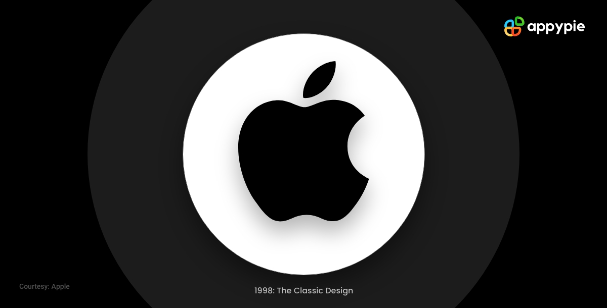
The company started to flounder a little, and then Steve Jobs returned with a bang in 1997. He came up with the plan of positioning the brand as a luxury one, and in order to do that, he needed to add a few tweaks to the old Apple logo. This time the rainbow color got ditched with a solid black color, and the shape also got honed in order to make it slightly thinner.
There have been further variations in the Apple logo, also. For example, a translucent-looking blue version of the Apple logo was also there to reflect the new iMac of Bondi blue color. Also, in 2001, a shiny version of the Aqua Apple logo got featured on MacOS X Cheetah.
2001: Full of Depth
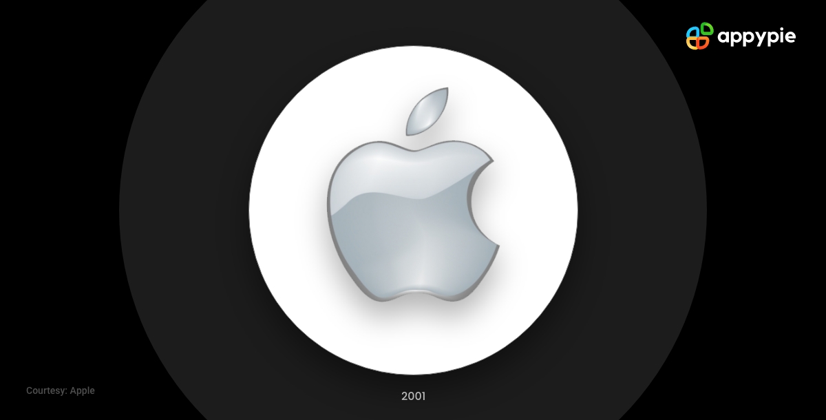
In 2001, the Apple logo tried adding some characters to it. Therefore, the flat logo got replaced by a new one introducing a silver gradient and a noticeable depth in color. This silver logo was considered so vivid that it could stand out anywhere.
Known as the glass or aqua logo, the color got so popular that it was very well-used on the brand's online channels.
2007: A 3D Spin
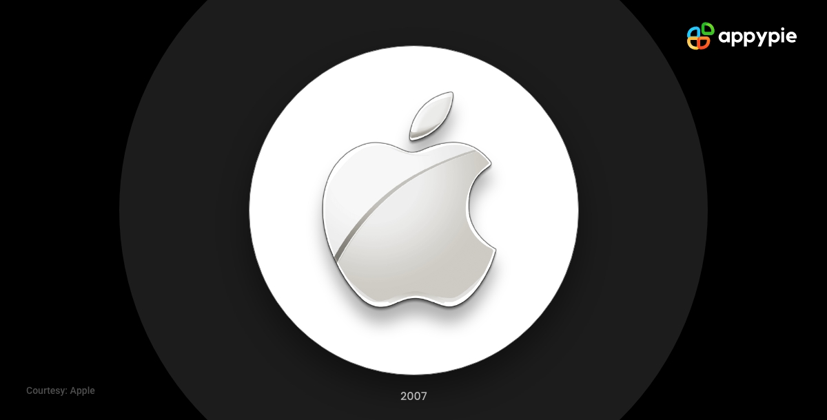
In 2007, the freshness of the Aqua Apple logo started to run out. So, a 3D spin has been introduced with a dash of chrome. Also, there was a strip running across it. This made the logo look more premium; however, this logo was not very much appreciated by the fans of solid colors.
One of the reasons for this change could be the cost of Apple devices which is way more expensive than its competitors. The logo looked sophisticated and depicted as a premium choice. Also, it arrived when the brand started focusing on sustainability and longevity. This 3D spin lasted about a decade, surviving the testing time.
2017- Current: The Apple Logo Today
The current Apple logo has remained very similar. Depending on the device and application, it has been used in gray, silver, white, and black. The gray logo is used on the website and store as an Apple favicon. Also, it's close to the silver logo, which gives a metallic look and appears on Apple devices.
There are various reasons why the logo is known to be one of the most successful logos today. The simplicity of the logo actually makes it more recognizable and memorable. Also, we can’t ignore the fact that the logo is the representation of the brand name in the most literal ways. The glossy feel of it represents the high quality but minimalistic design.
Wrapping Up
Mystery always drives curiosity. The less you reveal about your brand; the more people crave to find out. Since its inception, Apple has always used riddles and puzzles in order to attract loyal customers. Steve Jobs has always revealed a little about their brand logo and leaves room for speculation.
Apple is known as the strongest brand in the world and it is actually the only company that has a market capitalization of $1.2 trillion. A few reasons behind the success of the brand are innovation, marketing drive, and of course its powerful logo.
Today, the bitten logo of Apple is almost everywhere. The logo has become synonymous with luxury, reliability, power, style, wealth, and innovation. Moreover, the logo is so recognizable that it can represent the company without its actual name, i.e, Apple Inc.


How to Create your own Logo with Appy Pie's Logo Maker for Free?
Creating your own logo online using Appy Pie's Logo Maker is really simple and easy. With our easy-to-use interface, you can easily create your logo with your brand or company name in just three simple steps.
Choose a Logo Template you like: To start creating your logo, you need to choose a logo template. You can either upload an image from your computer or take a picture of your desired logo using your webcam on your computer. You can also use Appy Pie's free logo templates, which are available to all registered users of the site.
Customize your chosen Logo Template: Once you have chosen a Logo template, you can add text to it and customize it according to your needs. You can add any text, like company name, slogan, tagline, etc. In addition, you can also choose the color of the text and its size.
Download and Use your Customized Logo: Once you are happy with the design, click the Download button to download your logo. Your logo will be automatically saved as a .zip file to your computer.
Related Articles
- Adidas Logo: History and Evolution
- Doritos Logo: A Glorious History of Little Bits of Gold
- Nike Logo: History and Evolution
- Bank of America Logo: From Monogram to American Flag
- Squid Game Logo: Meaning Behind Hidden Symbol
- TikTok Logo: The Meaning Behind the Colorful Note
- Domino’s Logo: History and what Domino’s has to do with Pizza
- AT&T Logo History: Journey From Bell to Globe
- Bitcoin logo and its Crypto History
Most Popular Posts
- How RJs and DJs can grow their audience by going mobile?
- AI Design Tools: Role of AI-powered Software in Graphic Designs, Video and Animations
- 6 Best Team Chat Apps for Seamless Communication
- Generative AI: What is It and How Does It Work?
- Wix vs WordPress: Which platform is better for e-commerce websites? [Top Integrations]