Doritos Logo: A Glorious History of Little Bits of Gold

Doritos stands out as a widely favored brand of seasoned tortilla chips, and it is under the ownership of Frito-Lay, a subsidiary of PepsiCo. Originating in the early 1960s, Doritos first emerged from the kitchens of Casa de Fritos, a restaurant located in Disneyland, Anaheim, California. The brand proved to be extremely popular locally, and demand increased unexpectedly. Observing an increase in demand Casa de Fritos merged with Frito-Lay, a PepsiCo wholly-owned subsidiary. Frito-Lay launched Doritos nationally in 1966. The Doritos chips are sold in more than 40 countries and generate billions of dollars in sales each year.
What Does Doritos Logo Mean?
Doritos is derived from the Spanish word "dorado," meaning "golden." The chips are named for their golden color. According to the Doritos website, the chips were initially called "Doritos," which translates to "little bits of gold. The original Doritos packaging was a small, triangular-shaped bag that was open at the top, completing the actual shape of the chips.
Evolution of the Doritos Logo
Since its inception, the organization has experimented with various logos to highlight the company's playful nature and diverse range of products.
1964 – Doritos Original Logo
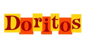
The original logo was created in 1964, featured a simple yellow and red sunburst color, and remained unchanged until 1973.
1973—The First Update
As the company gained traction in the 1970s, it decided to improve its logo. The Doritos logo was redesigned in 1973 and featured a bright yellow and orange composition with a brown inscription. The text in this new Doritos logo was still very similar to the first logo.
1979—The Second Update
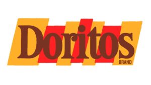
Doritos' logo was updated in 1979. The first and last rectangles of the logo were angled in this redesign, and the lettering was bolder in the new Doritos logo.
1985—The Third Update
In 1985, it was decided to redesign the brand logo. The company's advertising campaigns were aimed at a young audience, and the new logo was supposed to reflect this. The trademark name was increased in size and repainted in black with a thin white outline in the new Doritos logo. The word "Brand" was removed.
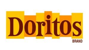
1994—The Fourth Update
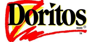
In the 1994 redesign, "Brand" was added in small print under the "s." The brand name's outline turned yellow. The letters D and O were inserted into a triangle, which is the actual shape of the chips.
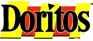
1999—The Fifth Update
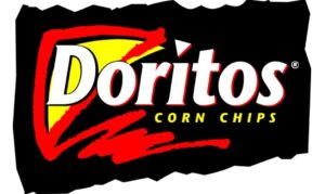
Doritos introduced another update in 1999. This new Doritos logo retained the previous design while changing a few colors of the logo. The caption became white with a red outline in this case. In addition, the word "corn chips" was added in the upper case with a black frame.
2000—The Sixth Update
The next update came in 2000, just a year after the previous ones—the black triangle with a white outline and a dark blue outer edge. The triangle inside was black again, with a white river. The wordmark was also in white in this new Doritos logo.
2004—The Seventh Update
In 2004, the logo was changed to a more simplistic design. The triangle and 3D effect were removed, the text was written in a streamlined, sans serif font, and a fiery line in the shape of a cardiogram. The new logo was meant to show a more modern and stylish look that would appeal to a younger audience.
2007 – The Eight Update
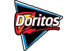
The triangle was expanded, and the slogan was removed. The typeface was changed to a more modern sans-serif font, and the geometrical dot above the letter "I" was yellow again. The blue circle surrounding the logo is an evolution of the previous "I," becoming a stylized blue circle with a yellow triangle inside this new Doritos logo.
2013—Now
The iconic triangle was reinstated in the 2013 change. The triangle's frame piercing the letter "O" makes the image appear three-dimensional. Each letter of the Doritos new logo is white but has a dark border of red and black stripes.
Doritos Logo Design Elements
Many different design elements are used in the Doritos logo. These elements include using the color red, the wordmark, and the triangle. These elements all work together to create an eye-catching and memorable logo. Here are a few of the aspects that make it one of the best logos in the world:
- Color
As the company experimented with its image and Image Color Picker, the colors of the Doritos Logo changed several times over the years. As a result, the Doritos logo now comes in six colors: black, red, yellow, and white. In the past, the company has also used blue and green, but these colors are no longer used on the logo.
- Design
The Doritos logo was designed to be simple, bold, and easy to read. The wordmark is set in a custom typeface with thick, blocky letterforms. In addition, the word "Doritos" is written in all caps, and the "o" is replaced with a red triangle, which is meant to represent a chip.
- Font
The Doritos logo is written in a sans serif font, a type of font that is simple and easy to read. The font used for the Doritos logo is very similar to the font used for the Pepsi logo.
Why did Doritos Change its Original Logo?
Though primarily snack organizations have maintained a consistent, reasonable image over the past years, Doritos has gone through many experiments regarding branding choice.
The company started in 1964, and since then, it has been experimenting with various logo designs. However, the Doritos logos have always represented the fun nature of the brand and the unique range of its products.
When we look at the different Doritos logo designs over the years, people are primarily drawn to the rebranding of Doritos that happened in the initial years of the organization's growth.
Throughout history, most of Doritos' logos have been separated in the square-focused design. The emblem has been created only to highlight the shape of Doritos chips which is actually triangular.
Though the introduction of the triangle to the logo first appeared in the 1980s, it was during the 90s when one of the most significant changes to the Doritos logo occurred.
As per the organization, the rebranding was done just to highlight the unique differentiating factor of tortilla chips of Doritos, i.e., their triangular shape.
How to Create an Effective Brand Logo like Doritos?
To design a logo for your company, you must consider several factors, such as image color, font, size, design, and slogan. Therefore, a high level of design skills is required when creating a logo. However, with Appy Pie's logo maker, you can create an effective brand logo without any design skills. You can easily choose from many templates, icons, and shapes to create a logo that perfectly represents your business. Moreover, you can customize your logo's colors and fonts to make it more unique. Creating a business logo is a matter of minutes. Appy Pie's AI Logo Maker has all the tools required to create the best logo in the industry.
How to create your brand logo with Appy Pie's Logo Maker?
- Go to Appy Pie Pie Logo Maker.
- Enter your Brand name and Tagline.
- Choose your Logo design from the templates.
- Customize your Logo with the easy-to-use editor.
- Download your customized, high-resolution Logo Design in the desired format.