
Alexander Graham Bell invented the telephone in 1876. And then, the company named AT&T was founded. It is one of the leading communication brands synonymous with innovation in telecommunications.
AT&T is known to be one of the world's largest telecommunications and wireless providers, with over 150 million customers. AT&T is the world leader in communication services which is not very far from the truth.
History, Meaning & Evolution of AT&T Logo

The original AT&T logo was created in the late 19th century. The logo was composed of a black bell image surrounded by a triple square frame. A wordmark in white was put on the black bell, reading, "Long Distance Telephone." It was in a traditional typeface with all letters in uppercase.
1900-1921
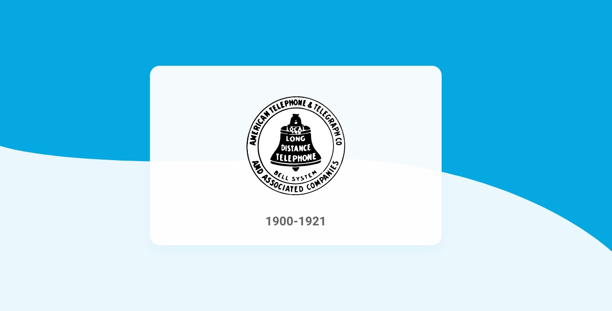
In 1900, the outer frame of the AT&T logo turned from a square to a circle. Some additional text got placed right in the circular frame. Regarding the logo's central emblem, the wordmark on the black bell got a 'Local' placed on the topmost part. Also, another word mark in black, reading "Bell System," was added under the bell.
1921-1939

In 1921, the text on the logo was changed a little, and the whole lettering on the black bell got a little shorter. Now the inscription just read "Bell System" while the text in the circular frame featured "American Telephone & Telegraph Co.
1939- 1964

This time, the inscription present on the AT&T logo got more assertive and bolder in 1939. While the composition remained the same, all outline elements were modified, making the emblem more serious and confident.
1964-1969
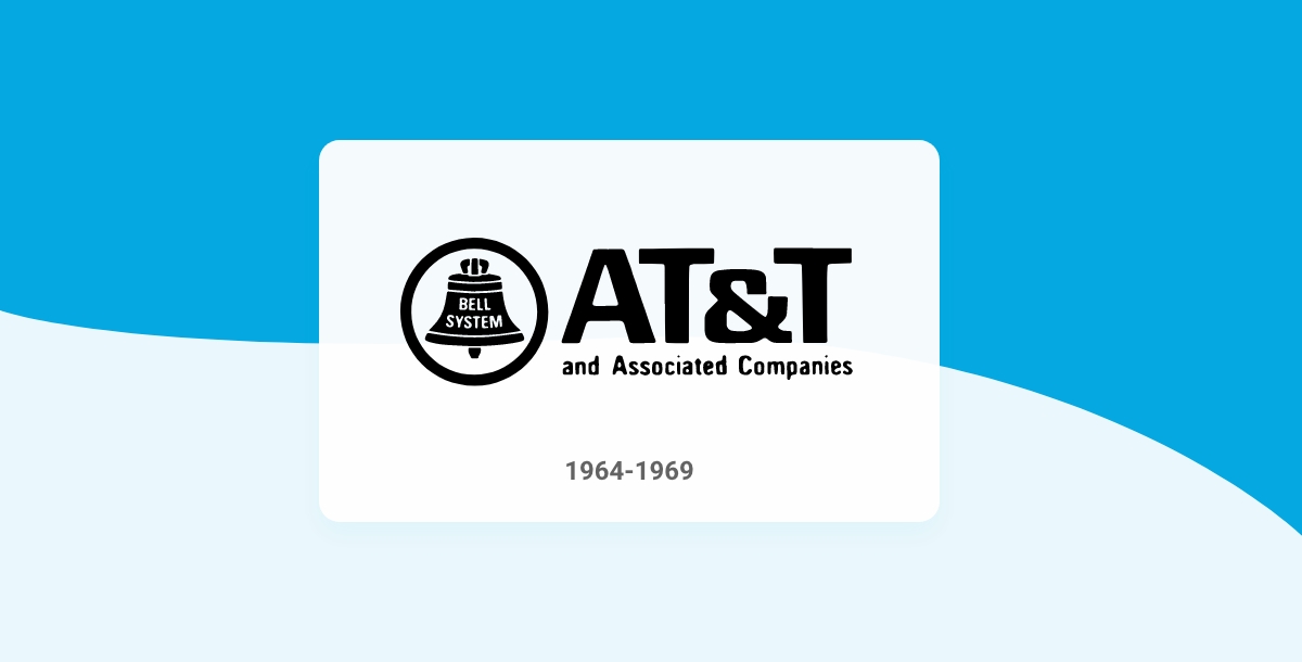
In 1964, the name of the organization was shortened. Thus, the AT&T old logo was also changed according to the title. The circular frame became bold and solid this time, and the emblem got placed on the left. In addition, the logo's wordmark was placed on the right side in two levels, where a giant "AT&T" was set above and "Associated Companies" was placed below in small. However, the color palette was still monochrome.
1969- 1982
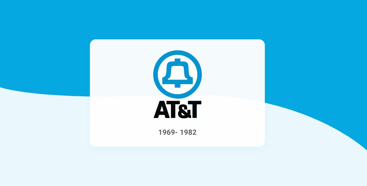
In 1969, the first colorful AT&T logo was launched by Saul Bass. It was more of a stylish bell emblem which is blue. The circular frames were also redrawn with blue outlines. The logotype was written in bold and black typeface under the bell emblem.
1982- 1996
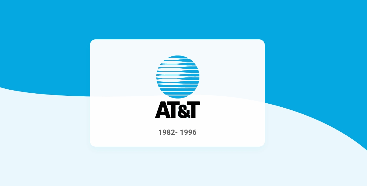
In 1982, Saul Bass kept the color palette of light blue and black unchanged, but a new emblem was created. A stylish globe replaced the bell icon in a circular frame in a solid light blue and white color in a horizontal striped pattern. This new badge also had a nickname called "Death Star." This name stayed with the company for many years, eventually becoming the current emblem of the company's base.
1996- 2005
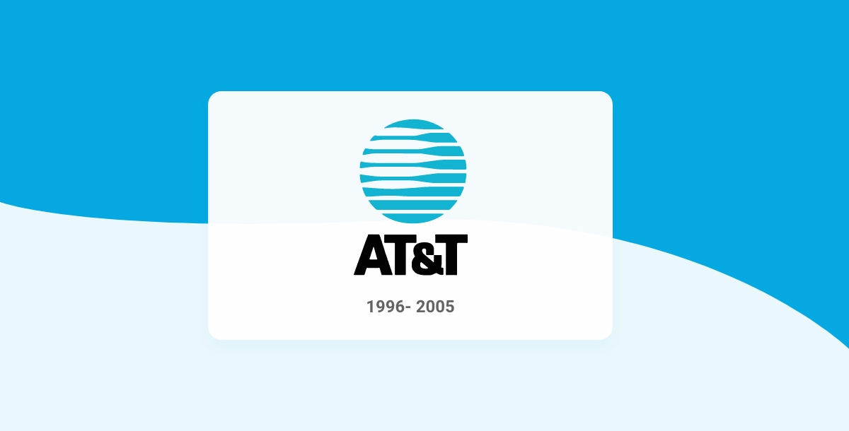
In 1996, the AT&T logo was redesigned one more time. Though the composition remained untouched, the overall design became a bit minimalist. The number of blue and white stripes on the globe reduced, and the bright blue color also got muted. As far as the bold black lettering is concerned, it remained untouched.
2005- 2015
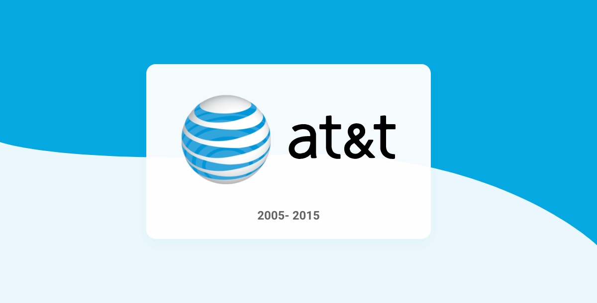
AT&T merged with SBC in 2005; thus, the AT&T logo got redrawn with the Interbrand design bureau. The previous versions inspired the new emblem; however, now it's a three-dimensional sphere with blue horizontal stripes and white as its primary color. In addition, the logotype lettering has changed to lowercase, again in bold black.
2015- Today
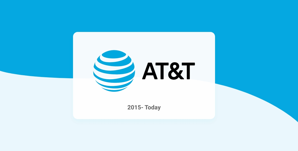
In 2015, the redesigning of the AT&T logo became flat again, and the logotype with uppercase letters was returned. However, the color palette of blue and white remained the same, but this time the primary color has changed to blue. This new logo shows the roots and traditions of the company.
ATT Logo Elements
There are several elements to the ATT logo: the globe, the wordmark, the quicksilver line, the tagline and the company name. The globe represents ATT's global reach, while the quicksilver line represents the company's speed and efficiency. Below, we'll go over the symbolism of its design elements.
- Symbol
The modern AT&T logo symbol represents the globe, which symbolizes the brand's global ambition. Despite having numerous splittings, the brand is indeed a true leader when it comes to the number of subscribers. In addition, the latest technologies have constantly been improving since its inception and have contributed to the organization's expansion on the global market. The decision to go beyond the US market was actually a forced one; however, it turned out to be the beginning of a new era for the company.
- Emblem
The modern logo changed from monochrome to two-colored, or we can say three-colored, to be precise. The emblem has a voluminous globe with light blue and white stripes, whereas at convergence, the blue lines intensify. This helps the logo to give depth and volume.
- Font
Redefining the AT & T logo also led to a few changes in the "AT&T" font. The most crucial difference in the corporate font took place in 1984 when the location of the logotype got changed. Earlier it was placed under the picture; however, the picture got shifted to the left, and the logotype is on the same level as the image. The transition from uppercase to lowercase was quite symbolic and fundamental. Due to the gained global power, the brand can't afford to use lowercase in the logo.
- Color
Though the AT & T logo was monochrome initially, the modern emblem has colors. The transition actually represents the desire to be attractive and more visible.
How to Create your own Logo with Appy Pie's Logo Maker?
Creating your own logo online using Appy Pie's Logo Maker is really simple and easy. With our easy-to-use interface, you can easily create your logo with your brand or company name in just three simple steps.
Choose a Logo Template you like: To start creating your logo, you need to choose a logo template. You can either upload an image from your computer or take a picture of your desired logo using your webcam on your computer. You can also use Appy Pie's free logo templates, which are available to all registered users of the site.
Customize your chosen Logo Template: Once you have chosen a Logo template, you can add text to it and customize it according to your needs. You can add any text, like company name, slogan, tagline, etc. In addition, you can also choose the color of the text and its size.
Preview and Download: Once you are happy with the design, click the Download button to download your logo. Your logo will be automatically saved as a .zip file to your computer.
Wrapping Up
A good logo is very crucial while making an app a success. Now you can also create a professional-looking logo without any design skills. Yes, you heard it right! Sign up with Appy Design software now to learn more. Click on the link below to get started!
Related Articles
- Adidas Logo: History and Evolution
- Doritos Logo: A Glorious History of Little Bits of Gold
- Nike Logo: History and Evolution
- Bank of America Logo: From Monogram to American Flag
- Squid Game Logo: Meaning Behind Hidden Symbol
- TikTok Logo: The Meaning Behind the Colorful Note
- Domino’s Logo: History and what Domino’s has to do with Pizza
Most Popular Posts
- The Future Trends in Conversational AI: 7 Trends to Watch in 2023
- The Art of Using Chatbots and Customer Service Software [+Call Center Script Samples]
- How to Design a Restaurant Menu? (Step-by-Step Guide)
- 10 Best Todoist Integrations That Will Boost Your Productivity in 2022
- Avatar Design and the Future of Character Illustration