
Graphic Design Tips & Tricks You Need to Know

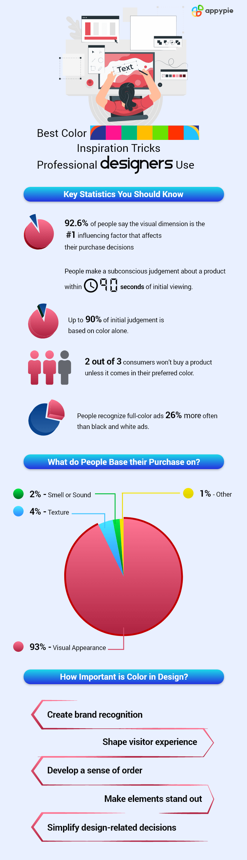
Colors are the essence of good graphic design. There are so many emotions that can be attached to graphical pieces that sometimes we find it difficult to convey the desired message. And that is where good graphic design helps us be more expressive to our viewers.
In this post, we have listed 20 graphic design tips from designers that will help you get the perfect color combinations and attract your viewers towards your pieces.
Table of Contents
Graphic Design Secrets from Designers
Graphic Design helps you visually communicate using various effective design elements. Go through this post to learn more about Graphic Design - An Introduction to Graphic Design: What is Graphic Design.
Let us go through the infographic to learn how colors affect your graphic design piece and then we will continue with the graphic design tips and tricks that you need to know.
- Limit the Number of Fonts
- Use Contrasting Fonts
- Start with Personal Preferences
- Use a Color Wheel
- Consider the Industry
- Don’t Offend
- Use Contrasting Colors
- Complement Your Message
- Create a Vibe
- Keep in Mind the Trends
- Go BIG
- Be Consistent in Your Design
- Set Up the Size and Height Perfectly
- Look for the Emotional Reaction
- Pink: Energetic, Young, Sweet
- Gold: Elegant, Stable
- Red: Passionate, Exciting, Dangerous
- White: Pure, Honest, Simple
- Orange: Pleasing, Friendly, Tangy
- Purple: Regal, Mysterious, Elegant
- Light Blue: Cool, Healthy, Young
- Yellow: Energetic, Cheerful, Warm, Cautious
- Dark Blue: Peaceful, Logical, Stable, Trustworthy
- Gray: Mature, Cool
- Give Each Letter Its Personal Space
- Give Your Text a Good Structure
- Use Icons to Draw Attention
- Adjust Image and Background Levels
- Take a Break and Bounce Back
- Be Yourself
Do not use too many fonts in the same design piece. It will look all messed up. Play around with the fonts until you find the ones that work well. The maximum number of fonts you use in one image should be three or less.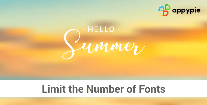
Make sure your design draws viewers’ attention and portrays the message well. You can use contrasting fonts and use a little trick to make a big statement. You can show people the mood of the text by using different fonts like bold, italic, cursive, etc.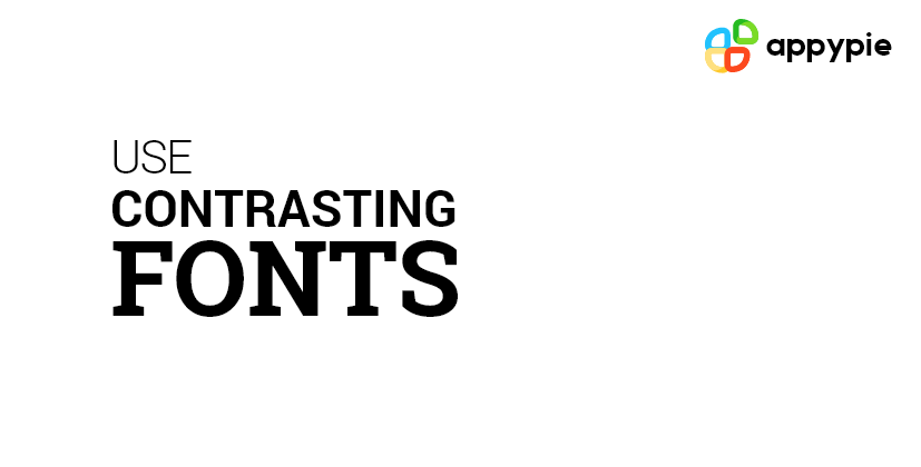
When you start working with a new client, check their color preferences. You must know what is there in their mind. If they don’t like a specific color, no matter if it is the right color for the project, you may not be able to use it.
Use the color wheel to find different color combinations and create attractive color palettes. This quote defines the color wheel in the best possible way, “All colors are the friends of their neighbors and the lovers of their opposites”.You can use Appy Pie’s Color Wheel to discover attractive color combinations and create an amazing color palette for your graphic design pieces.
Create Designs With the Colors You Choose
Go through this post to learn how you can create a color palette for your business - How to Create a Color Palette for Your Business?
Always pick colors related to the industry. For example, blue for service, green for medicine. It’s not a kind of rule that you need to follow. Some colors just go well with certain industries. Let’s take an example of the IBM logo, it’s blue that indicates strength and stability. So, for most technical companies we have blue as the standard color however when it comes to making people feel hungry, it’s red, the color of restaurants. 
Avoid offending the users with your color selection. Many colors are considered complete offensive when you misuse them. For example, green is a holy color and you can’t use it for a restaurant campaign. You are not expected to know the issue behind the use of every color, so discuss it with your client and take help from Google.
Contrasting colors are eye-catching as the opposites attract. It’s human nature, they are always interested in the unusual which is why using contrasting colors can help you attract the attention of the viewers.
Watch this video to learn how you can choose colors for your website.
(Above video is a part of a more elaborate course on Academy by Appy Pie. To access the complete course, please Click Here, or continue reading below.)
All the elements in your design piece must support a common concept. And, when we talk about colors, they should not be an afterthought but an integral part of a graphic design piece. All the elements like motion, scale, texture, images, light, style, etc. related to the branding and its communication goal. The key is that the message should be clear and must be identified by the users.
Here is a post to help you learn how you can use better color palettes to shape your brand - How Colors Can Shape Your Brand and Top Tools That Help.
Colors help you create a vibe, whether it’s open and friendly, fast and nimble, or quiet and confident. As an example, you can take the color of a power tie - Red. Let us talk about other colors like yellow is cherry but when it comes to yellow light, it offers a hint of warning, Orange is a playful and happy color, Blue offers peaceful, stable, and loyal vibe.
You must focus on the trends without ignoring reality. Just like logos demand the careful color selection that helps the brand stand out, but it should also go with the marketing campaigns or event graphics. Color trends get influenced by everything that happens around us, may it be sports, politics, music, or technology. For example, during World War II, it was a trend to wear Khaki color. 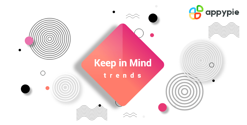
Always remember larger objects draw more attention than the smaller objects. In case you are using multiple elements with different sizes, make sure the main object is a larger object than the others. This will help you attract viewers’ attention towards the principal object automatically.
If you are consistent in your design, you can bring together all the graphic design elements and tie them together to make sense. Consistency in the designs also helps you keep the clients happy.
You can use our graphic designing tool – Appy Pie Design. The tool has easy-to-use features with a friendly user interface.
You can create a box effect in the image where you need to adjust the line-height. Make sure you place the text the way it pleases the eyes of the viewers. You can also decrease the transparency in the text so that it truly comes to life. 
Keep in mind the emotional reaction of the colors. Usually, people have the same reaction to the colors.
Let each letter have a personal space and a room to breathe. Kerning and letter spacing is a huge deal when it comes to designing a piece. The perfect kerning can certainly help you make or break a design. This is not something major to take care of, you can handle it all by yourself like a pro. Whether you increase or decrease the spacing between the letters, just make sure it looks right.
Use various alignment tools to set up a structure of your graphic design piece. Align the text with the other elements of your piece to make it visually pleasing.
Icons help you attract the viewers’ attention whenever you want. You can include famous logos with your preferred icons in a single image. Create icons in 3D or flat design. Fit them into your design to gain more value and improve the viewer’s experience keeping them engaged with your graphic design piece.
Always try to manage the image and its background levels to help viewers get the message. For example, if there is text in the image, the background needs to be a little blur so that users could read and understand the text.
The key is to rest your brain. When no ideas are coming to your mind, take a little break, have a cup of tea and coffee, and come back. The ideas will start popping up in your head again. It works, trust me, I have tried it myself.
This is the best tip that any designer could ever share with you. Be yourself and Be Authentic You! Create what you feel is right, it’s only you and you don’t need to be like someone else. Make your own rules as you reserve the right to be authentically yourself. Although, you can take ideas from others but always be your own rule-maker. Conclusion
To sum up, we can say that colors and visuals play a critical role in making the graphic design pieces meaningful. You must select the right color combinations to be able to create effective color palettes that help you make your design pieces more expressive.
Go through this post to learn what mistakes you need to avoid to create a perfect graphic design piece - 13 Most Common Graphic Design Mistakes to Avoid.
Try using Appy Pie Design and start designing visuals with endless color choices!
Do leave us a comment if you are a designer and want to add more tips to the article. We will do the needful. Good Luck!
Citations
Creative ProBanner SnackRelated Articles
- 10 Best AI Voice Generator Tools in 2023
- How to Automate Invoices with QuickBooks Online
- 8 Easy Discord Automation Ideas with Appy Pie Connect
- How to Get Buzz Cut Filter on Instagram
- What Are dApps and What Are They Used for?
- 15 Pro Tips to Master Calendar Management for Optimizing Your Time
- What is Schedule C (Form 1040) & how to file it?
- The Art of Using Chatbots and Customer Service Software [+Call Center Script Samples]
- What is Chat AI and How It is Revolutionizing Customer Support and Engagement
- Top 10 Best Photo Filter Apps in 2024