
13 Most Common Graphic Design Mistakes to Avoid

By Abhinav Girdhar | Last Updated on April 10th, 2024 10:51 am | 4-min read
Table of Content
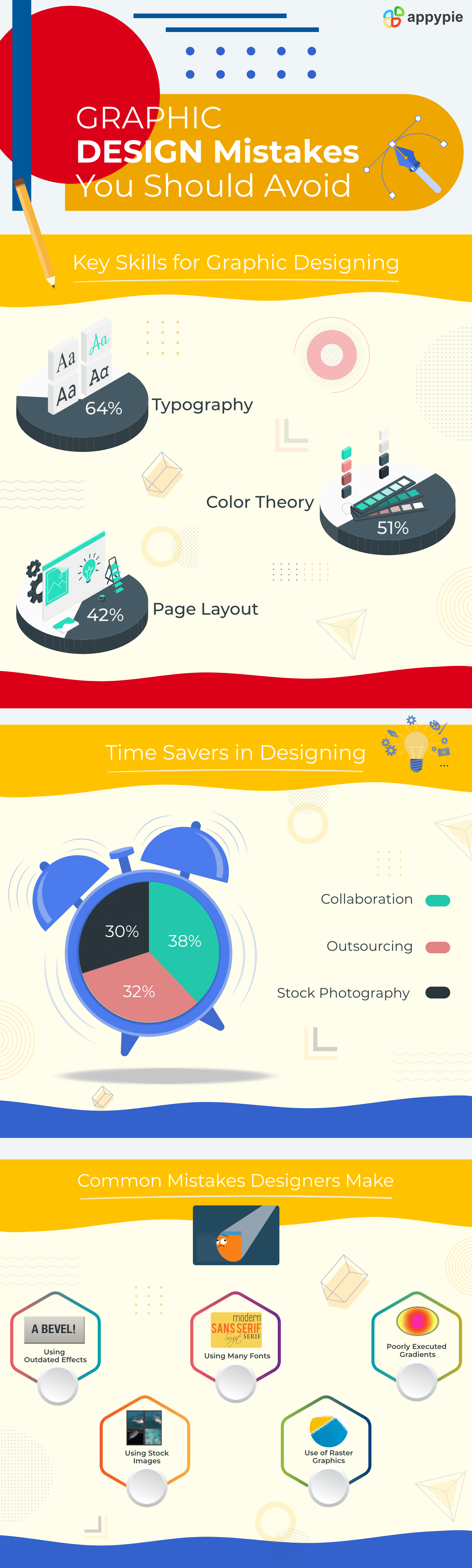
- Using Outdated effects
- Using Many Fonts
- Poorly Executed Gradients
- Using Stock Images
- Use of Raster Graphics
- No Proofreading
- Choosing the Wrong Colors
- Using Incorrect Hierarchy
- Creating Design for the Wrong Medium
- Not creating a Versatile Design
- Poor Kerning
- Overthinking Everything
- Not Following the Instructions
Graphic design involves a lot of aspects such as depicting a company’s brand image, promoting its products, and researching its business. Graphics designing gives you plenty of opportunities to stretch your creative muscles and nurture your business at the same time. Whether you are planning to design a new logo, brochure, website, business card, or a product replica, designing doesn’t have to be scary.
 Any mistake in a design task can leave a negative impact on the prospects of a company. However, a well-thought-out and carefully designed piece can help a business capture their audience’s attention and become a trustworthy brand for them.
In this post, we have put together a list of the most common graphic designing mistakes that you can avoid. Doing this can help you improve your graphic design strategy and create flawless design pieces.
Any mistake in a design task can leave a negative impact on the prospects of a company. However, a well-thought-out and carefully designed piece can help a business capture their audience’s attention and become a trustworthy brand for them.
In this post, we have put together a list of the most common graphic designing mistakes that you can avoid. Doing this can help you improve your graphic design strategy and create flawless design pieces. Common Graphic Design Mistakes to Avoid
Here are a few common graphic design mistakes that you need to avoid creating fabulous design pieces and wow your audience with them.- Using Outdated effects
- Using Many Fonts
- Poorly Executed Gradients
- Using Stock Images
- Use of Raster Graphics
- No Proofreading
- Choosing the Wrong Colors
- Using Incorrect Hierarchy
- Creating Design for the Wrong Medium
- Not creating a Versatile Design
- Poor Kerning
- Overthinking Everything
- Not Following the Instructions
Design pieces need to be creative and made with new color and font effects. Try not to use outdated effects in your designs. For example, drop shadows effect was very popular in earlier days of graphic designing, but if you will use them now, they will seem so out-of-date. 
This is one of the major mistakes that graphic designers make. Sometimes they use so many fonts that the message of the piece is not clear. More than two or three fonts used in a design distract the viewers. With the correct use of fonts, you can convey your feelings, add continuity, and establish your brand identity. Remember to keep in mind the size of your piece and the amount of text when selecting the font.
Try not to use an excessive number of poor-quality gradients. Study the color wheel, learn how to use trajectory graphic programs, and then start creating eye-catching gradients. Make sure your gradients are relevant to your design and that you execute them well.
Adding stock images can be a great idea when you are working on a project that needs certain images. However, excessive use of stock images can make your project look unprofessional. Also, keep in mind that you use new stock images in your marketing piece other than using the common and already used ones. Make sure you purchase high-resolution and clear stock images.
If we talk about brand logos, you never use raster images. Always create logos with the vector images as they easily get scaled with different sizes and are flexible with all mediums. Raster images, on the other hand, are an array of pixels of several colors and have a hard time scaling with different sizes.Watch this video to learn how to design your brand logo. (Above video is a part of a more elaborate course on Academy by Appy Pie. To access the complete course, please Click Here, or continue reading below.)
Not proofreading your document is another bad graphic design mistake that you can make. Always check on grammar and spelling in the content that you are adding to the piece. Sometimes when people notice a minor grammatical error or an incorrect punctuation mark mentioned, they ignore the rest of the piece. They start considering your business as an unprofessional one. So, make sure you proofread your text and take it through multiple rounds of edits.
Just like the fonts, choosing incorrect or too many colors could also be a mistake. Excessive use of colors can also distract people. Let us take an example of your brand logo. With so many bright colors your brand logo could look less clear and harder to read. Make sure you have enough knowledge of the color wheel while selecting your colors for the piece. Create your color palette with the combination of both primary and secondary colors and ensure that the text is clear and readable.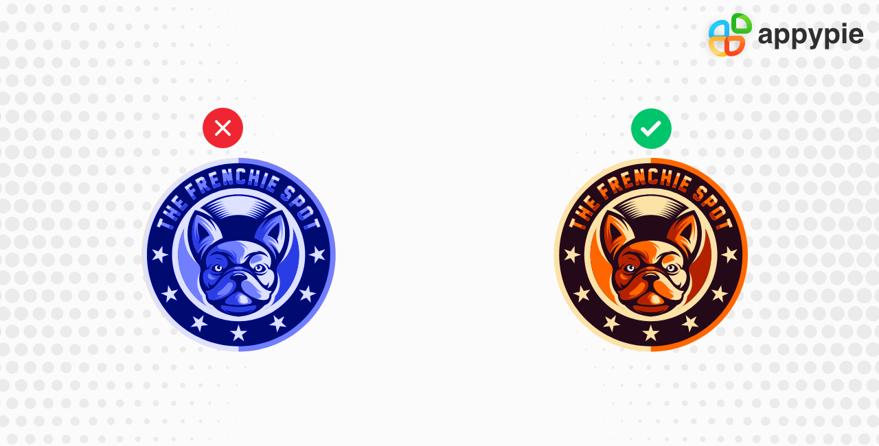 To learn more, go through this post to learn How Colors Can Shape Your Brand and Top Tools That Help
Hierarchy in the piece helps the audience find out what elements are the critical ones and how their eyes should look at and move over the piece. Generally, when a viewer is looking at the piece, it is easy for their eyes to navigate from the left, so try to place the important information there. 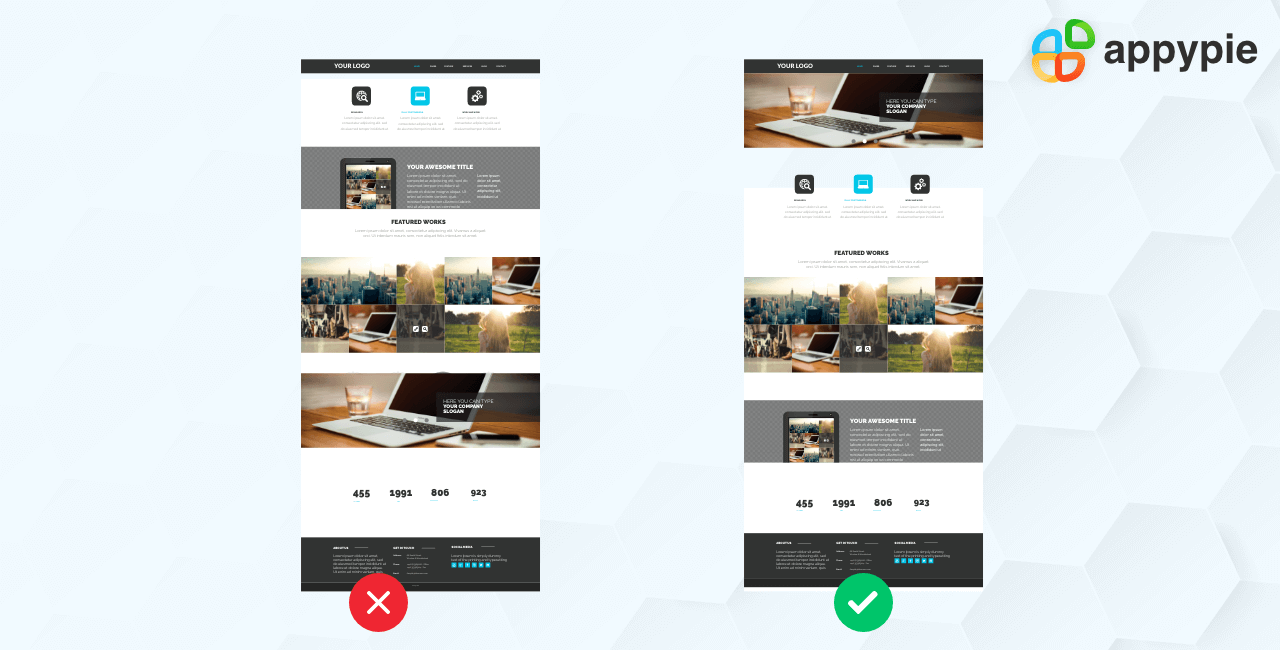 Hierarchy is one of the best design techniques that rank the importance of the information that you provide. Whether you are designing this piece for the new blog post, an upcoming event, or to communicate a sale, hierarchy in your piece decides what the viewer takes away from you.
Before you design a piece, decide where it will appear. Whether it will be printed in a magazine, displayed on a social media platform, or you will use it for your product marketing. For example, you create a design using RGB color mode which has red, green, and blue. These are the colors for light screens that you can add to display the range of colors on a digital screen such as tv, phone, tablet, computer screen. If you will create a format for digital and will use it for printing, it will look different as the colors will not interpret.
Watch this video to check out how you can design a piece for your social media post. (Above video is a part of a more elaborate course on Academy by Appy Pie. To access the complete course, please Click Here, or continue reading below.)
Always try to create multipurpose and evergreen designs. For example, if you are creating a logo, you need to think about how it will look on the marketing channels, your promotional products, and wherever you need to use it. You should be able to use your brand logo with various design purposes. Doing this can not only help you establish your brand consistency but also saves your time, effort, and money for redesigning artwork for new pieces.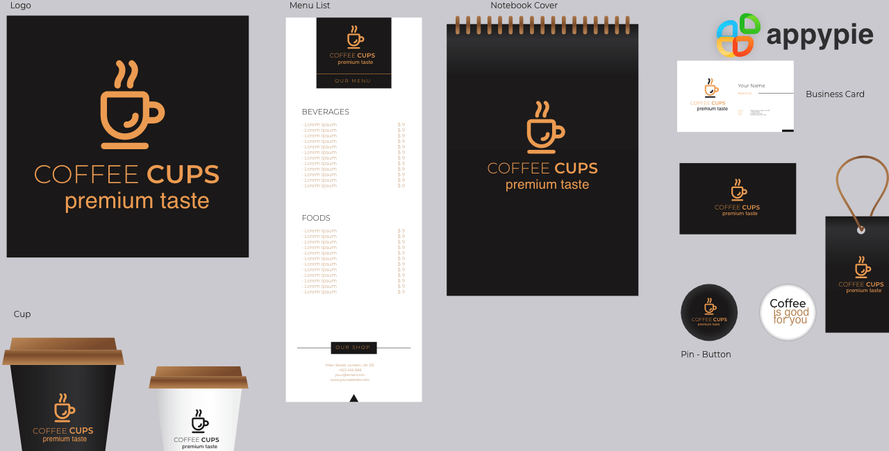
This one of the pitfalls that you need to avoid. To make your piece pleasing to the eye, try to add right and equal space between letters and words. The right kerning can make your piece look polished and easy to read. 
Keep your design simple. You are creating this design and you can add anything to it, but that doesn’t mean you should. Save yourself from overdesigning and going crazy with the photoshop filters. If you will add so much stuff in your design, the viewer will get confused and distracted. It will become difficult for them to extract the info from the piece. Let your design breathe and flourish. Try to avoid filling every inch of blank space with something. A little whitespace left in the image can make it look visually appealing, understandable, and clutter-free.
If you are creating a piece for a client, stay cognizant of the fact that you follow all the instructions given. Whether you are working with a site or if you are a freelancer, it is essential that you stick to what has been told and not try to add something to the piece just because you think it goes with it. Follow the instructions, just do your job well and help your client achieve their vision. Conclusion
You can avoid making these common graphic design mistakes by keeping your design simple. Simplicity has its own perks. Try our designing tool – Appy Pie Design to create more appealing and beautiful designs. The software helps you with both designing and editing purposes. With this tool, you can not only create designs but also you can make changes to them whenever required. To learn more about graphic design, go through this course on Appy Pie Academy - Introduction to Graphic Design | Learn Graphic Design Free. Go through the course to learn how to be a good graphic designer.Citations
99designsSage WorldDesign hillRelated Articles
- MMInA: Benchmarking Multihop Multimodal Internet Agents
- Ensuring Data Security in Help Desk Software: A Comprehensive Guide
- Zoom Meeting Etiquette: Best Practices for Participants
- Introduction to Cool Gray: What is it and Why is it Important in Graphic Design
- How Adobe Express AI Enhances Design Productivity?
- 20 Best Google Sheets Add-Ons in 2024
- Making App Maintenance Easier with Appy Pie AppMakr
- Jotform vs. Google Forms: Which is Best for You in 2024?
- 22 Artist Websites We Wish We Could Frame (2024 Inspiration)
- Top 5 Investment Apps – How To Create a Stock Trading App?
Take a Related Course
- Start learning for free
(No credit card required)