
Colors hold profound significance in our lives, not just in the beauty they bring but in the energy and luck they are believed to attract. Understanding the good luck color that harmonizes with the year's vibes can be crucial for anyone looking to enhance their fortune, be it in wealth, business ventures, or life's celebratory moments like weddings. This blog discusses the hues destined to bring good luck across various aspects of life, backed by the innovative assistance of AI Design Tools.
The quest for prosperity, success, and happiness is universal. Interestingly, certain colors have been historically associated with bringing good luck. Whether you're curious about what color is good luck for money, seeking good luck color for business, or selecting good luck wedding colors, the right palette can set the tone for a fortuitous year. Let's explore the powerful good luck color combinations to attract good fortune.
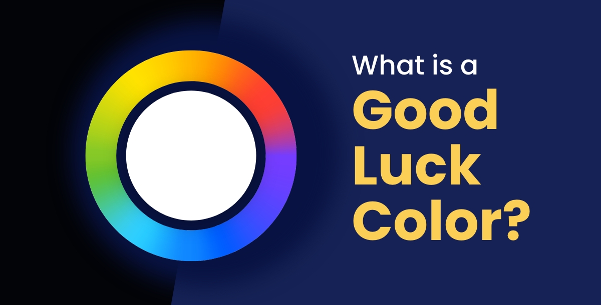
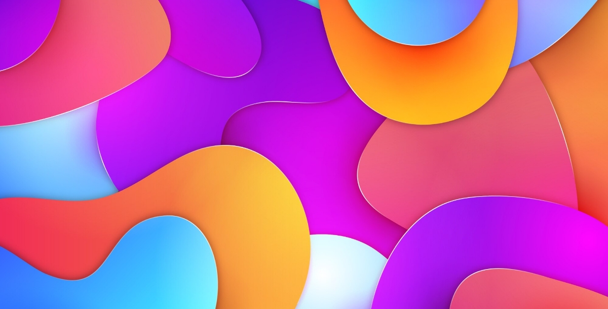
What is a Good Luck Color?
The concept of a good luck color transcends mere superstition, embedding itself deeply within the fabric of various cultures and traditions around the globe. These colors, rich in symbolism and history, are thought to channel specific energies into our lives, acting as magnets for fortune, prosperity, and well-being. Whether it’s the prosperity-inviting green, the passionate and powerful red, or the calming and wise blue, each hue carries its own set of beliefs and meanings that contribute to its perceived ability to influence outcomes in finance, entrepreneurship, love, and life.
- In finance, colors such as green and gold are often associated with wealth and abundance, encouraging a mindset of growth and financial success.
- For entrepreneurs, vibrant colors like orange and red can symbolize creativity, motivation, and the courage to take risks, essential attributes for thriving in competitive markets.
- When it comes to matrimonial harmony, soft pastels like pink and light blue can evoke feelings of love, understanding, and mutual respect, laying a strong foundation for a lasting relationship.
Incorporating these auspicious colors into your designs and surroundings isn’t just about aesthetics; it’s about aligning your environment with the energies you wish to attract. The use of a Color Wheel becomes instrumental in this process, serving as a guide to understanding color relationships and harmonies. By exploring complementary, analogous, and triadic color schemes on the color wheel, you can create balanced and harmonious designs that not only appeal to the eye but also resonate with the vibrancy, balance, and strength needed to attract good luck.
Good Luck Color Palette
The good luck color palette combines earthy and serene tones, designed to bring balance, stability, and a sense of renewal. These colors not only promise to enhance good fortune but also to create a harmonious atmosphere conducive to growth and positivity. Here's a breakdown of the palette along with their respective color codes:
| Color | Hex Code |
|---|---|
| Taupe | #B2A5A0 |
| Sage Green | #97A090 |
| Slate | #8A9EA1 |
| Ebony | #1A1910 |
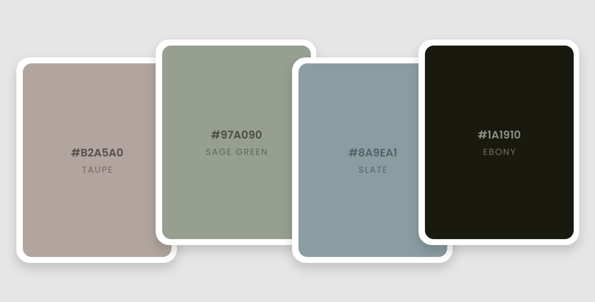
This palette draws inspiration from the natural world, promoting a grounded approach to life while inviting prosperity and luck. With various color tips and tricks Additionally, you can also pick up good luck shades from any picture using Appy Pie's Image Color Picker and accurately select and apply these auspicious colors in your designs, ensuring that you harness the full potential of these good luck charms in all your endeavors.
Cultivating Harmony: Feng Shui Color Palettes for Good Luck
Feng Shui, the ancient Chinese practice of harmonizing energy flow, extends its wisdom to color selection. Specific colors are believed to influence the energy (chi) within a space, impacting well-being and attracting positive outcomes. Understanding these color associations can empower you to create Feng Shui color palettes that promote good luck in different areas of your life.
While specific color preferences exist, remember that Feng Shui is a personalized practice. Consider your intuition and the overall feeling you want to cultivate in a space. Here's a helpful tip: an online color mixer can be a useful tool to visualize different color combinations before committing to paint or décor.
A Feng Shui Color Palette for Every Intention
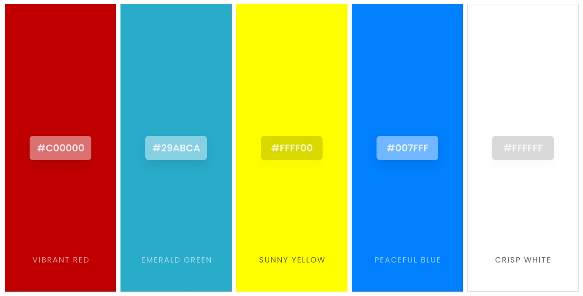
The following table offers five auspicious color options within Feng Shui, along with their associated hex codes and symbolic meanings. You may use color palette generators to get the accurate desired color palette easily with in no time
| Color Name | Hex Code | Feng Shui Association |
|---|---|---|
| Vibrant Red | (#C00000) | Represents fire energy, symbolizing passion, activity, and good luck in career endeavors. |
| Emerald Green | (#29ABCA) | Evokes the energy of wood, signifying growth, new beginnings, and prosperity. |
| Sunny Yellow | (#FFFF00) | Radiates earth energy, associated with happiness, optimism, and attracting positive energy. |
| Peaceful Blue | (#007FFF) | Represents water energy, promoting tranquility, wisdom, and healing. |
| Crisp White | (#FFFFFF) | Symbolizes purity, new beginnings, and a sense of a clean slate, allowing other colors to shine. |
These colors can be used individually as accents or combined to create harmonious palettes using color palette generators. By incorporating Feng Shui color principles into your home or workspace, you can cultivate an environment that fosters good luck and supports your overall well-being. Moreover, you can explore different color combination ideas to find what resonates most with you and your desired outcome.
Incorporating Good Luck Color Combinations for Diverse Designs
When it comes to enhancing the aesthetic appeal of a design, the strategic selection of colors plays a pivotal role. Dealing with the concept of good luck color combinations not only adds a layer of depth and meaning to your projects but also aligns them with the positive energies these colors are believed to attract. Whether you're designing a brand's visual identity, setting up a website, or simply looking to infuse your work with a touch of fortune, understanding how to blend these auspicious hues can make all the difference.
- Understanding Color Psychology: Begin by exploring the psychology behind colors to grasp their impact on mood and behavior. This knowledge is crucial in how to choose a color palette that resonates with your design's intent and audience's expectations, incorporating good luck colors to foster a positive reception.
- Aligning with Brand Identity: Choosing the right colors for your brand involves more than just aesthetic appeal; it's about storytelling and conveying your brand's values. Choose the right colors for your brand that not only look appealing but also embody luck and prosperity, strengthening your brand’s narrative and emotional connect.
- Optimizing Website Engagement: The colors you select for a website can significantly influence visitor engagement and conversion rates. Integrating good luck colors into website color schemes can create an inviting and dynamic online environment, encouraging longer visits and more positive interactions.
- Shaping Brand Perception: Colors have the power to shape perceptions and evoke specific feelings. How colors can shape your brand is fundamental in utilizing good luck colors to craft a brand image that’s both memorable and imbued with the essence of prosperity and success.
- Consistency Across Touchpoints: Maintaining a cohesive color scheme across all brand touchpoints reinforces brand recognition. Use brand colors that are associated with good luck consistently across your marketing materials, packaging, and online presence to create a unified and powerful brand identity.
By thoughtfully incorporating good luck color combinations into your designs, you're not just enhancing their visual appeal but also embedding a layer of meaning and intention that resonates with your audience.
Conclusion
Incorporating good luck color combinations into your designs goes beyond aesthetic enhancement. It's about embedding your work with positive energies and meanings that resonate with your audience. By choosing colors wisely, you create more than just visually appealing designs; you forge a deeper connection with viewers, inviting prosperity, success, and well-being into the spaces they inhabit. Understanding and utilizing these auspicious color palettes empower designers to not only beautify but also infuse their creations with a sense of purpose and positivity.
Related Articles
- 10 Best Wave Integrations for Small Businesses
- Popular Instagram Filters: A Comprehensive Guide to Enhance Your Social Media Presence
- How to manage inventory and fulfill orders using Amazon Seller Central? [Top Amazon Seller Central Integrations with Appy Pie Connect]
- How to Create & Share a Dropbox Direct Download Link
- Best Hacking Websites for Different Types of Hackers
- iOS 18 is here: What to expect from Apple’s latest iOS update?
- Top 10 Healthcare Web Design Inspirations
- 11 Discord Music Bots: Improve Your Server’s Audio Experience
- How to Add a Dropdown List in Google Sheets?
- How To Add Facebook Live Chat To Your Website in 10 Minutes