
Asymmetrical balance has an intrinsic relationship with human perception and natural phenomena. Just as nature seldom adheres to strict symmetry, compositions with asymmetrical balance in art resonate with the organic rhythms of the world. From the irregular patterns of foliage to the asymmetrical features of the human face, asymmetry reflects the complexity and beauty of existence. In this blog, we will comprehensively discuss what is asymmetrical balance along with examples that incorporate other design elements to produce remarkable pieces of art.
Table of Contents
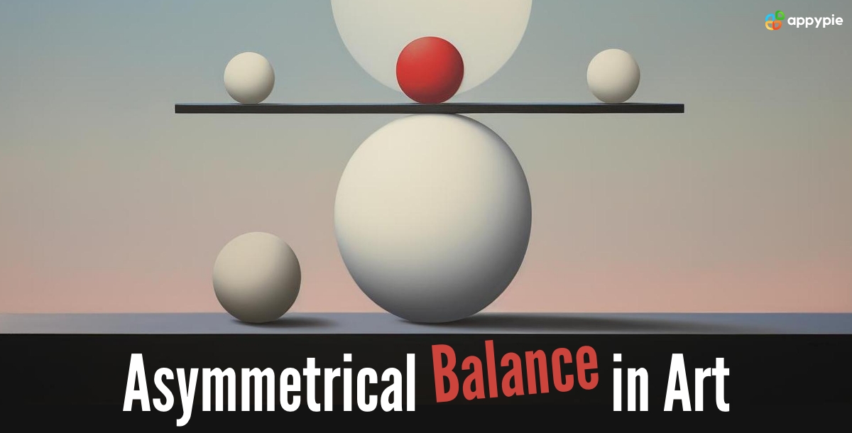
What is Asymmetrical Balance?

Have you ever seen a photograph or artwork that is unusual although it is not completely symmetrical? This is the secret of asymmetrical balance. Instead of everything being exactly in the middle, artists utilize different sizes, colors, or shapes on the opposite sides of varied works. This generates the feeling of visual tension and at the same time makes you move your eye around the picture. It appears as a dialogue among different elements where each one is significant for the performance without being a copy-paste.
A perfect painting to consider is the famous "The Starry Night" by Vincent van Gogh. Examine this work of art, and you will see that the swirling night sky with its dark, large cypress tree dominates the left side of the painting. On the right, the village appears to be much smaller. Although the elements are not central, the painting still feels balanced due to the contrast of the sizes and the way the dark tree "weighs in" on the composition. By using asymmetrical balance, the artist van Gogh creates a sense of movement and drama in this well-known painting.
Moreover, the launch of AI Design Tools, equipped with advanced algorithms has enabled artists to experiment with asymmetrical balance in unprecedented ways. These tools provide a playground for creativity with intuitive interfaces and sophisticated features that facilitate experimenting with asymmetrical compositions.
Difference Between Symmetrical and Asymmetrical Balance

Have you ever made a drawing where everything ran in the middle of a butterfly with two matching wings? This is called symmetrical balance - the two sides are even and a mirror reflection of each other. However, art isn't always about perfect symmetry. Other times, things can be unbalanced but still feel balanced, and this is the power of asymmetrical balance. Let us understand the difference between these two exciting design concepts in the following points that will help you to develop visually interesting artwork.
Symmetrical Balance: You can consider the example of a beautiful snowflake with six identical branches. This is a clear case of symmetrical balance. Every mirror opposite to the other part creates a feeling of the same order. For instance, you can visualize numerous logo designs like the McDonald’s logo, and the Volkswagon logo which uses the symmetrical balance principle. Additionally, if you want to design unique symmetrical logos, you can try using the AI Logo Maker. It not only generates a catchy custom logo design for you but also streamlines your design process.
Asymmetrical Balance: Imagine a child's drawing of a house now. The sun could be in the corner of the sky, and the tree could be tilted to one side. This is an asymmetrical balance, where things do not have to be perfectly mirrored but still appear balanced. Artists utilize different elements and techniques on the opposing sides to induce a feeling of movement and excitement.
Also, you can admire the surroundings! An example of asymmetry is a tree with more branches on one side as compared to the other. Picture a photo with someone standing off-center or a painting with a big object on one side and the details on the other side. Examples of symmetry can be a starfish or a peacock feather showing mirror reflection along the line of symmetry.
Why is it Important to Achieve Balance in Art?
Have you ever had the feeling of unease when you are looking at photos that seem distorted in position or angle? That's why we need to strive for balance in artistic work! It is almost like a magic trick, that makes the picture look correct and corresponding, even though there are certain other things, which might not be perfectly in the middle.
Consider an example of a seesaw – to make it even both sides should hold roughly the same weight. The function of balancing in art matches this principle. An artist may vary the relative sizes, colors, or shapes of the objects on opposite sides of the painting as well.
This brings about harmony in the sense that it influences the flow of your eye around the picture pleasantly. It's like having an exchange between different parts, making each element necessary without demanding the others to be the same.
Recommended read: Understand the types of balance in art.
Asymmetrical Balance Examples and Usage
It requires immense creativity and experience to achieve a perfect asymmetrical balance in art. We will discuss a few pieces of art that serve as the best balance in art examples and will help you enhance your artwork in the future.
Visual Weight

Envision a scale to weigh, but in design, you balance all the visual elements, not the weight. Therefore, bigger, bolder stuff is visually heavier and the smaller or more delicate elements are less important or not obvious by nature. Through the broken balance, artists provide elements of different visual weights and pose them on either side of the center to achieve equilibrium.
For example, Guernica illustrates Pablo Picasso’s use of overwhelming impact in asymmetric balance. Notice the painting – and see flies are there with other chaos of war in the left bottom. The horse offsets this on the right, a big solo figure, backing the background with a light tone. Placed asymmetrically, the painting does not look unbalanced since the artist uses disproportion thin-thick visual weight to suggest disquietude and uneasiness subjectively. The broad and dark shapes on the left dominate the composition and visually signify the hardship of war that attracts and stresses viewers. It shows how the usage of varying visual weight strategically can help in achieving asymmetrical balance.
Moreover, you can use AI Art Generator to create your artwork showcasing a unique style. Its generative AI technology efficiently delivers your envisioned artwork by simply entering prompts that specify your idea.
Placement of Elements Using Rule of Thirds

The placement of elements plays a crucial role in asymmetrical balance. Artists intentionally position key elements off-center, often leveraging the "rule of thirds" to create a more dynamic composition. This placement creates tension and visual interest, drawing the viewer's eye around the artwork. This compositional guideline suggests placing important elements off-center at the intersection points of a grid dividing the image into thirds. This creates a more dynamic and engaging composition compared to placing everything in the center.
The best example to understand this would be Mobiles by Alexander Calder. Contrary to the traditional balances, mobiles achieve equilibrium because of their asymmetry. There is an uneven distribution of those suspended elements but they constantly change and keep the harmony of visuals in the dynamic state. A skewed arrangement and dynamic moves among layers keep the viewer interested and his eye looking throughout the composition.
Use Contrast

Contrast can be used in various ways to achieve asymmetrical balance. This can involve contrasting color combinations, textures, shapes, or even sizes of elements. By using contrasting elements on opposite sides of the composition, the artist can create visual interest and balance without centering everything.
This iconic Japanese woodblock print exemplifies asymmetrical balance through a powerful use of contrasting elements. The massive, towering wave dominates the right side of the composition, creating a sense of awe and impending danger. This large element is balanced by the smaller Mount Fuji on the left, creating a sense of stability and grounding the scene. The cool blues and grays of the wave and churning water contrast sharply with the warm orange hues of Mount Fuji and the pale sky. This contrast emphasizes the dramatic tension between the powerful wave and the serene mountain. The dynamic curving form of the wave contrasts with the triangular shape of Mount Fuji. This juxtaposition creates visual interest and adds to the dynamic energy of the composition.
Focal Point

Asymmetrical balance doesn't negate the importance of a focal point. There should still be a dominant element or area that draws the viewer's attention first. However, the focal point may not be located in the center of the artwork, contributing to the off-center balance.
Asymmetrical balance might break the traditional mold of centered compositions, but it doesn't diminish the importance of a focal point. There should still be a dominant element or area that captures the viewer's attention first, even if it's not smack dab in the middle. This dominant element works like a star in the night sky – it guides the viewer's eye and sets the stage for exploring the rest of the artwork.
Let's take a look at an example. Las Meninas portrait by Diego Velázquez features a large group of figures, but our attention is immediately drawn to the Infanta Margarita. She's positioned slightly off-center, not squarely in the middle of the canvas. However, Velázquez uses several techniques to make her the focal point. She's dressed in a light-colored dress that stands out against the darker background and clothing of the other figures. The Infanta's pose and gaze hold our attention as she looks outwards, seemingly acknowledging the viewer.
Despite the asymmetrical balance of the composition, with figures and elements scattered throughout the scene, the artist masterfully uses placement, contrast, and body language to establish the Infanta as the clear focal point.
Negative Space

Negative space, the empty areas surrounding the objects in a composition, plays a vital role in asymmetrical balance. Strategic use of negative space can help balance the visual weight of elements and create a sense of depth and flow within the artwork.
To understand this we can take up the example of M.C. Escher's lithograph "Relativity. The artwork depicts a world defying gravity, with stairs and buildings creating a sense of confusion and movement. There's no central focus point, and the figures climb upwards on all sides, creating a dynamic and unbalanced feel.
The key to achieving balance here lies in the strategic use of negative space. The empty areas between the stairs and buildings become just as important as the solid shapes. They define the pathways, create a sense of depth, and guide the viewer's eye around the illogical world Escher has created.
Without the negative space, the artwork would become a chaotic jumble of lines and figures. However, by carefully utilizing both positive and negative space, Escher achieves a sense of balance and visual interest even within the asymmetrical composition.
Suggested read: Learn white space usage in design.
Conclusion
Hence, the next time you view a painting or a photograph, try locating the asymmetrical balance. Is there a lone bold object on one side as opposed to a group of smaller ones on the other? Does the artist deliberately use out-of-center contrasting colors to add visual interest? Once you understand this concept well, you will eventually come to realize the degree of creativity used by the artists to make their work visually dynamic and interesting.
Related Articles
- Top 15 HubSpot Alternatives & Competitors in 2023
- ID-Animator: Zero-Shot Identity-Preserving Human Video Generation
- Red Background in Art and Design: A Comprehensive Guide for Creatives
- What To Build For First – Apple Or Android?
- How to Remove TikTok Filter: A Step-by-Step Guide
- Exploring the Top Wrike Integrations for Project Management
- How to start your own Podcast – The Ultimate Guide for Beginners
- The Number Of Shopping Apps Rise By 92% In Just A Year
- Chatbots vs. Conversational AI – Which is Right for Your Business?
- Hardware Requirements for Large Language Model (LLM) Training