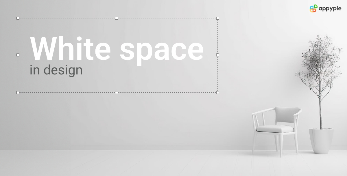
White Space: A Complete Guide to its Usage in Design

In the world of design, mastering the subtle art of utilizing white space is akin to unlocking a secret door to a world of aesthetic brilliance and visual harmony. White space, often misunderstood as empty or unused space, is a silent protagonist that plays a pivotal role in elevating designs from mundane to extraordinary. In this comprehensive exploration, we will delve into the principles, nuances, and practical applications of white space, unraveling the mystery behind its importance and learning how to wield it effectively.
What is White Space?
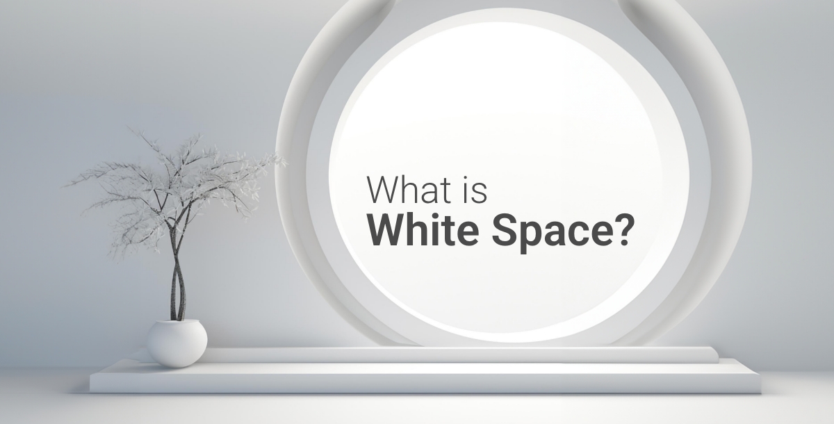
Before we unravel the magic of white space, let's demystify what it truly is. White space, also known as negative space, refers to the unmarked, untouched areas within a design. It can manifest as margins, padding, or gaps between elements. Far from being empty, white space is a powerful design element that breathes life into compositions. White space in design principles is the canvas that frames the content. It is the intentional decision to leave areas uncluttered, creating a visual balance that is crucial for the overall aesthetic appeal. Using white space effectively on a white background is crucial for creating a clean, uncluttered design that emphasizes the most important elements of your composition. In order to do that, you can try AI Background Remover to isolate your subject perfectly.
The Importance of White Space in Design Principles
- Enhancing Readability:
- Focusing on Visual Hierarchy:
- Creating a Sense of Balance:
- Aiding User Interface (UI) Design:
- Striving for Simplicity:

One of the fundamental roles of white space in design is to enhance readability. In the world of typography, the judicious use of white space around text elements prevents visual clutter, making it easier for readers to absorb information. White space in graphic design refers to the intentional and strategic use of unmarked or empty areas within a composition to enhance visual clarity, readability, and overall aesthetic appeal. One of the great examples of the role of white space in graphic design is it's usage in App Background. Users can explore App Background Templates with white space usage and witness how using it wisely can make your content clear and legible.

Visual hierarchy is the roadmap that guides viewers through the design. White Color space becomes the silent conductor, directing attention to key elements. Whether you're designing a logo or any other graphic design element, understanding visual hierarchy through white space ensures that the most critical elements take center stage.

Balance is the foundation of any visually appealing design. It creates a sense of order and harmony, guiding the viewer's eye through the composition. White space plays a crucial role in achieving balance. By strategically distributing empty areas around your design elements, you prevent any single element from feeling dominant or overwhelming.
This principle is particularly important when using background tools, like the popular Blue Background Maker. A well-balanced background sets the stage for your design content. It offers a variety of options to create a base that complements your design elements, not competes with them.
In the digital landscape, UI design relies heavily on the strategic use of white background space. Proper spacing around interactive elements, like buttons and icons, ensures a seamless user experience. An effective UI design, crafted with tools like an AI Background Maker, understands the importance of white space in guiding user interaction.

Simplicity is the hallmark of great design, and white space is its ally. The minimalist philosophy thrives on eliminating unnecessary elements and embracing ample white space. This approach is evident in the clean and sophisticated designs created using the Logo White Space technique.
How to Design with White Space
- Embrace Minimalism
- Prioritize Content
- Experiment with Proportions:
- Test Responsiveness:
- Iterate and Refine:
Minimalism and white space go hand in hand. Start by eliminating unnecessary elements, leaving room for the design to breathe. Using white background in any design is a great example of minimalistic design. You can also try Appy Pie's White Background Maker and embrace the simplicity it can offer. Whether you're creating a white space background or working on a logo, minimalism ensures that every element serves a purpose.

White space should not be an afterthought; it should be an integral part of the design process. Prioritize the content and strategically incorporate white space to highlight key information.
Understanding proportions is key to effective white space utilization. Experiment with different proportions to find a balance that suits the design. Don't be afraid to play with the size of your white space! Think of it like empty space on a canvas waiting to be filled. A wider margin around a photo can create a sense of calm, while a smaller gap between headlines can add a touch of energy. It's all about finding the right balance for the mood you want to convey.
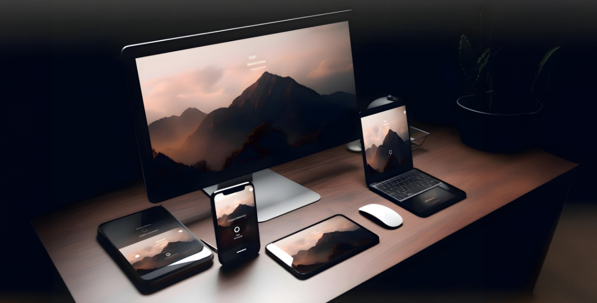
Making your design work across different screen sizes is crucial. White space plays a big role here! If the white space around it is too tight on a desktop screen, it might become cramped on a mobile phone. Test your design on various devices to ensure the white space maintains a comfortable distance around your elements, keeping your layout clean and visually pleasing no matter how someone chooses to view it.

Design is an iterative process. Don't be afraid to experiment, receive feedback, and refine your designs. Use the iterative approach when working with AI to fine-tune the balance between content and white space.
Conclusion
White space is not just a design element; it's a language. Understanding its principles and incorporating it effectively can transform a design from ordinary to exceptional. Let white space breathe life into your creations, guiding the viewer's journey and leaving a lasting impact. Designing with white space is an art, and mastering it ensures that your creations speak volumes in the language of visual aesthetics and sophistication.
Related Articles
- 10 Best AI Marketing Tools in 2024
- Top 5 Google Forms Integrations For You To Use
- Customer Service Analytics: What It Is and Best Ways To Use It
- CT-GLIP: 3D Grounded Language-Image Pretraining with CT Scans and Radiology Reports for Full-Body Scenarios
- Key Ad Design Tips to Help Your Brand Make Good Advertisements
- An Introduction to Programming In HTML5 and CSS
- 6 Best Time Tracking Apps for Better Monitoring
- Call Center Workforce Management: Key to Smarter Workforce Management
- How to Drop a Pin on Google Maps on Mobile and Desktop?
- How to Improve Your Customer Feedback Loop With Automation