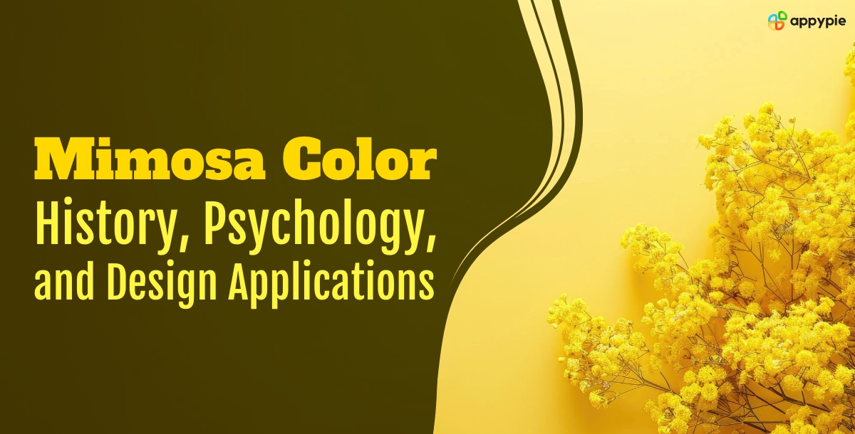
Mimosa Color – Exploring History, Psychology, and Design Applications

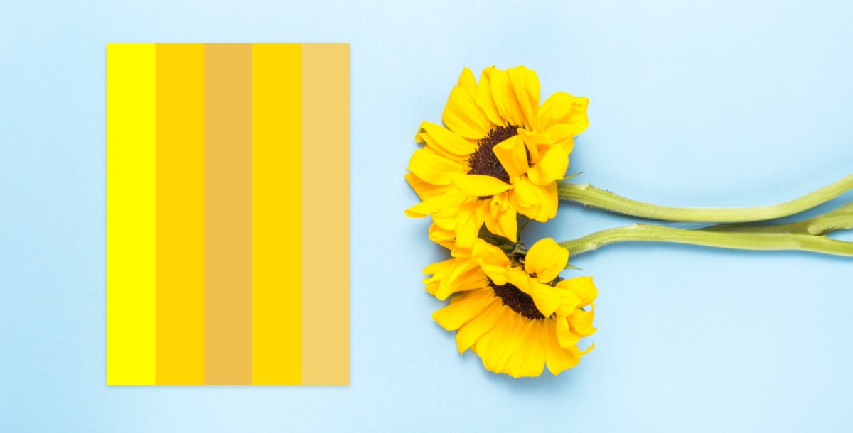
Mimosa Color, inspired by the delicate yellow blooms of the mimosa tree, brings a burst of energy and joy to graphic design. Its vibrant golden tones evoke feelings of happiness and optimism, making it a powerful tool for creating visually engaging designs that capture attention and inspire emotions. Within the color palette, Mimosa sits alongside shades of lemon, sunshine, and gold, creating a harmonious spectrum that celebrates the beauty of sunlight and warmth. By leveraging AI design tools, creators seamlessly integrate Mimosa into their projects, ensuring visually striking outcomes that inspire and engage.
One of the most appealing aspects of mimosa color is its versatility. It pairs beautifully with various colors, from soft neutrals to deep tones. When combined with crisp whites and earthy brown, mimosa color can add a touch of warmth and brightness to any space.
Understanding the significance of this color is crucial for graphic designers who wish to create compelling designs.
Mimosa has graced the palettes of artists for centuries. Vincent van Gogh, known for his vibrant use of color, frequently incorporated mimosa in his paintings, capturing the sun-drenched landscapes of Provence. Modern artists continue to be drawn to mimosa's warmth and vibrancy.
A Journey Through Mimosa's Origins
The mimosa story begins not on a breakfast table with a mimosa cocktail, but under the warm Australian sun. The mimosa tree, native to this continent, boasts clusters of bright yellow flowers that resemble tiny suns against the clear blue sky. European explorers encountering these vibrant blooms in the 18th century likely sparked the association between the flower and the color. By the 19th century, mimosa had become a popular ornamental plant in Europe, further solidifying the connection between the cheerful yellow hue and the delicate flower.
Interestingly, the mimosa's symbolism extends beyond sunshine and good times. In Italy, mimosa flowers are traditionally given on International Women's Day (March 8th), symbolizing resilience and femininity. This deeper meaning adds another layer to the mimosa color palette, hinting at the strength and vibrancy that lie beneath the surface cheer.
A Guide to Creating Color Palettes with Mimosa
Mimosa, the sunshine yellow offers a warm and inviting palette for graphic designers. Its versatility allows you to create captivating designs that evoke happiness, optimism, and creativity. Here's your guide to mastering mimosa color palettes:
Mixing Mimosa for different moods
Fresh & Energetic: Pair mimosa with cool tones like crisp aqua or lime green to create a refreshing and invigorating vibe.
Sophistication: Combine mimosa with deep navy or charcoal for an elegant and sophisticated look.
Grounded & Tranquil: To calm the vibrancy, pair mimosa with earthy brown color and gray color. Soft pinks and lavenders create a gentle and calming palette.
Choosing the perfect color combinations can be tricky. But with our user-friendly Appy Pie Color Mixer, experimentation becomes a breeze!
-
Find the perfect match for your design vision and bring your mimosa-inspired creations to life!
Incorporating Mimosa Color into Your Designs

In graphic design, color plays a crucial role in influencing emotions and perceptions. Mimosa Color, with its bright and cheerful appearance, has a profound psychological impact on viewers. Studies have shown that exposure to vibrant yellow color shades like Mimosa can stimulate mental activity, promote feelings of happiness, and increase energy levels, making it an ideal choice for designs aimed at uplifting spirits and creating a sense of positivity.
Experiment with using Mimosa as a primary color for backgrounds or accents, or combine it with complementary tones to create visually striking compositions that command attention. Remember to consider the context and audience of your design to ensure that Mimosa Color effectively communicates the desired message and elicits the intended emotional response.
Also, you can use Appy Pie Color Wheel which offers the tools and guidance necessary to bring your creative vision to fruition effortlessly.
Typography and Mimosa Color
Typography plays a crucial role in graphic design, and choosing the right colors for text can significantly impact readability and visual appeal. When using Mimosa Color for typography, ensure that the contrast between the text and background is sufficient to maintain legibility. Consider pairing Mimosa with darker or neutral tones for optimal readability, or use it sparingly for emphasis in headings or call-to-action elements.
Creating Mood Boards and Inspiration
Before diving into your design projects, take inspiration from the vibrant tones of Mimosa Color by creating mood boards and gathering visual references. Explore images, patterns, and textures that incorporate Mimosa Color in unique and creative ways, and use them as a springboard for developing your design concepts. Mood boards are an excellent tool for brainstorming ideas, refining your color palette, and establishing the visual direction of your project. You can also create your own mood board using Appy Pie’s Moodboard Maker.
In the fashion world, mimosa adds a touch of sunshine to any outfit. A mimosa dress can be the perfect choice for a summer soiree, while a mimosa scarf or handbag can add a cheerful pop of color to a neutral ensemble. Mimosa also finds its way into interior design, brightening up rooms and creating a welcoming atmosphere.
Whether you're designing a logo, website, or marketing materials, this warm and inviting color can help you connect with your audience in a sophisticated way. You can also create your logo, hassle-free with Appy Pie’s Logo Maker.
The Psychology of Mimosa
Mimosa falls within the yellow color spectrum, a range inherently linked to happiness, optimism, and creativity. However, mimosa leans towards the warmer end of the yellow spectrum, possessing a touch of orange that adds a gentle warmth and a sense of approachability. This subtle difference imbues mimosa with a unique emotional resonance.
Psychologically, mimosa is associated with:
Celebration: The bright, cheerful nature of mimosa makes it a perfect color for festive occasions. It evokes a sense of joy and lightheartedness.
Hope and Optimism: Mimosa's sunny disposition translates into a feeling of hope and optimism. It inspires positive thinking and a bright outlook.
Escapism: The warm glow of mimosa can create a sense of escapism, transporting us to a carefree and sunny place.
Mental Stimulation: Mimosa can stimulate the mind and encourage creativity.
A Guide to Mimosa Color Shades: Understanding HEX Codes
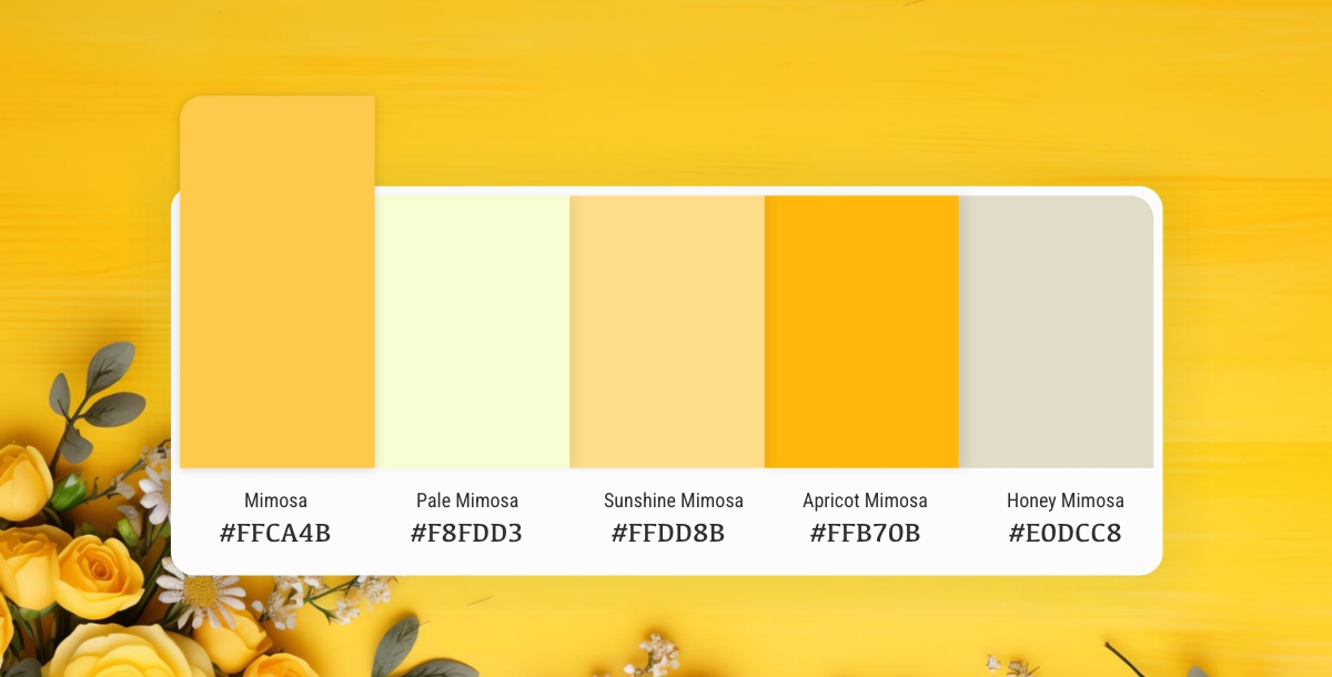
Mimosa (#FFCA4B) isn't just a single shade, it's a spectrum of vibrant yellows with a touch of warmth. Here is a guide to Mimosa color shades and their corresponding HEX codes:
- Classic Mimosa: The OG mimosa, captured by the HEX code #FFCA4B, embodies the essence of the color. This bright, golden yellow is perfect for adding a burst of sunshine to your designs.
- Pale Mimosa: For a softer touch, consider #F8FDD3. This pale mimosa leans closer to cream, offering a more delicate and calming feel.
- Sunshine Mimosa: Want to crank up the vibrancy? #FFDD8B is your answer. This sunshine mimosa exudes pure summer energy, ideal for designs that demand attention.
- Apricot Mimosa: Infuse a hint of orange with #FFB70B. This apricot mimosa adds a touch of warmth and sweetness, perfect for creating a welcoming and inviting atmosphere.
- Honey Mimosa: Craving a touch of richness? #E0DCC8 is your golden ticket. This honey mimosa offers a more muted and sophisticated take on the mimosa palette.
Craft Graphics with Appy Pie's Image Color Picker

Designing visually appealing graphics can be a daunting task, especially if you're not familiar with color theory. However, with Appy Pie's Image Color Picker, enhancing your design skills and creating gorgeous graphics has never been easier. Here's a step-by-step guide to using Appy Pie's Image Color Picker tool to create stunning graphics:
- Choose an Image
- Pick a Color
- Analyze Color Codes
- Preview Your Color Palette
- Save and Export Your Design
Either choose an image from your computer or enter an image URL, and the image will be uploaded to the screen.
You can now pick any color on this image using your mouse pointer.
Once you choose the color, you will have HEX, RGB, HSL, and CMYK codes for the color displayed on your screen.
As you scroll down, you will also get an entire palette curated for you directly from the image!
Save and export your design - Finally, save your color palette and use it in your design. Appy Pie's Image Color Picker tool allows you to export your color palette as a PNG or SVG file, making it easy to use in your design software of choice.
By following these simple steps, you can create a visually appealing color palette that will take your designs to the next level.
Conclusion
In conclusion, mimosa color offers a warm and inviting palette for graphic designers. Its sunny disposition evokes feelings of happiness, optimism, and creativity, making it a versatile tool for creating engaging designs. From website backgrounds to marketing materials, mimosa can add a touch of vibrancy and warmth to your projects. Embrace Mimosa for vibrant, impactful graphics.
Related Articles
- Customer Success Playbook: A Comprehensive Manual for Your Company
- PuLID: Pure and Lightning ID Customization via Contrastive Alignment
- 20 Best Ways to Increase the Sales Of Your Food Truck Business
- Zendesk vs. Salesforce: A Comprehensive Comparison of CRM Solutions [App Integration]
- What Does the Future Hold for AI in App Development? A Forecast and Analysis
- 4 Digital Magazine Examples with Exceptional Design Flair
- 21 Best Ad Campaign Examples of All Time
- How AI-Powered Ticketing System Can Revolutionize Your IT Support
- 11 Best AI Design Websites You Should Try in 2024
- 5 Best Texting Apps to Boost Business and Customer Communication
Most Popular Posts
- How to insert a Google Sheet into a Google Doc: Step-by-Step Guide
- Top Evernote Business Integrations for Better Team Collaborations
- 11 Effective Examples of Email Marketing Campaigns
- The Ultimate Guide to Chatbot Analytics [Essential Metrics and KPIs to Measure]
- Top 5 PandaDoc Integrations For your Business