
Have you ever been fascinated by a website's layout, a poster's color scheme, or the flow of information in an infographic? It happened because the design followed the core principles of design that created visual harmony and guided the viewer's experience. Just like grammar structures a sentence, the principles of design provide a foundation for creating visually appealing and effective communication.
While implementing the principles of design in your work takes practice, the emergence of AI Design Tools offers exciting possibilities. These innovative tools can assist graphic designers at all levels by, offering a template to work on, suggesting layouts, recommending color palettes, and even generating initial design concepts based on the core design principles.
Table of Contents
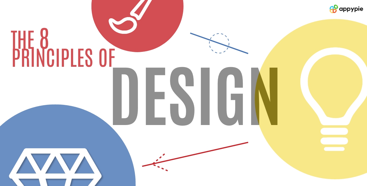
The 8 Principles of Design
Imagine entering a cluttered room with furniture haphazardly placed and dim lighting. It's hard to find what you need, right? Design principles are like the architect's blueprint for a space. They ensure balance, hierarchy, and clarity, guiding the user's eye and making information easy to digest. Let us now discuss the 8 principles of design in detail.
- Hierarchy
- Alignment

- Balance
- Proportion
- Emphasis
- Repetition
- Whitespace (Negative Space)
- Contrast

Hierarchy dictates the order of importance within a design. It's like an invisible conductor, directing viewers' attention to the most crucial elements first. Effective hierarchy aids clear communication and avoids overwhelming the viewer. Let’s take a website homepage, for example, where all elements, like text, images, and buttons, have equal visual weight. It would be confusing, wouldn't it?
Designers utilize various tools to establish hierarchy. Larger font sizes, bolder text, and contrasting colors highlight key information like headlines or calls to action. Placement also plays a role; elements positioned higher in the layout are generally perceived as more important.
A magazine cover is a prime example of hierarchy in action. The main headline, typically the largest and boldest text element, grabs attention first, conveying the cover story's essence. Supporting text in a smaller font size provides additional details. A catchy image, strategically placed, visually complements the headline. Moreover, you can opt for an online Magazine Cover Maker to maintain such hierarchy and ensure readers instantly grasp the magazine's central theme and are enticed to explore further.

Alignment refers to the arrangement of elements and is one of the important visual principles of design. This simple principle helps create a sense of order and organization. For instance, consider a poster with text and images scattered roughly. It would feel chaotic and difficult to read.
Aligning elements horizontally, vertically, or along a grid system helps designers guide the viewer's eye through the information. Text blocks can be left-aligned for readability or centered for emphasis, whereas images can be aligned with the top, bottom, or center of the text to create a balanced composition.
Let us consider a movie poster design example promoting a historical drama. The title might be prominently displayed at the top, centrally aligned for emphasis. Below, an intriguing image showcasing the film's protagonist could be vertically aligned with the title. Supporting text details like the cast and release date might be left-aligned in a column alongside the image, maintaining a clean and structured layout. This use of alignment communicates the film's message successfully and draws viewers in. You may also opt for using editable poster templates which are pre-designed with proper alignment.


Balance refers to the distribution of visual weight within a design. Think of holding a seesaw for it to remain level, both sides need to be roughly equal in weight. The same principle applies to visual design. Balance creates a sense of stability, and order, and prevents the viewer's eye from feeling pulled in one direction. This doesn't necessarily mean perfect symmetry; balance can be achieved through asymmetry as well. Designers use elements like size, color, and negative space (empty areas) all contribute to the overall visual weight.
Let’s pick up the example of a restaurant menu that demonstrates balance in action. The restaurant's logo or name, often larger and bolder, might be positioned at the top, establishing a focal point. Menu items themselves can be balanced asymmetrically. Larger text or visuals for signature dishes might be strategically placed to attract attention, while descriptions and prices could be balanced on the opposite side in a smaller font. You can use a Menu Maker to imitate such use of balance to create a menu that guides diners through their choices easily.

Proportion is the relative size and scale of elements within a design. Consider a photo where a person's head is comically large compared to their body, it throws off the entire image. Strategic proportion creates a sense of balance and visual harmony. Expert designers consider the size of various design elements in graphic design in relation to each other.
Larger elements are often perceived as more important, while smaller elements provide details or support. Proportion also considers the overall size of the design itself.
To understand this better, let’s consider a book cover. The title, arguably the most important element, might be displayed in a large, bold font that dominates the cover. This size emphasizes the title and draws the reader's eye first. The author's name, though important, might be displayed in a smaller, complementary font to maintain hierarchy.
The cover image, carefully chosen to reflect the book's content, would be sized proportionally to the text. It might be large and visually striking to capture attention, but not so large that it obscures the title. You can also use online customizable book cover templates to make a cover that effectively conveys the book's title, author, and genre, enticing readers to pick it up.

Emphasis elevates specific elements within a design to grab attention and become the focal point. Imagine a dimly lit room where you can barely make things out. Now, imagine a spotlight illuminating a specific object. Emphasis works similarly, using visual techniques to shine light on the most important message in your design. Designers use contrast (using contrasting colors or sizes), placement (positioning key elements prominently), and isolation (surrounding the element with negative space).
Let’s take up the example of a blog banner. The main headline, the element you want readers to focus on first, might be displayed in a large, bold font, perhaps contrasting with the background color for maximum impact. The headline itself could utilize contrasting text colors for optimal readability.
Supporting text, like a blog post snippet, could be displayed in a smaller font, ensuring a clear hierarchy and preventing it from competing with the headline. A Blog Banner Maker can help you achieve emphasis so that the banner effectively conveys the blog post's core message and compels readers to click for further exploration.
Repetition involves the deliberate reuse of elements throughout a design. A beautiful melody for example has a repetition of notes and phrases that have its actual charm. Similarly, repetition in design creates a sense of rhythm, and visual unity that reinforces the message of your design. Repeating elements like colors, shapes, fonts, or patterns establishes a connection between different parts of the design, and gives a sense of coherence. However, overuse of repetition can lead to monotony. Proficient designers strategically repeat elements while maintaining variety through subtle changes in size, color, or placement.
Let’s consider an app icon that might use a single, recognizable shape, perhaps a circle or square as a base. This shape is then repeated throughout the app's interface, in buttons, navigation menus, or progress bars. The consistent use of this shape creates a sense of visual unity and reinforces brand recognition. However, the designer might introduce subtle variations in color or fill patterns within the repeated shape to maintain visual interest and differentiate between different functions within the app. You can explore editable app icon templates to create an icon design that can be consistently used further.


Negative space, often referred to as "white space," refers to the empty areas surrounding design elements. It might seem counterintuitive, but using negative space effectively helps you create a clear and visually balanced composition. Negative space in design acts as a breathing room and makes elements stand out.
Strategic white space usage enhances readability, improves hierarchy, and guides the viewer's eye through the design. While negative space can be left empty, it can also incorporate subtle textures or patterns to add visual interest without overwhelming the design.
For example, take the iconic FedEx logo. At first glance, you see the letters "F" and "E" interlocked. However, upon closer inspection, the negative space between the "E" and "X" cleverly forms an arrow. This unexpected use of negative space adds depth and meaning to the logo, subtly hinting at the brand's focus on speed and delivery.
The negative space also ensures the logo remains clear and legible, even in small sizes. You can opt for brand logo templates to artistically use negative space to create a memorable and impactful logo.
Also read: Learn white space usage in design.

Contrast as a design principle refers to the use of opposing visual elements to create emphasis and visual interest. Take for instance a black-and-white photograph, the stark contrast between light and dark areas immediately captures our attention. In design, contrast can be achieved through various elements like color, size, value (lightness/darkness), or texture.
The application of an effective contrast draws the viewer's eye to specific elements, guiding them through the composition. However, overuse of contrast can be jarring, so designers strive for a balance between similar and contrasting elements.
For example, consider a children's book illustration of a vibrant red apple, meticulously detailed and slightly larger than other elements, placed against a soft, muted background. The contrasting color and size instantly draw the viewer's eye to the apple, making it the focal point of the illustration. Surrounding elements, like leaves or a basket, might be rendered in a simpler style and softer colors, creating a sense of depth and preventing them from competing with the apple. This strategic use of contrast can be made easy with the help of an Illustration Maker.
Recommended read: Learn the important elements of design
How to use the Elements and Principles of Design?
Simply knowing about the design principles does not suffice. You should also learn how to strategically incorporate their usage in your work. You can go through these steps to understand the best practices in graphic design.
- Plan & Define: You should first start with clearly defining your purpose and target audience. What message do you want to convey? Who will be viewing your design? This helps guide your element selection (like shapes, colors, and text) and principle application (like balance and emphasis).
- Choose & Arrange Elements: You can now select design elements like shapes, lines, colors, texture, and text to build your composition. Also, consider the principles of hierarchy (importance of elements) and balance (visual weight distribution) to arrange them effectively.
- Apply Design Principles: Overlay the principles of design like contrast (highlighting key elements), repetition (creating rhythm and unity), and white space (preventing clutter) to refine your work.
- Iteration & Refinement: Design is an iterative process. You should continuously evaluate your work, seek feedback, and adjust elements and principles till you achieve optimal clarity and impact.
Also read: Get a comprehensive introduction to what is graphic design.
Breaking the Mold: Out-of-the-Box Designs
Although the principles of design provide a strong foundation, there are instances where intentionally breaking them can lead to innovative and thought-provoking designs. Here are some examples to show that:
- Dada & Surrealism: These art movements employed chaos and challenged traditional notions of aesthetics. These works may lack traditional balance or hierarchy but evoke strong emotions and spark conversation.
- Deconstructivism in Architecture: This style deconstructs conventional building principles and creates structures with skewed angles and unbalanced forms. These can be visually unsettling yet undeniably striking.
- Glitch Art: Intentionally introducing digital glitches or errors into visuals can create a sense of disruption and question the idea of a "perfect" design.
You can follow established design principles or intentionally break them, the choice is yours. The ultimate aim is to produce a design that successfully hooks your audience’s attention and conveys the hidden message in your design.
Suggested read: Create unique designs: learn what is Swiss Design
Summing Up
The elements and principles of design are a guide, not a rigid rulebook, crucial for creating visually appealing and effective communication. A good understanding of these principles enables you to create impactful designs, but feel free to experiment and push boundaries to achieve a truly unique and memorable visual experience. Moreover, you can also explore AI design tools to free yourself from the time-consuming design process and focus more on ideation and content.
Related Articles
- 10 Pitch-Perfect Sales Presentations Suggestions
- What is a CRM Workflow? Benefits of CRM Workflow for Your Business Growth
- 17 Family Business Ideas To Start In 2024
- Best Dashboard Apps in 2023
- 10 Best Presentation Software in 2024
- How to Capitalize or Change the Case of Text in Any App
- How To Create An App For Veterinary Clinic?
8 Steps to Write the Perfect Business Plan*[Free Sample Business Plan included]
- Why Businesses Need to Integrate Salesforce DX Now?
- Flash3D: Feed-Forward Generalisable 3D Scene Reconstruction from a Single Image
Most Popular Posts
- Top 20 Best Real Estate Websites in India & Worldwide
- Monochromatic Colors: Unlocking the Expert Design Tips
- How to Schedule Messages in Slack to Boost Productivity
- Top 5 Form Building Software to Accept Payments in 2023
- ClickUp vs Notion: A Quick Comparison [Features, Limitations, and Integrations]