How to Create a Minimalistic Poster Design [9 Tips & Tricks]

By Abhinav Girdhar | Last Updated on June 4th, 2024 11:55 am | 4-min read
Minimalist designs have been quite popular in the 21st century. With time, minimalism has become its own field with artists pushing new boundaries in minimalism. Minimalism in graphic design is, however, still a new concept.
Table of Contents
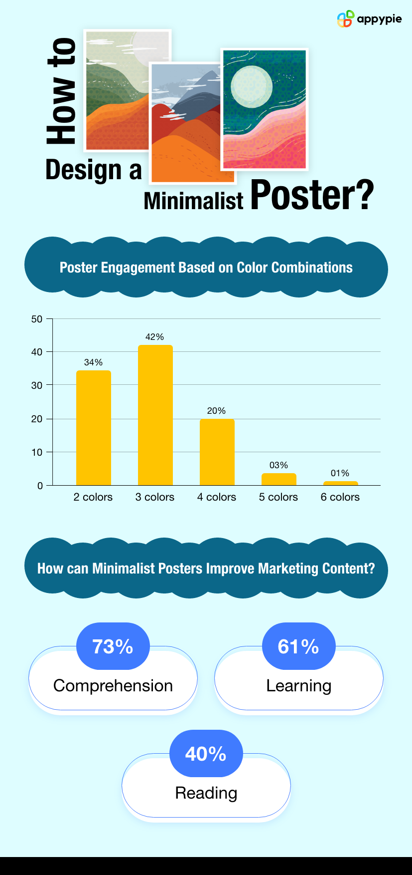 In this guide, we shall discuss a few principles to keep in mind when designing minimalistic posters for your business. Without much ado, let’s jump right into it.
Tips to Create a Minimalist Design Poster
- Think Outside the Box
- Minimalism through illustrations
- Matching Font
- Geometric Shapes
- Black Your Way Out
- Use a Grid
- The Case for Letterform
- A Good Use of WhiteSpace
- Mix it Up
A minimalist design poster doesn’t mean that you take a generic background and a generic text and drab them in a monochrome gray. Minimalism poster design is as free as any other kind of design. The only ‘minimal’ thing about it is that the end product should look ‘simple’ at first glance.
Use your design elements to send your message and play around with it. Experiment with your design. To know what design elements to use, a good look at the current trends in graphic design is a great way to go about it. Research online and find minimalistic posters to get an idea of what you can create. You can even check out pre-made poster templates.
One way to execute a minimalistic design poster is by creating minimal illustrations. An example has been given below.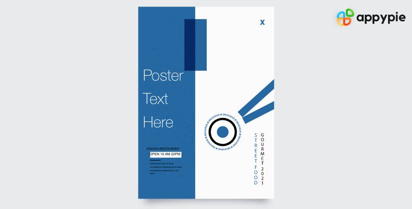 Illustrations with flat 2d structures and clear matte colors often constitute minimalism. Illustrative minimalism is a good way to create beautiful, memorable, and clean posters.
Your poster will likely include copy text relating to your business. Ensure that the design you create has a copy that matches it. Minimalism shouldn’t just be limited to the design and design elements. A minimalistic font is also a great way to enhance a design.
Your minimalistic design will use monochrome colors to share your message. One way to accomplish it is with the help of geometric shapes.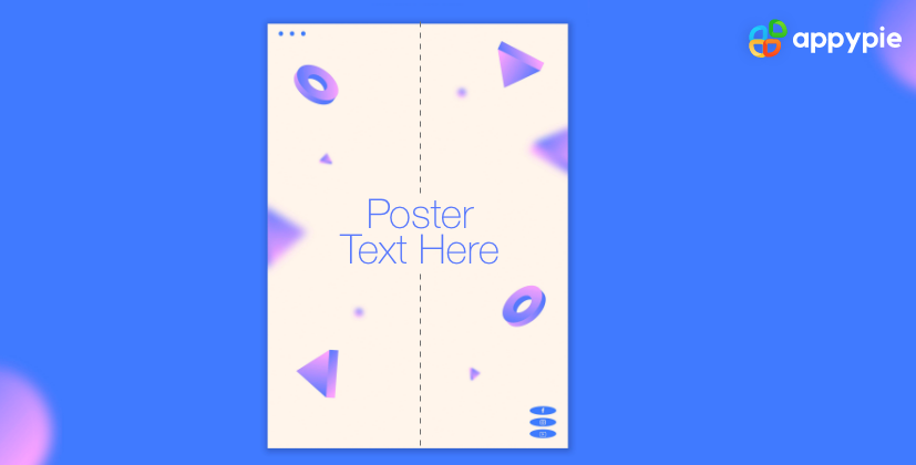 Geometric shapes create a visual dissonance that you can use to create an eye-grabbing poster. With the help of the right monochrome colors, geometric shapes can be a great way to achieve a minimalistic poster design.
Minimalism is often expressed through greys and matte fades of various color hues. However, when it comes to posters, the easiest way to create a minimalistic poster is to add your design elements and copy to a black background.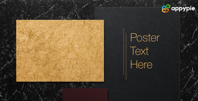 Popular among luxury brands, content copy on black is a popular way to show off a minimalist perspective. It is, however, a bit overdone now so refrain from it unless you are completely out of ideas!
Minimalism is about striking a balance between style and simplicity. This is why using a grid is essential. Once your copy and design elements to your poster, use a grid to strike balance in your images. Ensure that the copy and elements are divided to give a minimalistic vibe.
Pun intended, letterform is an excellent way to give your minimalistic designs a new breadth of creativity. Letterform is the practice of using alphabets as design elements in designs. For example, the yellow ‘M’ in McDonalds acts as both an alphabet and a design element.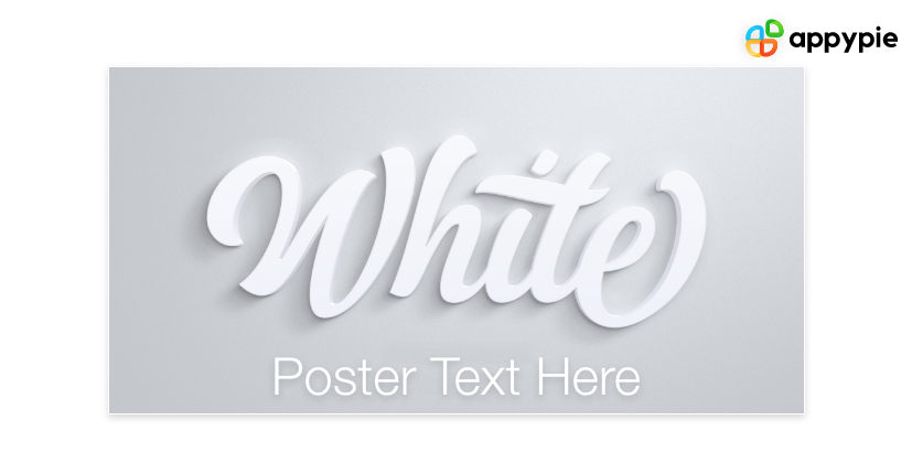 Letterform can often add an additional cool vibe to your designs. Letterforms often create a lasting impression on your viewers when they look at your design and catch the alphabet that shapes up like a design element. For this reason, letterform is popular across the industry.
Sometimes to attract attention, you don’t need to do anything. Even a good amount of whitespace can work miracles for your designs. Appy Pie Poster Maker has wonderful examples of templates with whitespace in them that you can check out!
Building on the first point in the blog, one of the best ways to think out of the box is to mix different ideas together. Mix and match your designs and how you use various design elements and create a completely unique new design for your designs.Conclusion
Minimalism poster design is here to stay. With time, more and more designers will realize the true potential of minimalist poster design. In a market where cluttered, bright, and loud designs, uncluttered, and simplistic design attracts a lot of attention. With good poster maker software such as Appy Pie poster maker, designers can also use pre-made templates to take their designs to the next level. Use the principles given in this blog experiment with your next big poster!Related Articles
- 200+ Creative Craft Business Names to Inspire Your Startup
- How to Make Party Invitations? (Things to Remember)
- 6 Small Businesses that can Benefit from Mobile Apps
- Logo Design Cost: Budgeting Brand Identity In 2024
- 10+ Blog Examples to Guide Your Blogging Journey: Find Your Niche, Find Your Voice
- 390+ Best Mirror Selfie Captions & Quotes For Instagram
- How to Use Eventbrite Create an Event Check Analytics Integrations and more
- 87 Instagram Ideas and Poll Questions to Catapult Engagement and Win Leads
- Which are the Top 10 Apps to integrate with Zendesk in 2024?
- Top 10 Pipedrive Integrations to Boost Your Productivity
Most Popular Posts
- Dropbox vs Google Drive: Which is better? [Top Dropbox & Google Drive integrations]
- How Conversational Marketing Helps Grow Revenue?
- Graphic Design vs Illustration: Learn the Difference
- Freesia Color Trends: Future Directions for Freesia in Graphic Designing
- Remove Duplicate Entries in Excel [Top Excel Integrations]