
How to Make a Poster Using an AI Poster Maker?

By Abhinav Girdhar | Last Updated on April 14th, 2024 8:08 am | 5-min read
Are you ready to experience the magic of AI in the world of design? With the arrival of AI in design, creating stunning posters has become easier than ever, thanks to AI Poster Maker. If you're wondering how to make a poster that's visually captivating and attention-grabbing, you've come to the right place. In this blog, we'll guide you through the exciting process of using an AI poster maker to craft your own masterpieces.
Table of Contents
Introduction
Posters are one of the most cost-effective graphic design marketing tools for any business niche. You can use them to announce new product launches, attractive discounts, contests, or any other promotion you are running. However, for a poster to be effective, it has to be eye-catching.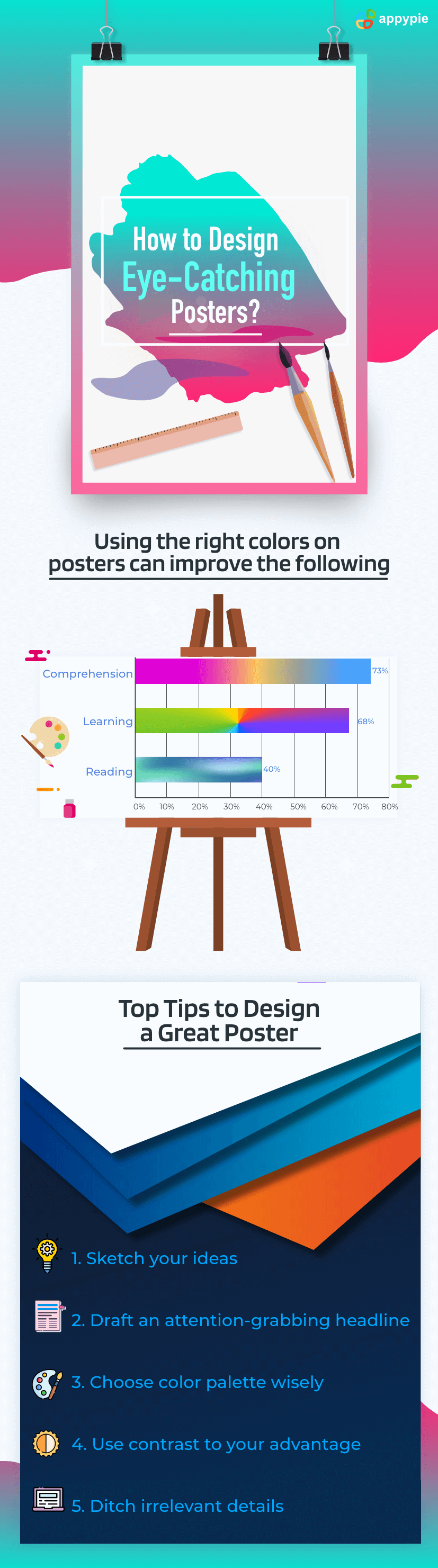 Whether you're a professional graphic designer or a complete novice, our step-by-step instructions will empower you to make a poster with ease. We'll cover various aspects, including the process of creating a poster, designing it to perfection, and making the most of an AI poster maker. You'll discover the secrets to producing eye-catching posters for events, promotions, or personal projects.
Our mission is to introduce you to poster generators that use AI to create a poster that meets your expectations and specifications. Get ready to explore the endless possibilities that AI poster makers offer, as we dive into the creative process and demonstrate how to use these cutting-edge tools. Join us on this journey to become a poster design pro, and let your imagination run wild with the help of AI poster generators. It's time to make your poster-making dreams a reality with AI design tools from Appy Pie!
Whether you're a professional graphic designer or a complete novice, our step-by-step instructions will empower you to make a poster with ease. We'll cover various aspects, including the process of creating a poster, designing it to perfection, and making the most of an AI poster maker. You'll discover the secrets to producing eye-catching posters for events, promotions, or personal projects.
Our mission is to introduce you to poster generators that use AI to create a poster that meets your expectations and specifications. Get ready to explore the endless possibilities that AI poster makers offer, as we dive into the creative process and demonstrate how to use these cutting-edge tools. Join us on this journey to become a poster design pro, and let your imagination run wild with the help of AI poster generators. It's time to make your poster-making dreams a reality with AI design tools from Appy Pie!Top Tips to design eye-catching posters
It might seem overwhelming, but you do not have to be a professional designer to create an eye-catching poster. To help you out, we have listed down a few tips:- Sketch your ideas
- Draft an attention-grabbing headline
- Choose your color palette wisely
- Use contrast to your advantage
- Ditch irrelevant details
- Maintain visual hierarchy
- Pay attention to typography
- Can you read the poster from a distance? You want your poster to be readable and legible.
- Use unusual or decorative fonts for your headline to attract attention.
- Use complementary fonts for maximum visual impact.
- Select a font keeping in mind the purpose of your design.
- Do not use more than two fonts to avoid confusing the viewer.
- Include attractive and suitable images
- Use space wisely
- Include a compelling CTA
- Enjoy the design process
Before you design a poster, you need to visualize how to present the information to your target audience. For example, if you end up putting too much text, people may not feel inclined to read so much. Instead, try and communicate with images and have very little text to convey the details. For instance, if you create an OSHA poster, add signage images instead of text to convey safety protocols and ensure workplace safety.
Hence, it is a good practice to start by sketching your ideas on paper or digitally, if you prefer. This will help you mentally structure how the information will be presented in the poster. If you are not artistically inclined and need some inspiration to get started, then you can use Appy Pie’s free poster maker. It has a huge library of exciting templates and offers unlimited editing options to make your work easier.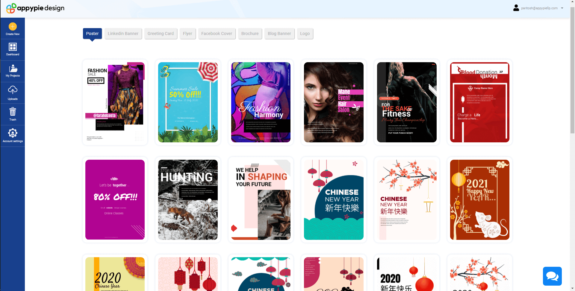
Your headline is the title of your poster. Only if the headline is engaging, a viewer will go through the rest of the information in the poster.
Be creative when it comes to the headline, but remember to avoid confusing or misleading the viewer. 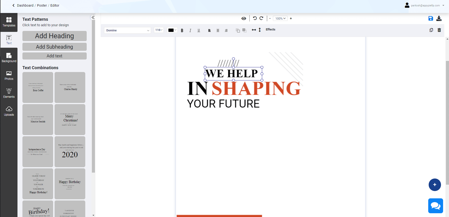
Your color palette will determine the overall look and tonality of your poster. It will also have a deep influence on the perception your viewers develop about you. Hence, choosing the right color palette is crucial for a poster.
For example, if it is a poster for a R&B music band, a monochrome palette could be an ideal fit. Whereas, if your product is a healthy multi-grain biscuit, earthier tones are a better choice.
Keep experimenting with multiple color combinations until you find something eye-catching. You can choose a color palette that matches your brand colors and create a poster that adds to your brand identity and value. 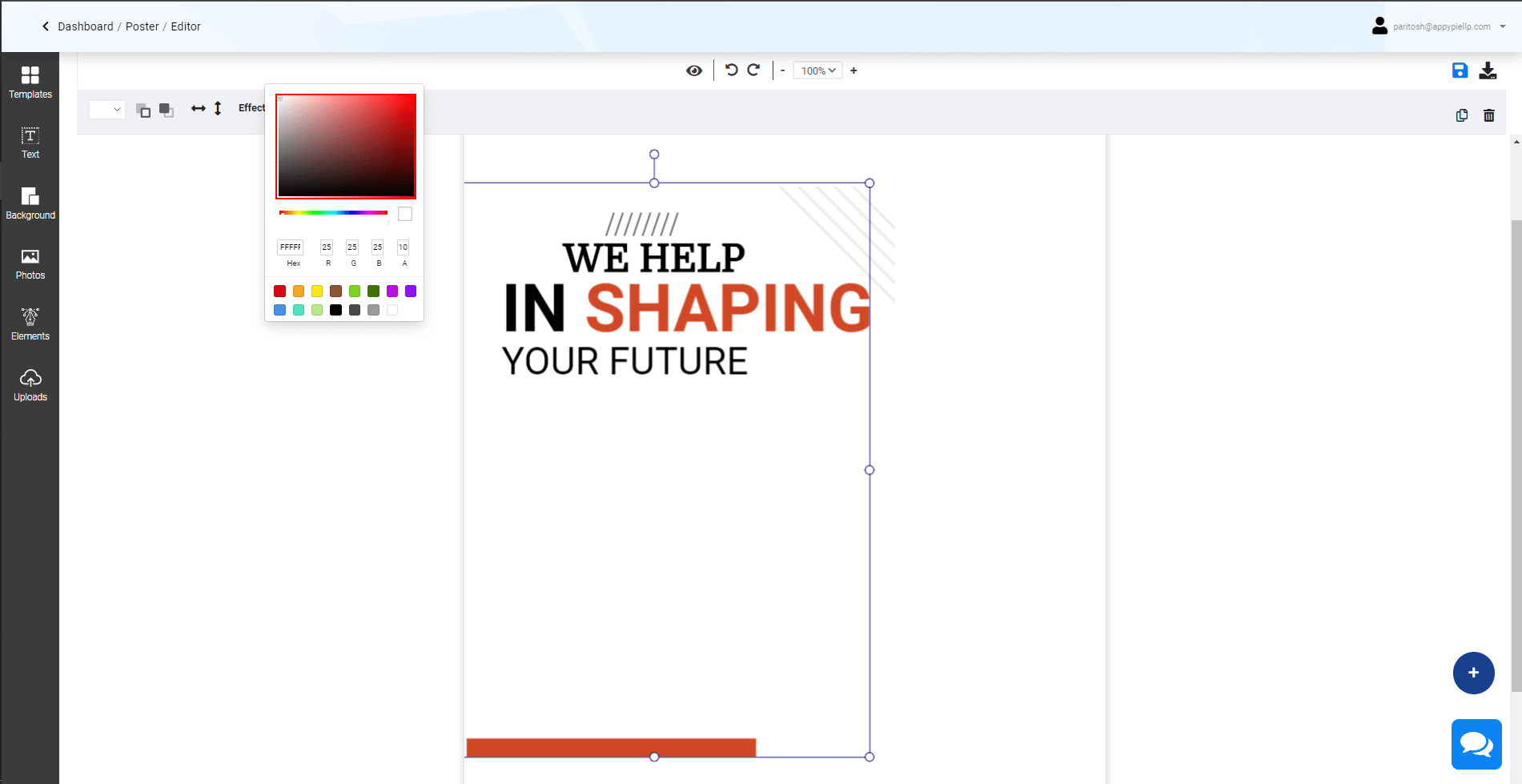
Most people today have short attention spans. This means you need to have a compelling poster design. This is where contrast becomes important.
If you use an element of contrast in your poster, it will catch the viewer’s eye should they happen to glance at it. Combining dark colors with light colors creates a good contrast. For example, you can use a dark text against a lighter background.
Contrast can also be achieved with shapes – using organic shapes with geometric ones. Similarly, varying the color intensity can also create interesting contrasts.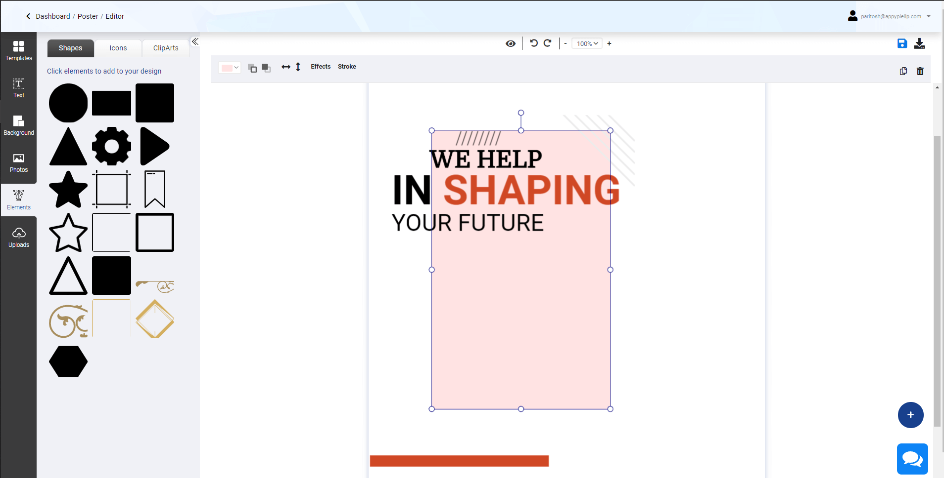
You don’t want your poster to be cluttered with too much information. So, carefully select the details you want to include. Retain only essential information. A clean poster is an effective one.
Visual hierarchy acts as a guiding point for a viewer to comprehend the flow of information in a poster. Basically, information is displayed according to how important its role is in the design.
To create visual hierarchy, start by ranking the information you want to present on the basis of their importance. If there is a lot of textual information in your poster, then you will have to segregate them in the following manner – headline, sub-heading and body text.
The headline will be the largest, sub-headings will take the medium size and the body text will have the smallest font size.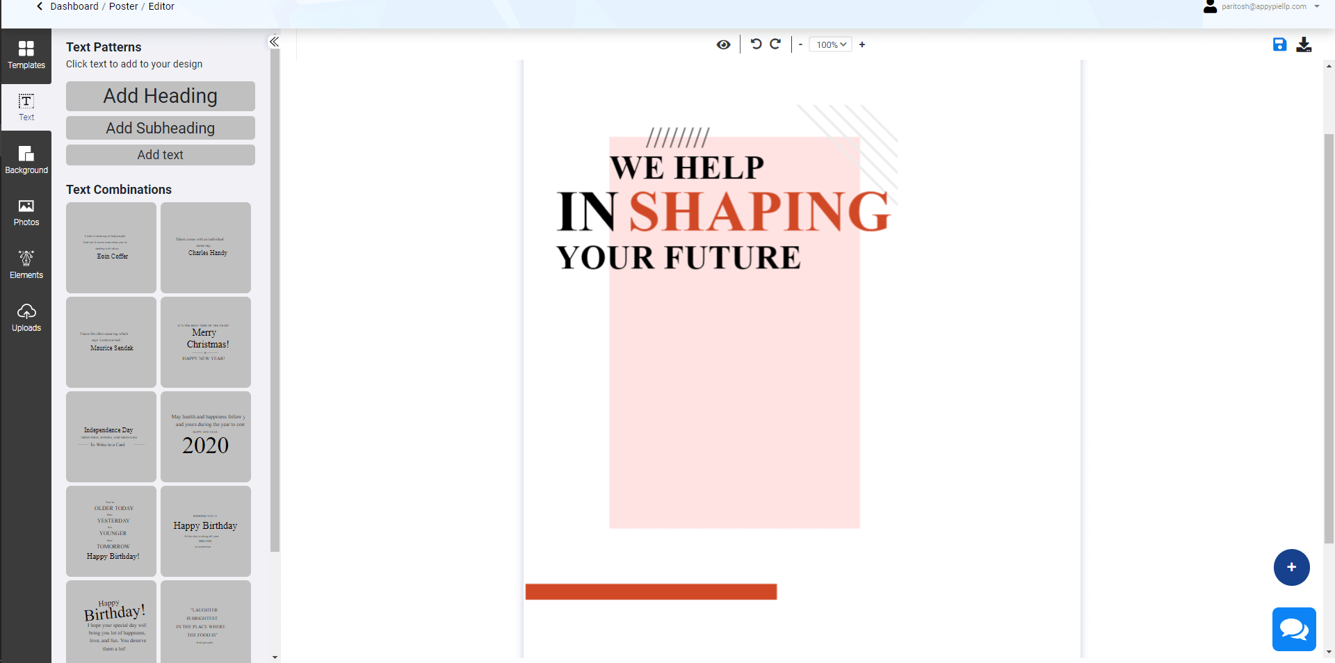
Choosing the right typography can help you create a design that will leave a lasting impression on a viewer. In this context, keep these things in mind:
When you make your own poster, the most important part of the design is the image. A good image – be it an illustration, photograph or anything else – will infuse energy into your poster.
Use a high-quality, big image. An imposing picture at the top or the middle of your poster will instantly catch people’s eyes. Moreover, viewers will retain good quality images in their memory for longer.
You can choose from one of the multiple images in our library to start creating a poster that truly stands out.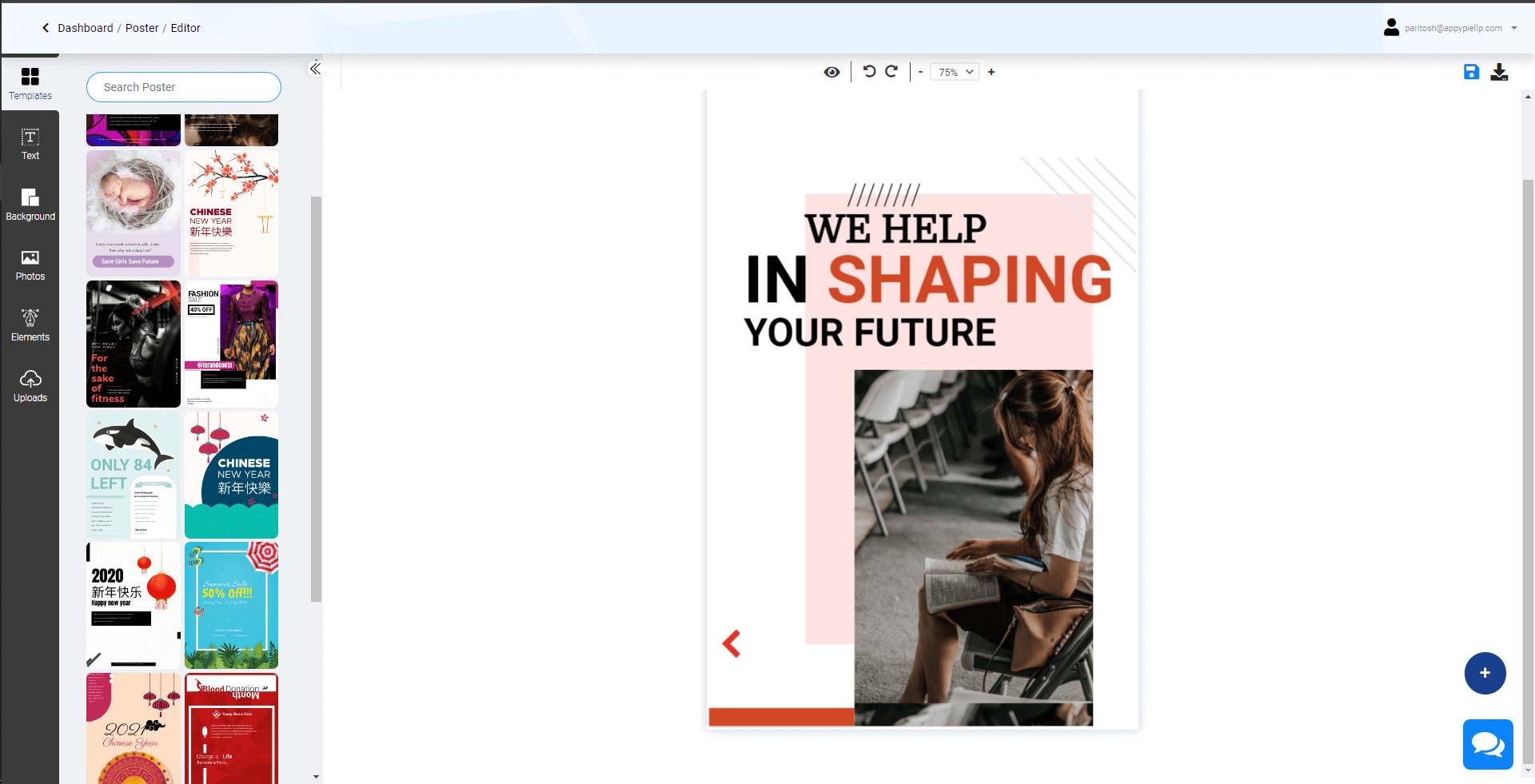
Even if you are using a poster creator, you still have to pay attention to how you are using your space. Allow breathing space between various design elements as it improves the overall visual impact. Moreover, it makes the poster more readable.
Ultimately, it is the call to action (CTA) that matters the most. This is the entire reason why you want people to take a look at your poster. It could be anything – going to an event, buying a product/service, or getting a discount.
So, when you make your own poster, ensure that your CTA has high visibility. The flow of information in your poster should follow a sequence that concludes with your CTA. It can be either in the middle or at the end of the poster. The idea is to make it prominent. For example, share a QR code to a digital business card with contact details and link to the product or event you want to promote as your CTA. In order to do so, make make use of relevant resources to create the best digital business card.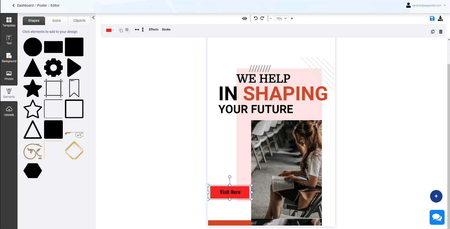
If you are a poster creator, then you want every element of your design to enhance the visibility of your poster. So, experiment and see what ideas fit well into the design. Your goal is to create a poster that is memorable and unique. Benefits of Appy Pie's AI Poster Maker
Appy Pie's Poster Maker stands out for its simplicity and effectiveness. The intuitive user interface empowers you to design posters like a pro. You don't need to download any software or learn complicated design techniques; everything is at your fingertips on the platform.- Time Efficiency: Creating a poster using traditional methods or software can be time-consuming. Appy Pie's AI Poster Maker saves you time by automating the design process, allowing you to focus on your message and content.
- User-Friendly: You don't need to be a graphic design expert to use this tool. The user-friendly interface makes this poster generator accessible to individuals of all skill levels.
- Professional Results: The AI Poster Maker consistently produces professional-looking posters. Your designs will impress, whether you're promoting a business, event, or personal project.
- Customization: While the AI takes care of the layout, you have full control over customizing the poster to match your unique style and branding.
- Cost-Effective: Designing posters with Appy Pie's AI Poster Maker is cost-effective, eliminating the need for expensive graphic design software or hiring professional designers.
How to Make a Poster Using Appy Pie's AI Poster Maker?
Now that you know all the lucrative benefits behind Appy Pie's AI Poster Maker, it's time to learn how to design a poster using this incredible tool. Follow these simple steps to turn text into posters that suit your needs:- Visit Appy Pie's AI Poster Maker: Start by going to the Appy Pie platform, where you'll find the AI Poster Maker. It's a web-based tool, so there's no need to download or install any software.
- Select a Template or Start from Scratch: You have the option to choose from a variety of templates tailored to different purposes, such as events, promotions, or social media posts. Alternatively, you can start with a blank canvas and design a poster from the ground up.
- Enter Your Text: This is where the AI magic begins. Input the text prompt you want to feature on your poster. Be it a catchy slogan, event details, or product information; the AI Poster Maker will transform your text into a stunning design.
- Customize Your Poster: Now comes the fun part. Customize your poster by adjusting the font, colors, layout, and adding images or graphics. You can make your poster as unique as you want, thanks to the easy-to-use design tools.
- Review and Edit: Take a moment to review your poster. You can make further adjustments if needed. The AI Poster Maker ensures that your design remains visually appealing and professional.
- Save and Share: Once you're satisfied with your poster, save it in your preferred formats, such as JPEG or PNG. You can then share your creation on social media, print it for physical use, or use it in your marketing materials.
Conclusion
Creating captivating posters is no longer reserved for design experts. With Appy Pie's AI Poster Maker, anyone can turn text into posters that are visually appealing and effective for various purposes. Whether you're looking to promote an event, advertise a product, or simply unleash your creative side, this user-friendly tool empowers you to design posters that make an impact. Say goodbye to design barriers and hello to the world of AI poster making. Make your poster-making dreams a reality with Appy Pie today!Related Articles
- 15 Advertising Appeals for Greater Brand Loyalty
- Woocommerce vs. Shopify: Which is better for your Business? [Top Integrations]
- How to Automate Google Sheets Using Macros Without Coding
- Exceptional Qualities of A Great Leader
- How to Design the Perfect App Store Icon?
- How to Use Discord for Business [A Comprehensive Guide]
- 7 Intercom Integrations You Should Use
- The Most Inspiring Architecture Websites for Designers- 2024’s Guide
- Best Microsoft Apps for Greater Communication & Productivity
- Facebook Reels Explained- Tips for Creating Viral Videos in 2024