
Brown Color: Symbolism, Significance, Uses, And Hex Codes

Brown is a composite color that can be created by combining red, black (or blue), and yellow color. This rich, earthy hue has several sources, including natural substances like coffee, walnuts, and chestnuts, and minerals like Limonite ore, which are used to produce brown pigments and dyes.
Designers and artists often turn to the rich palette of brown and its close cousins as their go-to choice for creating captivating designs. Brown is a gateway of natural wonders, echoing the hues of earth, wood, and soil. But here's a simpler way: with the aid of AI design tools, you can explore endless variations and palettes of brown, right at your fingertips.
Therefore, this blog is about exploring the multifaceted significance of the brown color, encompassing its symbolic connotations and diverse uses. Furthermore, it explores various color codes alongside complementary shades, offering a deep understanding of its nuanced presence in design contexts.
Table of Content
Meaning and Symbolism of Brown Color

Brown has been associated with feelings of comfort and homecoming. In color theory, this rich hue is linked with emotions of warmth and coziness, evoking a sense of reliability and stability. As a result, brown has become a staple in various aspects of life, from art and design to branding and interior decor.
In addition to its warm and comforting connotations, brown is also often referred to as "conventional". It embodies traditional values such as honesty, comfort, and nurturing. These qualities make brown an attractive color for those seeking a sense of security and familiarity.
The emotional benefits of brown are numerous. By incorporating this color into your life, you can:
Feel a sense of comfort and security, reminiscent of a warm hug on a cold day.
Experience a sense of stability and reliability, like a trusty companion by your side.
Enjoy the warmth and nurturing qualities of a loving home.
Embody honesty and integrity, as brown is often associated with these values.
Significance Of Brown Color In Different Landscapes

For centuries, humans have used Raw umber and burnt umber as art supplies. These pigments are derived from a type of brown clay that contains high levels of iron oxide and smaller amounts of manganese oxide, which gives them their characteristic color. The name "umber" originates from the region in Italy where it was historically extracted, Umbria.
Brown’s significance varies widely but generally centers on themes of earthiness and naturalness, making it a deeply versatile and culturally rich color. It is associated with stability and resilience and carries various significances across different landscapes.
Brown in Western Culture
Brown in Latin America
Brown in Photography
Brown in Fashion
Brown in Designing
In Western culture, brown is often linked to resilience and earthiness. It's a color that evokes a sense of stability and support. It also symbolizes honesty and genuineness, making it popular in branding and marketing to project an image of dependability and sincerity.
Brown holds cultural and symbolic importance in Latin American contexts signifying a connection to the land and its ancestral heritage. In art and cultural expressions, it is used to represent the people, their history, and the richness of their cultures.
In photography, brown tones are used to evoke a sense of age, nostalgia, and timelessness. Sepia tones, which are a form of brown, are particularly popular in giving photographs a vintage or classic look. It can help highlight textures and emphasize the solidity and grounding of the subject matter.
In fashion, brown is versatile and understated, offering an alternative to black as a neutral. It pairs well with various colors and is particularly popular in leather goods like shoes and bags. Brown fashion items can project an image of refined taste, natural elegance, and a down-to-earth appeal.
In design, brown is used to create a warm, inviting atmosphere. It can be grounded in a color palette, bringing a sense of wholesomeness and comfort. Designers use brown to imply robustness and reliability, and it is often used in eco-friendly and natural designs to signal a connection to the earth and nature.
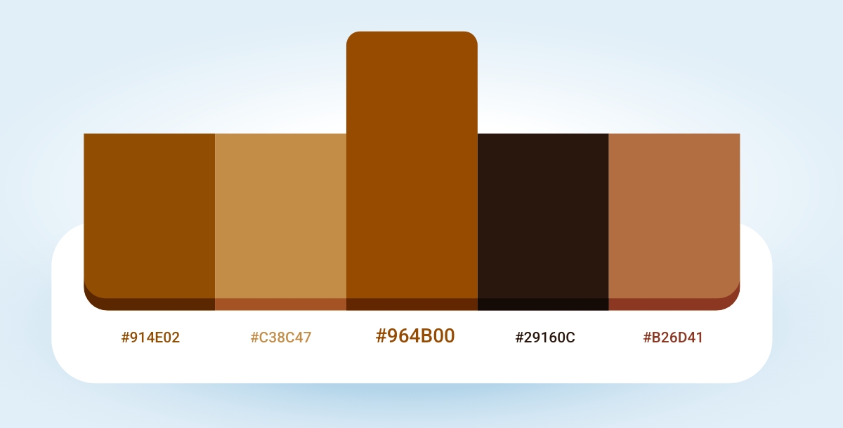
Brown Color HEX Code
| Aspects | Codes |
| HEX | #964B00 |
| RGB | 150, 75, 0 |
| RGB (Percentage) | 58.8%, 29.4%, 0% |
| CMYK | 0, 50, 100, 41 |
| HSL | 30°, 100, 29.4 |
In an RGB color space, hex code #964B00 is made of 58.8% red, 29.4% green, and 0% blue color. In a CMYK, it is made of 0% cyan, 50% magenta, 100% yellow, and 41% key (black) color. Brown has a hue angle of 30 degrees, a saturation of 100%, and a lightness of 29.4%.
Designing Themes Using Brown Color Palettes
Designing themes for your brand? Confused about how to choose a color palette that qualifies your expectations? No worries, you can adjust the color palette according to the specific needs of the theme, enhancing its visual appeal and emotional impact.
To design the theme using brown color palettes involves understanding how different shades and tints of it can harmonize or contrast your design. Or you can simply use Appy Pie's color wheel tool to create a unique palette of brown for your banner or brand marketing material to achieve the desired aesthetic effect.
Monochromatic Theme

A monochromatic color scheme uses various shades and tints of a single hue. For brown, this can create a sophisticated and cohesive look.
Complementary Theme

Complementary colors sit opposite each other on the color wheel. For brown, a good complement can be a vibrant blue or teal color, providing a striking contrast.
Analogous Theme

Analogous color schemes use colors that are next to each other on the color wheel. This can include combining browns with warm tans and rich umbers.
Triadic Theme

A triadic theme often involves a group of three closely related colors. Brown with deep green and burgundy color can form a perfect triadic color scheme.
Making Different Shades Complementing To Brown Color

Due to its versatility, brown color complements a variety of other colors to create different moods and styles in design. And to find the perfect color, Appy Pie's color mixer tool can come in handy for you to enhance the aesthetic appeal and emotional resonance of your designs. It helps you with opacity, hue control, and discovering your perfect color.
Here are some effective color combinations that work well with brown, enhancing its warmth and richness:
Blue
Light Blue color offers a fresh, serene look when paired with brown, bringing out a natural and airy feel.
Navy Blue color creates a more sophisticated and professional appearance, ideal for corporate designs.
Pink
Blush Pink adds a soft, romantic touch to brown, lightening the overall mood and adding a playful, modern twist.
Dusty Rose complements brown with a vintage feel, perfect for elegant and understated designs.
Green
Olive Green color and brown, both have earthy tones, and their combination reinforces a natural, organic vibe.
Mint Green provides a crisp, refreshing contrast to the deeper, subdued shade of brown.
Gray
Light Gray maintains a neutral palette but adds a modern twist, keeping things sleek and refined.
Charcoal Gray offers a strong, masculine contrast to brown, suitable for more serious or formal designs.
Purple
Lavender color introduces a gentle, floral contrast to the earthiness of brown, suitable for soothing and feminine designs.
Plum color creates a deep, luxurious palette that can be very sophisticated and rich.
How To Pick Perfect Color From Design Using Appy Pie’s Image Color Picker
Finding the perfect color of the design can be a tough task for any designer including the experienced ones. Therefore, the best color combinations of your designed website, flyer, or any brand material decides whether it’s likable or average. Hence, you can use Appy Pie’s image color picker to overcome this challenge.
To extract the ideal color from your image follow these easy steps:
Step 1: Upload Your Image or URL Link
Share your image or provide the URL link, and get started!Step 2: Click on the Color You Desire
Move your cursor over the image and click on the exact color that catches your eye.Step 3: Get Your Color Code
Instantly, you'll receive the color code of your selected hue, ready to use in your design project.Step 4: Get Your Curated Color Palette
You will get a curated color palette, directly inspired by your image. This palette will ensure harmony and consistency in your design.
Conclusion
Now, we are at the end of the blog on the down-to-earth color - brown. The color with emotions of warmth and coziness has an impactful significance from Western Culture to designers designing graphics or making flyers.
The brown color either represents the people, their history, and the richness of their cultures or takes us back to the nostalgia with its brownish tone. Whatever the context is, this color is surely one of the colors that you want in your designs irrespective of whether you are designing something related to nature or for your professional corporate work.
Related Articles
- The Ultimate Guide to the Best Meeting Scheduler Apps of 2023
- How to use Trello for Project Management? [Trello Beginner’s Guide]
- Creating an Organizational Chart Design for Small Businesses
- 31+ Motivational Quotes for Teachers
- Mastodon vs. Twitter: What Should You Choose?
- 10 Best Employee Management Software in 2024
- The Evolution of Gmail Labs: Enhance Your Email Efficiency
- Understanding Color Schemes in Design: A Comprehensive Guide
- Kanban 101: Mastering Efficiency with Kanban Boards
- ASTPrompter: Weakly Supervised Automated Language Model Red-Teaming to Identify Likely Toxic Prompts