
Understand The Key Elements of Art and Elevate Your Craft

By Abhinav Girdhar | Last Updated on April 6th, 2024 12:15 pm | 4-min read
Table of Content
A captivating piece of artwork or graphic design appears as a single entity. However, through careful observation we can break it down into several constituents, known as elements of art. The elements of art are the building blocks of visual representation and blend together to produce an appealing visual impression.
 For graphic design enthusiasts, it’s crucial to be familiar with the key elements of art - definitions, utility, and more.
What are the commonly defined elements of art?
For graphic design enthusiasts, it’s crucial to be familiar with the key elements of art - definitions, utility, and more.
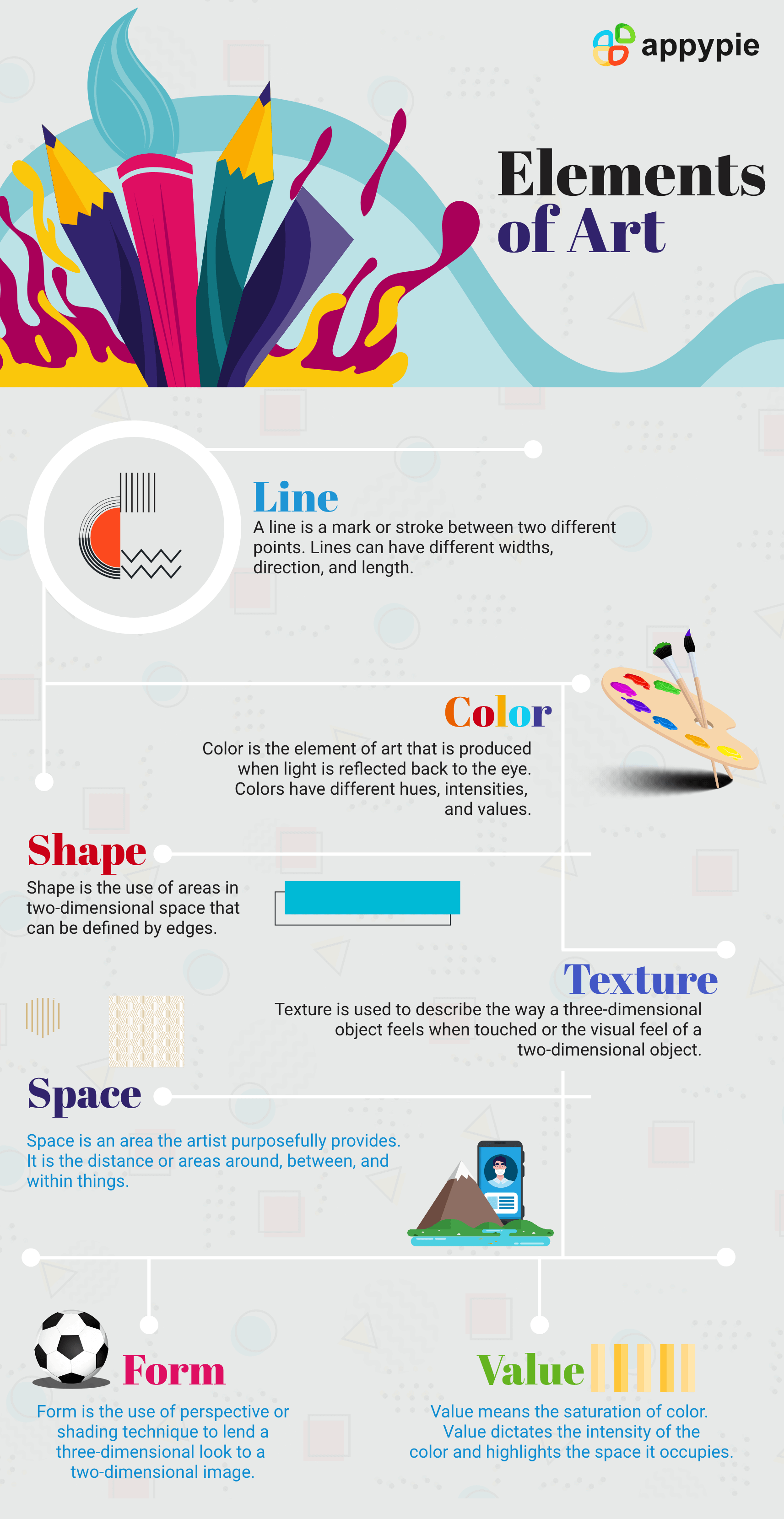
What are the commonly defined elements of art?- Line
- Color
- Form
- Shape
- Space
- Texture
- Value
Uses Of Elements And Principles Of Art
A disclaimer: Not all artworks use all of these elements. However, it is universally accepted that at least two of the formal elements of art need to be used. An architectural classic like the triangular Flat Iron Building in NY occupies space and has a form being three dimensional, but David Hockney’s swimming pool paintings utilize color and shape. Thus, depending on the form of art and the object that is depicted, the designer would utilize the elements to be used. It goes without saying that texture is of great importance in interior design and fabrics but not so much when it comes to formal artwork. It is probably the least utilized of the above. In the case of web-designing, the texture could be substituted by typography – the shape and size of letters – as an element of art.A Closer Look at Elements of Art Definitions
- Line
- Color
- Shape
- Form
- Space
- Texture
- Value
Geometry teaches us that line is a continually moving point and may be straight or curved. What do we appreciate most in German cars such as BMW or Mercedes – classic lines, unencumbered by needless flanges and display precision engineering design.
Lines do not necessarily need to be defined but can be implied by a change of color or texture. We find this quality in abstract art.
From jagged to crooked, lines are a versatile tool for suggesting shape, form, movement, distance and creating a fundamental structure on which all other elements are based.
Hues and pigments have a powerful effect on human emotions. Color creates mood and defines the tempo.
There are three primary colors – red, yellow, and blue. All other colors are a combination of these. Yellow and blue together produce green; blue and red create purple and so on. The secondary colors such as green, orange, purple, are used to compose shades such as teal, violet, fawn, and aquamarine.
The varying use of color can also be used to create a pattern, as we find in fabrics. Painting a room requires an understanding of color and its effect on mood. It is widely accepted that the color green stimulates the brain while lighter shades of blue have a calming effect on the mind.
Shapes are two dimensional and bound by lines on all sides. They are flat and have no depth—common examples of geometric shapes include a square, circle, and triangle. There are also shapes that occur naturally and have no fixed name such as splatter and spray caused by ink on paper.
Shapes are used by an artist to convey objects in an image. Think about the Windows 7 GUI. All the buttons and icons were geometric but have soft corners and were translucent. A decade later, the most dominant shapes on the internet are Google’s material design, card-shaped, flat, and pastel-hued with no transparency or depth.
Shape is of utmost importance in web page design and can be the difference between a visitor staying on and browsing or bouncing away within a few seconds.
Where shape is two dimensional, a form is three dimensional.
We usually observe it in sculpture and architecture. From the Great Pyramids to the majestic dome of St Peter's Basilica, the form is of utmost importance to convey grandeur and magnificence.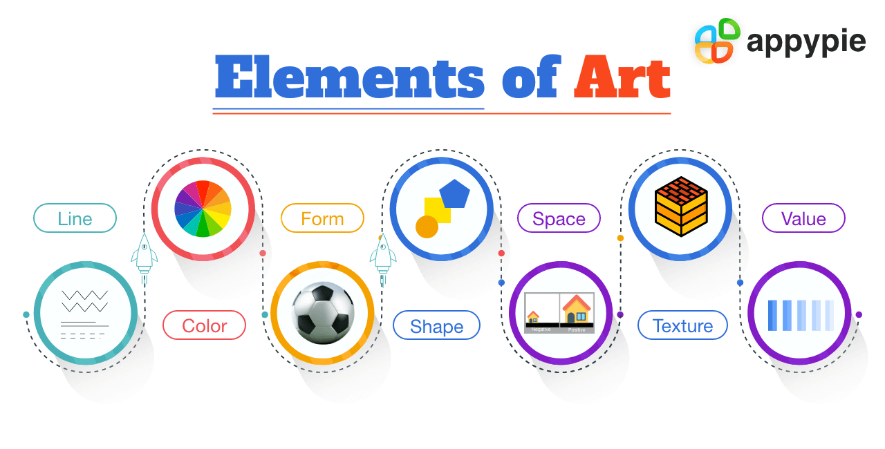 Forms are often adopted from nature since they are soothing for the eye. Bahai Temple at Delhi is lotus-shaped, and the Sydney Opera House is shaped like a peeled orange. It goes without saying that these are landmark designs.
Postmodern art and architecture are dominated by wavy forms such as Heydar Aliyev Center created by architect Zaha Hadid.
Minimalistic designs with rigid geometrical forms and very little clutter is the current trend in all types of design - from homes to even the smart devices such as iPhones.
Forms are often adopted from nature since they are soothing for the eye. Bahai Temple at Delhi is lotus-shaped, and the Sydney Opera House is shaped like a peeled orange. It goes without saying that these are landmark designs.
Postmodern art and architecture are dominated by wavy forms such as Heydar Aliyev Center created by architect Zaha Hadid.
Minimalistic designs with rigid geometrical forms and very little clutter is the current trend in all types of design - from homes to even the smart devices such as iPhones.
Space does not mean emptiness alone, but how lines, shapes, and objects are arranged in relation to each other. This can be most easily observed in photographs where framing or arrangement of elements in each frame is often the difference between excellent and mediocre.
Space can be positive or negative. Positive space is that which is occupied by an element, and negative space is the area between elements.
Both play an equally important role in avoiding clutter and contributing to aesthetics. Space also differentiates between foreground and background and focusing attention on particular parts of a visual composition.
Texture is the feedback we receive from touch and sight. Satin is smooth, and a burlap sack feels rough. Of all the elements of design, texture has the narrowest application in modern design.
Renaissance artists used optical texture in sculpture, and the art form of Pietra Dura or stone inlay producing varying texture can be found in the Taj Mahal.
The use of ephemeral texture such as water drops, and rain is used to produce what is known as verisimilitude or the appearance of being real.
While the use of texture is not relevant in modern art and architecture, it is not unknown. Nearly all technology companies are housed in steel and glass buildings with a visual texture that imparts the look of precision and clarity.
Value means the saturation of color. Such as champagne pink has high value and lace pink low value.
Value dictates the intensity of the color and highlights the space it occupies. If the sky is overly blue and the grass is too green, the image would look artificial. That is why color correction by adjusting color values and temperature is essential in modern imagery.
Very high color value causes fatigue and low value appears insipid. If a hue moves towards white, it is known as tinting, and if it moves towards the darker end, it is shading.Next...
It is the combination of these elements of art that give rise to various schools such as surrealism, cubism, and realism. From chunky Walkman of the 80s to a sleek Tesla S, they are all heavily influenced by a combination of these seven components. Be it web design or oil on canvas, these basic building blocks have immense potential. A thorough understanding of their nature is required to visualize designs that are attractive and create a lasting imprint on the mind. Are you an art aficionado or a design enthusiast without proper training in the field? Here is an absolutely brilliant solution that can help you take care of your design requirements – Appy Pie Design. The platform comes with multiple useful tools like the Color Wheel, Photo Editor, background remover, Logo Maker, and many more. Time to get going!Related Articles
- DeiT-LT Distillation Strikes Back for Vision Transformer Training on Long-Tailed Datasets
- 9 Fun & Creative Holiday Marketing Ideas to Try This Holiday Season
- SQL Tutorial for Beginners: Understanding & Utilizing SQL Language
- From Chat App to Marketing Powerhouse: Strategic WhatsApp Marketing Plan
- OneDrive vs. Dropbox: Which Cloud Storage Apps is Better to Use?
- Wave vs QuickBooks- Which Should You Choose
- 7 Best SMS Platforms for Customer Engagement
- How to Create an Appointment Bot
- Maroon Color: All You Need to Know
- How to Create a Stellar Landing Page? [An Essential Guide]