
Top tips for a great user interface design

By Abhinav Girdhar | Last Updated on April 24th, 2024 11:54 am | 7-min read
A website or an app is a meeting place where people communicate with your business. The ambience in which the interaction takes place creates an impact on the user. The ambience in context of your digital properties like websites and apps is its user interface design.
Table of Content
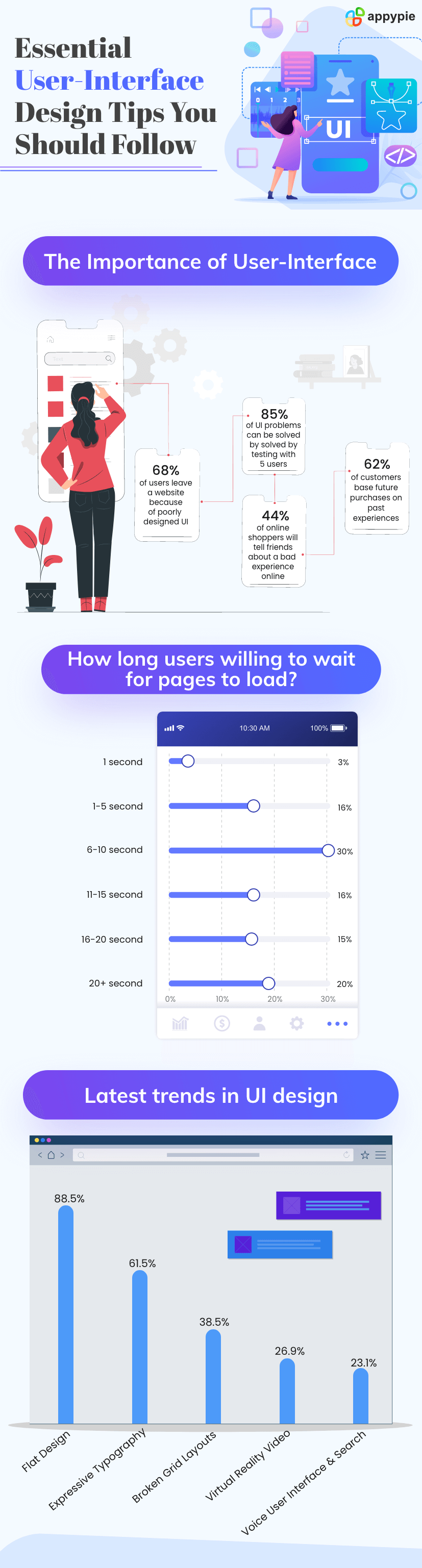 A good user interface design will lead to a memorable experience for the visitor, which means you have got them hooked. The next step is to slowly nudge the user into buying your service/product.
What is UI?
A user interface (UI) is the space where human-machine communication takes place. A web or app user interface lets a user interact with content or software that’s running on a remote server. The goal of user interface design is to develop these interfaces or connecting spaces that a user would find easy to use and appealing. So, how does one get the user interface design right? Here are some time-tested tips:- Learn all you can about your users
- Whatever the user needs, make it easily accessible
- Consistency is a virtue
- Keep it crystal clear
- Create a hierarchy in your typography
- Keep the flow and scrolling smooth
- Using colors the right way
- Stick to set design standards
- Have clickable buttons
- Let the user assume control
- Design for Fingers and Thumbs
To design a great user interface, you must know everything about your target group. What do they require, and the type of problems they face, are only two of the questions you need to ask before you set out to design the user interface of your website or app.
You can speak to some of your target audience directly and even observe them use your website. Seek feedback and implement it in your design iterations.
Be it the FAQs, the contact page, or the product gallery, if users cannot find what they need easily, then it is likely you will lose them. You can use tabs, hover tooltips and shortcuts to enhance the accessibility of your interface.
A common section that most users always look for is the contact/support page. Therefore, you should place help or contact button in an area where it has high visibility.
In user interface design, consistency does away with confusion on the user’s part. For example, uncertainty can prevail over a user when they see multiple styles for design elements with the same interaction in a user interface. If the design is consistent across the platform, then it reduces the work a user needs to do. 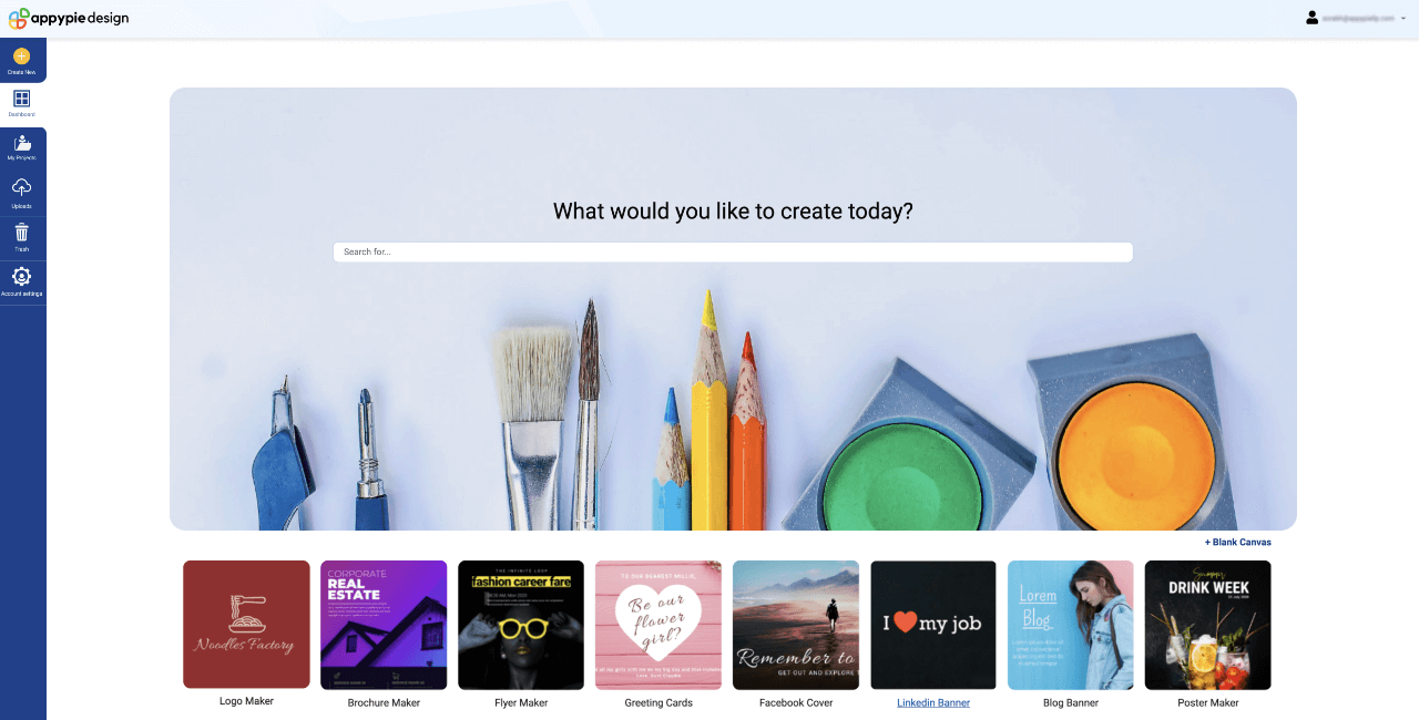 How can you improve consistency? Through reuse. For instance, if you are satisfied with the style of your primary button, you can use the same design with minor alterations in other spaces as well.
To get your design right, use Appy Pie’s design tools. You need zero design skills to use it. You can choose from thousands of templates, effects, and photos to create unique design elements.
How can you improve consistency? Through reuse. For instance, if you are satisfied with the style of your primary button, you can use the same design with minor alterations in other spaces as well.
To get your design right, use Appy Pie’s design tools. You need zero design skills to use it. You can choose from thousands of templates, effects, and photos to create unique design elements.
When a user visits your website, they should know what to do next. If they don’t, then it can frustrate them and lead to higher bounce rates for you.
You need to keep your user interface design minimalistic. The lack of clutter would translate to clarity about a webpage or website’s purpose.
The best example of a clean interface is our Appy Pie App Builder app on Google Play Store.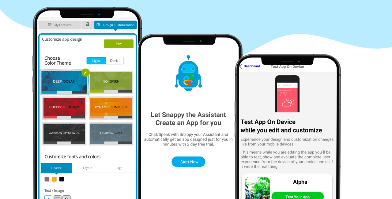 One of the things you can do to keep things simple is to take the user from one step to another on separate pages. For example, make the user go from a product page to the shopping cart page, and then to the checkout page.
This is necessary because it helps users read in a way they have been accustomed to read. It helps them comprehend information quicker and locate important data faster.  How do you do this? You start by reducing the number of typographic styles in your interface. A combination of three heading styles with two or three body styles is adequate. Also, when it comes to the weight of fonts, stick to just two, like bold and regular, to help the user distinguish important elements from the less important ones.
A website is like a well-built road that offers a smooth ride for cars. Users should be able to move and transition seamlessly from one part of the website to another. For example, items at the top of a page catch users’ eyes and they deem these items as the most important ones. The order of importance decreases as you scroll down.
When it comes to scrolling, there should be a visual indicator that will tell the user the direction of scrolling and the availability of content below. Remember that nobody likes scrolling down an extremely long webpage, so avoid that.
For starters, don’t use blue for any website text besides links. For the CTAs on your website, use one colour and do not use that colour for anything else. 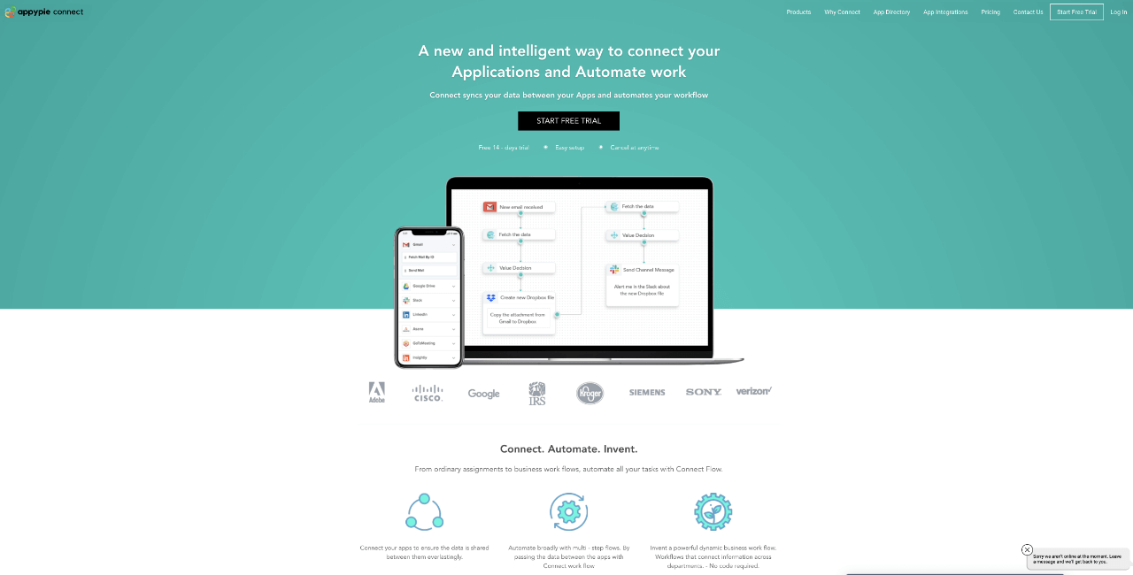 For example, here on our automation platform Appy Pie Connect the CTA is loud and clear and signifies clearly, what you need to do, to move ahead.
Note that warm colours come at the forefront while dark, cool colours are ideal for the background.
For example, here on our automation platform Appy Pie Connect the CTA is loud and clear and signifies clearly, what you need to do, to move ahead.
Note that warm colours come at the forefront while dark, cool colours are ideal for the background.
This is a very important aspect of user interface design. What this means is that you should exercise your creativity but at the same time, not move away from established best practices.
Consider a search bar for example. These bars are located at similar positions on most websites, which is the centre of the top part of a page or above the sidebar. Placing a search bar elsewhere like in the footer will confuse users because they are not used to that.
The buttons on your app or website should visibly appear to be clickable. There should be sufficient space around them so that the user can click or tap on them comfortably.
Buttons that are frequently used should be placed strategically so that they are easy to reach. Moreover, a visual cue should be offered to the user immediately after a button gets clicked and interaction takes place.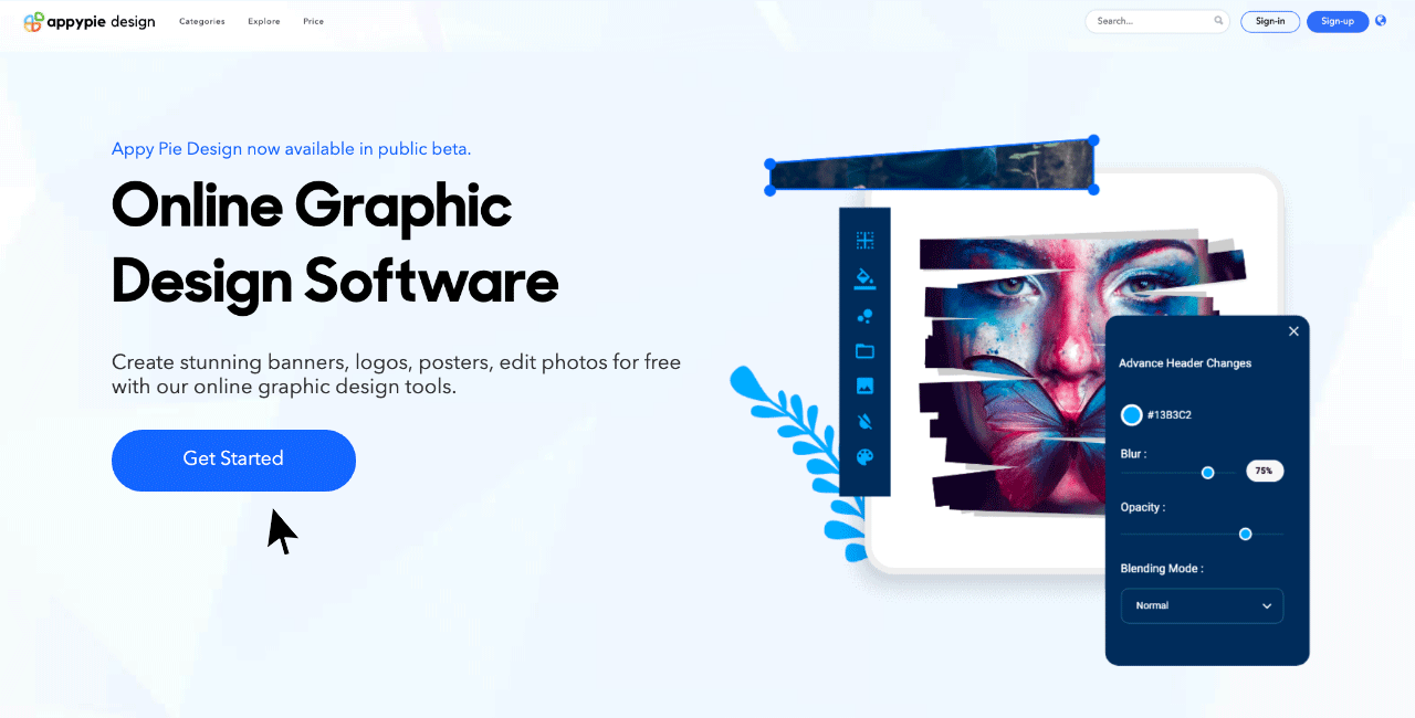
When it comes to user interface design, taking control from users is a very bad idea. They shouldn’t feel restricted while using an app or a website. The idea is to create a design that empowers users so that they can perform the actions they want.
For example, users should feel that they can undo an action. Adding a cancel button on the checkout page of your website will allow them more freedom and convenience.
As you can see here, on our app builder interface, though we are asking the user to enter a business name, but by indicating that they can change it later, we are offering them a sense of control and empowerment.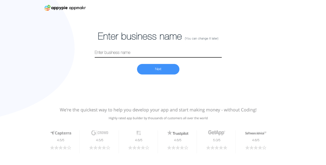
Touchscreens have been around for a long time now and is the most popular mobile input method today. From the UI point of view, this has great significance. How smartphone users use this screen is very important.
Certain parts of the screen are more difficult to reach, hence are tougher to use with accuracy. Though the left and right extremes of the screen are tough to reach irrespective of the dominant hand, the top and bottom edges are the worst! Related Articles
- How to Create Your Own Zendesk Chatbot ?
- Top 10 AI Painting Generator Tools in 2024
- Identity Decoupling for Multi-Subject Personalization of Text-to-Image Models
- What is a webinar and how to create a good one?
- ITIL Problem Management: A Comprehensive Guide
- How An App Can Help Healthcare Industry Grow Its Customer Base and Revenue
- 15 Proven Ways to Get Clients for Your HR Consultancy Agency
- How to Build an Engaging Online Community Forum
- How to Create A Workflow Model?
- Geometric Designs: Explore the World of Shapes and Patterns
Most Popular Posts
- How to Generate More Leads for Your Construction Company
- IVR Software- A Complete Guide
- What is CSR? [7 Examples of Corporate Social Responsibility Done Right]
- Learning In-Hand Translation Using Tactile Skin With Shear and Normal Force Sensing
- HQ-Edit: A High-Quality Dataset for Instruction-based Image Editing