
In today's digital era, creating a website is not just a necessity but an art form. The process of making a website involves more than just understanding coding or choosing the right hosting; it's about encapsulating your vision, values, and message in a digital format that is both engaging and easy to navigate. Whether you're a business owner, an artist, or someone looking to establish an online presence, understanding the basics of website creation is crucial. This guide will explore the essential steps and considerations for building a website that not only stands out but effectively communicates your brand's message.
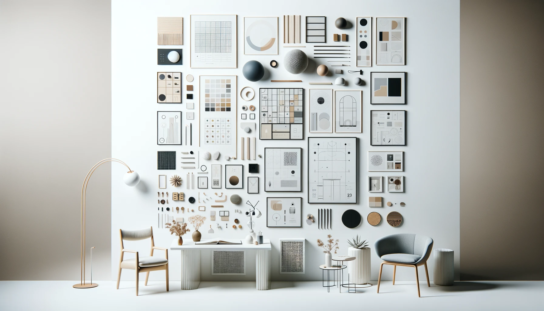
Key Elements of Minimalist Website Design
Minimalist website design, characterized by its simplicity and use of open space, has become increasingly popular in the digital world. This design philosophy focuses on the idea that less is more, emphasizing the essentials of your content and design to create a clean, efficient, and user-friendly experience. Here are some key elements that define minimalist website design:
-
Negative Space
Often referred to as 'white space', negative space is the unmarked area between design elements. In minimalist design, it's not just empty space but a crucial element that helps in focusing attention on the content. It provides breathing room for the eyes, making the website appear uncluttered and more approachable.
-
Visual Hierarchy
This involves organizing and prioritizing content in a way that guides the viewer's eye across the page. In minimalist designs, visual hierarchy is achieved through the careful placement of elements, ensuring that the most important information catches the viewer's attention first.
-
High-Quality Images
Minimalist websites often rely on striking, high-quality images to convey messages and emotions. These images are used not just as decorations but as integral components of storytelling and branding, providing depth and context to the minimal text present.
-
Bold Typography
With fewer design elements, typography becomes a key player in minimalist websites. Large, bold fonts can make a statement and guide the viewer's attention, while simple and clean font styles maintain the overall minimalistic feel.
-
Color Palettes
Minimalist design typically involves a limited color palette, often revolving around neutrals. However, this doesn't mean the design has to be monochromatic; strategic use of contrasting or accent colors can create a visually appealing and memorable experience.
15 Minimalist Website Examples
Delving into the world of minimalist website design, we find an array of stunning examples that beautifully encapsulate this design philosophy. Let's explore these 15 minimalist website examples in more detail:
-
Vitsoe
Vitsoe's website is a testament to minimalist design, where the focus is on their modern, sleek furniture. The use of clean lines, ample negative space, and a neutral color palette allows their products to shine, inviting users to experience the elegance and simplicity of their furniture.
-
Muji
Reflecting its brand ethos, Muji's website is a marvel of minimalist design. It embraces a straightforward layout with a muted color scheme, focusing on functionality and quality. The site's uncluttered design mirrors the simplicity and utility of their products, offering a seamless and calming browsing experience.
-
Everlane
This fashion brand’s website is a perfect blend of minimalism and sophistication. With its clean, simple design, it employs white space and a monochrome color scheme to draw attention to their apparel. This approach not only highlights the products but also communicates the brand’s commitment to transparency and ethical manufacturing.
-
Framery
Specializing in acoustic solutions, Framery's website uses large, evocative images against a limited color backdrop. The design is minimal yet powerful, conveying the brand's focus on creating peaceful, focused work environments through their soundproof pods.
-
Hey.com
As an innovative email service, Hey.com's website showcases minimalism in the digital realm. It utilizes bold typography and a user-friendly layout to highlight its unique approach to email management, making it stand out in the crowded space of digital communication tools.
-
Field Notes
Embracing a vintage aesthetic, Field Notes uses a grid-based layout and classic typography to showcase their range of notebooks. The minimalist design is both functional and visually appealing, emphasizing the brand's dedication to quality and simplicity.
-
&Walsh
This design agency’s website combines bold typography with vivid imagery on a clean backdrop, effectively showcasing their creative portfolio. The minimalist layout allows each project to stand out, highlighting the agency’s innovative and avant-garde approach to design.
-
Google Material Design
As the epitome of minimalist web design, Material Design’s website uses a grid-based layout, intentional color usage, and interactive elements to explain Google's design philosophy. The site serves as an educational tool as well as a showcase of minimalist design principles.
-
The Design Cut
Offering creative assets, The Design Cut’s website features a minimal layout with focused sections for each product category. The design is intuitive and user-friendly, making it easy for visitors to navigate and find what they’re looking for.
-
Uncommon Goods
This online marketplace for unique products employs a clean, minimal layout with high-quality images. The design prioritizes ease of use and product discovery, providing an uncluttered and enjoyable shopping experience.
-
Hello Monday
Hello Monday's digital creative agency website merges simplicity with interactive elements. The result is a captivating user experience that is both straightforward and engaging, effectively showcasing the agency's creative prowess.
-
Basecamp
As a project management tool, Basecamp's website uses clear, concise messaging and ample spacing. The design is straightforward, guiding users through its features and benefits, and reflecting the tool’s emphasis on simplicity and efficiency in project management.
-
Moleskine
Moleskine's website, much like their notebooks, is elegantly simple. It employs a simple color scheme and focuses on high-quality images of their products, offering an online experience that’s as refined as their physical notebooks.
-
Oatly
The oat milk company's website stands out with its unique combination of quirky typography and minimal design elements. This approach not only makes the site visually interesting but also effectively communicates the brand's playful and unconventional personality.
-
Patagonia
An outdoor clothing brand, Patagonia's website uses clean design and stunning nature photography. This approach not only showcases their products but also reflects their commitment to environmental activism and high-quality outdoor gear.
Build Your Own Minimalist Web Design With Appy Pie
Creating your own minimalist website design can be both exciting and daunting. However, platforms like Appy Pie make this process much easier, even for those without technical expertise. Appy Pie’s website builder is designed to be user-friendly, allowing you to create a professional-looking website with minimal effort.
When building your website with Appy Pie, you can start by choosing a template that aligns with your vision of a minimalist design. These templates are pre-designed with essential elements like layout, typography, and color schemes, giving you a solid foundation to start from. You can then customize these templates to suit your specific needs.
One of the key advantages of using Appy Pie is the drag-and-drop interface, which lets you add, remove, or modify elements on your website easily. Whether it’s adjusting the negative space, experimenting with visual hierarchy, selecting high-quality images, customizing bold typography, or fine-tuning the color palette, Appy Pie offers a range of options to help you create a minimalist website that reflects your brand identity.
Moreover, Appy Pie ensures that your website is not just aesthetically pleasing but also functional and responsive. This means your website will look great and work smoothly across different devices and screen sizes, providing an optimal user experience.
Related Articles
- A Guide To Character Count Tools & Tips For Quality Content
- Master the Art of How to Write an Email
- Notion vs. OneNote-Which Note-Taking App Should You Use?
- The Versatility of Cognac Color in Different Design Styles and Genre
- 10 Best Mobile Scanning and OCR Apps in 2024
- How Mobile Strategy Can Push In-Store Sales?
- Why are Ratings and Reviews Important for Your Business?
- How To Live Stream Successfully?
- LACIE: Listener-Aware Finetuning for Confidence Calibration in Large Language Models
- CountGD: Multi-Modal Open-World Counting