
20 Color Combinations That Can be Applied to Your Designs

By Abhinav Girdhar | Last Updated on November 6th, 2022 10:22 am | 8-min read
“Color is a power which directly influences the soul”The perfect color combinations are important to create eye-catching graphics. Such graphics can help give your business’ designs a polished look. Colors are very important for creating good graphics. It can help your design come alive, set a perfect tone and mood, and influence user perception.
Table of Contents
A major difficulty that many designers face is finding a good color combination for their designs. A designer needs inspiration to find the perfect color combinations for their designs. Be it a poster, logo, or just graphics; they need a color combination for their designs. Keeping that in mind, we have created 20 different color combinations that can be used to make your graphics perfect. Before we proceed ahead, let us discuss the various types of color combinations that can be applied in your designs.
Types of Color Combinations
Colors are combined with the help of a color wheel. Each color of a color wheel evokes a different mood. The colors you create with the help of a color wheel can be used to create color combinations that act as the color palette for the graphics you are creating. You can experiment with your own colors with the help of Appy Pie Color Wheel. It is a free online tool that helps you find crisp color combinations and experiment with your colors. Go check it out!There are five distinct types of color combinations that you can find for your color palette:- Complementary Colors
- Triadic Colors
- Monochromatic Colors
- Analogous Colors
- Tetradic Colors
Complementary colors are found on opposite sides of the color wheel. Using these colors provides a bright and prominent feel. This combination has an extremely high contrast and can often be termed as loud.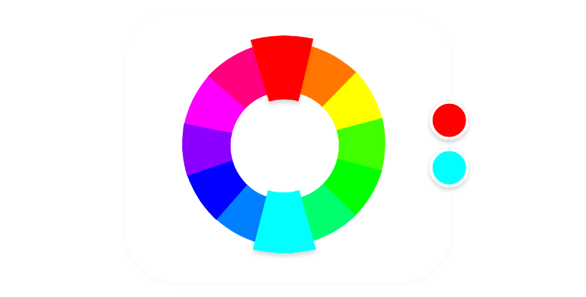
Triadic colors use three opposing colors from the different sides of the color wheel. Triadic is rarely used since balancing using three opposing colors is difficult. Just like complementary colors, triadic creates bright, contrasting color schemes.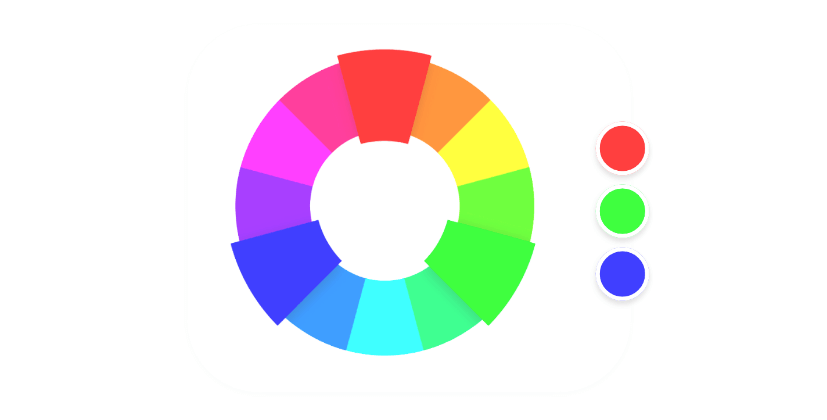
Monochromatic colors use the three different shades, tones, and tint of the same base color. Monochromatic color schemes are usually soothing to the eye and provide a great amount of versatility and harmony to the designed website.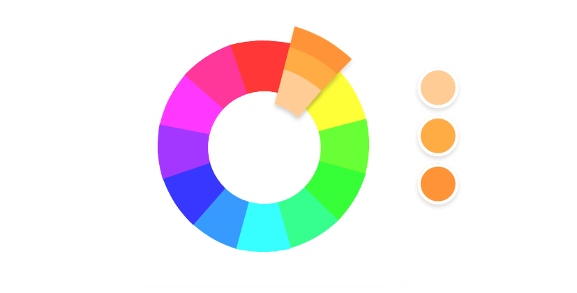
This color scheme uses three neighboring colors of the color wheel. It provides the same versatility as monochromatic colors. However, analogous colors are extremely hard to balance together.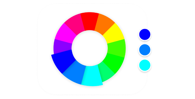
This color scheme uses 4 colors from the color wheel. Colors are evenly separated from each other. Tetradic color is the hardest to balance and they often create a very bold color scheme. It works best if one of the four colors is used as the dominant color and the rest accentuate.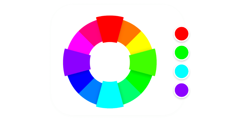
Applying Color Combinations for Your Designs
The color combinations for each graphic depends on the type of graphics you are designing. For more artistic graphics, the graphic design may differ and a designer has more of a free hand in their color combinations. However, if you are designing graphics for a business, your job may involve a set of preset colors and color combinations. Here is an infographic that reflects the trends that business color combinations tend to follow: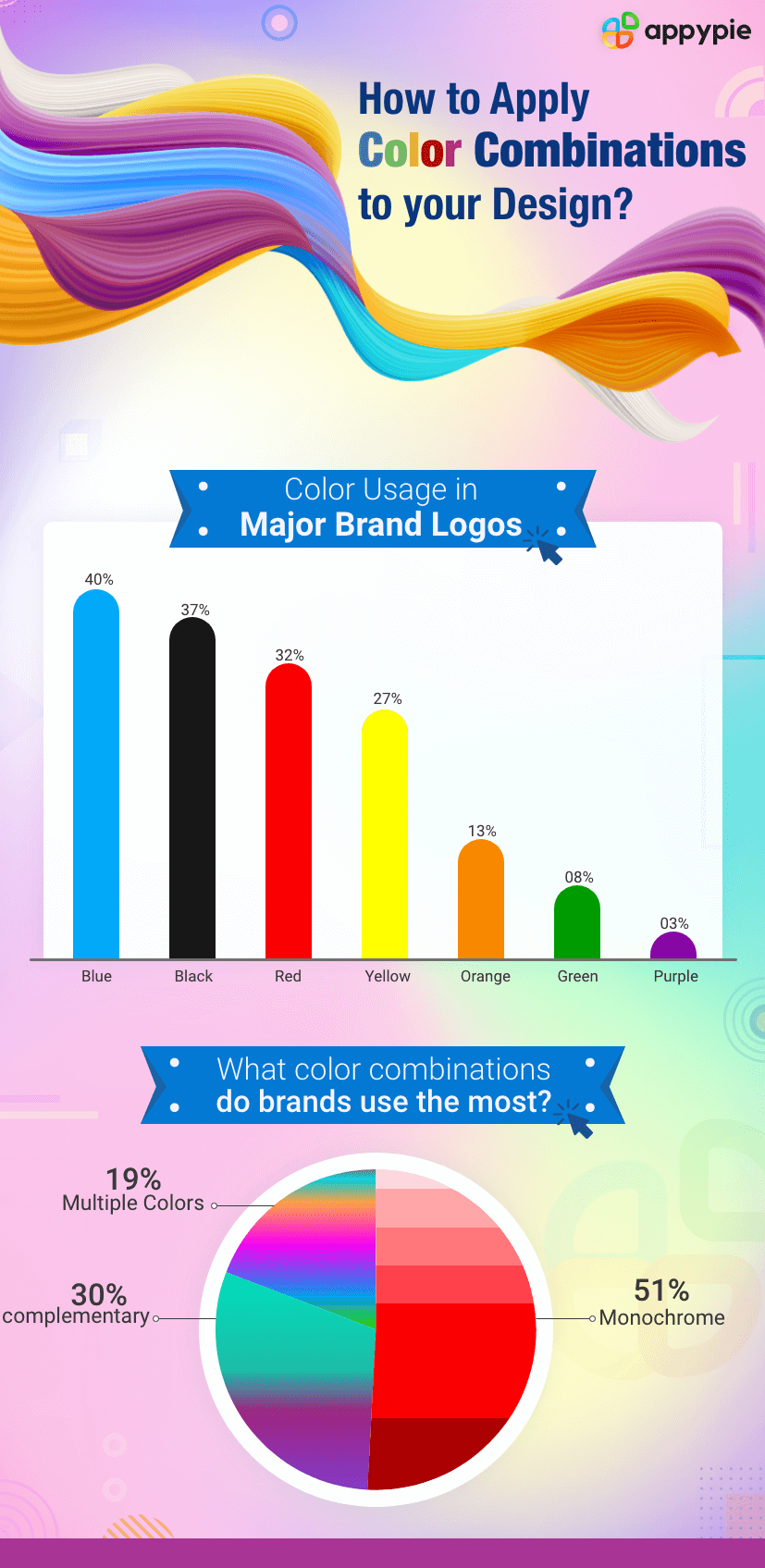 Once you can create a good color combination for your designs, you can start designing your own graphics. For designing your graphics, you can go with an easy-to-use free graphic design tool, Appy Pie Design.
Appy Pie Design is a free graphic design software that helps you create graphics online. It has an intuitive interface that beginners and professionals can use. Check it out!
Once you can create a good color combination for your designs, you can start designing your own graphics. For designing your graphics, you can go with an easy-to-use free graphic design tool, Appy Pie Design.
Appy Pie Design is a free graphic design software that helps you create graphics online. It has an intuitive interface that beginners and professionals can use. Check it out!20 Color Combinations That You Should Apply To Your Designs
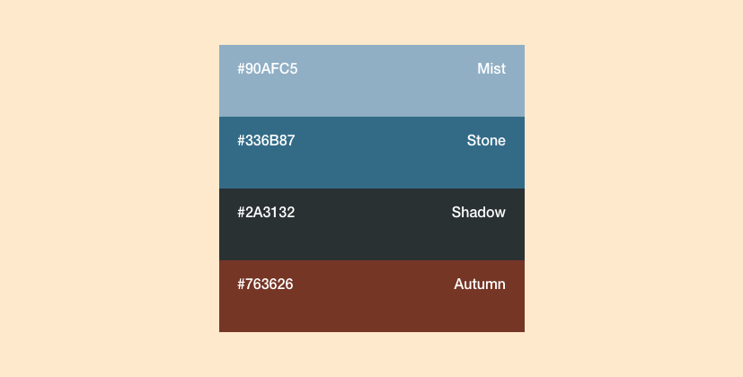
The time has come to take a look at some of the best color combinations that you can apply to your designs. All color combinations have been created by the designers at Appy Pie. Try these color combinations for your designs. All of these colors can be color picked with the help of Appy Pie’s Color Wheel.- Corporate Professional(Mist, Stone, Shadow, Autumn):
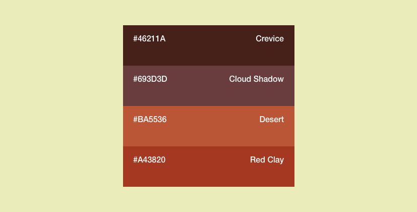
- Desert Contrast(Crevice, Cloud Shadow, Desert, Red Clay):
- Relaxed Blues(Deep Aqua, Ocean, Wave, Seafoam):
- Natural Greens(Forest Green, Grass, Lime, Earth):
- Instagram Pretty(Aquamarine, Turquoise, Canary Yellow, Pink Tulip):
- Bright Sand(Turquoise, Warm Sand):
- Good ol’ Television (Black, White):
- BubbleGum Contrast (Bubblegum Pink, Pale Green):
- Sofa Beige(Brown Sugar, Beige):
- Cherry(Cherry, Off White):
- Hipster Latte(Slate, Ceramic, Latte, Coffee):
- Blueberry Navy(Midnight Blue, Indigo Ink, Blueberry, Periwinkle):
- Instagram Pastel(Baby Blue, Peach, Butter, Butterscotch):
- Color Candy(Orange, Fuchsia, Lemon Drop, Blue Raspberry):
- Pasta Afternoon(Current, Scarlet, Marigold, Cobblestone):
- Mango Mojito (Mellow Yellow, Verdant Green):
- Classy Silver (Powder White, Silver):
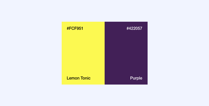
- Tonic Purple (Lemon Tonic, Purple):
- Electric Summer(Blue Atoll, Vibrant Yellow):
- Blushing Pink (Cantaloupe, Blush):
 As shown in the infographic above red, black, and blue are very common colors used by most businesses. Red reflects confidence, black reflects authority while blue reflects calmness and trust. This color combination uses desaturated shades of red and blue, toned with hints of black and brick red. It is a conservative color shade that is well-suited to more ‘professional’ design projects and is a combination that works well wherever it is applied.
 Deserts are often full of different contrasting shades of red. Since red signifies confidence, the desert contrast color combination expresses confidence and gives your designs a classy look. Without being too bold and ungainly, desert contrast can cater to subtle needs of your designs. It works because the desert red shades are more toned down and have an earthy appearance.
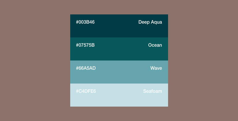 Monochrome blue tones are popular among designers. The relaxed blue color combination gives a serene and calm feel to your design. This color combination brings varied colors of the ocean to your designs with a natural yet calming feel.
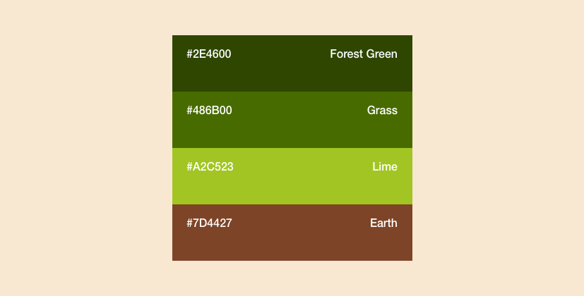 Suited to designs and businesses that want to portray themselves as ‘natural’. For eg, this color scheme is well suited to organizations involved in organic farming or engaged in sustainable activities. Other than that, this color combination works for businesses that sell natural products. This color combination sets the tone of being natural and earthly.
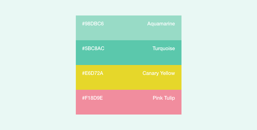 This is a popular combination of colors. The reason it is called Instagram pretty is because a lot of art influencers on Instagram use this color combination knowingly and unknowingly to showcase their work. This color combination can be described as ‘bright’, ‘cute’, and ‘girly’ and can be used to portray liveliness in your designs.
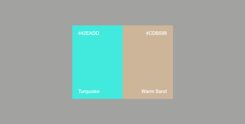 There is nothing more activating and bright than the shade of turquoise. Combine it with a warm shade of gray and you have a muted turquoise color combination that looks bright yet relaxed. It creates a harmonious and gentle balance of colors for the eyes. This color combination is often found in apparel, especially sportswear.
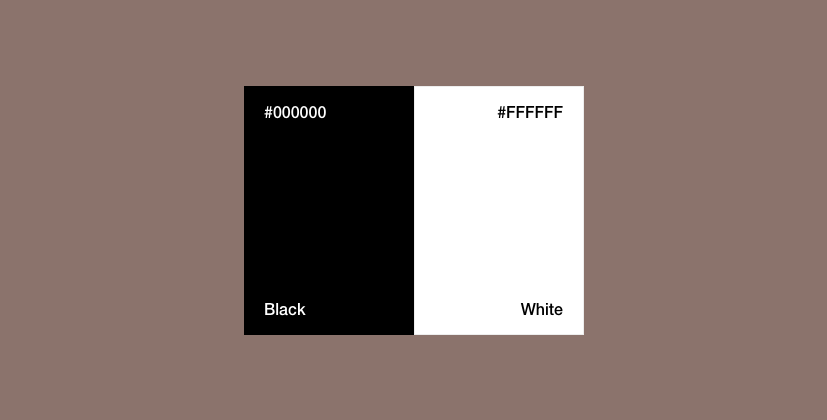 Some things never get old. A color combination of black and white will never get old. This color combination is simple and timeless. It is sophisticated, classy, and gives off a rich vibe. Many luxury brands often use black and white as their chief color combination.
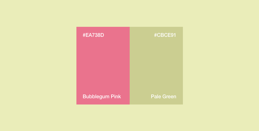 These two colors go surprisingly well together. Their wild contrast compliments each other really well and ends creating a very youthful color combination. When going for this combination use pale green as the dominant shade and the bubble gum to add contrasts. Even when used sparingly bubblegum pink stands out and appears bright.
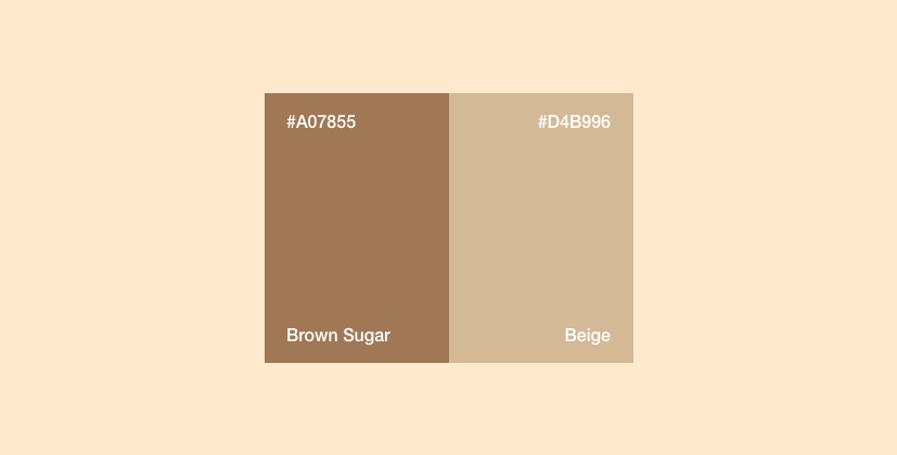 This color combination is great for interior designing, especially for homes. The colors look classy, expensive yet cozy, and give off a calm vibe. Think warm cups of coffee, a beige sofa, a book in your hand, and the pitter-patter of rain outside. This combination is very relaxing, reassuring, and mature.
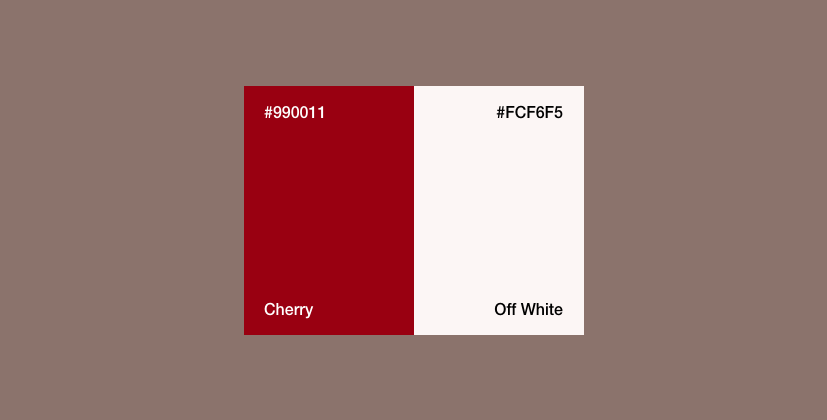 No color combination expresses sophistication as a blend of cherry and white. This color combination is a standard for many brands and businesses. The red balances the white and the white gets a radiance thanks to the red.
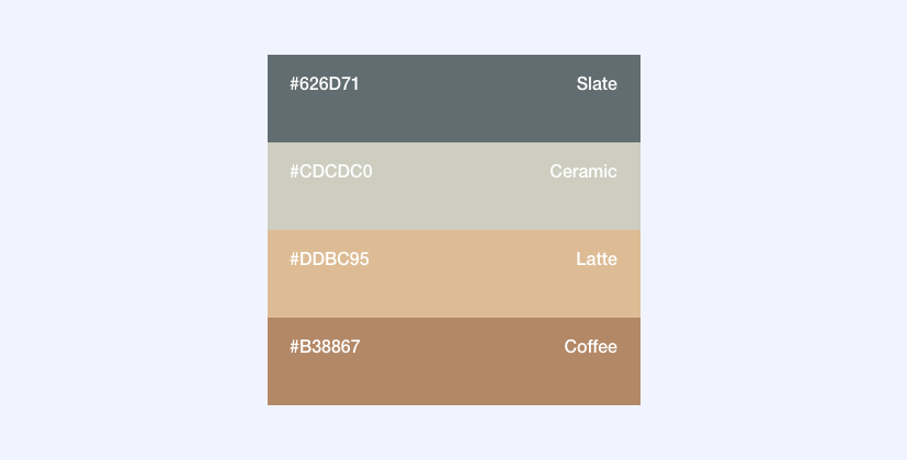 Neutral grays and tans combined with a shade of coffee to add a little flair. This color combination inspires Starbucks. It is calming, sophisticated, relaxing, and classy. This combination is very common among businesses and many contemporary businesses use it. From clothing to interior design it always looks good.
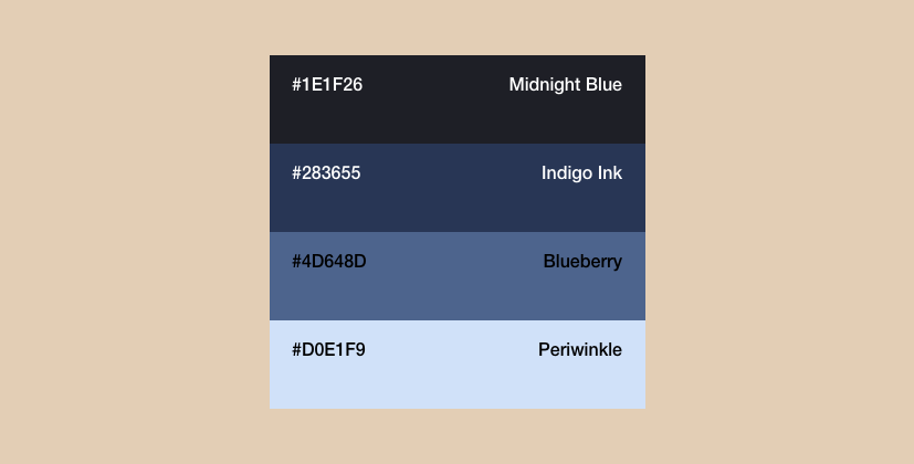 Called the blueberry navy, this color combination uses darker and muted monochromatic shades of blue. This blue color combination is authoritative, royal, and trustworthy. It is also fancy and is suited to brands with a strong image and a good reputation.
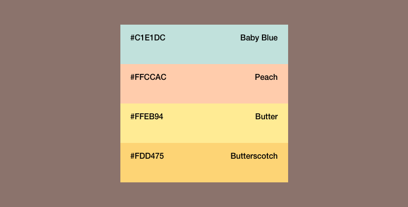 This color combination is suited for the ‘gram. It portrays fun and childishness but looks good and is used by many influencers. A lot of baby clothes are made in this color combination due to the simplicity of the combination. It works though and is great for many designs.
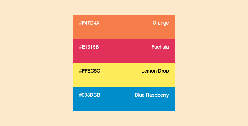 Nothing like a little candy can brighten up your day. This color combination may seem overpowering but is very youthful. It perfectly suits bright interior design, especially for themed cafes and restaurants. It can also work great for art websites and personal websites. It does however require a tasteful application and needs some experimentation to get right.
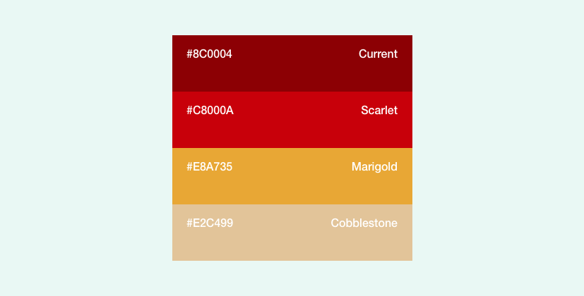 Called pasta afternoon, this color combination is bright, rich, and Mediterranean. It is suited for restaurants and food-related businesses. It is visually appealing and eye-catching. It adds warmth and flavor to any design you create for your brand.
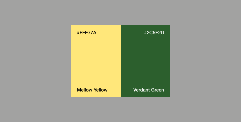 Named after the color of the signature drink, this color combines muted shades of yellow and green. It creates a warm aura of calmness. It is a happy color combination having a relaxing vibe, like that of a drink it’s been named after.
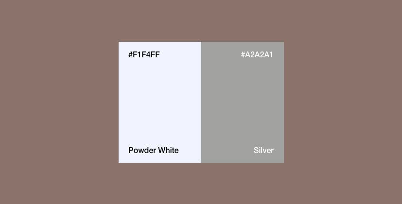 A combination of silver and powder white, this blend is simple and luxurious. It is a very soothing color combination and is used exclusively in minimalistic designs. Thanks to its simplicity which can give a unique minimal look to your designs. It is a sensible color choice for many industries and businesses.
 A blast of bright contrasting colors is extremely eye-catching. This color combination demands attention. If you feel that this is a familiar color combination, look no further than LA Lakers who have been rocking this combination for decades.
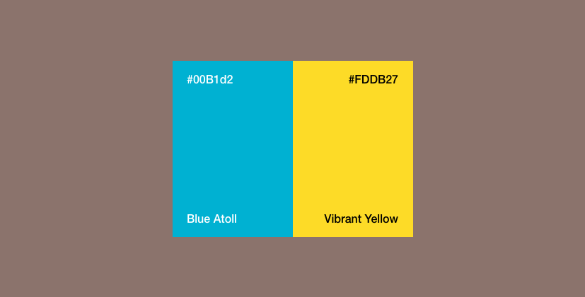 Beaches are fun. This blog would be incomplete without a color combination inspired by the beaches. Electric summer is bright and vibrant with a combo of popular beachwear and beach accessories. It is also an excellent color combination that can pretty much find a place anywhere it wants.
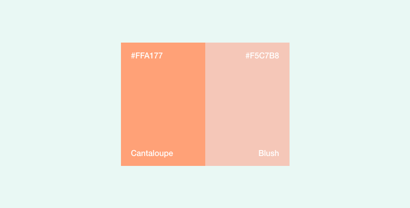 Coming straight out of a make-up kit, cantaloupe and blush are a monochromatic combination of pink/tan that create a cool vibe. This color combination works really well with clothing and accessories. The warm tones are welcome and approaching. It can even suit brick and mortar stores and cafes which calls for engagement from everyone who looks at it.
Summing Up
That was our list of 20 best color combinations which can help you in making your designs amazing. We will add more colors to this blog, so keep checking it out every once in a while. Meanwhile, you can start experimenting with these color combinations in your design with the help of Appy Pie’s Color Wheel. Go check it out!Leave us a comment with your ideas for great color combinations and we’ll make sure to add in our blog.Related Articles
- 17 Creative Photography Ideas to Refresh Your Vision
- How to Make a Discord Bot Without Coding
- Why your business needs workflow automation software? [+ top 10 options]
- 15 Best Portfolio Websites in 2023
- 7 Effective Tips to Humanize your Chatbot
- 26 Interactive Classroom Activities Ideas
- The Ultimate Guide to Chatbot Analytics [Essential Metrics and KPIs to Measure]
- The 6 Best Online Whiteboards for Greater Collaboration
- Demystifying Explainable AI (XAI)
- Top 9 Strategies to Acquire Customers