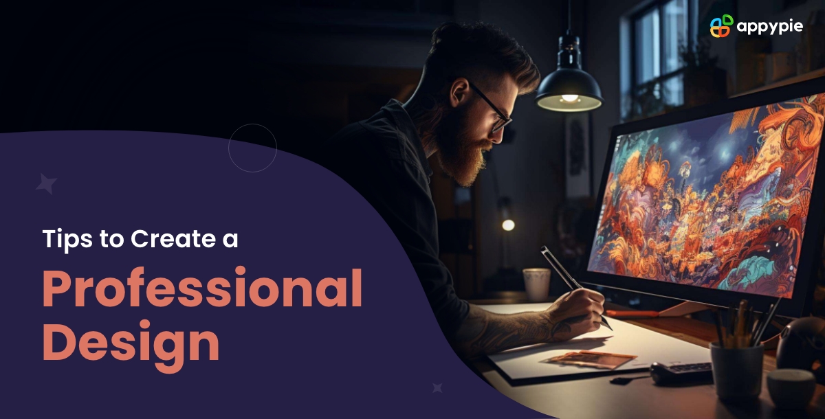
20 Expert Tips to Create a Professional Design

Have you tried creating a professional design that turns heads and elevates your brand, but felt intimidated by the process? You're not alone newbie designer. Whether you need a professional design logo that packs a punch, a professional flyer design that gets noticed, or an ID card professional design, achieving that polished look can seem like a hurdle initially.
The good news is, you don't need years of design experience or expensive software. Today's design arena offers countless user-friendly tools, including AI Design Tools that help you generate professional designs with a couple of clicks and a vast library of online editable templates. This blog will provide 20 expert tips that will enable you to create professional designs like an experienced graphic designer, all within the easy reach of these modern resources so that you can create a professional portfolio for yourself.
Table of Content
- 20 Best Tips to Create a Professional Design
- Prioritize clarity and avoid overcrowding
- Use white space for balance
- Choose fonts wisely and be consistent
- Mind your colors to avoid clashes
- Maintain hierarchy to guide the viewer's eye
- Optimize for readability as font size matters
- Align elements purposefully to enhance cohesion
- Use grids for structure
- Limit decorative elements to create more impact
- Incorporate contrast strategically
- Respect brand guidelines
- Scalability test to adapt the design
- Aim for achieving balance in your design
- Consider the context of the intended environment
- Incorporate visual storytelling
- Declutter to maintain simplicity
- Experiment with textures to add depth and evoke emotion
- Incorporate asymmetry to create dynamic compositions
- Seek feedback to refine and elevate your designs
- Optimize for all screens
- Wrapping Up!
20 Best Tips to Create Professional Design
We will now discuss 20 expert tips that can help you take your graphic designs to the next level. These tips are specially curated following design aesthetic principles and will help you transform from a newbie in the field of graphic design into a pro graphic designer.
- Prioritize clarity and avoid overcrowding
- Use white space for balance
- Choose fonts wisely and be consistent
- Mind your colors to avoid clashes
- Maintain hierarchy to guide the viewer's eye
- Optimize for readability as font size matters
- Align elements purposefully to enhance cohesion
- Use grids for structure
- Limit decorative elements to create more impact
- Incorporate contrast strategically
- Respect brand guidelines
- Scalability test to adapt the design
- Aim for achieving balance in your design
- Consider the context of the intended environment
- Incorporate visual storytelling
- Declutter to maintain simplicity
- Experiment with textures to add depth and evoke emotion
- Incorporate asymmetry to create dynamic compositions
- Seek feedback to refine and elevate your designs
- Optimize for all screens
You should be extra mindful of prioritizing clarity in your design since it's paramount in conveying the distinct message it is made for. Avoid overcrowding your design with excessive text or graphics, as this can overwhelm the viewer and dilute your message. Instead, focus on conveying your information concisely and effectively. Especially when designing materials like letterheads, make sure you create clean, uncluttered designs that communicate the organization’s or brand’s vision with clarity and impact. You can try using a Letterhead Maker to design one easily if you are a beginner to make a letterhead professional design. Moreover, this tool also provides several pre-designed templates to work on.
White space is also known as negative space. It plays a crucial role in design by providing breathing room for elements to stand out and thereby creating a sense of balance. You can incorporate ample white space in your designs, especially in flyers to ensure a harmonious composition throughout that draws the viewer's eye to the most important elements and helps you maintain a clean and professional aesthetic. You can use online editable flyer templates to get ideas on how to best utilize white space.
Do not neglect fonts at any cost since they are the voice of your design and even convey the tone and personality of your design. When selecting fonts for your professional materials, go for clean, legible typefaces that complement your brand identity. Also, be consistent in your font choices throughout your design, from the headline to the body text, to maintain a cohesive look. It is especially important while designing a business card since fonts play a crucial role in highlighting important information. You can use an online Business Card Maker to understand this better and use editable business card templates to work on initially.
As we all know colors evoke emotions and can significantly impact the perception of your design, we need to be mindful of our color choices. It is important to ensure they align with the desired mood you want to convey to the audience it is intended for. You should avoid clashes by selecting a cohesive color palette and using it consistently throughout your design. This tip is to be especially kept in mind to produce a professional design poster. A Poster Maker can help you make a poster that incorporates the right set of colors and elevates its engagement.
You should have a clear focus on maintaining a clear hierarchy in your design. It helps in guiding the viewer's eye and prioritizing information effectively. You can achieve this by using varying sizes, colors, and placements to differentiate between elements and draw attention to the most important content. This tip is quite crucial to follow while you are designing resume templates. Since, a resume has several points to focus on and others that are generic, maintaining a hierarchy for sections is important. An online Resume Maker can help you create a professional design resume that meets all the format standards.
Readability is crucial in professional design, especially when it comes to text-heavy materials like invoices. You should ensure that your font size is large enough to be easily read, particularly in smaller formats. You may also experiment with different font sizes using tools like an Invoice Maker to find the perfect balance between readability and aesthetics for your professional invoice designs.
Proper alignment creates a sense of order in your design and makes it easier for the viewer to navigate and understand the message. You should focus on aligning the text, images, and other elements consistently to create a polished and professional look. It is very important to follow this tip as a thumb-rule while designing cover photos like Facebook cover design, especially for brands and organizations. A Facebook Cover Maker can help you with creating a professional Facebook cover design while ensuring well-aligned element placements.
Grids provide a framework for organizing content and also help in maintaining visual alignment across your design. Whether you're creating a logo or an icon, a grid can help you considerably in ensuring that elements are aligned and spaced evenly. With the use of grid-based layouts, you can create a professional design logo with precision and structure. For better ideation, you can use a Logo Maker which has several logo templates and helps in creating logos that perfectly match your brand’s essence.
While fancy flourishes might seem enticing, beginners often over-embellish their designs. Remember, simplicity reigns supreme! Restrain yourself from adding unnecessary decorations. Focus on conveying your message clearly with well-chosen visuals and concise text. A clean layout will make your design more impactful and visually appealing. Just like a stage where too many props can distract from the main performance.
Contrast is the magic sauce that creates visual hierarchy and directs the viewer's attention in your design. Don't be afraid to play with contrasting colors, font sizes, and weights. Use bold elements to highlight key information, like a product name or a call to action. But remember, balance is key! Too much contrast can be jarring, so use it sparingly to guide the eye, not overwhelm it. Think of it like a spotlight that illuminates the important details without making everything else disappear.
If you're designing for a specific brand, familiarize yourself with their brand guidelines. These are like the design bible; they outline the brand's colors, fonts, and even tone of voice. Adhering to these guidelines ensures consistency and reinforces the brand's identity. Don't stray too far, since it's like going to a costume party and showing up in the wrong era! Respect the brand guidelines and your design will feel like a harmonious extension of the brand's personality.
Imagine your stunning poster shrunk to a thumbnail on a social media post. Does it still hold its impact? Scalability is crucial. Before finalizing your design, test it at different sizes. Ensure text remains legible and elements stay proportionate when shrunk or enlarged. A design that works on a billboard should also translate to a business card (with adjustments, of course!). Think of it like a rubber band, it should stretch and shrink without losing its form.
A balanced design feels stable and pleasing to the eye. Distribute elements thoughtfully to create a sense of visual equilibrium. This doesn't mean perfect symmetry; it means a harmonious arrangement. Balance can be achieved through color placement, element size, or whitespace distribution. Don't let your design be like a seesaw that's tipped over! Aim for a balanced composition that feels visually pleasing and effortless.
Imagine your flyer posted on a crowded bulletin board. Does it stand out? Consider where your design will live. For a busy environment, use bolder colors and larger fonts for better visibility. Conversely, a website banner might call for a subtler touch. Think of your design like a chameleon; it should adapt to its surroundings to grab attention.
People connect with stories. Don't just tell them your message; show it! Use visuals that evoke emotions and tell a narrative. This could be a photograph capturing a joyful family for a product ad or an illustration depicting a problem-solution journey. A picture is worth a thousand words, so use it to your advantage!
As a beginner, it's easy to get carried away with design elements. Resist the urge to overload your work! You should rather prioritize a clear message and a clean layout. Use white space to create breathing room and let your key elements shine. Think of it like a minimalist room, clean lines and purposeful placement create a calming and impactful space.
Textures add a layer of visual interest and can evoke specific emotions. A rough stone texture might suggest strength or durability, while a soft fabric texture could feel comforting. Explore textures in backgrounds, patterns, or even subtle overlays on text. But remember, use textures strategically, since too many competing textures can create chaos!
While balance is important, don't be afraid to experiment with asymmetry. Off-centered elements can create a sense of dynamism and intrigue in your design. This doesn't mean throwing balance out the window entirely. Look for ways to create visual weight using color contrast or element size to maintain some form of equilibrium. Think of it like a dancer defying gravity; an asymmetrical composition can be captivating when done thoughtfully.
Don't be afraid to share your work and get feedback! Ask friends, colleagues, or even online design communities for their honest opinions. This fresh perspective can help you identify areas for improvement and elevate your designs to the next level. It's like having a personal design coach; their insights can help you avoid blind spots and create truly professional-looking work.
Use flexible layouts that respond and adjust to different screen sizes. This might involve using relative units like percentages for sizing elements instead of fixed pixels. Consider using responsive design tools or templates that offer built-in adaptability. Remember, test your design on various devices throughout the creation process. This ensures your masterpiece looks crisp and functions flawlessly, no matter the screen size – just like your favorite superhero always saving the day!
Wrapping Up!
As we come to the end of these 20 expert tips that will equip you to create professional-looking designs, you always need to remember that design is a journey of constant learning and exploration. You should be receptive to feedback, and most importantly, have fun with the process! These tips are your launchpad, but your creativity is the rocket fuel. So, design with confidence, and remember, with dedication and these valuable tips in tow, you'll be well on your way to becoming a design pro in no time!
Related Articles
- What is CSR? [7 Examples of Corporate Social Responsibility Done Right]
- 12 Best Calendar Apps for Android & iOS in 2024
- MetaCap: Meta-learning Priors from Multi-View Imagery for Sparse-view Human Performance Capture and Rendering
- Overview of the concept of AI Text to Video Generation
- 13 Proven Ways To Increase Your Gym Membership Sales
- The Emu Landscape: A Journey into Creative AI
- What is Brand Marketing? A Comprehensive Guide
- Silver Color: Exploring Hues and Hex Codes
- 60+ Best Resume Action Words That Will Majorly Impress Hiring Managers
- Transforming Customer Frustrations into Success Stories: A Deep Dive into Pain Points