Nike Logo: The Meaning and History Behind the Swoosh

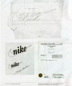
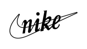
The globally renowned Nike logo boasts a captivating history. Crafted in 1971 by Carolyn Davidson, a student at Portland State University in Oregon, the iconic Nike swoosh quickly became one of the most recognizable logos worldwide. Despite Davidson presenting various concepts, it was ultimately chosen as Nike's logo by Knight, one of the company's founders. She was paid $35 for creating the Nike logo (or $2/hour), which she considered appropriate based on her work. The brand name “Nike" was derived from the Greek goddess Nike, the goddess of victory.

What does Nike Logo Mean?
The Nike logo is a simple design, but it has a lot of meaning behind it. The brand name “Nike" was derived from the Greek goddess Nike, the goddess of victory. It represents the speed, power, and victory of the brand.
The history of the Nike logo is a simple swoosh design. However, simplicity is more difficult to achieve. This logo was created in 17.5 hours by designer Davidson. Obviously, she had put a lot of thought and effort in the Nike logo design.
Originally, the Nike logo was intended to be drawn as a shoe. However, Davidson stated in an interview that the real challenge was translating the shoe concept into a logo design. The Nike logo was supposed to be placed on the shoe. It had to look good on the shoe. As a result, she drew sketches of the swoosh logo on tissue paper. If it looked good, they would have probably approved more work on it.
She also mentioned that another challenge was to design a logo that was not only classic and clean but also distinct from other competing businesses. At that time the biggest competitors were Adidas and Puma in the sports market.
Evolution of Nike Logo
The Nike logo has evolved significantly since its inception in 1971. The very first Nike logo was simply the word “NIKE” in Futura Bold font.

The font of the logo was changed to bold, capital letters in 1978. This logo was later adapted in various colors, including red and blue.
In 1985, the logo was again updated, this time to make it more three-dimensional and to better reflect the company's commitment to innovation.
Over the years, the Nike logo has undergone several changes. The most notable change came in 1985 when the company decided to remove the word "Nike" from the logo. This was done in order to make the logo more recognizable and to simplify the design. The current Nike logo consists of only the Nike swoosh.
What are the design elements in the Nike Logo?
Nike is one of the most famous logos in the world if we talk about design, creativity, and simplicity. The logo is a simple one with a unique font style and swoosh symbol. there are some basic elements that make it one of the best logos in the world, including:
- Shape: The Nike logo has changed over the years since its inception, but its meaning has not. Nike's logo includes key the swoosh shape that was originally included in the logo.
- Color: Now the Nike logo has a variety of colors, but its basic design is the same. Over the years, the brand has pitched many colors, including black, orange, red, white, and more. If you're curious about the exact shades, you can use an Image Color Picker to identify the precise color codes.
- Font: The Nike Logo typeface looks simple yet attractive. The Nike logo font consists of only capital letters so it looks simple and clean. Nike uses Futura for their digital applications and Coronet for their print media like brochure, advertisement, poster, etc.
How do you get ideas for your own logo from the Nike logo?
A good logo often has fewer elements than what you think it should. They are unique, relevant, memorable, simple, and can be easily scaled to any size. while designing a logo for your business, you should use a typeface that is easy to read. The symbol, text, and colors should have a relation to each other. Creating a logo for your business requires a lot of work. You have to brainstorm, find inspiration and come up with a unique idea that your business can be identified by. With Appy Pie’s AI Logo Maker, you don’t have to do all that.
Appy Pie’s logo creator is super easy-to-use and will help you create a logo in just minutes. Even if you have zero experience with design, you can design your own logo in just a few clicks. Appy Pie’s AI logo generator offers thousands of templates generated by professional designers. You can choose from the available template collection to find the ideal one for yourself and create an impressive logo. However if you want you can you can also upload your own graphics.
Steps to create an effective brand logo with Appy Pie’s Logo Maker:
- Log in to Appy Pie Pie Logo Maker
- Enter your brand name and tagline
- Choose your logo design from the templates
- Customize your logo with the easy-to-use editor
- Download your high-resolution logo files
