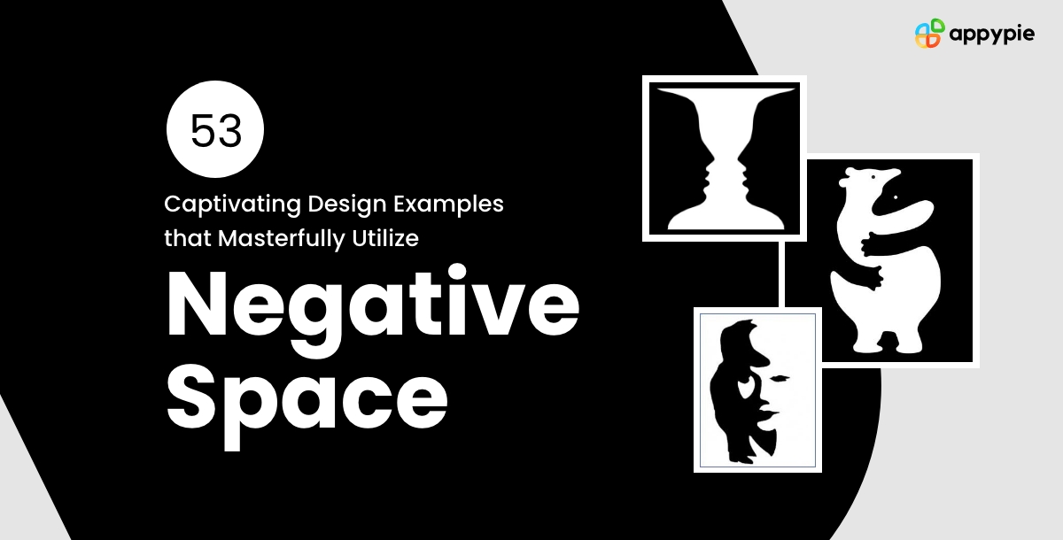
53 Captivating Design Examples that Masterfully Utilize Negative Space

Negative space emerges not as an absence, but as a powerful element that shapes and defines the visual narrative in the realm of design. This concept, often overlooked, holds the key to transforming ordinary designs into captivating works of art. From negative space tattoos that intrigue with hidden meanings to negative space in photography that elevates composition, the mastery of this silent yet potent design component beckons a closer look.
The exploration of negative space challenges designers to rethink the traditional boundaries of creativity. It's a principle that applies across various mediums, including negative space logos and negative space lettering, where the balance between filled and empty space invites viewers to engage more deeply. As we delve into the world of negative space, we uncover its potential to add complexity, elegance, and clarity to design.
What is Negative Space?
Negative space, by definition, refers to the area around and between the subject of an image or the background in a composition. Far from being merely background, it plays an integral role in defining the subject itself, often creating a secondary image that captures the viewer's imagination. This concept encourages viewers to look a little longer and think a little deeper about what they're seeing.
In both negative space tattoos and negative space in photography, artists and designers utilize this principle to create a visual dialogue between the subject and its surroundings. The clever use of negative space not only enhances aesthetic appeal but also imbues the work with multiple layers of meaning. It's this interplay between presence and absence that makes negative space a cornerstone of innovative design.
53 Design Examples That Elevate Negative Space
Negative space opens a world of possibilities for creativity and expression. Whether it's a logo that cleverly integrates negative space to reveal a dual meaning or a tattoo that combines both the seen and unseen to tell a story, each application demonstrates the versatility and impact of this design principle. These 55 examples showcase how designers from various fields have harnessed negative space to create visually stunning and conceptually rich pieces.
-
FedEx's Logo
It cleverly incorporates an arrow between the "E" and "x," symbolizing speed and precision. This ingenious use of negative space not only enhances brand recognition but also communicates the company’s core values seamlessly. For those designing logos, incorporating such subtle messages can significantly impact perception, a technique easily explored with a Logo Maker.
-
The Toblerone Logo
It hides a bear silhouette within the mountain, a nod to the brand's Swiss origins and the city of Bern. This clever use of negative space adds depth to the design and enriches the brand story. Applying background templates can aid designers in creating similarly layered logos.
-
Formula 1 Logo
In the Formula 1 logo, negative space creates a "1" between the black F and the red stripes, symbolizing the speed and excitement of racing. This strategic design choice demonstrates how effectively a brand Logo Maker tool can be used to merge symbolism with brand identity.
-
NBC Logo
The NBC logo features a peacock made out of negative space, representing the network's pride in its colorful programming. This imaginative use of space can inspire designers to utilize AI Logo Generator tools for creating logos that unconventionally convey brand values.
-
Pittsburgh Zoo & PPG Aquarium Logo
The Pittsburgh Zoo & PPG Aquarium logo cleverly forms the faces of a gorilla and a lion in the tree's negative space, illustrating the diversity of wildlife. Such imaginative designs can be achieved by experimenting with Poster Maker applications to blend elements creatively.
-
Spartan Golf Club's Logo
Spartan Golf Club's logo masterfully combines a Spartan helmet and a golf swing, using negative space to merge two distinct concepts. This highlights the importance of the color wheel in selecting complementary colors that enhance negative space designs.
-
Guild of Food Writers Logo
The Guild of Food Writers logo, featuring a spoon within a pen nib through negative space, elegantly merges writing with culinary arts. This innovative approach is a prime example of how elements of art are crucial in crafting meaningful and cohesive designs.
-
Yoga Australia's Logo
Yoga Australia's logo uses the negative space between the arm and leg to create the map of Australia, subtly infusing a sense of national pride into the design. Such clever integration of elements can benefit from the precise customization options offered by a Background Maker.
-
World Wildlife Fund for Nature
The World Wildlife Fund for Nature (WWF) showcases a panda in its logo, making a strong statement about conservation with minimalistic design. This logo serves as a powerful reminder of the brand's mission, encouraging similar organizations to prioritize clear, impactful imagery in their branding efforts.
-
Beats by Dre

Beats by Dre incorporates a person wearing headphones within the letter "b," cleverly indicating the product. This strategic use of negative space not only defines the brand but also highlights the product's purpose, showcasing the potential of thoughtful design in enhancing brand recognition.
-
Hershey's Kisses
In the Hershey's Kisses logo, the space between the "K" and "I" forms a kiss, adding a playful element that echoes the product's name. This inventive approach demonstrates how clever positioning and use of space can add a layer of meaning to a brand's visual identity.
-
Baskin Robbins' Logo
Baskin Robbins' logo subtly incorporates the number "31" within the "BR," representing their original 31 flavors. This smart use of negative space cleverly communicates a key aspect of the brand's identity, showcasing the effectiveness of integrating core messages directly into the logo design.
-
LG
LG's logo features a human face in the letters L and G, personifying the brand and making it more relatable. This design emphasizes the importance of creating a connection with the audience, leveraging familiar shapes and forms to build trust and recognition.
-
Carrefour
Carrefour's logo cleverly hides a "C" in the negative space, symbolizing the brand's focus on serving customers. This subtle inclusion enhances the logo's visual appeal while reinforcing the brand's customer-centric values, demonstrating the power of negative space in conveying complex ideas simply.
-
Amazon
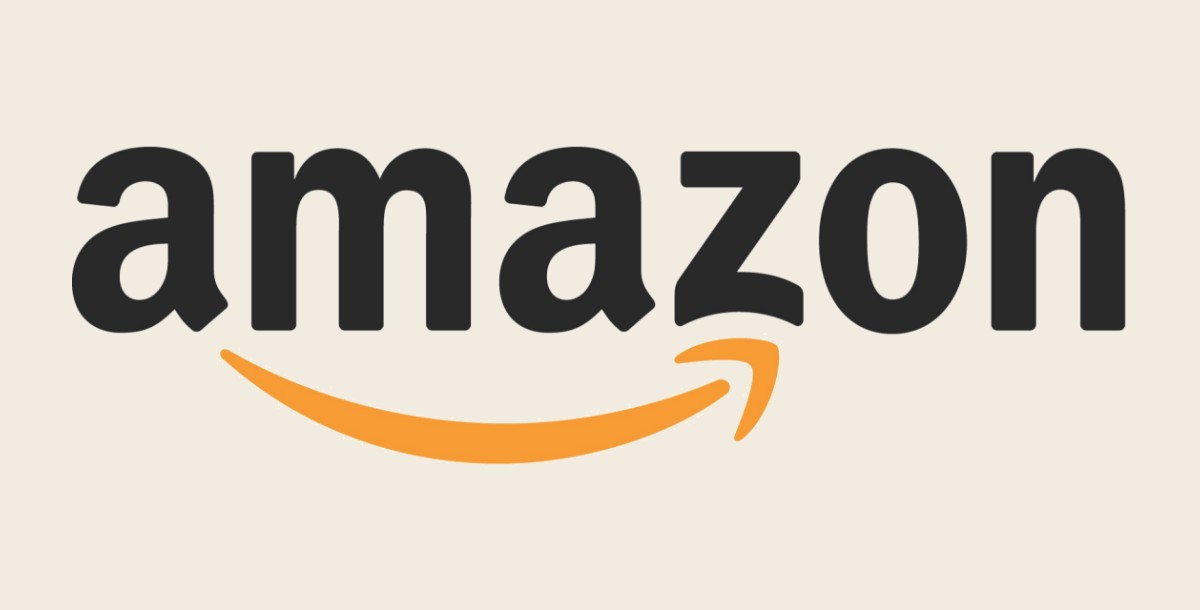
Amazon's logo includes an arrow from A to Z, indicating the vast range of products offered. This use of negative space not only adds a dynamic element to the design but also communicates the brand's comprehensive offerings, emphasizing the importance of aligning design elements with the brand's overarching message.
-
Hartford Whalers
The Hartford Whalers logo ingeniously incorporates a whale's tail and an "H" seamlessly blended into the negative space of a "W," creating a multi-layered design that honors the team's name and heritage with visual elegance and subtlety.
-
Elefont
Elefont cleverly uses the negative space within the letter "e" to form an elephant’s trunk, symbolizing strength and memory in a simple, yet profoundly imaginative manner that captures the essence of the brand’s identity.
-
Egg n Spoon
Egg n Spoon’s logo delightfully encapsulates an egg nestled within the curve of a spoon, utilizing negative space to convey the brand's name visually and invitingly, making it instantly recognizable and memorable.
-
Unilever
Unilever's logo is a marvel of negative space utilization, with the "U" cleverly incorporating various icons that represent the conglomerate's diverse range of product categories, showcasing the brand’s breadth in a compact and creative design.
-
The Museum of London
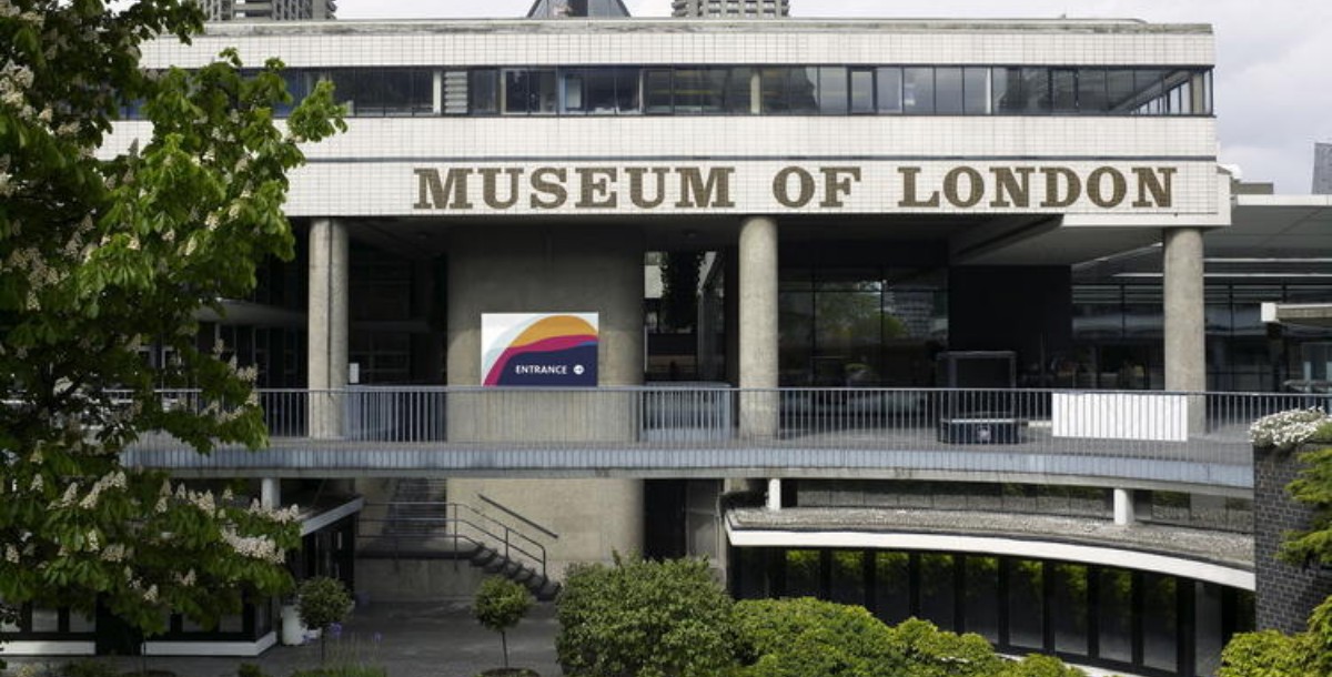
The Museum of London employs negative space to illustrate the geographic expansion of London through abstract shapes, representing the city's dynamic growth and history in a visually compelling and educational manner.
-
Sun Microsystems
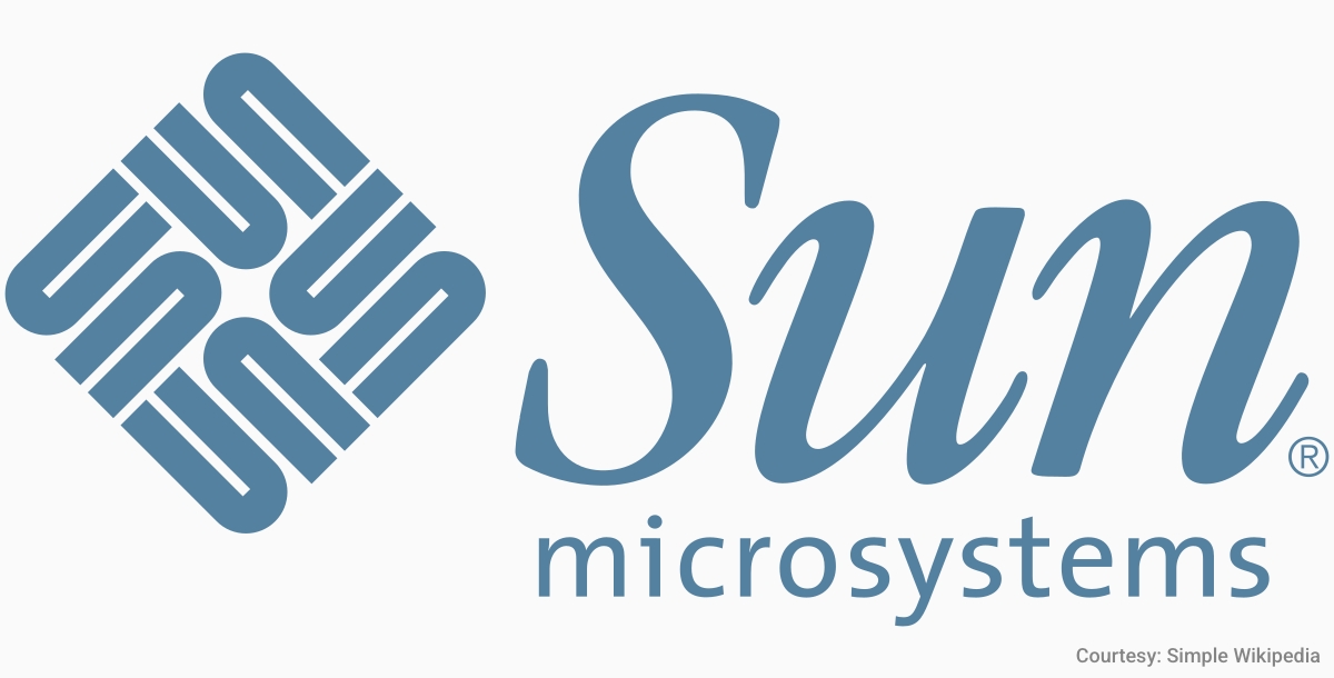
Sun Microsystems presents an ingenious arrangement with the word "sun" repeated in a circular pattern through clever use of rotation and negative space, creating a logo that's as brilliant as it is technically inventive.
-
Northwest Airlines
Northwest Airlines features a logo where the "N" and "W" also cleverly integrate a compass pointing northwest, embodying the airline’s direction and purpose within its initials through the strategic use of negative space.
-
Hope for African Children Initiative
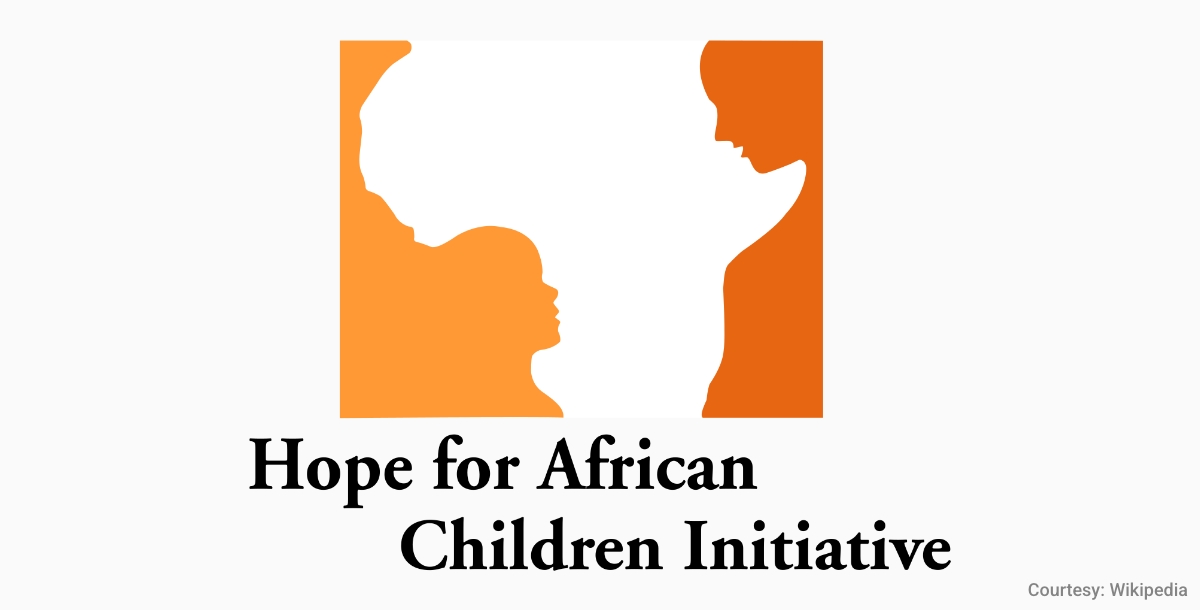
The Hope for African Children Initiative logo poignantly uses negative space to form a map of Africa alongside the profile of a child gazing up at a woman, symbolizing care and hope in a powerful, evocative design.
-
Guild of Food Writers
The Guild of Food Writers features a pen nib that ingeniously incorporates a spoon in its negative space, perfectly marrying the art of writing with culinary expertise in a logo that is both literal and metaphorical.
-
French Property Exhibition
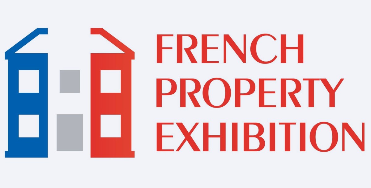
French Property Exhibition utilizes negative space within a key to craft the Eiffel Tower, merging the concepts of home and France's iconic imagery, inviting exploration and ownership in a creative, culturally rich design.
-
London Symphony Orchestra
The London Symphony Orchestra’s logo artistically arranges the letters "LSO" to form a conductor, using negative space to convey the essence of music and leadership in a harmonious, visually engaging composition.
-
Le Tour de France
Le Tour de France cleverly forms a cyclist out of the letter "R," using negative space in a dynamic representation that captures the spirit and motion of the famed cycling race.
-
Bronx Zoo
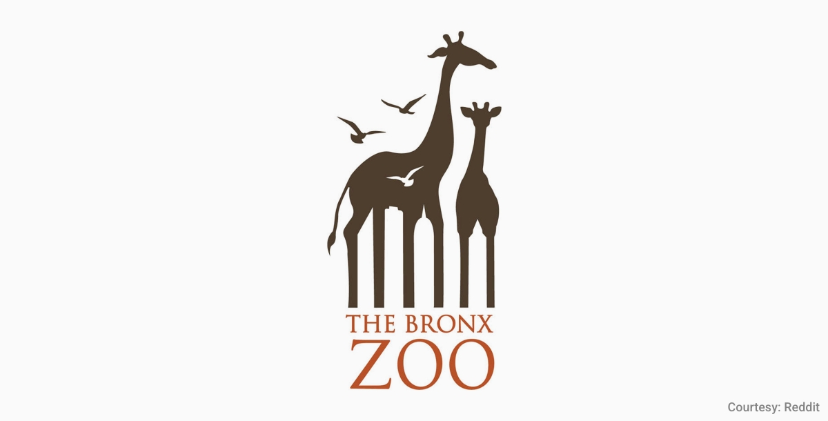
The Bronx Zoo logo creatively incorporates giraffes and birds into the city skyline through negative space, beautifully blending urban and natural elements to reflect the zoo's mission and location.
-
Bronx Zoo
Goodwill’s logo doubles the "g" as a smiling face through clever use of negative space, representing the organization's positive impact and friendly, welcoming nature in a simple, yet profound design.
-
Milwaukee Brewers
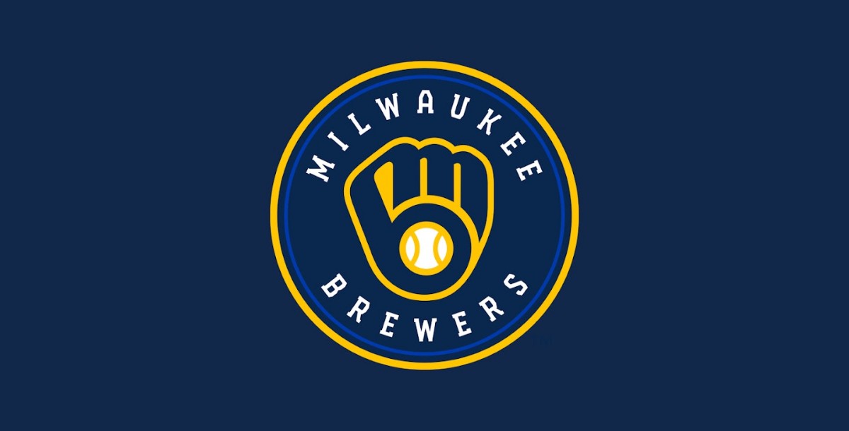
Milwaukee Brewers' logo masterfully forms a baseball mitt using the letters "m" and "b" in negative space, encapsulating the team’s identity in a visual pun that’s both clever and quintessentially baseball-themed.
-
"The Girl with the Dragon Tattoo" Book Cover
This cover masterfully uses negative space to create a dragon silhouette, blending it with the background. The design cleverly balances darkness and intrigue, mirroring the novel's intense narrative and mysterious atmosphere.
-
"Animal Farm" by George Orwell
Various editions of this classic novel use negative space to depict farm animals, sometimes emerging from shadows or forming from the landscape itself. This subtle use of design underscores the novel's exploration of power dynamics and rebellion. You can even utilise a book cover maker which serves you with numerous book cover templates to make stunning book cover designs.
-
M.C. Escher's Artworks
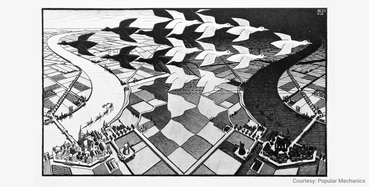
Escher's work is renowned for its imaginative use of negative space, creating impossible scenes where the background and foreground interchange fluidly. His drawings encourage viewers to question their perceptions of reality and perspective.
-
"1984" by George Orwell
Book covers often utilize negative space to subtly convey themes of surveillance and authoritarian control, with watchful eyes or oppressive imagery emerging from the shadows, reminding readers of the novel's cautionary tale.
-
"The Missing Piece" by Shel Silverstein
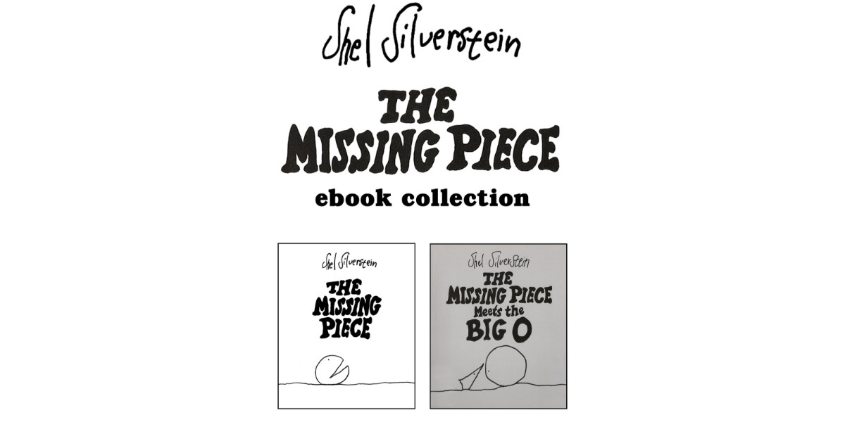
The cover's clever use of negative space to illustrate the story's central theme—the quest for fulfillment and wholeness. It invites readers into Silverstein's thoughtful exploration of happiness and self-discovery.
-
The 8 of Diamonds Playing Card
A hidden number "8" formed in the negative space between the diamonds is a delightful surprise, demonstrating how negative space can add a layer of discovery and playfulness to even the most familiar objects.
-
"A Clockwork Orange" Book Cover
Some editions creatively combine a cog and a human eye using negative space, visually encapsulating the novel's exploration of free will, control, and the mechanization of society.
-
Salvador Dalí's Paintings
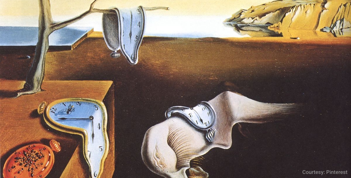
Dalí's surrealist works frequently employ negative space to create illusions, double images, or hidden scenes, challenging viewers to look beyond the obvious and explore the depths of his dream-like landscapes.
-
"The Cheshire Cat" in Alice in Wonderland Illustrations
The iconic grin of the Cheshire Cat, often the last part of it to disappear, utilizes negative space in a way that perfectly captures the whimsy and elusive nature of the character and Wonderland itself.
-
Optical Illusion Art
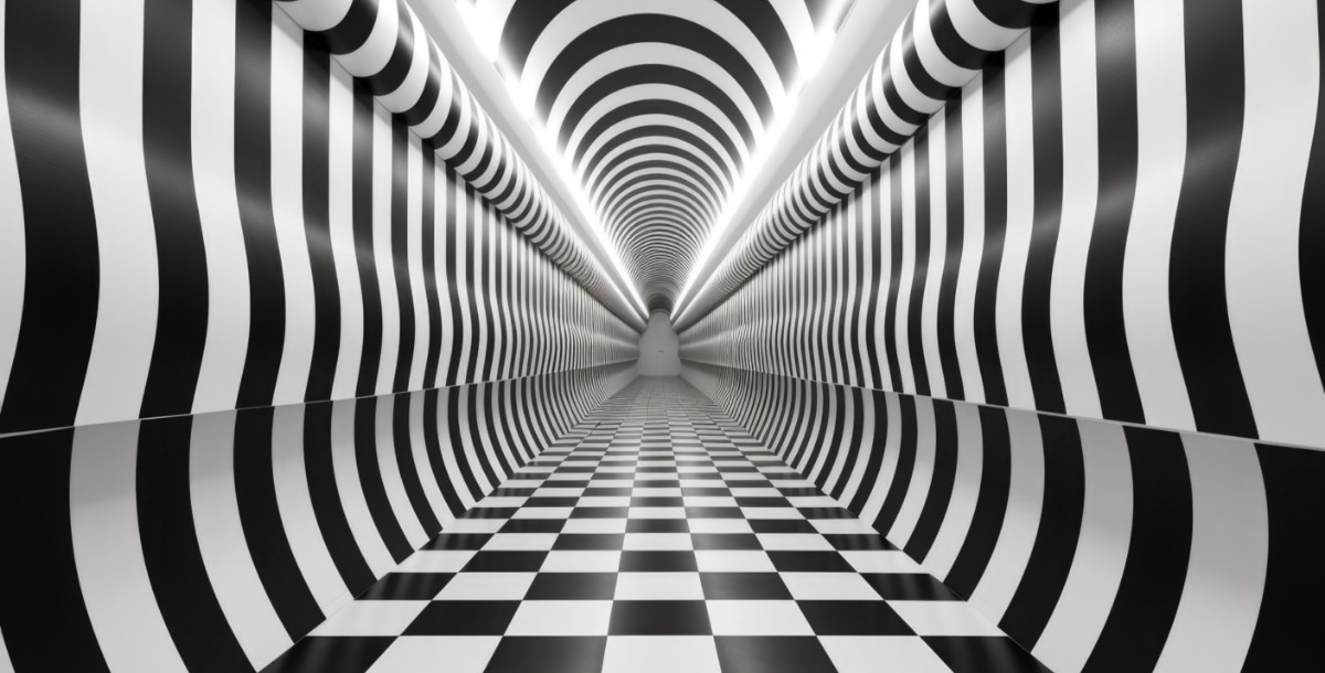
Art that uses negative space to flip between two scenes or subjects plays with the viewer's perception, often forcing a double-take and challenging the initial interpretation of the image.
-
"The Prince" by Niccolò Machiavelli
The cunning use of negative space on some covers highlights themes of power and manipulation, with imagery that alludes to the intricate strategies and political machinations discussed within the text.
-
Vincent Van Gogh's "Starry Night"
The swirling sky around the stars and the moon creates dynamic negative space, drawing the viewer's eye into the movement and emotion of Van Gogh's iconic night sky.
-
Rene Magritte's "The Son of Man"
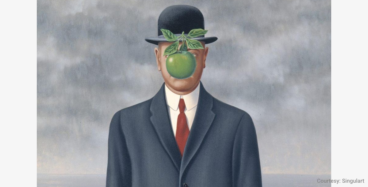
The apple and the man's face interaction, created using negative space, offers a compelling visual puzzle, encapsulating Magritte's themes of identity, reality, and concealment.
-
"Catch-22" by Joseph Heller
The clever use of negative space in some editions highlights the absurdity and circular logic central to the novel, with designs that provoke thought about the paradoxical nature of war and bureaucracy.
-
"Schrödinger's Cat Trilogy" by Robert Anton Wilson

The cat figure, often represented through clever use of shadows or outlines, encapsulates the quantum physics concepts explored in the trilogy, inviting readers into a world where reality is as much about perception as it is about physical presence.
-
"Harry Potter" Series
Some editions creatively use negative space around Hogwarts to evoke a sense of magic and wonder. This design choice subtly enhances the mystical quality of the series, inviting readers into a world where magic is real and adventures await.
-
"Invisible Man" by Ralph Ellison
The clever use of negative space to emphasize invisibility and themes of identity and social invisibility in this novel's cover art is both powerful and poignant. It visually represents the protagonist's struggle to be seen and acknowledged in a society that looks right through him.
-
Edgar Allan Poe's Collections
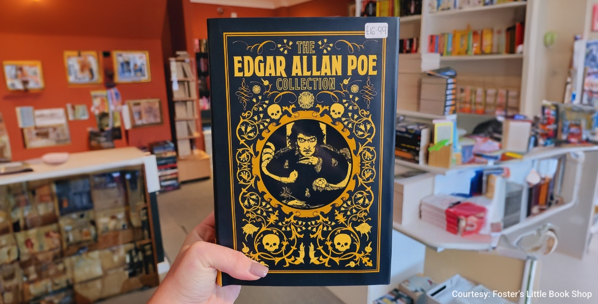
The use of negative space in the covers often brings a mysterious or foreboding atmosphere, with shadows and silhouettes creating imagery that alludes to the dark, psychological depths of Poe's stories, inviting readers into a world of suspense and macabre.
-
"The Kite Runner" by Khaled Hosseini
Employing negative space to depict a kite in the sky not only ties directly to the novel's title but also adds a layer of symbolic meaning, representing themes of redemption, freedom, and the complex nature of friendship and betrayal.
-
"To Kill a Mockingbird" by Harper Lee
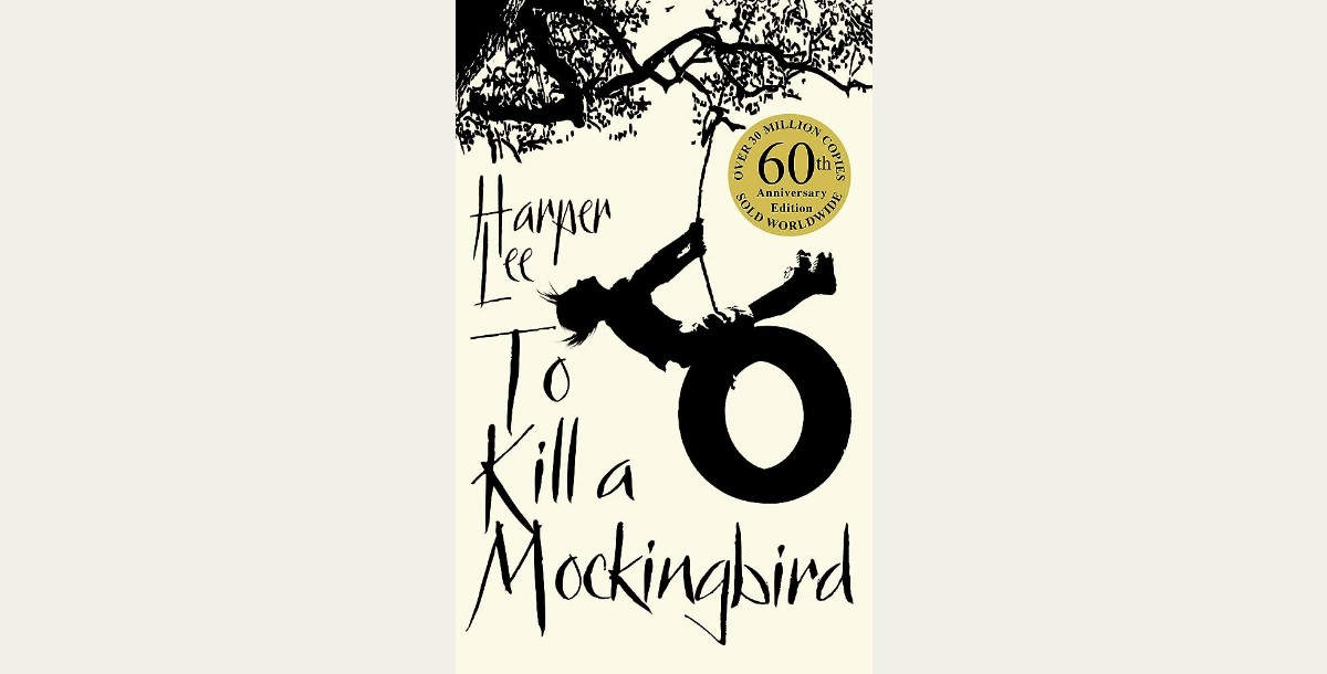
The creative use of negative space in the tree's silhouette often highlights key symbols from the story, such as the mockingbird or the gifts left in the knothole, offering a visual entry point into the novel's exploration of innocence, injustice, and compassion.
-
"Jaws" Movie Poster
The iconic poster masterfully uses negative space to create a sense of impending doom, with the shark's silhouette emerging from the depths towards an unsuspecting swimmer. This design perfectly captures the film's tension and the primal fear of the unknown lurking below the surface.
-
"Mad Men" TV Show Poster
The silhouette of Don Draper looking out the window, crafted from negative space, not only captures the show's aesthetic but also hints at the themes of identity, desire, and disillusionment that run through the series, inviting viewers into the complex world of 1960s advertising.
-
"The Silence of the Lambs" Movie Poster
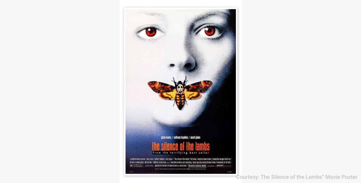
The moth and the skull formed in its body by figures in negative space is a chilling representation of the film's themes of transformation and the hidden horrors of the human psyche. This ingenious use of negative space compels viewers to look closer, mirroring the investigative journey at the heart of the story.
Conclusion
The exploration of negative space in design reveals its undeniable power to add depth, intrigue, and meaning to creative works. From the subtle sophistication of negative space logos to the personal narratives encapsulated in negative space tattoos, these examples serve as a testament to the limitless potential of using space effectively. As designers continue to experiment with what is present and what is absent, negative space remains an essential tool in the quest for visual harmony and conceptual clarity, pushing the boundaries of what design can communicate.
Related Articles
- Top Power BI Integrations for Data-Driven Insights
- Pipedrive vs. Trello- What Tool to Use in 2024?
- How to Become a Successful Entrepreneur?
- Unlock the Secrets of ACV and ARR- Propel Your Business Forward with Smart Strategies
- 13 Most Common Graphic Design Mistakes to Avoid
- 21 Rules for Starting a Poultry Farm Business Plan
- 6 Snapchat Hacks and Pro Tips to Grow Your Business
- How To Create An App For Veterinary Clinic?
- Food Branding Essentials: A Complete Guide
- A Beginner’s Guide to Chatbot Marketing [Benefits and Tips]
Most Popular Posts
- 7 Best Discord Integrations You Should Use
- Elevating Remote Support: Follow the Sun Model – Strategies and Advantages
- Best Pokémon Games Of All Time [2023 Pokémon Games List]
- How to Compile Research and Build a Bibliography in Google Docs Using Google Keep
- Handling Angry Customers: A Guide to Excellence in Customer Service