
10 Best Professional Fonts to Use For Websites

By Abhinav Girdhar | Last Updated on January 22nd, 2024 8:43 am | 4-min read
Making a website has become a critical part of building up your brand in the business community and your customers. Whether we talk about the website development part or the design aspect, each element impacts how your website looks. When it comes to the website’s design, we often talk about the colors, the layout, and brand placement or integration. However, the role of typography or fonts is overlooked most of the time. Website is a content-led platform, where typography plays an important role in how the brand and business are perceived. Hence, the choice of fonts should be at the front and center of your design process.
Introduction
Each font carries a certain value or meaning. While choosing your website fonts, make sure that the value or meaning of your web fonts and your overall brand messaging align well. Good professional fonts don’t just look fabulous but also have certain qualities like readability, user-friendliness, and web safety. Web safety means the ability of the font to look consistently the same across different devices and browsers. Before I begin listing out my favorite professional-looking fonts for websites, I would love it if you were to go through the infographic below for an overview of the topic at hand.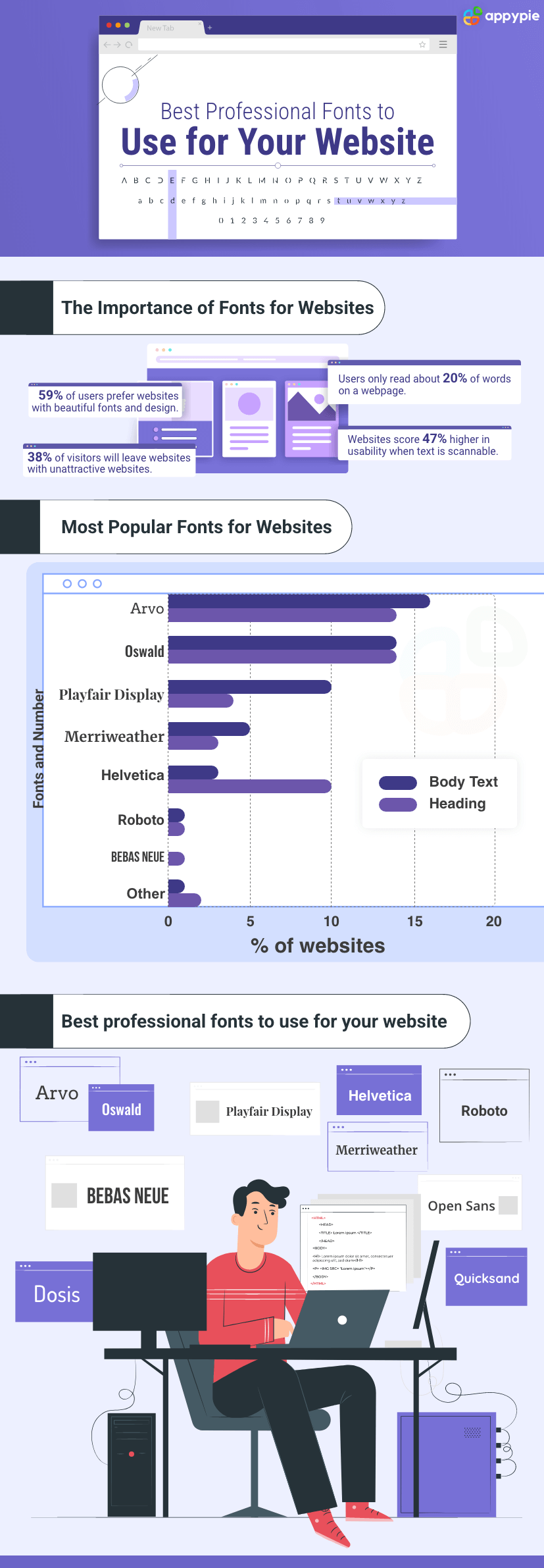
Best professional fonts to use for websites
While discussing professional fonts for websites, we must acknowledge that modern website design has gone through a transformation. Being professional does not mean sticking only to classic or old font designs. Here is a list of my top 10 most professional fonts for website design.- Arvo
- Oswald
- Playfair Display
- Merriweather
- Helvetica
- Roboto
- BEBAS NEUE
- Open Sans
- Quicksand
- Dosis
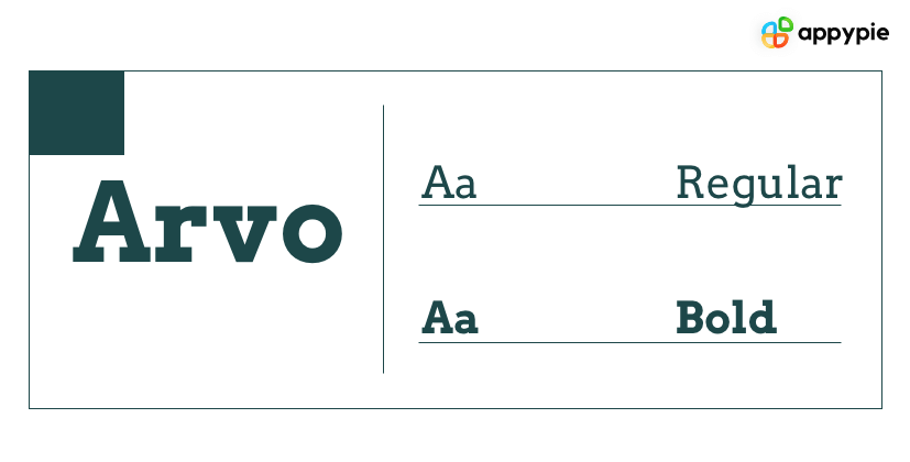 A serif font that is revered for its versatility and readability, Arvo features at the top of my list. The font has four variations - regular, bold, italic, and bold with italic. Depending on the variation you use, the font can look classic to modern. It is rare to find a full slab serif web font family, and Arvo is the closest you can get to satisfy all your font needs for impact and readability. The font is great for body text, headings, and subheadings.
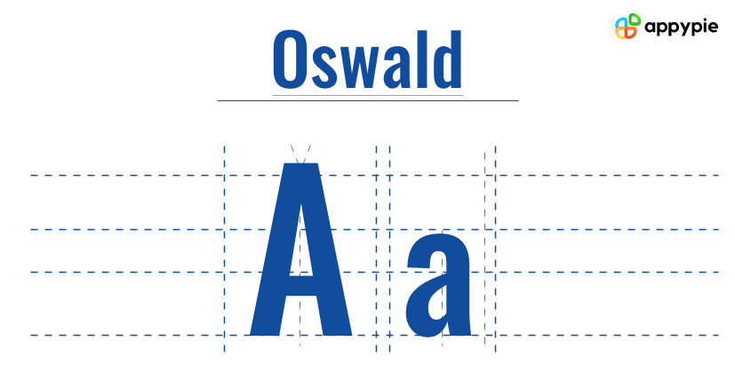 Derived from the 1903 font Alternate Gothic (of YouTube logo fame), Oswald is a modern take on its predecessor that fits today’s digital screen. The font has a legendary ancestry but is appreciated for its no-nonsense look and feel. This look and feel make the font perfect for strong headers and logos. However, I would like to clarify that just because I am calling it no-nonsense, it doesn’t take anything away from the fact that Oswald has character and charm that make the font memorable.
  A serif font with a gentle touch - Playfair Display has a certain non-traditional appeal to it. The font has defined elegance and feminine touch, making it ideal for a website that caters largely to the female demographic. Though Playfair Display comes in italic and bold, the lighter weight is preferred for titles purely due to aesthetics. When the common fonts like Georgia and Times New Roman just won’t do, Playfair Display is the top choice in serif fonts and is considered to be among the best professional fonts to use for websites.
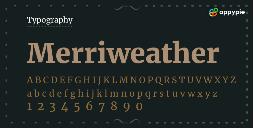 One of my personal favorites, Merriweather, is one of the best web fonts. This modern yet professional-looking font was developed particularly for screens and remains readable even at smaller sizes. Irrespective of whether you use it in regular, bold, or italic variations, the font does not lose sophistication. A great option for brands that take themselves seriously and prefer to be taken seriously. Another font that carries well from heading to subheading to body text.
 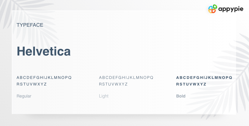 Easily one of the most popular among professional fonts, Helvetica is also the most versatile font design online. It has more than a hundred variations - yes hundred! Though the Helvetica web font has been around since 1957, it never lost its appeal. The reason most certainly is the timeless, universal, modern appeal. Whether you want to write body text, headlines, or subheadlines, Helvetica works.
  Often referred to as neo-grotesque, Roboto is in no way aesthetically grotesque! The name comes from its Gothic origin. This sans-serif font is unique because despite it being a geometric font, there are open curves that add an element of enigma and elegance. This visual fusion brings forth a font design that is a beautiful blend of friendly and professional. The font was designed specifically to help readers achieve a nice reading pace. The naturally wide characters make the font more readable.
 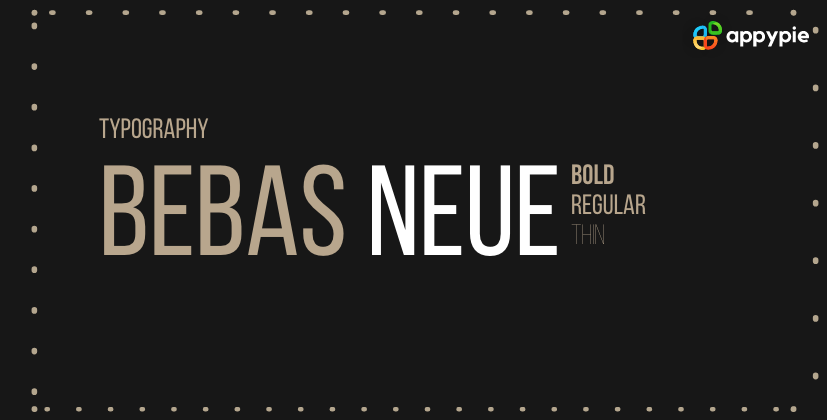 Perfect for those attention-grabbing headlines, Bebas Neue is a sans-serif all caps font. The font has a distinctly futuristic aesthetic appeal, making it great for tech companies. The font works well in combination with a number of other fonts like Montserrat, Lato, Playfair, and more!
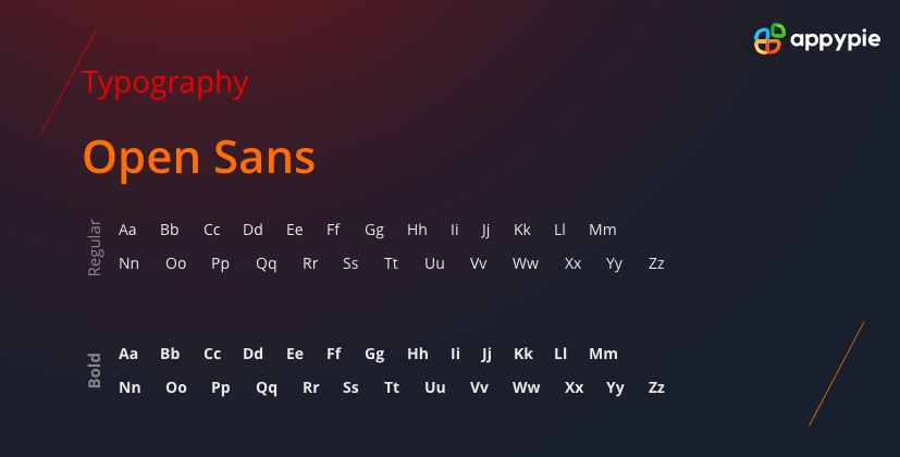 Quite quickly and silently, Open Sans has emerged as one of the most used website fonts. Many established brands chose to go with Open Sans font in an effort to clean up their websites and make the content more readable and friendly or unassuming. Open Sans is known for its excellent legibility due to its strong, neutral, and minimalistic letterforms, and extensive font library. A great way to level up from the default sans serif fonts.
 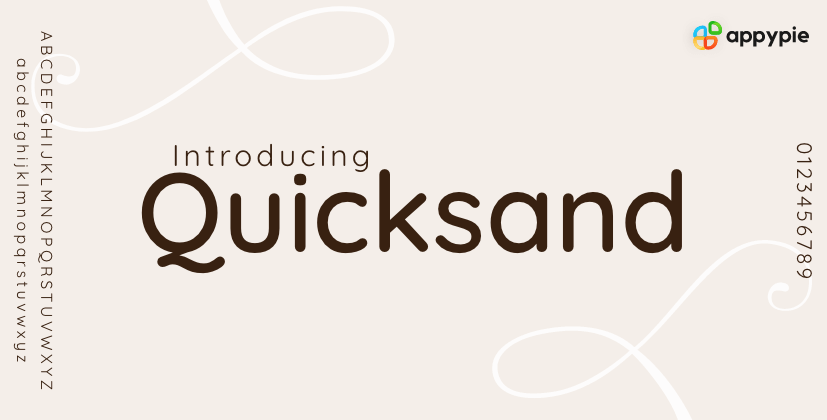 The font comes in a variety of weights. It always looks youthful whether you choose to go with the lightweight small case or bold uppercase. Though this sans-serif font is geometric, its fun and youthful appeal makes it suitable for brands that address the youth or kids.
 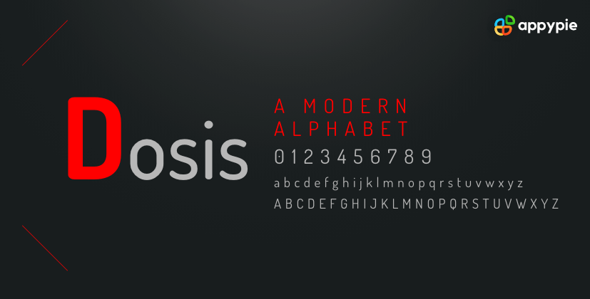 Unique, modern, and clean - that is how you can best define Dosis. The popular sans-serif font has a futuristic look with a sci-fi flavor, making it an excellent option for businesses with an innovative, techie vibe. The font pairs well with similar fonts like Lato or Exo.
 Conclusion
The fonts you choose to use on your website decide the tone of the entire website. Quicksand won’t make sense for a premium real estate website. Similarly, Arvo is not a great font for a youthful brand. The idea is not to choose the best website font or the most professional font but to choose the font that works best for your brand and your website.The list I compiled here is by no means exhaustive. In fact, I would love to see you add more to the list. Why don’t you try out some of these fonts for your website and tell me what you think! Leave a comment below, and I would love to hear from you.
Related Articles
- What is an NFT Drop [Everything to Know About NFT Drops]
- What does it take to Build an Alluring Loyalty Program with MOBILE APPS?
- G-HOP: Generative Hand-Object Prior for Interaction Reconstruction and Grasp Synthesis
- 7 Best Email Clients for Windows – A Curated List
- How to Design Wallpaper On Your Own?
- 10 Best Websites Down Checker Tools for Developers
- The Best Accounting Software in 2023
- How to Use the Google Calendar Appointment Schedule
- 51 Top TikTok Username Ideas for Standout Profiles
- 10 Best Trello Integrations for Efficient Task Management in 2023