
Top Tips for Responsive Website Design

By Abhinav Girdhar | Last Updated on April 14th, 2024 9:58 am | 8-min read
When web design was in its early stages, it was all about making a website perfect for a desktop. But, that era is long gone. Right now, with the advent of mobiles and tablets, there has been a sea change in how web design is approached.
Table of Content
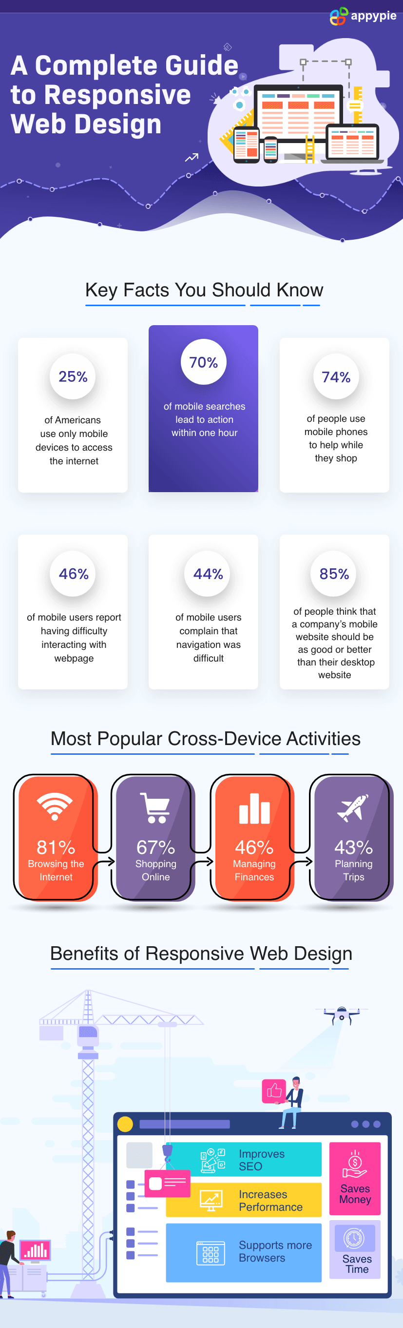 Today the word “responsive” has become an oft-used suffix to web design. A responsive web design allows your code and design to respond to the size of a device’s screen. This facilitates an optimal viewing experience regardless of the device you are using.
Designing a responsive website can be tricky as there are plenty of things to consider. To help you out, we have created a list of some of the best responsive web design tips and tricks.
Today the word “responsive” has become an oft-used suffix to web design. A responsive web design allows your code and design to respond to the size of a device’s screen. This facilitates an optimal viewing experience regardless of the device you are using.
Designing a responsive website can be tricky as there are plenty of things to consider. To help you out, we have created a list of some of the best responsive web design tips and tricks.- Keep the navigation simple
- Focus on smartphones
- Add CTA buttons
- Keep your images mobile-friendly
- Maintain hierarchy of information
- Keep word usage to a minimum
- Get your typography right
- Use keyboard triggers
- Use whitespace effectively
- Test prototypes
The basic idea behind a responsive website is that its design should adapt to the dimensions of smaller screens. You can do this by keeping your navigation minimal. Only include icons and menus that are collapsible and in-page links that make it easier for a user to find what they are looking for.
Another obstacle in responsive web design is sidebars. Smaller screens have limited horizontal space or width, so sidebars affect website dimensions. Ensure that you don’t have sidebars on your website.
Vertical designs where you have long scrolling pages are an important element in responsive web page design.
Remember to include a back-to-top button on your website to make it more user friendly.
To build a responsive website, you need to start with mobile friendliness in your mind. When you focus on responsive web design, the biggest advantage is, if your website looks great on a smartphone, it will look amazing on a desktop too.
So, when you develop content, navigation and graphics, you should aim to design these elements for a smartphone. When you design for a mobile, you will only retain the necessary design elements and automatically avoid clutter.
Moreover, a mobile-friendly design can be quickly adapted to larger screens.
Take a look at Poster Maker from Appy Pie Design.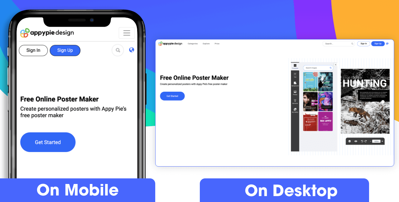 Get Started
Distinctly visible CTA buttons are vital in responsive websites. Their colour and style should make them appear prominent on the webpage.
As far as the shape of the button is concerned, stick to standard shapes like rectangular or circular. Similarly, the size of these buttons should be adequate so that everyone (including people with disabilities) can click on them.
Last but not the least, leave enough space between the button and the corresponding text so that miss-clicks don’t occur.
Have you tried Appy Pie AppMakr to create an app? The responsive design of the platform checks all the boxes! See for yourself here! 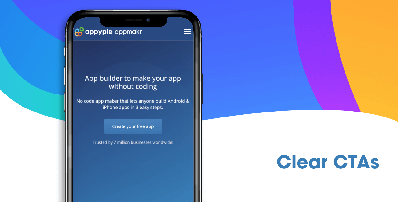 Create your free app
Images are very important to develop an emotional connection with your users. Moreover, images help your audience visualize your products and services better.
So, when you are using images for a responsive website, you need to optimize them. This means ensuring that images are saved in the right format – icons and logos in PNG format whereas images in JPG format.
Moreover, the image size should be adapted to mobile devices. If you are looking for images that you can use in your designs, the rich image library on our Graphic Design software is a great place to start.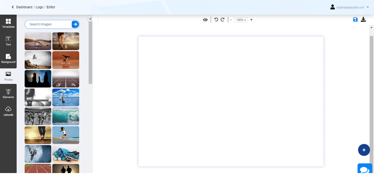 Start creating your design
The layout of your website is extremely important in mobiles. Because the mobile user experience has limited space, you need to keep your content focused. This means a user should easily get your message and clearly comprehend what the website is about.
The layout should be such that when a user reads and moves through your website, there is no confusion about where they are going.
Take a look at the design of the workflow automation platform offered by Appy Pie to understand what we are talking about here.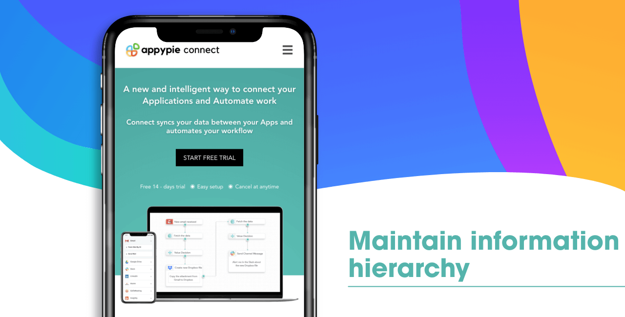 Start free trial
For a desktop website, there is room for a lot of textual content to be added. However, in case of responsive websites, things are different. Here, you need to keep your copy minimal and concise.
Your content needs to be formatted well, with bullet points and other such structuring elements so that your message can be clearly understood by the user, even though it is not wordy.
Quite frankly, a massive wall of text is pretty tiresome to read on a device as small as a mobile phone. No one’s going to read it, even if they wanted to!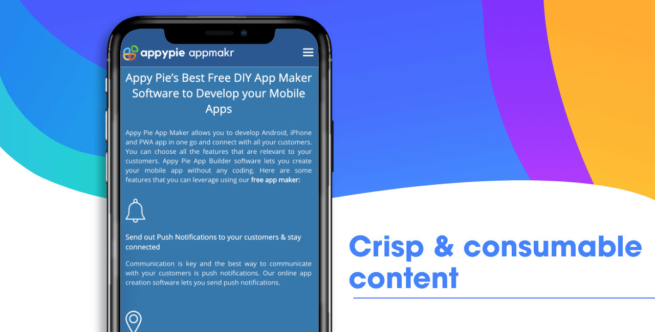 Create your free app
The size and type of font acquire more importance when it comes to mobile screens. A large font size enhances readability to a great degree. For the text in the body, 16px is generally a good size.
The type of font you use has to be legible and easily understandable.
Similarly, the height of your line plays an important role in how users see your text. So, a line spacing of 1.25 to 1.5 tends to work well for most websites. As you move on with the design process, check the text on multiple devices to determine how these factors can be optimized for the perfect presentation of content.
Not everyone is gifted with a keen sense of design, which is why, a design platform like ours is a great option. The platform has multiple templates designed just for your benefit. These templates take care of all your design needs, alleviating your worries.
Responsive web design makes the forms in your website adjust automatically to the size of the screen. You can further take it a step further and use input elements to form fields, this means clicking on the input field will trigger the relevant keyboard layout.
For example, an input field for address will trigger the general ABC keyboard on mobile. However, when the user clicks on a field that requires a numeric value, it will trigger a numeric keyboard.
Keyboard triggers are very convenient for users as it allows them to type faster and better, with fewer errors.
Creating a responsive web design means keeping it minimalistic. But, this shouldn’t come at the cost of leaving out vital information. Use white space to force breaks in your design and highlight important content that you want users to see.
To get a feel of how your website will appear across the device spectrum, you will need to test your design.
You will need to design a functional prototype to understand how your website is working. AT this point, make a note of problems, if any, and then resolve them before taking it live.
Responsive design is the present and future of websites. With the surge in usage of mobiles and tablets in today’ society, it is non-negotiable in the present scenario. Conclusion
The basic need of responsive website design can be demonstrated by the rising adoption of smartphones and the fact that majority of consumers are using them for researching products, exploring options, and for making the final purchase. If you are in the process of designing a website, we recommend you keep its responsiveness in focus, right from the start. Graphics, typography and the layout of your responsive website can easily be accomplished using our easy-to-use design platform. What are you waiting for? Get StartedRelated Articles
- LLMs vs. Traditional Language Models: A Comparative Analysis
- How to Write a Blog Post: A Step-By-Step Guide
- 30 Unique Business Ideas for Beginners
- Top 12 Essential Call Center Skills Every Agent Needs
- How to Repost on Instagram: A Comprehensive Guide for 2024
- Top 10 AI Painting Generator Tools in 2024
- How to Create a Business Proposal Presentation: Key Strategies for Success
- Enhancing Visual Communication: How AI Shapes Graphic Design Trends
- DynamoDB vs MongoDB: Which NoSQL Database is Right for Your Project? [Top Integrations]
- Find 10 Best Podcast Apps & Learn to Build Your Own