22 Call to Action Examples to Help You Get More Clicks


There is an overload of information, ads, services and offers online. However, you don’t sign up for everything you see. There will always be some things that would attract you more and before you know it, you are signed up and committed!
This is simply because of an effective ‘Call to Action’.
A strategically designed and placed call to action button can guide the customers through the buying journey effectively.
What is a ‘Call to Action’?
Before getting into the examples and the need for a Call to Action, let’s try and understand what it actually is.
To put it really simply, a call to action is anything that is aimed at getting the audience to take a certain action. In general, it has come to be associated with online marketing and clickable buttons, but it can be used broadly for even billboards, storefronts and even the flyers you get handed on the street.
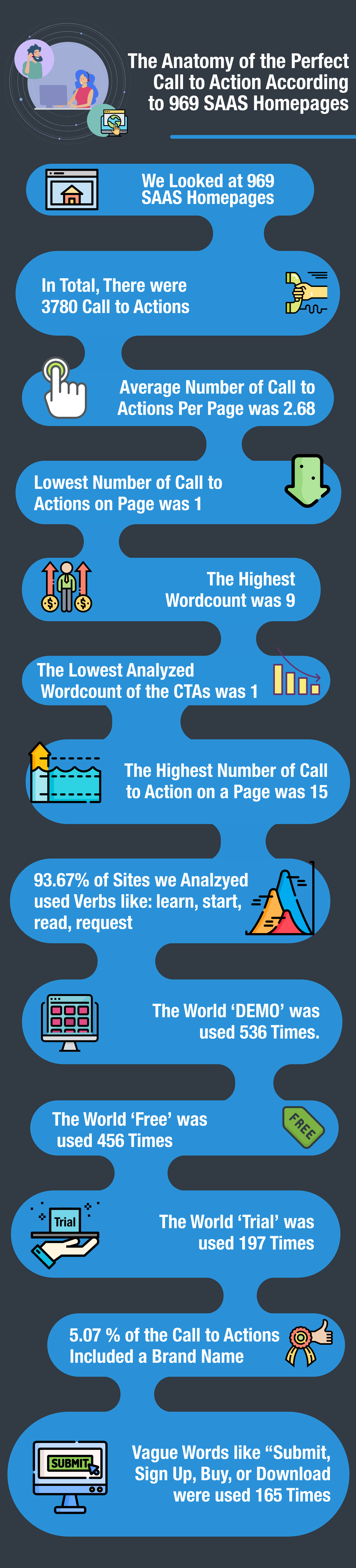
Marketing professionals use CTAs to convert a casual visitor or viewer into a lead. The CTAs can incite a wide range of actions depending on the objective. Here is the infographics that shows the anatomy of the perfect call to action according to 969 SaaS Homepages.
If you have been struggling to get the visitors on your site to do what you want, it may have something to do with your call to action.
Let’s help you get inspired with some brilliant examples of Call to Actions that actually work.
22 Call to Action examples
- Wordstream
- Hotjar
- Netflix
- Campaign Monitor
- Trello
- Amazon
- Dropbox
- Spotify
- Snappa
- Bigstock
- Salesforce
- Dollar Shave Club
- Plated
- Backlinko
- Gravitate
- CrazyEgg
- Cupid
- WWF
- BarkBox
- Huemore
1. Wordstream
The homepage color theme is all blue and that is how they make sure that their CTAs stand out. You see the green colored marker telling you that it has been “UPDATED FOR 2019!” which excites the visitor about finding something that is relevant.

The major CTA is “GET YOUR FREE REPORT TODAY” which is boldly written in all caps on a bright orange button, making it the central point of focus. The copy just below the CTA “Fast.Secure.Free” gives you three strong promises that creates trust in the customers’ minds by addressing three major concerns – time, safety, and money. The copy above the button tells the visitor exactly what they deliver.
2. Hotjar
Their is one of the simplest homepages with crisp focus on the CTAs and no clashes in the design. On a basic simple white background, the only three text points that are highlighted are “understand your users”, and “Try it free” on two different locations. Even among these, there is a clear hierarchy where the phrase “understand your users” is in a bright but subtle shade of blue and it clearly appeals to the target customers of Hotjar.

The main service offered by them is all about user behavior and experience. The prime focus, however, is on the CTA which is “Try it free”. The hot pink color immediately draws the attention of the site visitor and the assurance of trying out the service for free gives them an incentive to click on the link. Both the prominent CTAs on their homepage take you to the same place and are easy to spot on the page. Simple, clean, and effective.
3. Netflix
The example of the Netflix is often quoted and discussed when it comes to the most effective CTAs. The CTA says “TRY 30 DAYS FREE” a massive button in red makes it clear what you need to do next and what you are getting. This is further fortified by the sentence above which adds to the trust by saying “WATCH ANYWHERE. CANCEL AT ANYTIME”.

This indicates great flexibility in using the service and reassures you that you can discontinue at any time and cancel their service. For trials it is natural for the customers to have concerns about the charge or any hidden charges or a big fat surprise on the credit card bill. This simple button and the text above it, allay all those fears easily!
4. Campaign Monitor
The highlighted CTA button on a dark background seems to work really well for the brand and the simple button text that lets you “Sign up for free” has an allure that is tough to resist. What adds to the attraction is the simple subtext below the button that says “Instant signup. No credit card required.”

These simple sentences address two of the biggest causes for friction – time and money. Apart from this, the purple question mark at the bottom right corner reinforces the belief that help is available all the time and easily.
5. Trello
The home page uses the combination of colors in an effective way with a blue background. The crisp and focused copy in white stands out on a blue background and clearly tells you what you can achieve, and the fresh green button tells you exactly what you should do – “Sign Up – It’s Free!” The button is telling you it’s free and the copy is telling you all that you can achieve!

6. Facebook
This one is a little different from everything else that you see around. Their home page is in fact quite a clutter. However, it is this clutter that has helped some of the biggest barriers when it comes to acquiring new users. The home page does not have the typical Get Started or Free Sign Up buttons, it has simply placed one of the most basic forms on their home page for users to fill out and sign up with the social networking giant. There, of course, is an opinion that users may be put off by the form thrown at them as the first thing, but the bottom line is that it is the most effective way to get users to sign up and start using the platform as soon as possible.

The graphic on the left with words ‘connect and share’ message that tells the site visitors that it’s free to use and signing up is pretty easy and simple.
7. Amazon
Amazon’s home page is quite a clutter of elements and frankly it does look a lot more crowded as compared to the other CTA examples we have discussed in the list. This is simply because they have multiple roles to play like a storefront, marketplace, streaming service, tech company etc.
Since there is so much to offer, it is only logical that they add several CTAs if they want to reach out to the widest possible audience.

Hence while the top banner is showing the highlighted offers, you can scroll down to see deals and offers, before you can see everything listed according to categories. Everyone who visits the home page for Amazon will definitely find something that interests them.
The thing is that for Amazon signing users up is not really a high priority. They are, after all a marketplace and their focus is on converting more visits into purchases. This is why most of the prominent CTAs are product based whereas the “Sign in securely” option is pushed to one side and is small.
8. Dropbox
In this case, we are not going to talk about the home page. We are, instead going to talk about the CTAs that are displayed after logging into the app for the first time after a long time. So, let’s say you have (like me) a basic account where they are aware that you have an account registered with them even if you are not using it often.

So, when I logged into Dropbox after months, I saw three CTAs right there on the screen.
Let’s try and figure out what Dropbox may want the users to do so that their three CTAs make sense.
After speculating about the user actions that they want to achieve, this is what I could come up with:
- First, the users sign up
- They explore the primary features
- They collaborate with a group of people while using Dropbox
- They understand and experience the value offered by Dropbox
- They upgrade to the business plan to achieve more

I have been using Dropbox for a while now and have even collaborated with the whole team over it. Hence, these three CTAs on my screen after I login are put in strategically to encourage me to take the next desired action – upgrade to the business plan.
9. Spotify
Yet another example of someone that believes in keeping things simple, Spotify CTA simply focuses on the fact that they have something to offer for free!

Did you know that Spotify has a whopping 27% freemium conversion rate?
When they already have such an impressive success rate, the pressure to push the paid plan right from the start, is of course a lot lesser. This is why, it is logical to pay attention to get as many free plan users as possible and then work on converting them into paid customers.
The energetic orange home page has a fresh and shiny green colored button for their simple CTA “Get Spotify Free” and just above that you can see the one phrase that is soothing to sore eyes “No credit card needed”. They are just doing everything right! This assures the visitor that they are not getting trapped into a financial commitment by opting for the free plan, thus bringing down a huge barrier.
10. Snappa
Well, this one is a graphic design software, so it shouldn’t really be a surprise that they have a brilliantly designed CTA.
Their CTA is perfect in both, the visual design and the copy that goes with it. They have carefully created two primary focus areas, both in bright contrast to the background so that they scream for your attention.

The big, bold copy says “Create online graphics in a snap” and the bright orange button says “Create My Graphic Now”. Both the CTAs clearly and in a concise manner let the user know what exactly they can do with the software and that there is no doubt that they should!
Considering that this is a landing page, there are a couple of lines between the two CTAs that give you a crisp introduction to the tool. This actually further strengthens the CTAs.
11. Bigstock
The CTA on Bigstock’s image search box is a brilliant example of why all CTAs should be given their due importance and not just the ones that encourage an immediate conversion. A great number of similar sites tend to say “Search images” in the search box. Bigstock’s search box says “Find the perfect image…” which is quite encouraging, to say the least.

This CTA tells you that you would find the perfect image for you and not have to settle for anything less than your expectations. The final touch is with the ellipses at the end which makes you feel like the images are right there waiting for you to browse through and all that you need to do is type and click on the magnifying glass right there!
12. Salesforce
This home page has some of the best CTA examples that demonstrate how you can drive users to the right spot on the site. The “TRY FOR FREE” button at the top right is prominent in placement, copy, and the contrasting green color of the button.

Next, you can see exactly how Salesforce can help you and right under it two different buttons “SEE SALESFORCE IN ACTION” and “TRY FOR FREE”. The first button takes you to all the free demo videos and the second one encourages you yet again to go for a free trial. The bright blue and white buttons stand out on the colorful background.
13. Dollar Shave Club
The CTA on Bigstock’s image search box is a brilliant example of why all CTAs should be given their due importance and not just the ones that encourage an immediate conversion. A great number of similar sites tend to say “Search images” in the search box. Bigstock’s search box says “Find the perfect image…” which is quite encouraging, to say the least.

This CTA tells you that you would find the perfect image for you and not have to settle for anything less than your expectations. The final touch is with the ellipses at the end which makes you feel like the images are right there waiting for you to browse through and all that you need to do is type and click on the magnifying glass right there!
14. Plated
The copy above the CTA on the home page is clear and tells the visitors exactly what they are getting with the service. Using phrases like “Everything you need”, “delivered” they are telling you all the benefits upfront.

Combined with the brilliant imagery in the background, the home page gives off a luxurious yet convenient feel for the service. The earthy brown CTA buttons that call you to “Sign Up Now” complement the rustic chic look.
15. Backlinko
The landing page or the home page for Backlinko is all about their CTA, as it is the only dominant feature on the page. There is nothing subtle about what you should do once you land on the page – ‘Sign Up’. The background is a fresh and vibrant green and the copy in bright white tells you exactly what you should expect from them – ‘FREE’ and ‘EXCLUSIVE’ are two words that get visitors’ attention as does the phrase ‘TRAFFIC TIPS’. The visitors are then directed to exactly what they are supposed to do with clear instructions “Enter your email below to get access to my proven SEO and traffic tips”. You are not wondering what will happen once you sign up and what goes where. You know that once you enter the email, you get access to SEO and traffic tips. To top it all up, the bright orange colored CTA button on the vibrant green background makes it the most noticeable element on the page.

Some might argue that the homepage is too simple and that it doesn’t really tell you much. This in fact is what has made people trust Backlinko – the quiet confidence.
16. Gravitate
This web design agency has a unique approach to CTA’s across their primary service pages. The agency uses a case-study CTA slider next to a primary conversion form to elevate social proof and allow the user to dive deeper into the site content if they’re not ready to convert.

17. CrazyEgg
This CTA really stands out on the pale background with a bright blue gradient on top of it, but becomes even more prominent because of the character in the graphics pointing towards it! This makes sure that your attention is drawn to exactly the point where they want it to go.

The copy in the box has some promising stats that go a long way in convincing the user as does the simple language and clear promise of improving your website “Instantly”. The words “Cancel anytime” make sure that the visitor does not have any trepidation about hidden or unpredictable charges when they avail the “30-day FREE trial”.
18. Cupid
The homepage for the dating or matchmaking website cupid.com is quite like Facebook, a simple basic form with a simple “Join Now” CTA at the bottom. This simplicity makes the site visitor feel that finding love is going to be quick and easy, and it can happen just by filling the form up. The happy couple on the left adds to the dream of finding happiness and love with the platform.

The purple colored button stands out on the page and eggs visitors on to join in and find their own match. The simple copy that talks about ‘successful new love episode’ is alluring and reassuring as it has the excitement of something new and the stability of success woven right into it.
19. WWF
The colors used in the CTAs “DONATE” and “ADOPT” go really well with the background image chosen on the landing page for World Wildlife Federation (WWF). This way, the buttons really stand out against the black banner without looking awkward or out of place in any way.

Another smart thing here is that though both the CTA buttons have different variations of the same color so that one does not dominate over the other in any way. This is intentionally done so that you understand that no matter which CTA you click on, both the actions are equally important.
20. BarkBox
2
A smartly designed landing page, BarkBox has two major CTAs on it. Since both are important for them, the CTAs simply mirror each other in color. This means whether you click on “CHOOSE YOUR BARKBOX” or “GIVE A GIFT”, they are equally happy! The color theme is monochromatic, but the puppy with his goodies on the home page make it anything but mundane.

21. Pinterest
When you go to their landing page, you are presented with a couple of options for signing up with them. Sign up via email (you have to fill a form here), sign in with Facebook, or with Google. In spite of the fact that Facebook and Google buttons are below the email sign in, they are way more attractive.

Together they create a block of blue which becomes more noticeable and familiar because of the recognizable logos of Facebook and Google there. They want you to pick one of them, because when you do that, they get a lot more information through those APIs as compared to any data they may get through email.
22. Huemore
The web design agency has a great looking landing page. It has a beautiful background that looks hand painted and a bold concept of getting someone to land on the moon. The background really does attract your attention.

The CTA is really simple and exactly what anybody looking to hire them way want to do first, “VIEW OUR WORK”. The hot pink button does its job really well!
Conclusion
The thing about call to actions is that it doesn’t necessarily have to involve some kind of rocket science, nor does it have to be extremely elaborate. The call to action should be clear, it should be prominently displayed on the home page and must use engaging content or copy.
I hope the examples above gave you an idea about what works the best for your home page and how you can design the perfect CTA to encourage more and more people to click on it and convert.
It is important however to run A/B tests on any new CTAs you apply on your site to figure out what your audience prefers. Clearly, what works in one industry may not work in another and what works for you may not work for anyone else.
A strong CTA can bring about a breath of fresh air to a campaign and the lack on one can lead to a whole campaign falling flat. You can even use a dynamic QR code as the CTA.
The examples above can be a rich resource for you to consult and consider before you come up with your own.
Related Articles
- Crypto, Christmas and Commerce (Podcast 103)
- How to Use Social Media For Social Activism?
- How To Make Money On Cash App?
- Smart Ways To Engage And Retain Mobile App Users
- How to Overcome Challenges in Mobile App Development?
- Why the Education Industry Should Start Leveraging Knowledge Bases?
- 5 Best Meeting Agenda Templates and Examples
- The Death of Traditional Retail (Podcast 102)
- How Slack Improves Workplace Productivity? [Top 10 Slack Integrations]
- What is the Best Time to Launch an App?

Most Popular Posts
 Photoshop Alternatives: Top 10 Graphic Design Tools in 2024
 By Deepak Kumar | July 25, 2024
 Canva vs Appy Pie Design – Which is Better?
 By anupam | July 18, 2024
 Canva Alternatives: Top 15 Graphic Design Tools to Replace Canva in 2024
 By anupam | July 18, 2024
 Canva Review: Key Features, Pros, Cons & Pricing
 By anupam | July 18, 2024
 8 Best ManyChat Alternatives in 2024
 By Samarpit Nasa | July 12, 2024