
Enhancing Web Design without Relying on HTML Space Tags

Creating space within a website's design dramatically impacts readability and overall user experience. However, traditional methods like using html for a space have grown outdated, limited by their inflexibility and inconsistent responsiveness across various devices. This blog aims to introduce more contemporary and efficient methods to create visually appealing and well-spaced designs without relying on the HTML space tag. By leveraging modern CSS capabilities, designers now have at their disposal more efficient and adaptable means to orchestrate space within website layouts, ensuring content is optimally presented on any screen size.
HTML Space: Why It's Obsolete
The practice of using HTML space tags for creating gaps in web content is now considered outdated. The main issue with HTML space tags is their rigidity; they do not adapt well to different screen sizes or user environments. At present, where screen sizes and user environments vary widely, relying solely on HTML space code for layout design can lead to inconsistent and often subpar user experiences. Consequently, designers and developers are turning to CSS for space management, leveraging its capabilities to ensure content is not only visually appealing but also adaptable to any device, thereby rendering HTML space tags largely obsolete. This shift underscores the importance of evolving web design practices to meet modern standards and user expectations.
Create Negative Space as an Object Using div Elements
Creating negative space in web design is a technique that elevates the overall user experience by making content more visually appealing. Using “div” elements to create negative space allows for more control and flexibility than ever before. This approach transcends mere aesthetics, enhancing the functionality and interactivity of a website. By strategically implementing div elements, designers can manipulate the coding for space in HTML, ensuring that each component on the page has the breathing room it needs to stand out. This method is instrumental in guiding user focus and facilitating meaningful interaction with the site's key features, making it a critical aspect of modern web design.
How to Use div Elements
Div elements offer a versatile approach to structuring content and designing layouts. They allow for the grouping of related items, the application of CSS styling for precise control over padding, margin, and background, and the arrangement of content blocks in a responsive manner. Advanced layout techniques, such as CSS Grid or Flexbox, can also be employed within div elements for more dynamic and adaptable spacing solutions.
Here’s how to utilize them effectively:
- Wrap sections of your content in div tags to group related items.
- Apply CSS styling to div elements to control padding, margin, and background, creating intentional negative space.
- Use div containers to flexibly arrange content blocks, allowing for responsive design adjustments.
- Nest div elements for more complex layouts, controlling space at multiple levels.
Create Negative Space Relative to an Object Using a Margin Utility Class
When you’re designing a website, creating the right amount of negative space around different elements can significantly impact its overall appearance and user experience. That’s where margin utility classes come into play. These classes, commonly found in CSS frameworks like Bootstrap or Tailwind CSS, provide a straightforward way to add space around elements.
By adjusting margins efficiently, designers can achieve a more uniform and visually pleasing layout without diving into extensive custom CSS coding. Leveraging these utility classes allows website designer to manage spacing between elements effortlessly, resulting in a more user-friendly and aesthetically appealing website. Plus, it saves time and ensures consistent design throughout the site, giving it a polished and professional look.
How to Use a Margin Utility Class
Margin utility classes, a powerful feature in web design, make it simple to adjust the space around elements without diving deep into complex html code for space. By following a few straightforward steps, you can effectively use these classes to enhance the layout and readability of your site. Whether it's adding extra room around text blocks or images, or fine-tuning the spacing for different devices, margin utility classes offer a versatile solution for creating a more polished and user-friendly website.
Here’s how you can seamlessly integrate them into your design process:
- Determine the specific areas where you need more space, such as around text blocks or images.
- Apply the appropriate margin class to your HTML element, such as mb-4 for a bottom margin in Bootstrap.
- Adjust the class values to increase or decrease spacing as needed, ensuring content breathability.
- Utilize responsive variants of margin classes to adjust spacing based on the viewer’s device.
- Remember that using utility classes for margins can save time and maintain design consistency, making your website more professional and user-friendly.
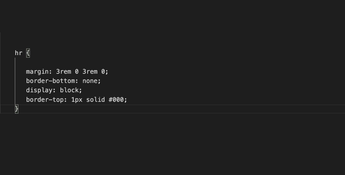
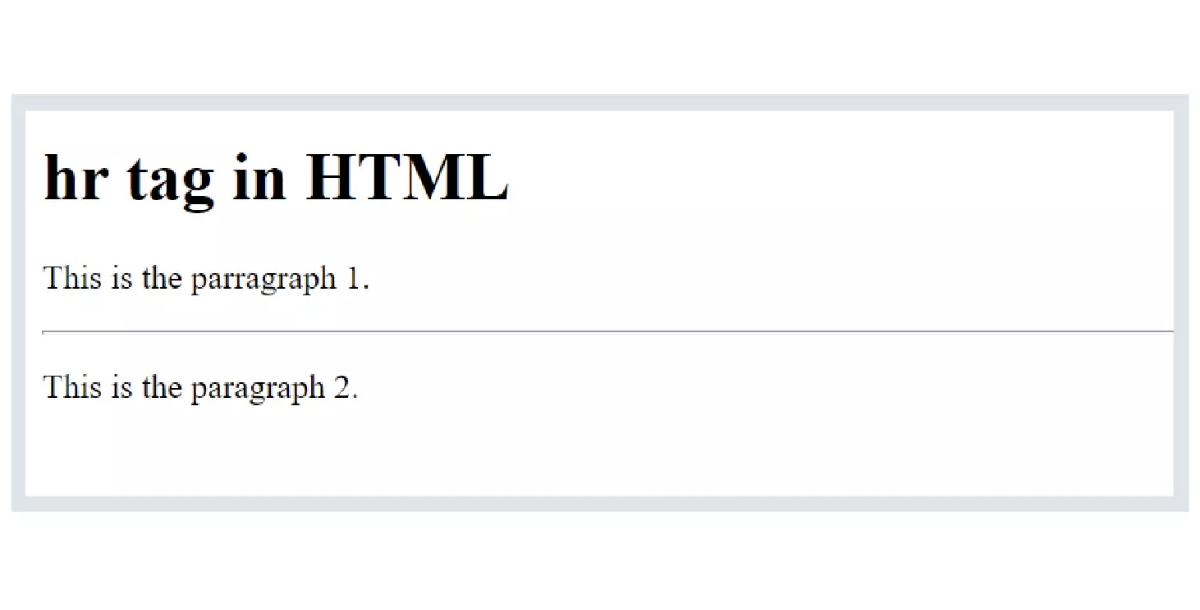
Use Custom Code to Insert an hr Element
The hr element serves as a subtle yet effective way to introduce space and define sections within content. Through custom CSS styling, designers can transform this element beyond its basic function, making it a versatile component in creating visually appealing websites. Incorporating elements like the hr tag into your web pages, especially when hosted on reliable website hosting platforms, ensures that your site not only looks great but also performs seamlessly across all devices.
Key Points:
- The hr element provides a clean and organized way to separate content sections on a webpage.
- Custom CSS styling allows designers to modify the appearance of the hr element, making it a versatile design tool.
- Using the hr element can enhance the overall visual hierarchy and flow of a website's content.
- Combining the hr element with reliable website hosting ensures optimal performance and consistent display across devices.
- Leveraging elements like hr demonstrates attention to detail and a commitment to creating a polished user experience.
Create Space Within Grids
CSS Grid layout offers an effective way to design web pages, providing an efficient framework for constructing complex, adaptable designs. This powerful tool includes a built-in feature for managing spacing, known as grid gaps. By meticulously defining these gaps, designers can achieve a harmonious balance and uniform spacing between individual grid items. This not only boosts the visual appeal of your website but also contributes to its structural integrity and seamless flow.
- Grid gaps eliminate the need for additional wrappers or complex CSS to manage space.
- Easily adjustable for responsive design, ensuring consistency across various devices.
- Enhances readability and user engagement by preventing content from appearing cluttered.
- Facilitates the creation of visually distinct sections within a single layout, improving navigation.
- Simplifies the design process, allowing for more focus on content and functionality.
Be in Control of Your Use of Negative Space
In web design, the strategic use of negative space isn't merely about creating voids; it's a deliberate design decision that enhances both aesthetics and functionality. By manipulating the spaces between and around elements, designers can direct the user's focus, improve content legibility, and craft a coherent visual narrative. This approach isn't just beneficial—it's essential for designing websites that are visually appealing and easy to navigate. Understanding how to master negative space means taking control of how users interact with and perceive your website's content.
Ready to Use Website Layouts on Appy Pie
Are you considering starting an "HTML Basics for Beginners" course to develop a website? Look no further. Appy Pie offers a range of pre-designed website layouts crafted with contemporary spacing principles. These website templates provide an effortless beginning to crafting aesthetically pleasing websites, allowing you to personalize spacing to match your content requirements. So, are you ready to go the non-code way to develop a website?
How to Develop Website Using Appy Pie's Website Builder
Wondering how to create a website without the hassle of coding? Enter Appy Pie's AI HTML website builder, a user-friendly solution for crafting professional-looking websites. This innovative tool streamlines the web development process, allowing you to choose from a variety of templates and easily customize them to fit your needs. Whether you're a beginner or an experienced developer, Appy Pie's intuitive interface and comprehensive features make building a website a breeze.
With Appy Pie's website builder, you can effortlessly adjust spacing and layout to ensure your website looks polished and professional. No need to worry about coding or design skills – Appy Pie's experts have you covered. Simply choose a template, add your content, and let the AI do the rest.
Here are a few simple steps to build your website without coding using Appy Pie’s website builder:
Step 1: Choose Your Website's Name and Theme
Begin by deciding on a name for your website that reflects its purpose. Then, pick a suitable category that aligns with your content and select a color scheme that is visually attractive. This initial step lays the foundation for your website's identity and aesthetic appeal.
Step 2: Integrate Essential Features
Integrate essential features and pages into your website, enhancing user experience and fulfilling objectives without coding expertise. Also personalize your website's design to match your vision, connecting it to a chosen domain name for online presence.
Step 3: Test & Launch
This step involves the final step of launching your website. Begin by thoroughly testing its functionality and performance. Once you're confident in its readiness, proceed to officially launch your website, making it available for public access. By following these steps, and with the guidance of Appy Pie experts, you can create a professional and effective website that showcases your expertise and attracts clients to your business.
Conclusion
In today’s web design, controlling space effectively is more important than ever for creating engaging, easy-to-navigate websites. By moving away from outdated methods like the HTML space tag and embracing modern CSS techniques and tools like Appy Pie’s website builder, designers can achieve precise spacing with greater ease and flexibility. Remember, the key to a successful website lies not just in the content but in how that content is presented. Through thoughtful spacing, your website can stand out in the crowded online world.
Related Articles
- IBM Watson Chatbot: How to Create a Similar Chatbot
- Best Book Layout: 10 Essential Design Principles
- What is a Blog? Definition, Types, Benefits, and Why You Need One
- Halloween Origin & How to Plan a Halloween Party on a Budget
- 27 Creative and Hilarious PowerPoint Presentation Night Ideas
- How to Animate a Logo: A Comprehensive Guide
- The Future of AI in Data Analytics
- Lead Nurturing Mastery: Unveiling Strategies and Statistics for 2024
- The Significance of Pride Month: Advocating for LGBTQ+ Acceptance, Advocacy and Visibility
- How to Integrate Chatbot with Facebook Messenger
Most Popular Posts
- 8 Types of Instagram Posts Every Business Should Upload
- Best Zoho CRM Integrations for Business Growth
- Vendor Management- A Complete Guide
- The Art of Using Chatbots and Customer Service Software [+Call Center Script Samples]
- How to Compile Research and Build a Bibliography in Google Docs Using Google Keep