
Coral Color in Graphic Designing- Timeless or Trendy?

Introduction
Welcome to the world of coral color - a vibrant and versatile hue that is both captivating and energizing. With its blend of pink, orange, and red undertones, coral color is a truly unique shade that can evoke feelings of warmth, passion, and creativity. In the world of graphic designing, coral color is a popular choice for its ability to stand out, make a statement, and convey a sense of playfulness. Whether you're designing for a brand, a website, or a print project, coral color can add a touch of whimsy or sophistication, depending on how it's used. So, let's dive deep into the world of coral color and explore all the possibilities it has to offer!
Table of Content
- Introduction
- The Importance of the Coral Color in the World of Graphic Design
- An In-Depth Guide to Designing Color Schemes using the Coral Color
- The Significance of the Coral Color in the Design World
- The Historical Development of Coral Hue from Ancient Times to the Present
- The Harmony-Boosting Effects of Complementary Colors when paired with Coral Color in Design
- A Guide to Perfecting shades of Coral with HEX Codes Mastery
- Enhance Your Design Skills and Craft Stunning Graphics with Appy Pie's AI Image Color Picker
- Conclusion
The Importance of the Coral Color in the World of Graphic Design
Coral color is a vibrant and energetic hue that has captured the attention of graphic designers worldwide. Its unique blend of pink, orange, and red tones makes it a versatile color that can convey a range of emotions and messages. In the world of graphic design, coral color is often used to create a sense of playfulness and warmth. It can add a touch of whimsy to a design or convey a sense of creativity and passion.
One of the key benefits of using coral color in graphic design is its ability to stand out. It's a color that demands attention and can make a design pop. Whether you're designing a logo, a website, or a print project, coral color can help your work stand out from the crowd.
Coral color is also a popular choice for branding and marketing materials. It's a color that can evoke feelings of excitement, energy, and enthusiasm - all qualities that are highly desirable in the world of business. Whether you're creating a brochure, a banner ad, or a social media post, coral color can help your message resonate with your target audience.


An In-Depth Guide to Designing Color Schemes using the Coral Color
Designing color schemes can be a daunting task, but with the right approach, it can also be an incredibly rewarding one. If you're looking to create a color scheme that is both eye-catching and versatile, you might want to consider using coral color as a starting point.
Coral color is a warm and inviting hue that is often associated with playfulness, creativity, and passion. It's a color that can be both bold and understated, depending on how it's used, making it an excellent choice for designing color schemes.
To create a color scheme using coral color, start by selecting a range of colors that complement it. For example, you might pair coral with shades of blue or green to create a refreshing and calming effect. Alternatively, you could combine coral with deeper shades of red or orange to create a more vibrant and energetic feel.
When designing a color scheme, it's important to think about the context in which it will be used. Consider the medium you'll be designing for, as well as the message you want to convey. Whether you're creating a website, a logo, or a print project, your color scheme should be tailored to suit the needs of your audience.
The Significance of the Coral Color in the Design World
Coral color is a beautiful and captivating hue that has gained popularity in the design world over recent years. Its unique blend of pink, orange, and red tones makes it a versatile color that can convey a range of emotions and messages. In the world of design, coral color is often used to create a sense of playfulness and warmth. It can add a touch of whimsy to a design or convey a sense of creativity and passion.
One of the key benefits of using coral color in design is its ability to stand out. It's a color that demands attention and can make a design pop. Whether you're designing a product, packaging, or branding materials, coral color can help your work stand out from the competition.
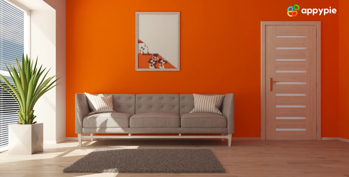
Coral color is also a popular choice for interior design. It's a color that can evoke feelings of relaxation, joy, and happiness, making it an excellent choice for spaces like bedrooms, living rooms, and bathrooms.
The Historical Development of Coral Hue from Ancient Times to the Present
Coral color has a rich and fascinating history that dates back to ancient times. In ancient Egypt, coral was often used as a decorative element in jewelry, textiles, and architecture. The Greeks and Romans also admired coral and used it in a variety of decorative arts.
During the Renaissance, coral became a popular color in art and design. It was often used in paintings to create a sense of warmth and vitality. The Baroque and Rococo periods also saw the use of coral color in ornate and elaborate designs.
In the 20th century, coral color continued to evolve and gain popularity. It was used in Art Deco design, as well as in the vibrant colors of the 1960s and 70s. Today, coral color remains a popular choice in design, from fashion to interiors to graphic design.
In addition to its aesthetic appeal, coral color also holds symbolic meaning in many cultures. In some traditions, coral is believed to have healing properties, while in others, it is associated with fertility and protection.
The Harmony-Boosting Effects of Complementary Colors when paired with Coral Color in Design

Pairing complementary colors with coral hue is an excellent way to create design harmony and balance. Complementary colors are colors that are opposite each other on the color wheel. When used together, they create a dynamic and visually pleasing effect.
One of the most common complementary color pairings with coral color is blue. The coolness of the blue hue helps balance out the warmth of the coral color, creating a harmonious and balanced design. Other complementary color pairings that work well with coral include green, purple, and yellow.
When working with complementary colors, it's important to use them in the right proportions. Too much of one color can overwhelm the other, creating an unbalanced design. A good rule of thumb is to use the complementary color as an accent, rather than the main color.
Coral color also pairs well with analogous colors, which are colors that are adjacent to it on the color wheel. This creates a more subtle and cohesive color palette that still has a sense of harmony.
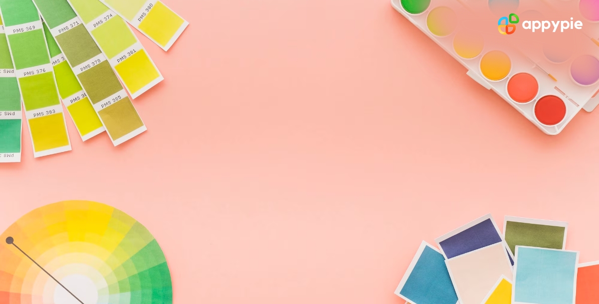
A Guide to Perfecting shades of Coral with HEX Codes Mastery
If you're looking to perfect the shades of coral color in your design work, a HEX code guide is an invaluable tool. HEX codes are six-digit codes that represent specific colors in the RGB (red, green, blue) color model. Here is a guide to perfecting shades of coral color with HEX code mastery:
- Understand the basics of HEX codes
- Use online color pickers
- Experiment with saturation and brightness
- Combine coral with other colors
Each digit in a HEX code represents a different level of color intensity. The first two digits represent the amount of red, the second two represent the amount of green, and the last two represent the amount of blue.
There are many online tools available that allow you to select a color and get its corresponding HEX code. This is a quick and easy way to find the perfect shade of coral for your design.
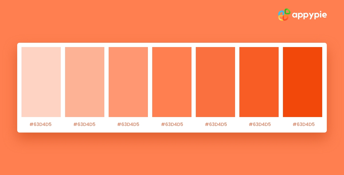
Using different levels of saturation and brightness can create a range of coral shades, from soft pastels to vibrant oranges.
As mentioned earlier, complementary colors can help enhance the beauty of coral color. You can use HEX codes to find the perfect complementary or analogous colors to pair with coral.
Some HEX codes to get you started on your quest to perfect coral hues:
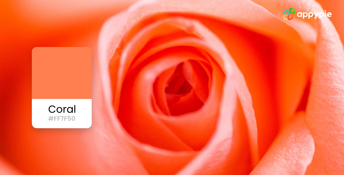
- #FF7F50: This is a vibrant and warm coral shade, perfect for creating a bold and eye-catching design.
- #F08080: This shade is a softer, pastel coral, great for creating a more subtle and sophisticated look.
- #FA8072: This shade falls somewhere in between the two previous shades, with a warm yet subdued feel.
Enhance Your Design Skills and Craft Stunning Graphics with Appy Pie's AI Image Color Picker
Designing visually appealing graphics can be a daunting task, especially if you're not familiar with color theory. However, with Appy Pie's AI Image Color Picker, enhancing your design skills and creating gorgeous graphics has never been easier. Here's a step-by-step guide to using Appy Pie's AI Image Color Picker tool to create stunning graphics:
- Choose an Image:Either choose an image from your computer or enter an image URL, and the image will be uploaded to the screen.
- Pick a Color:You can now pick any color on this image using your mouse pointer.
- Analyze Color Codes:Once you choose the color, you will have HEX, RGB, HSL, and CMYK codes for the color displayed on your screen.
- Preview Your Color Palette:As you scroll down, you will also get an entire palette curated for you directly from the image!
- Save and Export Your Design:Save and export your design - Finally, save your color palette and use it in your design. Appy Pie's AI Image Color Picker tool allows you to export your color palette as a PNG or SVG file, making it easy to use in your design software of choice.
With Appy Pie's AI Image Color Picker tool, enhancing your design skills and creating stunning graphics has never been easier. By following these simple steps, you can create a visually appealing color palette that will take your designs to the next level.
Conclusion
Coral color is a versatile and vibrant hue that has a long and rich history in the world of design. With its warm and energetic feel, it can add depth and dimension to any design work. By understanding the significance of coral color, its historical development, and how to create complementary color schemes, you can master the art of using coral in your graphic designs. The use of HEX codes and color wheel tools can further enhance your design abilities and help you create attention-grabbing graphics. So, next time you're looking for a color that is both bold and beautiful, consider using coral to add that extra punch to your design work.
Related Articles
- Major Todoist Integrations for Effective Task Management
- Architecture and Components of Large Language Models (LLMs)
- How to use a color wheel?
- From Words to Motion: Unveiling the Premier AI Text-to-Video Tools of Today
- What are Ethics and Bias in LLMs?
- 10 Best SugarCRM integrations for Content Management
- 21 Best Facebook Page Design Hacks to Boost Audience Engagement
- 11 Effective Reasons Businesses Need to Prioritize Customer Service
- Build Your Free Website AI Chatbot: It’s Easier Than You Think!
- 5 Best Payroll Software for Small Businesses