The History of Google’s Logo

By Abhinav Girdhar | Last Updated on August 14th, 2023 8:43 am | 4-min read
Table of Content
Starting with Backrub
Google’s original name was Backrub. While the name itself is weird, it was chosen because the main function of the website was to search through Internet backlinks and display the results. By 1997, they decided to change the name to something a little less sensual. No offense, back rubs are great, just not when you’re about to create a multi-billion-dollar brand that will literally run and indirectly control everything on the Internet. And what followed was one of the most iconic spelling mistakes of all time.Googol much?
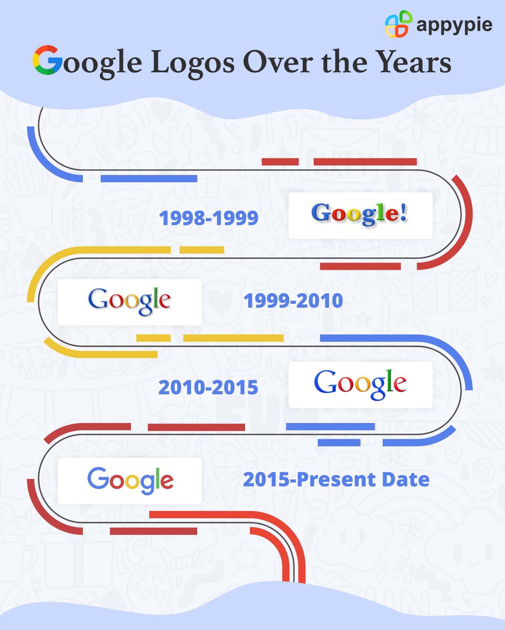
Googol. Let me tell you what a Googol is. A Googol is equal to 10 raised to the power 100. In other words, it is a 10 with 100 zeros. The name Googol was considered for Google, but it was later misspelled as Google. The philosophy behind naming it after Googol was that searching on Google would give you large quantities or ‘Googols’ of results.The First Google Logo (1998-1999)
Once both founders settled on a name, the next thing to do was to decide on a logo. After fiddling about a little, they settled on their first logo. There is some speculation on who designed this logo, but this design wasn’t the most polished.The Second Google Logo (1999-2015)
The second logo for Google was designed by Ruth Kedar. Both Page and Brin did not like the logo they had designed so they hired Kedar to design Google’s logo for them. She experimented around before settling on the rainbow-colored logo that Google used as its logo for the next decade.Third Google Logo (2015-Present)
The present Google logo was conceptualized and adopted in 2015 at a New York design sprint that Google organized. Along with the logo for the website, Google adopted a logo for its various software and an all-encompassing logo to represent them. The G follows the color scheme set by the search engine but is meant to represent the entire company.Google Doodles
Google Doodles are very popular. While Google hasn’t messed around with its logo too much, it has given temporary logos to commemorate events and iconic people. Google Doodles are regular features that help Google remain extremely popular among people.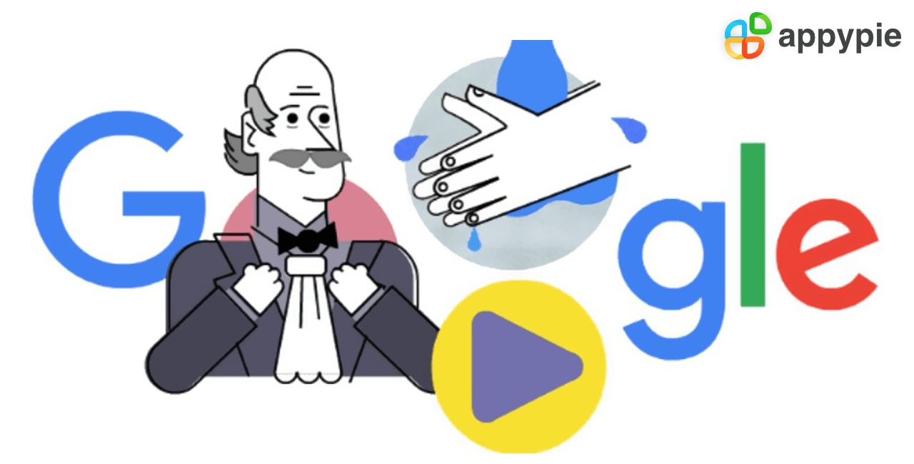 Doodles are often intricate GIFs or animated text. However, when Google started this tradition, that didn’t use to be the case. The original Google doodles go back as far as 2000. There have been over 4000 Google Doodles in the past 20 years. Google Doodles are headed by a separate team of designers at Google known as Doodlers. Doodles remain popular and Google routinely holds “Doodle 4 Google” competitions in many countries.
How the Logos Describe Google’s Philosophy
Google’s logo has somehow described its company philosophy and policy over the years. The first Google logo emulated Yahoo! because Google began as a company replicating the search engine model of Yahoo! search albeit in a different vein. Where Yahoo! searched through its own database Google differed slightly by using backlinks to search for pages on the web. However, Google soon started shifting away from this. The second Google Logo conceptualizes Google’s philosophy well. With bright colors and trendy design in its time, Google evolved into one of the most successful startups of all time. It was ahead of its time but still rooted in simplicity. That is what the second iconic logo conveyed. The Doodles Google uploaded conveyed that it was still ‘human’. The logo’s facelift with the discontinuation of the shadow and the change of yellow signified the coming of a transition for Google. It was slightly more ‘formal’ yet retained its fun and trendy side. The logo of 2015 is a different story. The modern Google logo no longer has the ‘fun’ in it. It is flat, bold, minimalistic and signifies a new era for Google. Google is now a serious business, with serious influence. The logo is now mature and focused. It is bolder, signifying Google’s approach to the future and to the middle phase of the Internet era.Conclusion
The history of the Google logo is a beautiful one. While one may not agree with some of Google’s policies or like the way Google has transitioned over the years, the fact remains that it is one of the harbingers of the era. It is both for users and for businesses. Coming to businesses, are you looking to improve your marketing prowess? Well, I do have something for you. Go to Appy Pie’s Academy and learn marketing strategies through our specialized courses. And guess what? It is free! Good Luck!Related Articles
- ShipHike – A Mobile App that Lets Your Packages Hitch-Hike. Is This the Beginning of the End for Personal Delivery Giants?
- 10 Best Employee Onboarding Software in 2024
- Best School Websites (+ How to Make Your Own)
- How to Create a HubSpot Chatbot?
- Create Passport Size Photos Online: A Complete Guide By Countries
- 15 Ways to Attract More Clients to Your Wedding Business
- 16 Ways To Increase Your iPhone App Ranking
- Why Apple Mail is the Go-To Email Client for iPhone and Mac Users
- What is Brainstorming: Techniques for Effective Problem Solving
- Key Ad Design Tips to Help Your Brand Make Good Advertisements