
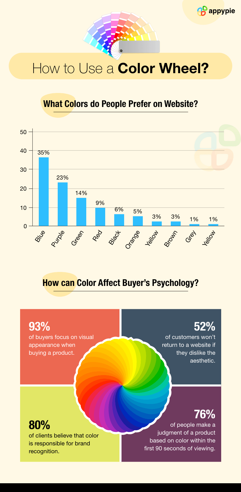
How to use a color wheel?

By Abhinav Girdhar | Last Updated on September 7th, 2022 10:22 am | 5-min read
There is a reason we don’t see the world in black and white- Celerie Kemble
Table of Contents
Think about the brand’s logo-golden “M” on the red background. You might immediately recall the famous brand, McDonald’s. Now the next one, think of the envelope having the white-yellow text written over a green background. Yeah! You are correct, we are talking about Subway. Did you notice how your mind instantly relates color combinations with their respective brands? That’s why experts advocate that color coordination is necessary for the marketing of any brand. In this digital era, it has become a necessity for every business to create their website and app, frequently post images on social media, publish event-based posters and brochures, etc., to promote their brand online. Every UI, image, or graphic designed for the promotion needs to be perfectly color-coordinated for attracting the audience. They should be visually appealing to create a better recall value or to leave a long-lasting imprint. In this blog, we are going to discuss an amazing tool - the Color Wheel. A color wheel can be your one-stop solution to develop a number of color schemes for marketing your brand. Also, we will explain how to use a color wheel effectively for all your design needs. Before proceeding ahead, let us understand the importance of the color wheel.
What is the Color Wheel?
Colors can make everything look beautiful. But mis coordinated combination can also ruin everything! Not everyone finds it easy to develop a perfect color combination for all their designs. So, if you are one of them or searching for the solution to develop color schemes catering to your brand’s needs then Color Wheel is meant for you.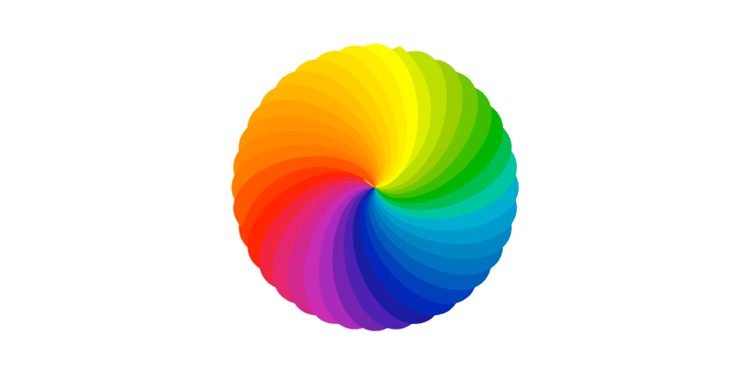 The color wheel was developed by Sir Issac Newton in 1666 which soon became the basis for all the color theories. A color wheel is a visual demonstration of the relationship between basic colors. It is the diagram of the wheel divided into a spectrum of 12 basic colors. It is a practical combination of art and science that is used to determine the colors that look good together in a color palette.
Technically, a color wheel consists of primary, secondary, and tertiary colors. Let us understand in detail.
The color wheel was developed by Sir Issac Newton in 1666 which soon became the basis for all the color theories. A color wheel is a visual demonstration of the relationship between basic colors. It is the diagram of the wheel divided into a spectrum of 12 basic colors. It is a practical combination of art and science that is used to determine the colors that look good together in a color palette.
Technically, a color wheel consists of primary, secondary, and tertiary colors. Let us understand in detail.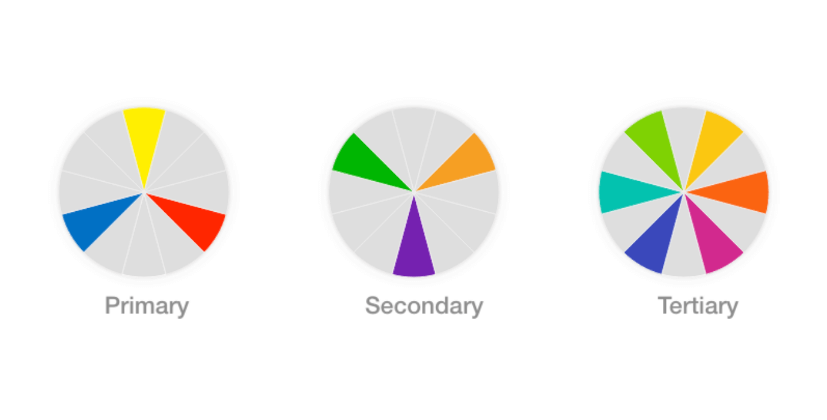
- Primary Colors: Red, Yellow, Blue
- Secondary Colors: Green, Orange, Violet
- Tertiary Colors (Intermediate Colors)
Primary colors are pure, i.e., these colors can’t be created by mixing other colors. Also, all other colors can be created from them. These colors are bright and vivid to the human eye. They are usually deployed to catch the viewer’s attention.
Secondary colors are made by combining two primary colors. For instance, red and blue combine to make violet. In the simple color wheel, each secondary color lies between two primary colors. These colors are basically used to complement primary colors and to show the basic contrast in any design.
Tertiary colors are made by mixing a primary color with secondary color next to it on the color wheel and found between primary and secondary colors on the wheel. They are completely distinct hues and not the shades or tints of other colors. Using tertiary colors judiciously in your designs can make them more vivid and unique.How to Use a Color Wheel?
When you design any graphic, the most common concern is to decide the best color combination that can perfectly cater to your needs. A color wheel can help you in choosing the most appropriate combinations. Even if you don’t consider yourself an artistic person, with the help of a basic color wheel you can become a color expert. Let us understand in detail how you can use a color wheel.- Complementary Colors
- Analogous Colors
- Triadic Colors
- Tetradic Colors
- Monochromatic Colors
Complementary colors appear on opposite sides of the color wheel. For instance, blue and orange, purple and yellow, etc. You can use this type of color combination to offset the main color. Complementary colors work together brilliantly as they balance each other visually. They kind of intensify each other and brings vividity to design. By experimenting with several shades and tints of this complementary color wheel, you can find the color schemes that suit your business needs. 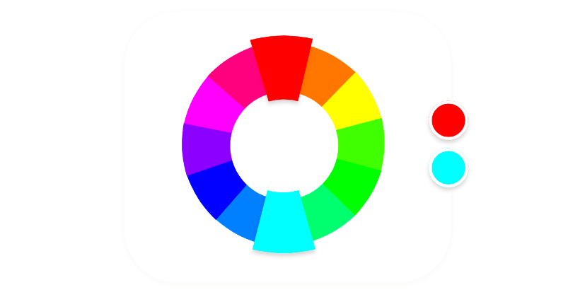
Analogous colors are adjacent colors to the one that you choose. For instance, analogous colors for yellow would be green and orange. You can use this color combination to create a dramatic effect in your design. Analogous colors work well for a bit of more contrasting but a relaxing feel. By choosing one color as a dominant one and the other two as accents with it, you can create an amazing effect to your design. This color wheel chart works well when you want to transmit a sense of knowledge with a tinge of excitement with your graphic. 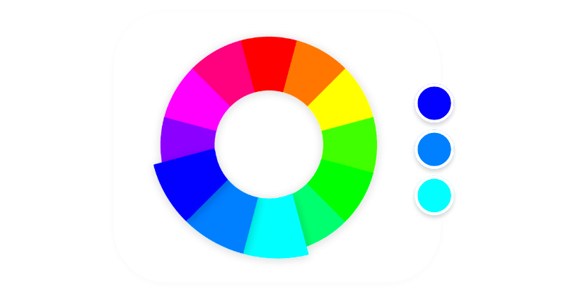
The triadic colors palette consists of three different colors of the color wheel. For making the perfect combination, you just need to choose one color and then draw an equilateral triangle on the color wheel to find the other two colors. For instance, violet, orange, and green make the triadic combination. Triadic colors work harmoniously but to give a little more vibrant effect. A triad creates an adventurous palette of vividly contrasting and balanced cool and warm colors. Triad of primary colors create a vibrant and lively effect; secondary colors create a neutral effect and tertiary colors create a muddy effect. 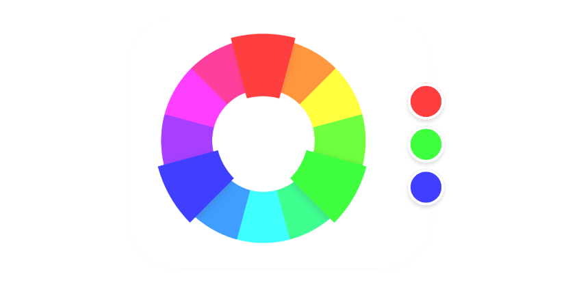
The tetradic color scheme consists of four evenly separated colors in a color wheel. Basically, it consists of two pairs of complementary colors. This color combination is difficult to balance but it definitely creates one of the boldest color schemes. By taking care of over-saturation, balancing the shades, tones, and tints, you can create a visually appealing effect with tetradic colors. You just need to be highly careful while using this color palette as the entire mood or feel can be changed by just a single color in it. 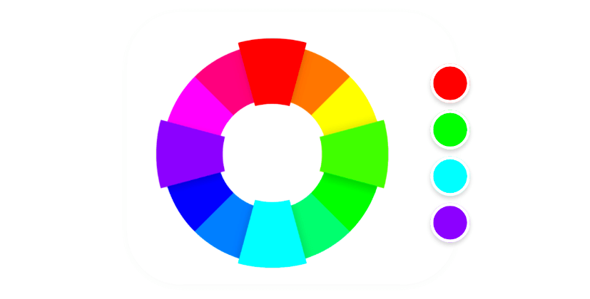
Mono means “single” so a monochromatic color scheme consists of different variations (shades and tints) of a single color. You can create the serene and relaxing mood of your graphics by setting up the tone of light colors while make your graphic vivid and adventurous by selecting the shades of dark color. The monochromatic color scheme seems easy to understand but it is highly tricky to pull off. You can choose this color palette to give a deep and nuanced feel to your graphics. 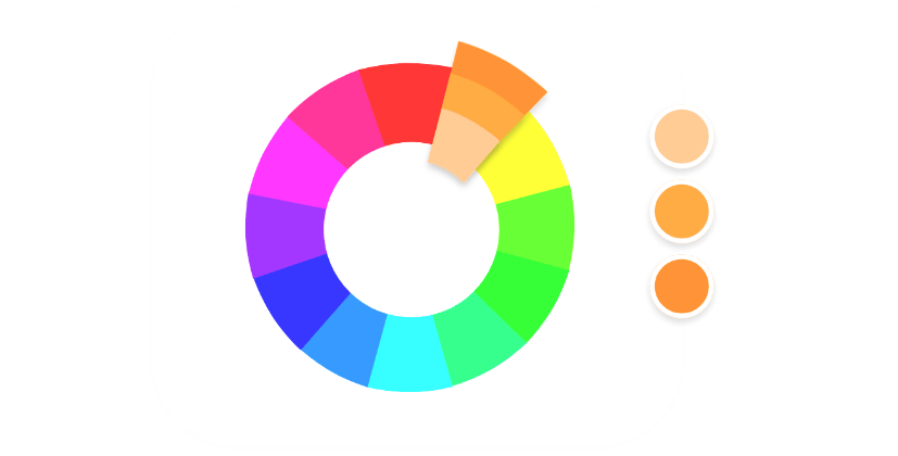
Summing Up
Choosing the right color palette does not always require creative skills. You can create your own color palette by understanding the psychology behind colors and learning the different combinations. Most importantly, by experimenting with different colors, you can produce different feels and expressions in your graphics. Also, you can take the help of various tools available online like that color wheel, to find different combinations and make a color palette to cater to your business needs. Make sure whatever you choose, you love it!Related Articles
- Proximity in Design: Understanding its Importance and Applications
- How to Make a Moodboard? A Step-by-Step Guide
- 11 Best Shopify Designers to Hire in 2024
- Best 10 Asana Integrations To Boost Productivity
- 15 Best Portfolio Websites in 2023
- Tiffany Blue Color: Exploring Shades, Symbolism, and Hex Codes
- How to Get Karma on Reddit?
- How to Make a Reel on Instagram: A Step-by-Step Guide
- Why Religious Organization Need Their Own Mobile Apps?
- Celadon Color: Understanding Its Shades, Combinations, and HEX Codes