
History of Orange Color in Graphic Design: 25 Best Colors that go with Orange Color

Table of Content
- Introduction
- Definition of orange color in Graphic Design
- What Colors Make Orange?
- Importance of Orange Color in Design
- A Brief History of Orange Color: From Ancient Art to Modern Design
- How orange color can be used to create a sense of warmth and energy in designs?
- Best Colors That Go With Orange
- Different shades of Orange color with HEX Code
- 25 Color Combinations featuring Orange for Graphic Design
- Create Stunning Graphic Designs with Appy Pie's Color Wheel tool
- Conclusion
Introduction
This blog explores the rich history of the orange color in graphic design and how it has been used to convey different emotions and messages over time. It also highlights 25 of the best colors that go with orange and how they can be used to create impactful designs. By understanding the psychology and historical significance of orange, designers can create more effective and visually appealing designs that resonate with their audience.
Definition of orange color in Graphic Design
Orange is a vibrant and energetic color that is often used in graphic design to convey warmth, enthusiasm, and creativity. In the world of design, amber color is a versatile keyword that can be used as the dominant color in a design or as an accent color to add interest and pop to a composition. It can be used to create a bold and eye-catching look or a more subdued and sophisticated design depending on the shade of orange used and how it is combined with other colors such as Lavender color, Blue Green color etc. The meaning and emotional impact of bright Orange color in graphic design can vary depending on cultural and contextual factors, but it is generally associated with positivity, vitality, and fun.
What Colors Make Orange?
Orange is a secondary color that is made by mixing colors of equal parts of red and yellow. The color red is a primary color, while yellow is also a primary color. When these two primary colors are mixed together, they create a secondary color that is orange. It's worth noting that the specific shades of red and yellow used in the mixing process can affect the resulting shade of orange.
For example, mixing a warmer shade of red with a brighter shade of yellow may result in a more vibrant and bold shade of orange, while mixing a cooler shade of red with a muted shade of yellow may result in a more subdued and earthy shade of orange.
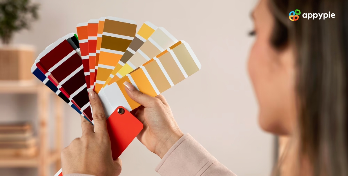
Importance of Orange Color in Design
Orange color plays an important role in design, from branding to visual communication. It is a color that radiates warmth, energy, and creativity, making it a popular choice in design. The significance of orange lies in its ability to capture attention, evoke emotion, and convey a sense of playfulness and optimism. In design, the use of orange can help to create a welcoming and engaging environment that inspires action and promotes a positive brand image. Also, By leveraging the psychology of color, designers can effectively use the Image Color Picker to harness the power of orange's association with happiness, enthusiasm, and excitement, strategically applying it in marketing and design projects to create impactful experiences for their audiences.
In Branding: Orange is often used to create a playful and approachable image, as it conveys a sense of fun and optimism. Examples of brands that use orange in their branding include Nickelodeon, Fanta, and Amazon.
Web Design: Orange can be used to draw attention to specific areas of a website or to create a sense of urgency, as it is a high-contrast color that stands out on digital screens. It can also be used to create a sense of warmth and friendliness, as seen on websites like Etsy and Mozilla.
Packaging Design: Orange is often used to create a sense of energy and excitement around a product, as it is a color that is associated with freshness and vitality. Examples of products that use orange packaging include Orangina and Orange Crush.
Interior Design: Orange color and bright yellow color, both can be used to create a welcoming and inviting environment in interior design, as these colors are associated with warmth and hospitality. They can also be used to create a bold and modern look, injecting a sense of vivacity and freshness to a space, as seen in the interior design of restaurants like Haidilao.
Fashion Design: Orange can be used to create a statement piece that stands out from the crowd, or as an accent color to add interest and depth to a design. It can also be used to create a sense of playfulness and youthfulness, as seen in designs by brands like Gucci and Kenzo.


A Brief History of Orange Color: From Ancient Art to Modern Design
Orange is a color that has been used in art and design for thousands of years. In ancient Egypt, orange was associated with the sun god, Ra, and was used in wall paintings and hieroglyphics. The Greeks and Romans also used orange in their art, often as a background color in mosaic floors and wall frescoes. During the Renaissance, orange became more popular, and artists such as Titian and Veronese used it in their paintings. In the 19th century, orange became a fashionable color, especially in the arts and crafts movement, and it was also used extensively in the Art Nouveau and Art Deco periods.
Today, orange is a versatile color used in many different types of design, from fashion and advertising to interior design and branding.
In addition to its use in art and design, orange has also been used symbolically throughout history. In Hinduism, orange represents purity and spiritualism, while in Buddhism it is associated with illumination and the highest state of enlightenment. Similarly, the warm and rich chocolate color can be associated with comfort and indulgence, evoking feelings of coziness and pleasure. In Western culture, orange has been used to represent warmth, energy, and enthusiasm, as well as danger and warning (such as in traffic signs and construction zones). With its long and varied history, orange, along with the comforting chocolate color, remains a popular combination that continues to inspire and influence artists, designers, and thinkers today.
Use of orange color in ancient Egyptian, Greek, and Roman art
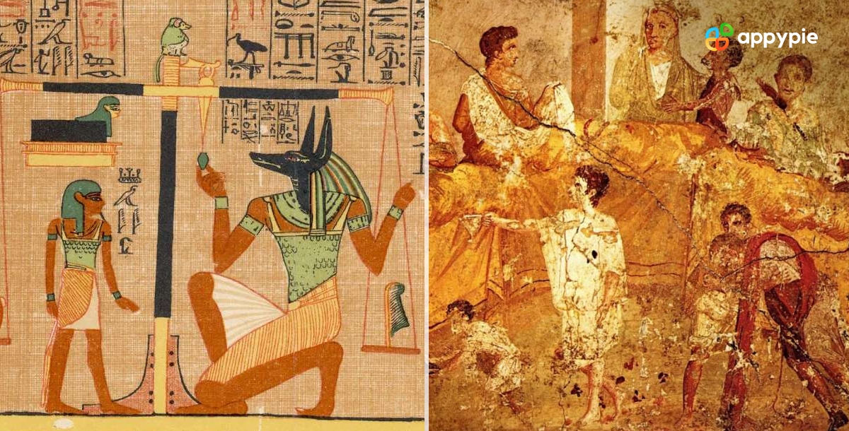
The color orange played an important role in ancient Egyptian, Greek, and Roman art, serving as a symbol of vitality, energy, and strength.
In ancient Egypt, orange was associated with the sun god Ra and was often used to represent the fiery sunrise or sunset. Orange was also used in Egyptian art to symbolize prosperity, abundance, and the fertile land along the Nile River.
In ancient Greece, orange was used in pottery, frescoes, and sculptures to depict athletic competitions and war scenes, as it was believed to convey strength and courage.
Similarly, in ancient Rome, orange was used in mosaics, murals, and frescoes to depict power and authority, often portraying emperors wearing orange-colored robes or using orange in their regalia.
Overall, the use of orange in ancient art reflects the significance of color symbolism in ancient cultures and the enduring influence of these traditions on modern art and design.
Symbolism and meaning of orange in ancient cultures
Oranges are often viewed as a refreshing fruit, but in ancient cultures, the color orange was imbued with deep symbolism and meaning. Here are some key pointers about the significance of orange in ancient cultures:
- Orange was associated with the sun and fire, symbolizing energy, vitality, and strength.
- It was also linked with the harvest, fertility, and prosperity, as it was often seen in the ripe fruit of the season.
- In some cultures, orange was associated with courage and power, making it a popular color for warriors and leaders.
- In ancient Egypt, orange was associated with the sun god Ra and was often used to represent the fiery sunrise or sunset.
- In ancient Greece, orange was used to depict athletic competitions and war scenes, as it was believed to convey strength and courage.
- Similarly, in ancient Rome, orange was used to symbolize power and authority, often portraying emperors wearing orange-colored robes or using orange in their regalia.
The symbolism of orange in ancient cultures reflects the importance of color in art, religion, and daily life, and highlights the enduring impact of these traditions on modern culture.
The emergence of orange in the Renaissance
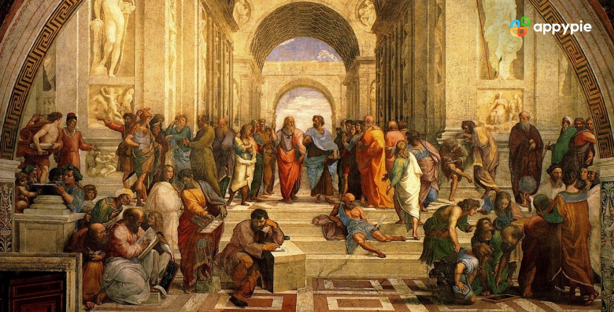
The Renaissance was a period of great cultural and artistic innovation, and the emergence of the color orange was a notable feature of this era. Here are some key pointers about the significance of orange in the Renaissance:
- Orange was a relatively new color at the time, having only been introduced to Europe from the Far East in the 16th century.
- It quickly became a popular color among artists, who were eager to experiment with new hues and techniques, including vibrant orange and enchanting Iris Blue color.
- Orange was often used in Renaissance art to create dramatic contrast and to emphasize the importance of certain figures or objects.
- It was also used in decorative arts, such as textiles, ceramics, and glassware, to add richness and vibrancy to designs.
- In fashion, orange was a popular color among the wealthy, who prized it for its rarity and association with exoticism.
- The use of orange in the Renaissance reflected the period's fascination with exploration, trade, and discovery, and its willingness to embrace new ideas and aesthetics.
Overall, the emergence of orange in the Renaissance was a significant moment in the history of color, demonstrating the power of artistic innovation and the enduring influence of cultural exchange.
The Use of Orange Color in Art Nouveau and Modernism
The Art Nouveau and Modernism movements of the late 19th and early 20th centuries embraced bold new colors and designs, and the color orange played an important role in both styles. Here are some key pointers about the use of orange in Art Nouveau and Modernism:
- In Art Nouveau, orange was often used in combination with other bold colors, such as deep blues iris and greens, to create striking contrasts and dynamic compositions.
- Art Nouveau artists also used orange to emphasize natural motifs, such as flowers and plants, as it was seen as a symbol of vitality and growth.
- The use of orange in Modernism was more experimental, with artists exploring the full range of hues and tones within the color.
- Orange was used in Modernist art to create abstract and geometric designs, often in combination with other bold colors such as black and white.
- In fashion, orange became a popular color among avant-garde designers, who used it to create bold and unconventional looks.
- Overall, the use of orange in Art Nouveau and Modernism reflected a desire to break free from traditional styles and to embrace bold, expressive colors and designs.
The use of orange in these movements had a significant impact on the development of modern art and design, and its influence can still be seen today in contemporary fashion, graphic design, and interior design.
How orange color can be used to create a sense of warmth and energy in designs?
Orange is a color that can be used effectively in graphic design to create a sense of warmth and energy. Here are some tips on how to use orange in your designs to achieve this effect:
Use orange as an accent color: One effective way to use orange in your design is to use it as an accent color. This can be achieved by incorporating small amounts of orange into your design, such as using orange typography, icons, or graphic elements. This will help to create a sense of energy and warmth without overpowering the overall design.
Combine orange with warm colors: Orange pairs well with other other colors, such as chili pepper, cyan, and Neon. When used together, these colors can create a cohesive and inviting color palette that evokes feelings of warmth and comfort.
Use orange in photography and imagery: Photographs and imagery that feature orange elements can create a sense of warmth and energy in your design. For example, using photographs of orange sunsets, autumn leaves, or warm fires can evoke a sense of coziness and comfort.
Use orange in branding and marketing materials: Orange is a popular color for branding and marketing materials, as it can convey a sense of excitement and energy. Using orange in logos, packaging, and promotional materials can help to grab the viewer's attention and create a memorable impression.
Use orange in interior design: Orange is a popular choice for interior design, as it can create a warm and inviting atmosphere. Using orange accents in furnishings, accessories, and wall colors can help to create a cozy and comfortable environment.
In conclusion, orange is a versatile color that can be used effectively in design to create a sense of warmth and energy. By incorporating orange into your designs as an accent color, pairing it with warm colors, using it in photography and imagery, incorporating it into branding and marketing materials, and using it in interior design, you can create a memorable and impactful design that evokes feelings of warmth and comfort.
Best Colors That Go With Orange
In summary, orange is a bold and vibrant color that can make a strong impact in design. The best colors that go with orange include complementary colors like blue and purple, high-contrast colors like black and white, and warm and cozy colors like mustard and brown. Other color combinations like orange and coral color or orange and pink can create a bright and cheerful mood. When choosing colors to pair with orange, it's important to consider the desired emotion and message of the design and to experiment with different color combinations to create a visually appealing and effective design.
Different shades of Orange color with HEX Code
There are many different shades of orange color that can be used in design projects, each with their own unique look and feel. These shades range from darker, more intense hues like burnt orange and rust orange to lighter, more pastel shades like peach orange and creamsicle orange. Each shade has its own HEX code, which is a six-digit code used to specify the color in digital design. By understanding the range of shades available and their corresponding HEX codes, designers can experiment with different color palettes and create visually appealing designs that convey the desired mood and message.
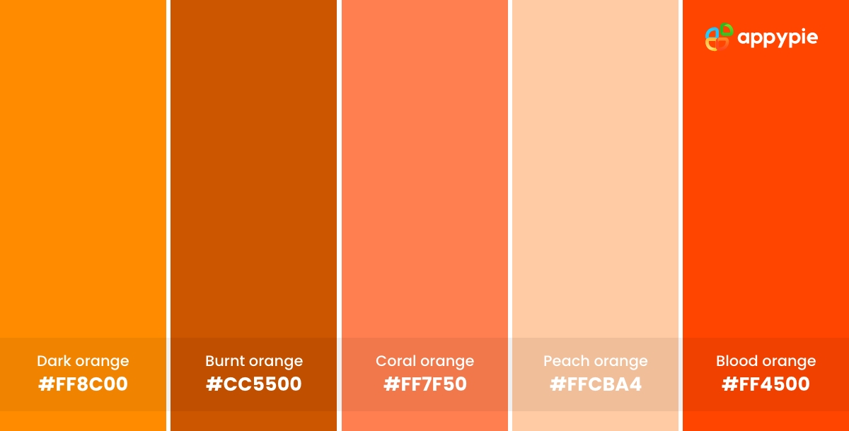
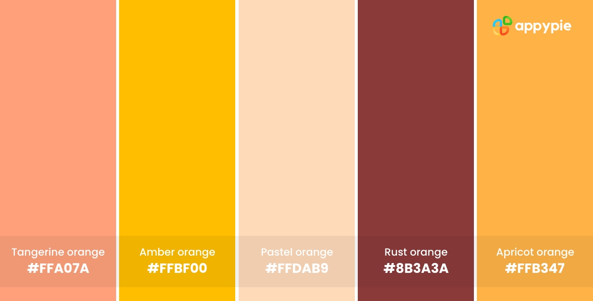
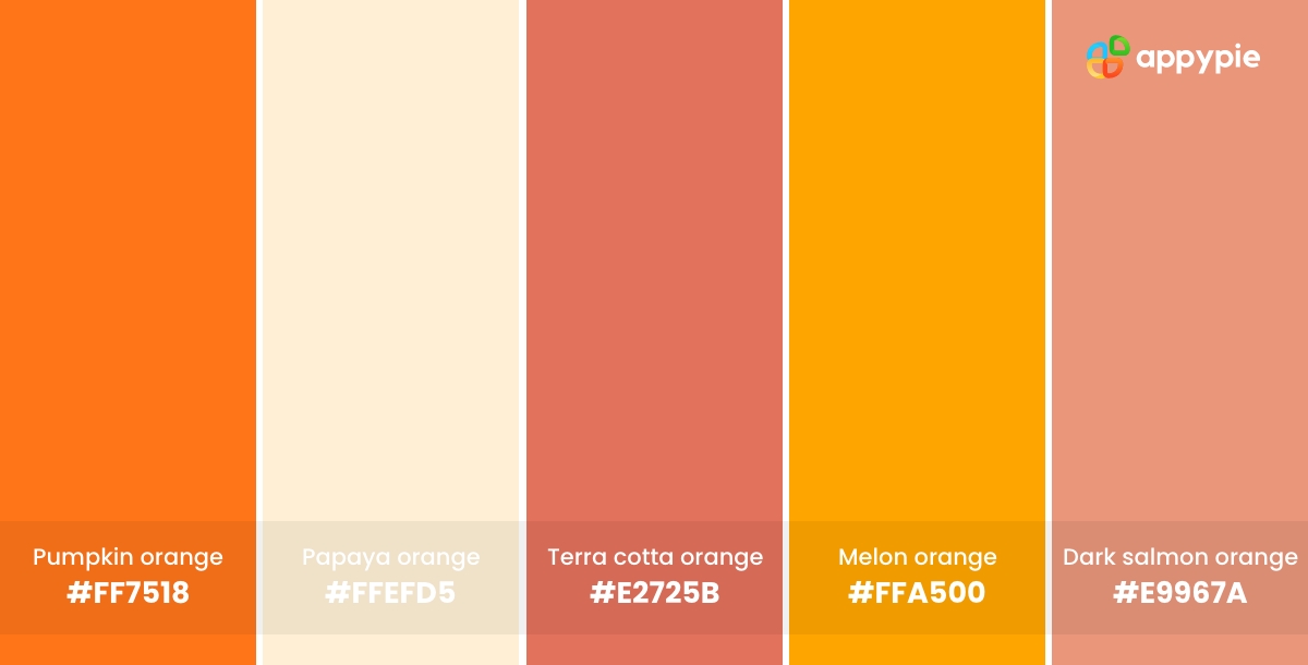
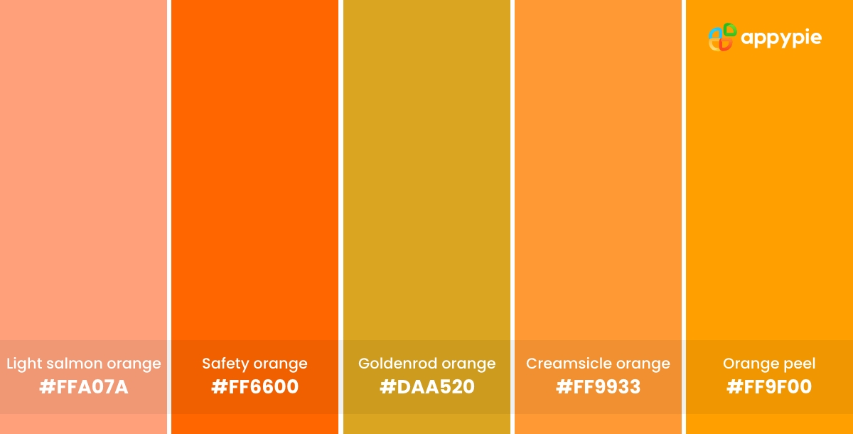
Here are some different shades of orange color along with their HEX codes:
- Dark orange (#FF8C00)
- Burnt orange (#CC5500)
- Coral orange (#FF7F50)
- Peach orange (#FFCBA4)
- Blood orange (#FF4500)
- Tangerine orange (#FFA07A)
- Amber orange (#FFBF00)
- Pastel orange (#FFDAB9)
- Rust orange (#8B3A3A)
- Apricot orange (#FFB347)
- Pumpkin orange (#FF7518)
- Papaya orange (#FFEFD5)
- Terra cotta orange (#E2725B)
- Melon orange (#FFA500)
- Dark salmon orange (#E9967A)
- Light salmon orange (#FFA07A)
- Safety orange (#FF6600)
- Goldenrod orange (#DAA520)
- Creamsicle orange (#FF9933)
- Orange peel (#FF9F00)
These are just a few examples of the many shades of orange that exist, and there are many more variations depending on the specific color palette or design needs.
25 Color Combinations featuring Orange for Graphic Design
Orange is a bold and vibrant color that can be tricky to pair with other colors. However, there are several colors that complement the orange and create a striking and harmonious look. The best colors to pair with orange depend on the desired look and style.
Here are 25 color combinations featuring orange that you can use for graphic design, including classic complementary combinations like orange and blue or high-contrast combinations like orange and black.
- Orange and Blue Color: A classic complementary combination that creates a bold and energetic look.
- Orange and Black: A striking and high-contrast combination that works well for Halloween-themed designs.
- Orange and White: A fresh and clean combination that creates a modern and minimalistic look.
- Orange and Green: A natural and earthy combination that works well for environmental and nature-inspired designs.
- Orange and Navy: A sophisticated and timeless combination that creates a classic and elegant look.
- Orange and Yellow Color: A fun and playful combination that works well for summer-themed designs.
- Orange and Gray: A cool and contemporary combination that creates a modern and minimalistic look.
- Orange and Red: A bold and passionate combination that creates a powerful and high-energy look.
- Orange and Pink: A warm and feminine combination that creates a romantic and playful look.
- Orange and Teal: A fresh and vibrant combination that works well for beach-themed designs.
- Orange and Purple: A bold and dramatic combination that creates a regal and sophisticated look.
- Orange and Brown: A warm and earthy combination that creates a natural and rustic look.
- Orange and Turquoise: A bright and refreshing combination that works well for summer-themed designs.
- Orange and Mint: A fresh and cool combination that creates a modern and stylish look.
- Orange and Olive: A natural and earthy combination that works well for outdoor and adventure-themed designs.
- Orange and Mustard: A warm and cozy combination that creates a vintage and retro look.
- Orange and Light Blue: A soft and soothing combination that works well for baby and nursery-themed designs.
- Orange and Lavender Color: A soft and romantic combination that creates a dreamy and whimsical look.
- Orange and Beige Color: A warm and neutral combination that creates a cozy and inviting look.
- Orange and Charcoal Color: A dark and moody combination that works well for industrial and urban-themed designs.
- Orange and Gold: A luxurious and elegant combination that creates a high-end and sophisticated look.
- Orange and Coral Color: A bright and cheerful combination that works well for summer-themed designs.
- Orange and Dark Green: A natural and earthy combination that creates a lush and organic look.
- Orange and Maroon: A warm and rich combination that works well for autumn-themed designs.
- Orange and Sky Blue: A fresh and airy combination that creates a light and breezy look.
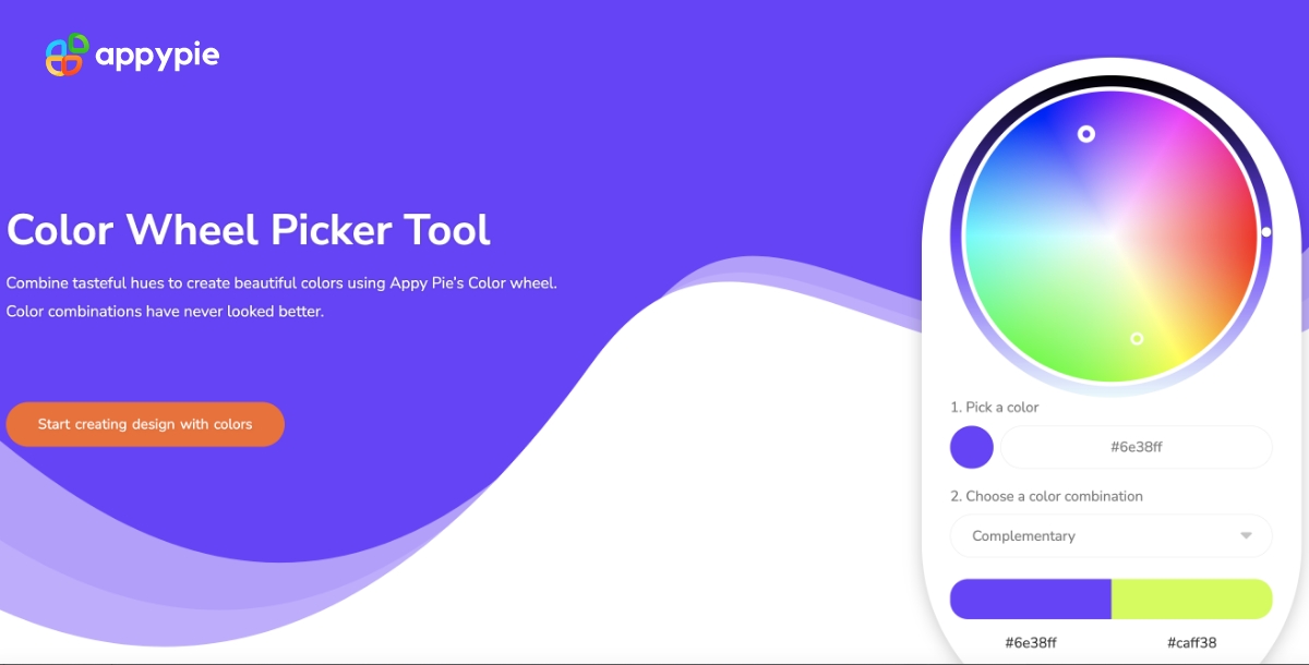
Create Stunning Graphic Designs with Appy Pie's Color Wheel tool
Appy Pie's Color Wheel tool is a tool that helps users select colors that complement each other for their design projects. It's a useful tool for designers who want to create a visually appealing color scheme for their projects. Here are the steps to use the Color Wheel tool:
- Go to the Appy Pie website and navigate to the Color Wheel tool.
- Select a base color by clicking on the color wheel. You can also type in a HEX code or RGB values if you have a specific color in mind.
- Once you have selected your base color, the tool will generate a color scheme with complementary, triadic, and analogous colors. You can adjust the color scheme by clicking on the different options available, including lightness, saturation, and hue. Once you have selected a color scheme, you can copy the HEX codes for each color or download a PNG image of the color scheme.
Conclusion
In conclusion, the history of the orange color dates back to ancient times and has played a significant role in art, culture, and symbolism. The color orange has come to represent a range of emotions and concepts, including energy, warmth, creativity, and enthusiasm.
In design, the color orange can make a bold statement and can be paired with a variety of other colors to create a visually appealing color scheme. Some of the best color combinations with orange include blue, green, yellow, purple, and pink, among others.
By understanding the history and importance of the color orange, and by experimenting with different color combinations using graphic design software, designers can create effective and memorable designs that convey the desired message and evoke the desired emotions. The versatility of graphic design software allows designers to explore various orange color palettes and seamlessly integrate them with other colors, enabling them to craft visually appealing and impactful designs for a wide range of projects.
Related Articles
- How to Create a Customer Service Knowledge Base in Easy Steps
- Different Characters of Rings of Power & Lord of the Rings
- On the Content Bias in Fréchet Video Distance
How to Create a Customer Journey Map – A Step-by-Step Guide
- Sales Promotion: Definition, Ideas, and Tips for Running Effective Sales Promotion
- Top 20 Best Real Estate Websites in India & Worldwide
- Chatbots vs. Conversational AI – Which is Right for Your Business?
- How to Get More Clients For Your Home Care Agency
- How to use pivot tables in Google Sheets? [Everything about Google Sheets Pivot Table]
- 8 Easy Discord Automation Ideas with Appy Pie Connect