Mozilla Firefox Logo: History and Evolution of the Logo over the Years

A couple of years ago, the world wide web turned 30. We all know that so many websites and companies have left their mark over the years for excellent and foul. Thus, we've seen advancement for a few companies and diminishing others. When it comes to technology, there have been a few names that have changed in the past decades, such as Google. In this blog, we'll discuss a logo everyone out there must have seen in their lifetime as an internet browser. Yes, we're talking about Mozilla Firefox! Though you all surely know the logo, let's take a look at the history and evolution of the Firefox logo over the years.
Though the new Firefox logo is simpler and more eye-catching than its predecessors, the core imagery has been consistent.
Meaning, History, & Firefox Logo Evolution
The visual identity of the Firefox icon always has flame and power, which started in 2002 with a picture of a Phoenix bird. It was a mythological creature that is shown to be resurrecting from ashes and turning out to be an iconic orange fox. That's why the initial name of the internet browser was Phoenix, that in 2003 further changed into Mozilla Firebird, followed by the existing name, i.e. Mozilla Firefox, which was given in 2004.
2002- 2004
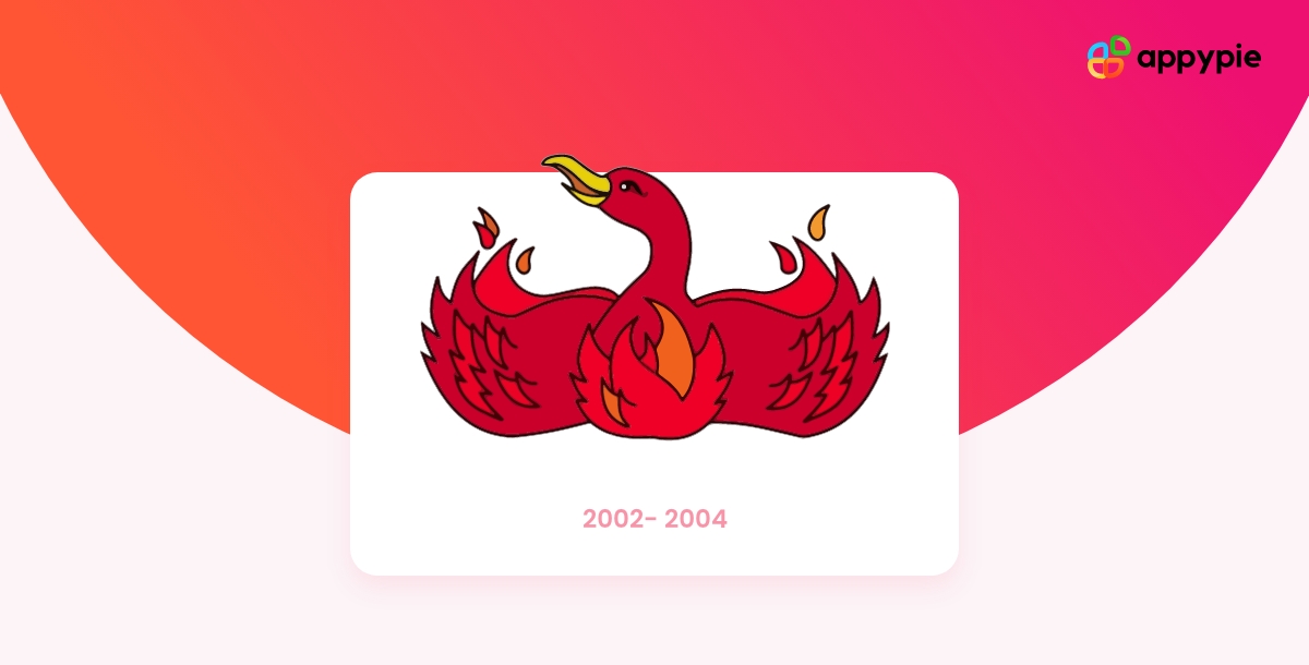
The earliest Firefox logo was created for Phoenix, representing a stylish red bird spreading its wings to the sides, curving above with red petals. The entire image of the Phoenix bird is used to describe a flame. The head of the bird was turned left, and it used to look very friendly and bright.
2004- 2005
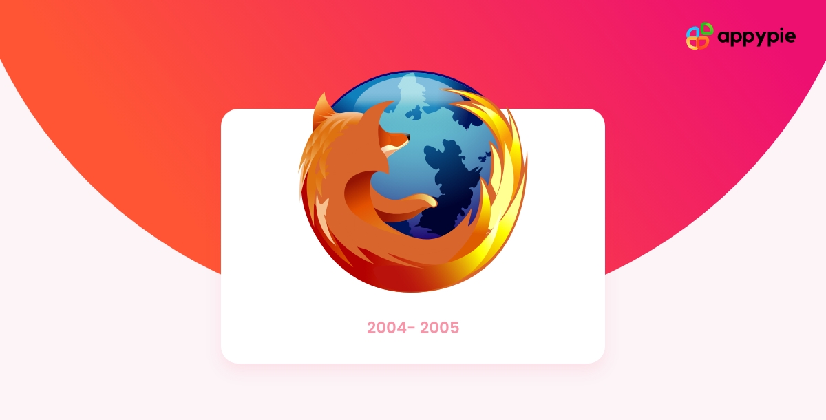
With the changing name of the internet browser to Firefox, the new Firefox icon was introduced in 2004. The new logo had a blue globe implemented in rising shades and a stylish orange fox that cuddles the entire blue globe and is curved at its bottom part.
2005- 2009
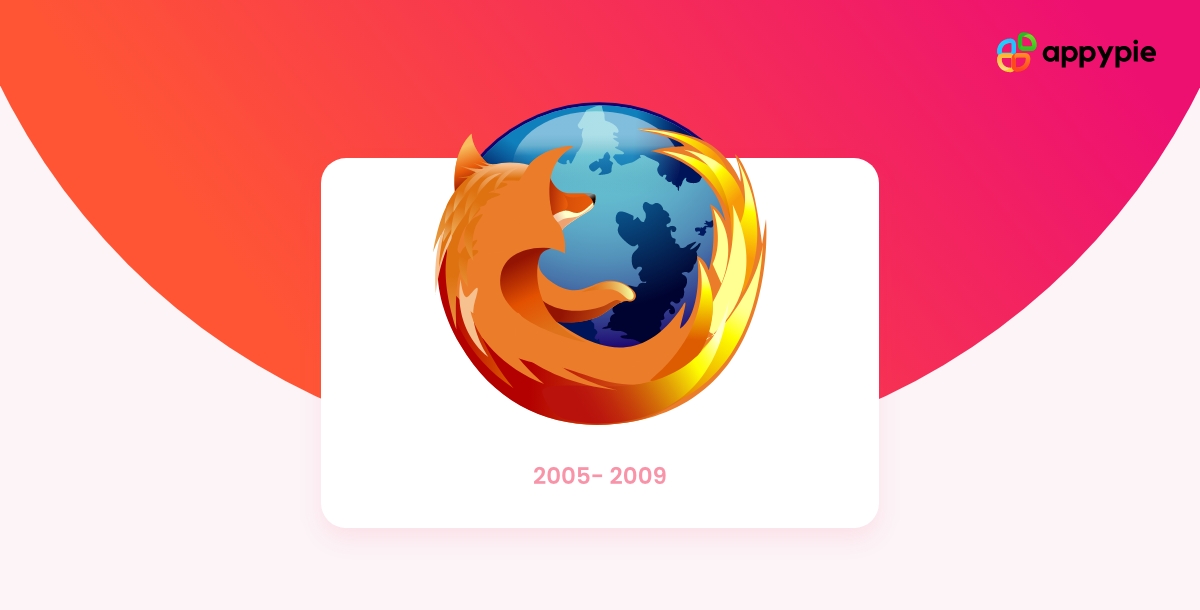
The image color of the Mozilla logo were again refined in 2005. Also, the outline of the orange fox and blue globe were modified. This time the bridge was more distinct and brighter because of the contrast tones of orange and blue.
2009- 2013
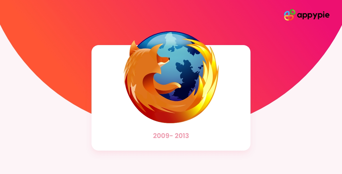
In 2013, the gradients of the globe got lighter and made the Firefox logo look glossy and three-dimensional. As a result, the Firefox new logo was trendy and modern. Though the overall style and composition of the logo didn't change much, the tail got redrawn, and this time it looked more identical to the flame.
2013- 2017
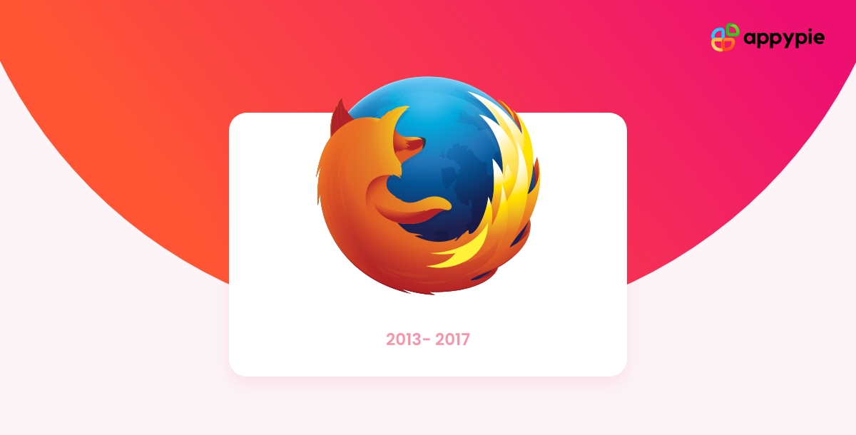
The Firefox icon was again redesigned and simplified in 2013. There's no gloss this time, and it made the logo look flatter and more uncomplicated. Though the colors remained the same, the elements were minimized, and all accents were shifted to the fox's tail.
2017-2019
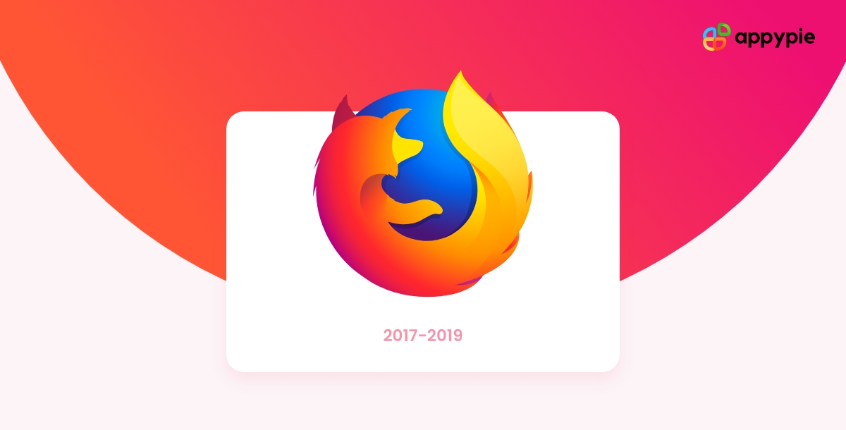
The redrawn 2017 Firefox logo came up with a smooth style and broad lines, removing all sharp triangular elements. As far as the globe is concerned, the blue color has become brighter, and the contours are not visible anymore with the gradient and plain background.
2019- Today
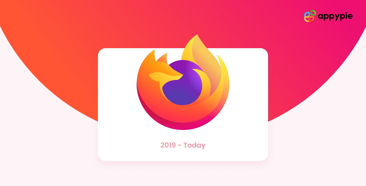
The globe's size became smaller this time, and the blue color was replaced by purple. The fox got enlarged, now cuddling the entire globe properly, and looks more friendly and tender. The fox tail lines are smooth and elongated, making the Firefox icon look sleek and more elegant.
The Elements of Firefox Logo
The logo has a simple and neat design. It contains a written word, which is Firefox. The word is written in uppercase. There are two different colors in the logo. It is blue and orange. The blue color mainly appears on the upper part of the word while the orange color appears on the lower part of the word.
The logo is centered on a white background. The two words, Firefox and Web Browser are slightly indented from the border of the logo. This gives it a unique look and feel. On each side of this white background, there are three icons placed in an organized manner. These icons represent some features that Firefox offers to its users. These features include Search, Tab, and Bookmarks.
- Symbol
Though the Mozilla logo is actually a fox, the term ''firefox'' refers to a red panda. So why isn't it on the logo? As per hicks, only a few people know that Firefox means a panda.
- Font
The font used for ''Mozilla'' and ''Firefox'' is known as FF Meta Bold Roman, and Erik Spiekermann developed it.
- Color
Eye-catching and optimistic, the combination of orange and blue seems to be quite natural. Orange represents the fox's fir, whereas blue gives an appealing contrast to orange.
How to Create your own Logo with Appy Pie's Logo Maker?
Creating your own logo online using Appy Pie's Logo Maker is really simple and easy. With our easy-to-use interface, you can easily create your brand logo in just three simple steps.
Choose a Logo Template you like: To start creating your logo, you need to choose a logo template. You can either upload an image from your computer or take a picture of your desired logo using your webcam on your computer. You can also use Appy Pie's free logo templates, which are available to all registered users of the site.
Customize your chosen Logo Template: Once you have chosen a Logo template, you can add text to it and customize it according to your needs. You can add any text, like company name, slogan, tagline, etc. In addition, you can also choose the color of the text and its size.
Download and Use your Customized Logo: Once you are happy with the design, click the Download button to download your logo. Your logo will be automatically saved as a .zip file to your computer.
Conclusion:
As we never know where an organization will stand in 10 years. Whether it will be thriving or declining, the evolution of Mozilla Firefox is one of the best examples of how the logo plays a crucial role in the success of any company. Therefore, it's always essential to ensure that you're up to date regarding logo creation.
Related Articles
- Adidas Logo: History and Evolution
- Doritos Logo: A Glorious History of Little Bits of Gold
- Nike Logo: History and Evolution
- Bank of America Logo: From Monogram to American Flag
- Squid Game Logo: Meaning Behind Hidden Symbol
- TikTok Logo: The Meaning Behind the Colorful Note
- Domino’s Logo: History and what Domino’s has to do with Pizza
- AT&T Logo History: Journey From Bell to Globe
- Amazon Logo History: What Message Is Hidden in Amazon Logo?
Most Popular Posts
- Button Design Essentials:Best Practices and Creative Designs
- A Practical Guide to Recognizing Bias in LLM Outputs
- 16 Powerful Real Estate Marketing Ideas & Strategies to Boost Sales
- Top Tips to find the Right Web Application Development Company
- How to Get Your Dream Job (15 Essential Steps to Follow)