
Famous Logos: Top 10 most famous brand logos

By Abhinav Girdhar | Last Updated on April 17th, 2024 9:06 am | 5-min read
Your brand logo is one of the most identifiable elements of your brand image. Whether it is the iconic golden yellow ‘M’ or Medusa’s head, people associate certain images, qualities, and values with the brand logo. However, this does not happen overnight. Some of the most popular logos have only found recognition after years of just being around.
Introduction
What makes some logos famous and immediately identifiable as compared to others? In my opinion, two of the most important things a logo must do is - remind people of the brand and convey the brand’s message clearly while standing out from the competition. The brand logo must look timeless and professional. The list of logos I have compiled here has ten amazing logos that have all these qualities.
What is a logo?
A logo is one compact icon that contains and represents the company’s entire visual identity. With hundreds of thousands of brands worldwide, some customers prefer one brand over the other. This is where your company logo attains importance - in setting you apart from the competition. Of course, the brand logo is not the most important part of your branding, but it really is of great importance for your brand image. You know your logo is doing well when it is recognizable. Have you started creating yours? Appy Pie Design has the best online logo maker for you to create unique, creative, and memorable logos.Top 10 most famous logos in the world
Some logos are good, and some are awesome! I have brought together ten of the most famous brand logos for you to read about and learn a little from each brand logo evolution.- Apple
- Starbucks
- Volkswagen
- Visa
- Mercedes-Benz
- Shell
- Canon
- UPS
- Adidas
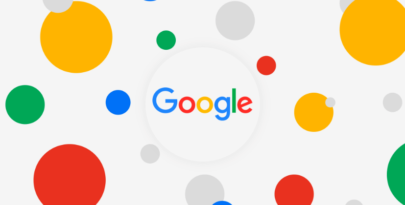 This is the one logo on the list that has checks almost all the boxes on a good logo design list. It is simple, the logo has the brand name in it, and it uses just the right colors. The original logo was created in 1998 and remained unchanged until 2009 when they altered the coloring and the shading of the lettering. In 2014, they altered the spacing between the letters. In 2015, the search engine giant relaunched its logo with a custom font in similar but more vibrant colors.
Learning: You don’t need to keep changing your logo to stay fresh in the memories of your audience. The company paid attention to details like colors, spacing, and more!
This is the one logo on the list that has checks almost all the boxes on a good logo design list. It is simple, the logo has the brand name in it, and it uses just the right colors. The original logo was created in 1998 and remained unchanged until 2009 when they altered the coloring and the shading of the lettering. In 2014, they altered the spacing between the letters. In 2015, the search engine giant relaunched its logo with a custom font in similar but more vibrant colors.
Learning: You don’t need to keep changing your logo to stay fresh in the memories of your audience. The company paid attention to details like colors, spacing, and more! 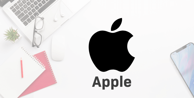 In 1976, Apple created its first logo, which looked nothing like the modern version of the logo. The original logo had Sir Isaac Newton sitting under an apple tree and the famed apple ready to drop. In 1977, the logo looked like a rainbow-colored apple to signify their first colored display screen. Gradually this transformed to shiny chrome versions of the apple and the flat color we see today. The “bite” in the apple is a fun little way of making the flat logo interesting and playful. However, there have been many theories about the bite, the most popular one claiming it to be a clever take on “byte”.
Learning: The Apple logo displays all the qualities of the brand. The logo is sleep, elegant, intelligent, and simple.
In 1976, Apple created its first logo, which looked nothing like the modern version of the logo. The original logo had Sir Isaac Newton sitting under an apple tree and the famed apple ready to drop. In 1977, the logo looked like a rainbow-colored apple to signify their first colored display screen. Gradually this transformed to shiny chrome versions of the apple and the flat color we see today. The “bite” in the apple is a fun little way of making the flat logo interesting and playful. However, there have been many theories about the bite, the most popular one claiming it to be a clever take on “byte”.
Learning: The Apple logo displays all the qualities of the brand. The logo is sleep, elegant, intelligent, and simple.  The Starbucks logo, one of the famous food logos, was inspired from a wooden seal that showed a beautiful siren with two tails. Initially, the Starbucks logo featured the beautiful siren with two tails framing her and a circle around the mermaid with the name Starbucks Coffee printed around. The logo has evolved through the years, and the mermaid has gained a mysterious smile while her tails have become less prominent. The colors have changed as well, and the mermaid has become an iconic symbol for coffee lovers all over the world (even in the countries where Starbucks doesn’t have its presence yet).
Learning: The logo evolved without changing its essence. The older clientele is still comfortable with their mermaid, while the modern look has made its place among the millennials and now Gen Z.
The Starbucks logo, one of the famous food logos, was inspired from a wooden seal that showed a beautiful siren with two tails. Initially, the Starbucks logo featured the beautiful siren with two tails framing her and a circle around the mermaid with the name Starbucks Coffee printed around. The logo has evolved through the years, and the mermaid has gained a mysterious smile while her tails have become less prominent. The colors have changed as well, and the mermaid has become an iconic symbol for coffee lovers all over the world (even in the countries where Starbucks doesn’t have its presence yet).
Learning: The logo evolved without changing its essence. The older clientele is still comfortable with their mermaid, while the modern look has made its place among the millennials and now Gen Z. One of the most famous car logos, Volkswagen’s original logo, had the initials “VW” in black and white with Swastika symbol to reflect Hitler’s regime. The logo later evolved into something that looked more like a car wheel. The company’s ownership changed at the end of World War II, which led to the British owners dropping the circle and adopting the square. The company was then returned to the German government when the British owners could not find buyers. Gradually the black and white logo evolved into the blue and grey logo that it is today.
Learning: Change with the times while keeping true to your roots. The initials - VW remained an integral part of the logo, even as the company went through turbulent times.
One of the most famous car logos, Volkswagen’s original logo, had the initials “VW” in black and white with Swastika symbol to reflect Hitler’s regime. The logo later evolved into something that looked more like a car wheel. The company’s ownership changed at the end of World War II, which led to the British owners dropping the circle and adopting the square. The company was then returned to the German government when the British owners could not find buyers. Gradually the black and white logo evolved into the blue and grey logo that it is today.
Learning: Change with the times while keeping true to your roots. The initials - VW remained an integral part of the logo, even as the company went through turbulent times.  The VISA logo has evolved quite a bit since its first version. The most popular version was the flag-like design with a blue stripe at the top, and an orange stripe at the bottom with VISA stamped in the middle. In 2006, the logo changed drastically and became beautifully minimalistic as it was liberated from the boxy form. The little orange accent on the top of the letter “V” brings an elegant touch to the whole logo making it contemporary while still reminding people of what the brand stands for. Eventually, the orange accent is phased out in the latest design to give way to a new flat logo design for VISA.
Learning: The logo didn’t make big changes just for the sake of making a change. Instead, it established a stronger image before moving on to a more modern, clean design when it made sense.
The VISA logo has evolved quite a bit since its first version. The most popular version was the flag-like design with a blue stripe at the top, and an orange stripe at the bottom with VISA stamped in the middle. In 2006, the logo changed drastically and became beautifully minimalistic as it was liberated from the boxy form. The little orange accent on the top of the letter “V” brings an elegant touch to the whole logo making it contemporary while still reminding people of what the brand stands for. Eventually, the orange accent is phased out in the latest design to give way to a new flat logo design for VISA.
Learning: The logo didn’t make big changes just for the sake of making a change. Instead, it established a stronger image before moving on to a more modern, clean design when it made sense. Another one of the most famous car logos, Mercedes-Benz, is actually one of the most famous logos. Theirs is one of the rare examples of logos that have stayed as close as possible to the original logo. It was in 1909 that the company introduced the star, and to this day, it remains the focus of their logo design. The three prongs of the star indicate air, sea, and water, indicating the three segments of the automotive industry. The font is thinner and more curved when compared to other brands, indicating an understated elegance - something the brand has always been known for.
Learning: Every detail matters. Even the thickness and the curves of the letters in your font say a lot when you place it next to your brand.
Another one of the most famous car logos, Mercedes-Benz, is actually one of the most famous logos. Theirs is one of the rare examples of logos that have stayed as close as possible to the original logo. It was in 1909 that the company introduced the star, and to this day, it remains the focus of their logo design. The three prongs of the star indicate air, sea, and water, indicating the three segments of the automotive industry. The font is thinner and more curved when compared to other brands, indicating an understated elegance - something the brand has always been known for.
Learning: Every detail matters. Even the thickness and the curves of the letters in your font say a lot when you place it next to your brand.  Before it was known as the oil and gasoline company, Shell was actually a trading company specializing in bringing seashells to the western countries. In 1900, the first logo for Shell was a black-and-white drawing of a seashell. The form has changed, as have the colors, but it is still a seashell.
Learning: The red and yellow colors were chosen deliberately to play up a cultural significance. When Shell first came to California, they wanted to reflect the colors of the Spanish flag, the country of origin for many of the California settlers. The seashell, even today, reminds you of the roots of the company that lay in trading seashells!
Before it was known as the oil and gasoline company, Shell was actually a trading company specializing in bringing seashells to the western countries. In 1900, the first logo for Shell was a black-and-white drawing of a seashell. The form has changed, as have the colors, but it is still a seashell.
Learning: The red and yellow colors were chosen deliberately to play up a cultural significance. When Shell first came to California, they wanted to reflect the colors of the Spanish flag, the country of origin for many of the California settlers. The seashell, even today, reminds you of the roots of the company that lay in trading seashells!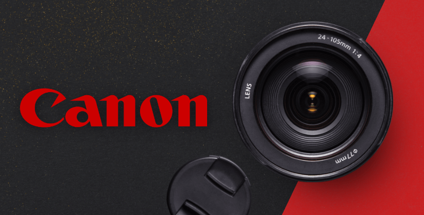 Really few people know that the first Canon logo featured Kwannon - the goddess of mercy, worshipped by Buddhists. Buddhism is the most popular religion in the region, and when the brand was local, the logo made it relatable to the target audience. As the brand and its cameras gained massive popularity, the brand revamped its entire brand image and gradually became one of the most famous logos with names as a part of it.
Learning: The brand recognized the potential of local imagery when it made sense and realized that they had to revamp their brand identity when they got globally well-known.
Really few people know that the first Canon logo featured Kwannon - the goddess of mercy, worshipped by Buddhists. Buddhism is the most popular religion in the region, and when the brand was local, the logo made it relatable to the target audience. As the brand and its cameras gained massive popularity, the brand revamped its entire brand image and gradually became one of the most famous logos with names as a part of it.
Learning: The brand recognized the potential of local imagery when it made sense and realized that they had to revamp their brand identity when they got globally well-known. The United Parcel Services logo is one of the most famous brand logos that has stood the test of time. Since 1961, the logo has had four different design variations, of which three were of the letters U, P, and S enclosed in a shield. The shield represents stability and integrity. In the original design of the logo, the package at the top represented the package service.
Learning: The logo stayed classic and true to its essence. However, as decades passed and people already knew what UPS was all about, the logo evolved to exclude the package visual from the logo, making it even more of a classic.
The United Parcel Services logo is one of the most famous brand logos that has stood the test of time. Since 1961, the logo has had four different design variations, of which three were of the letters U, P, and S enclosed in a shield. The shield represents stability and integrity. In the original design of the logo, the package at the top represented the package service.
Learning: The logo stayed classic and true to its essence. However, as decades passed and people already knew what UPS was all about, the logo evolved to exclude the package visual from the logo, making it even more of a classic. The three stripes have become synonymous with quality sportswear as the Adidas logo became a world-famous logo. The logo has evolved through the decades, but the three stripes have remained a fixture.
Learning: The brand has made multiple changes to the logo, but that never dampened its brand value or image as the basic “three stripe” element has remained the same.
The three stripes have become synonymous with quality sportswear as the Adidas logo became a world-famous logo. The logo has evolved through the decades, but the three stripes have remained a fixture.
Learning: The brand has made multiple changes to the logo, but that never dampened its brand value or image as the basic “three stripe” element has remained the same.Conclusion
Having your own unique logo is essential for your brand. It is the single icon that will convey your brand values, your brand persona, and your brand identity in the smallest visual space. Have you started creating your own logo? Who knows, yours might feature in this list soon! You do not need professional design skills or training to create a brand logo. Yes, that’s right! All you need to do is log in to Appy Pie Design and start working on your iconic logo!Related Articles
- Feedback Forms: Examples, Templates & Guide to Craft Your Own
- The Different Events on Roblox
- A Comprehensive Guide to the Best Sales Engagement Platforms
- 13 Reasons Why You Need Chatbot for Your Real Estate Business
- How to Write an E-commerce Business Plan
- Revenue Management and Profit Optimization: A Guide for Entrepreneurs
- How To Win Over Even The Toughest Customers
- 15 Best Drift Alternatives and Competitors for 2023
- ShipHike – A Mobile App that Lets Your Packages Hitch-Hike. Is This the Beginning of the End for Personal Delivery Giants?
- How to Become an App Developer for Android, iPhone in 2023