
9 Contemporary Home Page Design Ideas to Use in 2023

The world is a small place thanks to the Internet. I often wake up reading news articles about what’s happening on the other side of the globe, available to me as it happens. With millions of websites on the Internet, the world is quite literally at the fingertips of Internet users. What seemed a farfetched fiction back a few decades ago is now an actual reality.
Almost 4.3 billion people use the Internet regularly and a respectable 5 billion people have access to it. The Internet actually faces a new challenge now; being overloaded with webpages. While the overloading can be managed, there is a new problem for businesses across the world: standing out on the Internet. Good homepage design for a website is crucial for standing out and generating website traffic.  A good homepage design often consists of something that makes users want to interact with your webpage more. The abundance of websites means that users don’t spend a significant amount of time on websites, hence it becomes necessary to ‘catch’ their eye.Here are 9 design ideas that you can use for your website homepage design in 2021:
Homepage Brand Videos
This is the ‘in’ thing of today. 2019 began this trend and it is becoming common on websites. Homepage brand video usually involves an embedded video that would otherwise act as your brand video on social media.
Designing a webpage with a homepage brand video is extremely easy. Simply embed the video in your HTML and design the rest of the webpage around it. What makes this different from a content-heavy homepage with videos, is the fact that the video is given more priority than the content. It is recommended that the content on such home pages is in accordance with the video.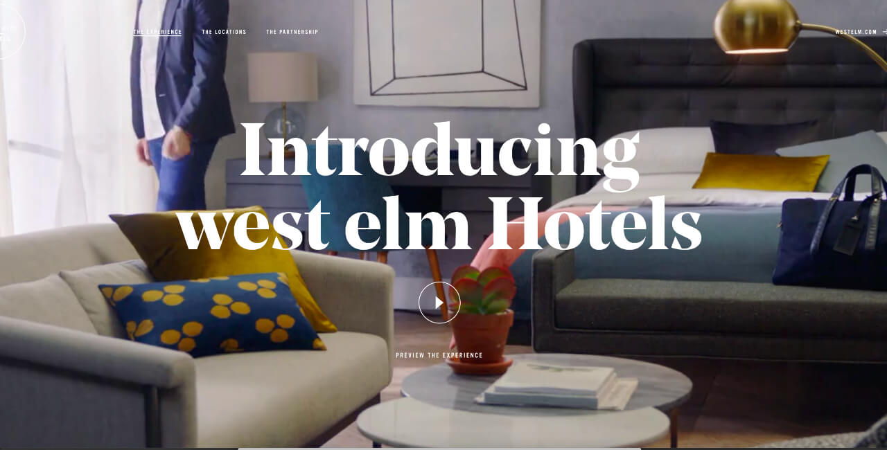 Source: West Elm HotelsIn the example given above, there is a ‘play’ button that acts as the CTA for the homepage brand video and has the rest of the page designed around what the video describes. A beautiful design, to say the least. The background of the website also plays a ‘.GIF’ video which adds to the experience.
Organic Shapes
My personal favorite website design. Using organic shapes and vector graphics for webpage design is a common theme for graphic design websites and is usually popular in art-related fields. Using organic shapes gives your website homepage a pleasing aesthetic that’s hard to replicate and is quite easily breathtaking.
However, it’s not popular with most major websites since it is often difficult to make an aesthetically pleasing website with organic shapes and it requires extensive knowledge of design, color theory, and color combinations. The beauty of using organic shapes is in its placement and color on a website’s homepage.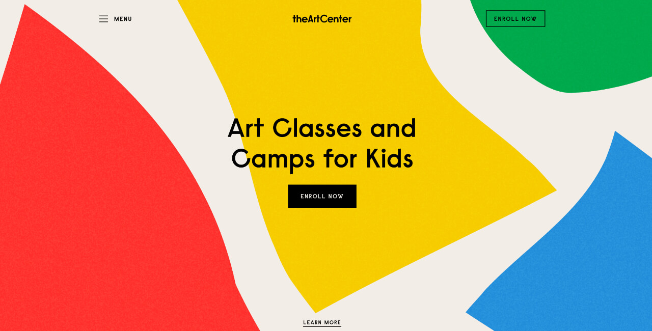 Source: The Art CenterIn the example given above, simplistic geometric shapes are given slight organic curves with a pleasing hue of primary colors. I especially like that they incorporate both yellow & green as primary colors since the Internet follows an RGB color format whereas the art world follows an RYB format.
Transitional Content
Transitional content is fairly common in websites. It’s been around for nearly a decade now. They are especially used by individual’s websites and are an excellent way to stand out on the Internet.
Transitional content is simple to embed in the code of a website. There are various ways to use transitional content. It can be either be a delayed animation that appears after the viewer hovers or spends a set amount of time on a website. Transitional Content for a homepage can also be an endless video loop. Transitional Content is extremely customizable and has been perfected in the last 10 years.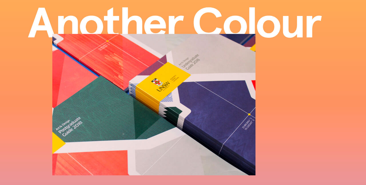 Source: Another ColorIt’s hard to choose a website as an example for transitional content but Another color is high up on the list of this type of design. The website becomes scrollable and usable once you click/hover on the homepage and transitions in the content of the website with a fade effect. It has an active and vibrant color wheel on the left which changes the color of the text as you scroll down the website. Beautiful use of both color and transitions.
Grounded Authentic Tones
Using authentic textures and tones is often suited to luxury brands and it always gives an impression of reliability, authenticity, and class. It’s always aesthetically pleasing. These website designs often use general colors and limited contrast sticking to a gentle grounded feel. You will find a lot of beige being used in such a design scheme.
Vibrant colors are often non-existent in such web designs and there is an emphasis on real photographs supported by simplistic design. ‘Understated styling’ is a good term to describe this type of website design.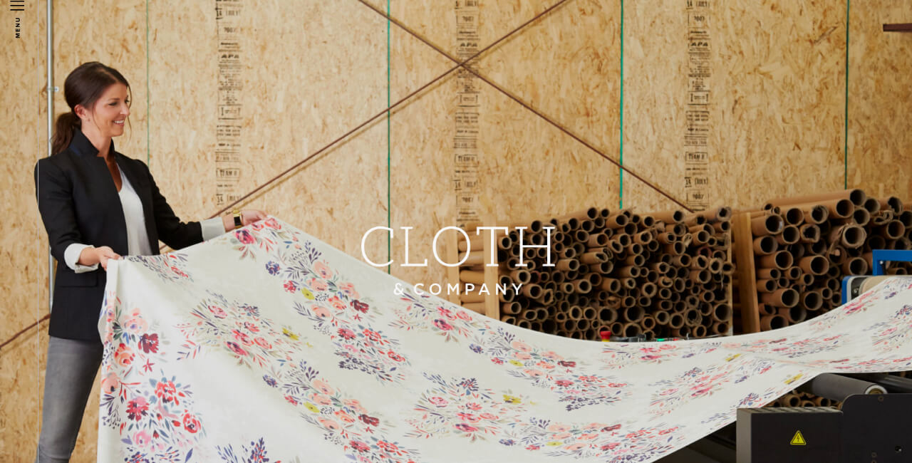 Source: Cloth and CompanyA moving gallery of preset realistic images selling the aesthetic appeal with a simple brand name and a white title font. The moment you open the website it exudes class and authenticity. Scrolling down you’ll see an array of images supported by appropriate content.
Vibrant Color and Gradient
This design style wakes my inner child. ‘Another Color’ mentioned above uses this in addition to its transitional style. Many professional graphic designers disregard vibrant colors for websites citing it doesn’t look ‘professional’ enough and often go for dull color palettes with home pages.
Vibrant colors are easy to mess up and often look bulky on webpages, which do hurt eyes, there is a way to do everything. The correct use of vibrant color is a talent developed over time and when done right has an excellent effect on the viewers and is likely to make them feel better.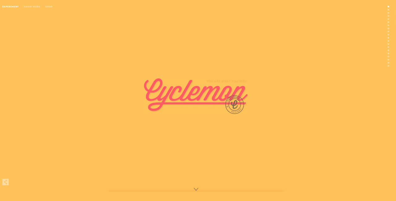 Source: CyclemonOne of my favorite website designs on the Internet. The main website color is bright but uses just the right orange gradient, but as you scroll across the website the colors change and just scrolling through the website is a joyous experience.
Depth and 3D Design
This is the future of website design. I see quite a few websites switching to 3D elements in their website content. 3d elements are created with the help of WebGL and software like Maya. The requirement from a 3d website often changes the method you will use for one. 3D websites look futuristic. Applying varying depth, on the other hand, creates an illusory 3d effect.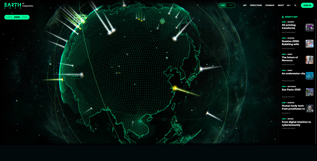 Source: Earth 2050 by KasperskyEarth 2050 is a concept website and simply shows various predictions of what the world will be in 2050. It uses a consistently rotating globe that has various pointers corresponding to real locations and shows a content snippet about the location. The globe stops rotating when you hover over a pointer.
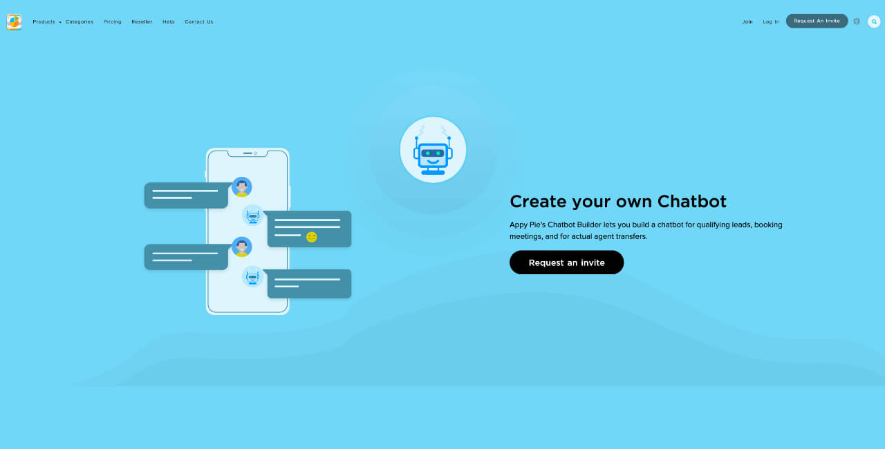 Source: Appy Pie Chatbot BuilderAppy Pie’s Chatbot Building software is designed with an equal balance of simple visuals and content that’s easy to understand and gives an idea about the ease of use of its software.
Minimalism
Quite simply, minimalism is meant to be minimal.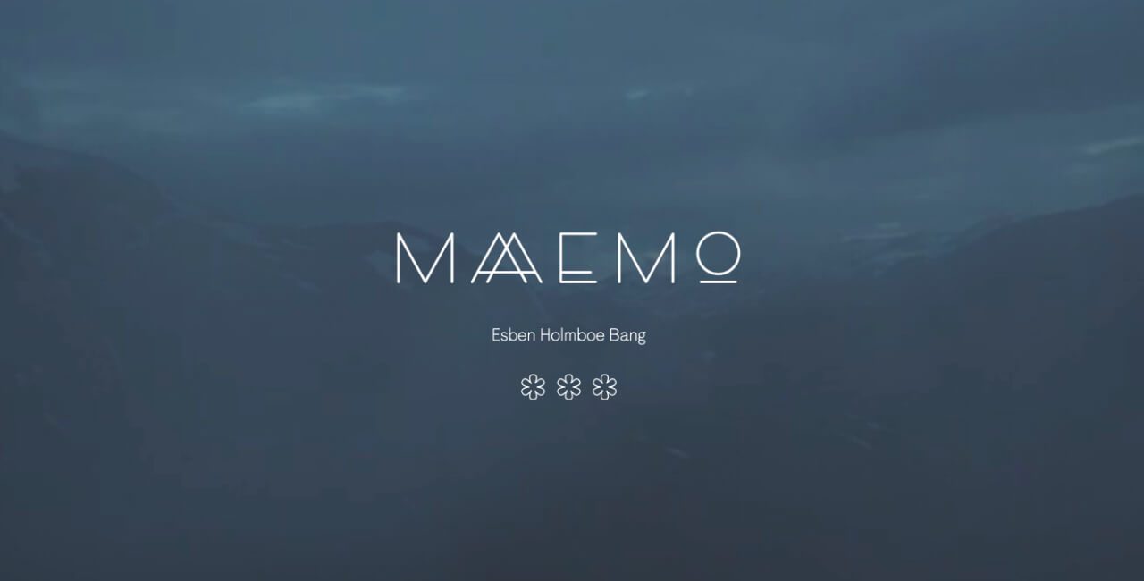 Source: MaaemoThe website belongs to a Michelin starred restaurant based in Norway. The website has a looped landscape video and follows a grounded tone with a few pictures and minimal text. The entire website follows the same design scheme and exudes class and elegance.
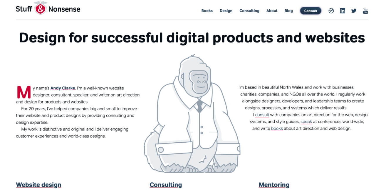 Source: Stuff & NonsenseThe website’s simplistic gorilla illustration might not match with what the text around it speaks but is a perfect fit for the website’s name. It looks adorable and exudes a fun image that humanizes the brand it represents.Those were 9 ideas that you can use in 2021 for your home page design. If you want to learn the basics of graphic design, take our beginner’s Academy course for the same! Good Luck!
 Related Articles
- Moving Object Segmentation: All You Need Is SAM (and Flow)
- What is the variance between fungible and Non-fungible?
- Watch Out For These E-commerce Trends In 2018
- 50 Examples of Successful Facebook Ad Templates that Actually Work
- Creating the Organization You Love: The Importance of Organizational Culture
- Dynamic Typography: Bringing Words to Life
- 71 Ways to Promote your Mobile App for FREE [#51 is Great!]
- Finding Visual Task Vectors
- Top 8 AI Logo Generator Tools in 2023: Ranked as the Best
- How AI-Powered Ticketing System Can Revolutionize Your IT Support
Most Popular Posts
- Revenue Management and Profit Optimization: A Guide for Entrepreneurs
- Exploring The World Of Burnt Orange: From Origins And Meanings To Fashion, Art, And Future Trends
- The Top 29 Social Media Platforms- Trends & Insights for 2024 [Infographic + Line Chart Race]
- How Many Types of Pokémon Are There? [Types of Pokémon Characters]
- What is RACI Model? A Guide to Project Role Clarity