

Font pairing is an important aspect of graphic design for the web and print. In this comprehensive blog, we are going to talk about the significance of good font combinations and how to use different fonts or font types in any design project. Also, to help you get started, we will give you a cheat sheet of the 37 best font pairings that you can use without worrying about how they will look on your website, magazine cover, brochure, or a catalog you are working so hard on. Though this is a great place to start when you are looking at different font types that you can use together, you also have a brilliant AI design tool that you can use - the AI font generator from Appy Pie Design
Whether you are a web designer, a student, a business owner, or a product manager, the aesthetics of your next project are of critical importance to you. There are multiple aspects of graphic design, like choosing a color palette, UI elements, deciding color combinations, and the best font for your website! However, one crucial aspect that is easy to overlook, but shouldn’t be, is the font combination you will implement on your website.Why Is Font Pairing Important?
You have already found the perfect font for your website. Then why are we talking about font combinations already? Any project, online or offline, requires a clear hierarchy of content where you can guide a visitor’s eye from the most important content on your page to progressively lesser important content. These fonts and how they come together actually tell you a lot about your company or business, its values, and its brand voice. Here are a few pointers or scenarios that will help you realize the impact a good font pairing can make on your content.- Imagine if both your fonts on a long-form blog post were boring. Would it be easy to read? Or would it feel like a wall of text that is intimidating and just not worth your time? Best case scenario - you will skim through the post and try to get the highlights. That’s it!
- A bold and super fun font makes a certain impression on the website visitor. But what if the body font was tiny, unassuming, and super simple? Is that going to confuse the visitors or add layers to your brand’s image?
- Now, let’s say you come across a luxury brand that talks about class, elegance, and sophistication. But, the fonts on the website are gothic, with a surreal appeal. Wouldn’t you feel a little betrayed?
37 best font pairings
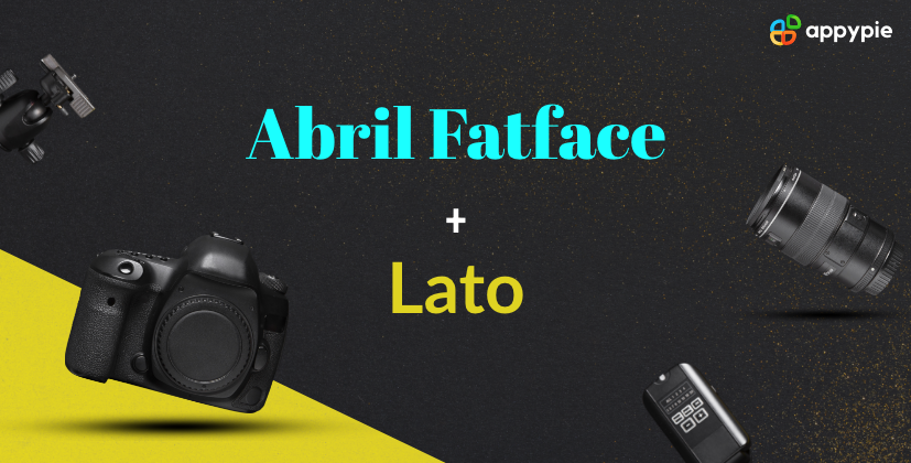
While all these rules and best practices to create the best font combinations are a great way to get started, it can be a little tough to follow in the first go. This is why I have a cheat sheet of the best font combinations that would look great together. Here we go!Abril Fatface and Lato
 This font combination is a classic, where a font inspired by an advertising font from the 1800s - Abril Fatface, is combined perfectly with a modern font designed for a corporation - Lato. The resulting combination is perfect for marketing and digital agency websites.
Calvert and Acumin
Calvert and Acumin are both strong font superfamilies. Calvert has six fonts in the family, while Acumin has 90 different fonts in the family. Calvert Pro and Acumin sans serif fonts go particularly well. However, one tricky thing here is that Acumin requires an Adobe Creative Cloud subscription for access.Playfair Display and Source Sans Pro
Playfair Display is a traditional font type with a subtle style element that has a classic charm. Source Sans Pro, on the other hand, is a simple and unassuming font.
The combination of these fonts brings an old-world charm to a modern space in a very balanced manner, lending a classic appeal to the entire composition.League Spartan and Libre Baskerville
As the name suggests, the League Spartan font possesses multiple Spartan qualities like power, strength, and robustness. The font is big, takes up a lot of space, and has sharp edges. The message is loud and clear when you use the font.
Libre Baskerville, in contrast, is a rounded font with a more elegant appeal. The voice of the font pairing is loud, clear, and warrants attention.Open Sans Condensed and Lora
You can’t write about font combinations without talking about Google font pairings. Open Sans Condensed and Lora is just a beautiful font combination where the former is a professional and bold font perfect for the header and the latter is simply gorgeous.
This combination works beautifully well on blogs and on product pages as well. The overall appeal of this Google font pairing is modern, elegant, and professional.Didonesque and Didact Gothic
This font combination is the perfect example of the oft-repeated (but controversial) - form meets function. Didonesque is a big serif font that makes quite an impact and serves as a perfect header font.
The contrast brought in by the tall and slim sans serif font Didact Gothic is ideal to bring in the much-needed balance on the page.Oswald and Lato Light
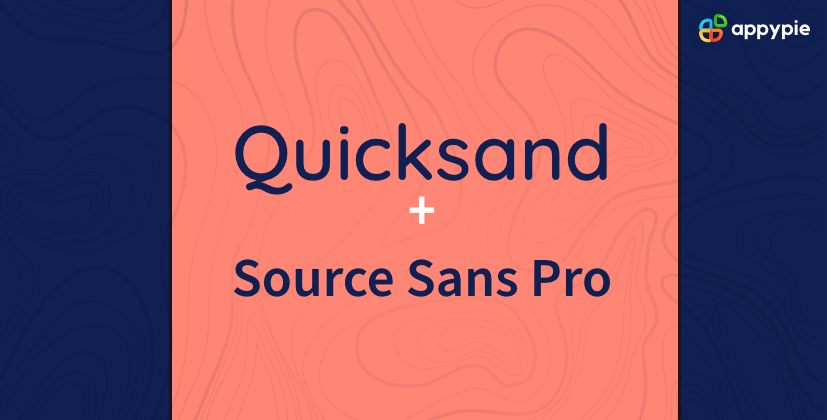
Oswald and Lato Light are two fonts that look like they were designed to work together! The bold, tall, and narrow Oswald font works great as a solid heading font. The Lato Light is broad, but thin and light, making it perfect as a font for the body text. The two fonts work cohesively without taking attention away from one another.Quicksand and Source Sans Pro
Ideal for headlines, Quicksand is a thin, lightweight font with a feminine appeal. The thicker, heavy variant works beautifully in minimalistic designs. In perfect contrast to Quicksand, Source Sans Pro is a modern font with personality. One of the best Google font pairings, this one works wonderfully well for modern brands with a flirty personality.Alegreya Sans Black and Alegreya
This is an excellent example of a font combination from a font superfamily. It was originally developed for literary purposes, and today, it is perfect for both professional and personal blogs. The bold sans headline looks powerful without taking over the entire page and is balanced perfectly with a serif body font.Aqua Grotesque and Roboto Slab Thin
Both these fonts are futuristic in quality and look like they belong in the future. Hence, an excellent choice for brands with a futuristic brand image, for example, software companies, high-tech automobiles, etc.
The body text is refreshingly light, making it a great option for home pages or any other pages with small content sections.Montserrat and Courier New
This font combination is an unusual one where Montserrat is a modern Google font designed particularly for the online world and Courier New is an old school typewriter font. On paper, these two fonts should not even work together, but surprisingly they go very well together! The contrast is beautifully demonstrated by the coming together of the modern vibe of the sans serif font Montserrat and the heavy, retro feel of Courier New.Merriweather with Oswald
Merriweather has a well-populated superfamily where you can try out variations in weight to make just the impact you desire. The font is impactful, legible, and broad so as to take considerable space. When used in headlines, this serif font attracts visitors' attention without screaming. Oswald is a simple sans serif typeface that is tall and narrow in structure, presenting a refreshing contrast to Merriweather. The legibility of the font makes it great for body text and great to pair with Merriweather.Julius Sans One and Archivo Narrow
Julius Sans One is an all-caps font that is a little lightweight. But, despite the lightweight, the font is a great display font. Archivo Narrow is a more severe-looking font with a geometric shape that works beautifully well in both print and digital formats. Put together, the two present a very smart and professional look.Raleway and Libre Baskerville
Raleway is the quintessential header font with its stylized letters. Despite being a sans serif font, it has a little bit of a character which makes it stand out. Libre Baskerville, on the other hand, is a serif font with a classic charm and is quite easy on the eyes. A great pairing for most kinds of designs.
This Google font pairing works best for brands with a big personality, blogs with long-form content, and magazine-style content.Archivo Black and Archivo Narrow
Two fonts from the same typeface superfamily make a winning font pairing for any webpage. The header font Archivo Black is bold and rounded - ideal for its space at the top. The body text - Archivo Narrow goes brilliantly well with the header as the design remains very similar, but the font is lighter and more condensed.
This font combination is potent and can work wonders on portfolios, resumes, flyers, and advertising material.Bebas Neue Bold and Montserrat
A hot favorite in the design community, Bebas Neue Bold font has a condensed and clean form and is great for headlines. The round form of Montserrat and the narrow form of Bebas Neue Bold fonts go very well together.
The font combination of Bebas and Montserrat looks quite tidy and contemporary.Exo 2 and Alegreya Sans
Two fonts that look absolutely gorgeous together - Exo 2 and Alegreya Sans will take your webpage to a whole new level. The futuristic look of Exo 2 grabs the visitors’ attention. Alegreya’s sans serif looks elegant next to it. This font combination is great for futuristic companies including tech, aerospace, and such. The idea is to make sure that it is all readable and legible, while still looking interesting.Fira Sans Black and PT Serif
Both Fira Sans and PT Serif fonts are great in their readability and legibility, making them an excellent choice for any kind of website. But the Fira Sansa Black font almost screams for attention, making it perfect for news websites.Pacifico and Quicksand
This is one of the most interesting and pleasant font combinations on this list with a tropical undertone. Pacifico is a gorgeous brush font that has a flamboyant soul that works perfectly well in headings. Quicksand, on the other hand, is a sans serif font with rounded terminals and an element of quirk here and there. I’m sure you have noticed the unique descender on the capital ‘Q’! Despite all the flourishes and quirks, the font is legible, and the combination is great for advertising content and creative or design-based websites.Oswald and Lato
Oswald could be considered a rework of the alternate gothic sans serif font. Lato, a sans serif font, is a whole different story altogether. Lato means summer in Polish and has a warm appeal to it. Both the fonts have big superfamilies, which present you with multiple font pairing options for your website.Montserrat and Merriweather
Montserrat was a sans serif font designed particularly for online use and is known for its exemplary legibility and readability. Merriweather is a serif font that matches Montserrat in its legibility. Together, the two fonts look cohesive, and the contrasts between them complement each other quite well.Playfair Display and Quattrocento Sans
Playfair Display is a dramatic little font that is big on style and impact - it makes for a great header! Quattrocento Sans is a clean-looking font that balances the big personality of the former. The two fonts together make a design look passionate and modern.Raleway and Lato
Both the fonts are simple and have matching aesthetics without being too similar. Raleway is a little bigger and more condensed than Lato, making it a great choice for an understated yet impactful header. The thinner and smaller Lato is great for body text that doesn’t take the attention away from the header but still has great legibility.Elsie with Roboto
Elsie is a beautiful font that was specially designed for women and has unique flourishes. The serif font is characterized by its flowing edges and has a very delicate look. Elsie needs a simple font to offset its inherent intricacies. Roboto is a clean, straight-laced, no-nonsense sans serif font that doesn’t take away from the charm of the Elsie font header, making it one of the best font combinations.Dancing Script and Josefin Sans
As the name suggests, Dancing Script is a script font with a flowy design. The unique look of the font makes it ideal for creative businesses or professionals. A script font pairs best with a simple font. Josefin Sans is a tall thin font and does not take focus away from the header. The combination is harmonious as the hierarchy is clear, and there is no conflict.Open Sans Extra Bold, Cooper Hewitt, and PT Sans
Yes, three can be good company! The robust and bold Open Sans Extra Bold makes for an impressive heading font that immediately grabs the reader’s attention. Cooper Hewitt in all caps is light and legible and is perfect for a subheading or category marker. PT Sans, an easy-to-read sans serif font, is one of the best fonts for body text. All three fonts are devoid of any frills and go very well together. The combination is reminiscent of the newspaper or magazine style of font pairings.Norwester, Kollektif, and Montserrat
These three fonts, when combined together, bring about a structure and have a geometric look.
Norwester, a geometric font that attracts attention instantly, is great for headings. The three solid and robust fonts put together present a defined hierarchy so that the entire page looks well-structured visually.Yellowtail and Lato
One of the most compact script fonts from Google, Yellowtail is the most neutral and restrained, and it doesn’t over-accentuate. When you use Yellowtail as a header, the crisp look of the sans serif font Lato lends a vibrance to the entire design.Phenomena and Heebo Light
Phenomena - a bold font with a big personality that has a touch of softness due to its rounded edges, makes for an impactful but attractive heading on invitations, creative portfolios, and even magazines.
Heebo Light is on the other end of the spectrum. A quiet, unassuming font that is easy to read and pleasant on the eyes, Heebo Light makes a perfect companion for Phenomena. The contrast is obvious without being conflicting.Antonio and Lato Light
Two fonts that are simple but have immense versatility - Antonio and Lato Light can be used quite creatively. You can vary the weights and sizes and develop interesting compositions that work great on business cards, flyers, magazines, and even creative professional websites.Rozha and Montserrat
Your choice of fonts is heavily dictated by the final property you are placing it on. There are times, like when you are creating a resume, building a visual portfolio, creating an editorial piece in a magazine, or something professional but with a dash of creativity. This is when the font combination of Rozha and Montserrat works the best!
Rozha is a bold serif font, perfect for a heading. Montserrat is a beautiful contrast that is modern, easy on the eyes, and beautifully legible. The contrast is seamless and almost fluid.League Gothic & PT Serif
This font combination is the perfect example of how contrasting fonts can make a perfectly balanced and beautiful webpage. The tall and strong League Gothic font goes in a balanced contrast with the rounded PT Serif that is shaped just right!
Two of them, put together, give a very professional and serious vibe without it looking too dull. The combination works incredibly well for finance-related websites.Libre Baskerville and Source Sans Pro
The serif font Libre Baskerville gives off a firm yet delicate vibe. It is great for the companies or individuals who are new to the game, are politely respectful, but will not shy away from challenges that come their way. The combination of Libre Baskerville and Source Sans Pro presents a solid but modern appeal and is being adopted by businesses that represent the underrepresented.Great Vibes and Montserrat
Great Vibes is an elegant script form, and it’s easy to go overboard with it. I wouldn’t advise that, though. As a heading or title on a page, the font looks about perfect, and Montserrat balances it with a clean, modern look and great versatility. This Google font pairing is amazing for powerful brands with a luxurious touch. It also works surprisingly well for wedding invites!Lobster and Roboto Condensed
Lobster is a cursive font without all the stigma of a handwriting font. The font is readable and legible. It is more of a regular font with a flair and can help you up the style quotient of any home page without going overboard.
On the other hand, Roboto is very neutral with a restrained quality. The two fonts together make a very balanced look with a dash of fun and some style on the page.Minion Pro and Super Grotesk
Minion Pro is a really popular serif font that sits nicely at the top of any webpage as a heading font. It is stable, impactful without being overpowering, and makes you sit up and take note. Super Grotesk is a whimsically light sans-serif font perfect for body text. Together, the two fonts bring in a modern elegance to the page.Kaufmann and NeutraDemi
You may not think of putting Kaufmann and NeutraDemi together. Kaufmann is a handwriting font with a lot of flair and curves all through it, and NeutraDemi is full of angles and straight lines. This massive contrast is probably why they work so well together.
 This font combination is a classic, where a font inspired by an advertising font from the 1800s - Abril Fatface, is combined perfectly with a modern font designed for a corporation - Lato. The resulting combination is perfect for marketing and digital agency websites.
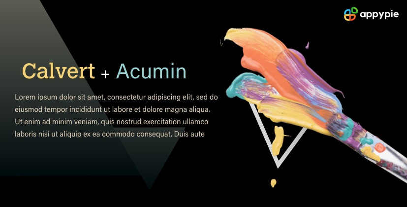 Calvert and Acumin are both strong font superfamilies. Calvert has six fonts in the family, while Acumin has 90 different fonts in the family. Calvert Pro and Acumin sans serif fonts go particularly well. However, one tricky thing here is that Acumin requires an Adobe Creative Cloud subscription for access.
 Playfair Display is a traditional font type with a subtle style element that has a classic charm. Source Sans Pro, on the other hand, is a simple and unassuming font.
The combination of these fonts brings an old-world charm to a modern space in a very balanced manner, lending a classic appeal to the entire composition.
Playfair Display is a traditional font type with a subtle style element that has a classic charm. Source Sans Pro, on the other hand, is a simple and unassuming font.
The combination of these fonts brings an old-world charm to a modern space in a very balanced manner, lending a classic appeal to the entire composition.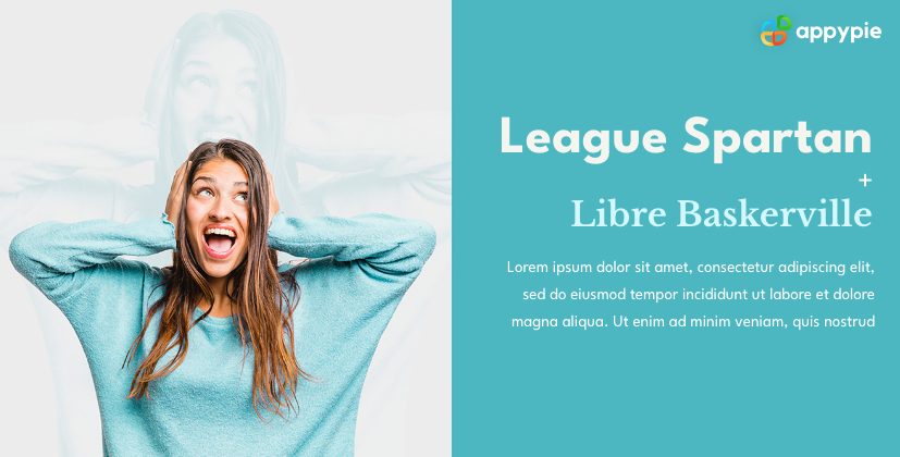 As the name suggests, the League Spartan font possesses multiple Spartan qualities like power, strength, and robustness. The font is big, takes up a lot of space, and has sharp edges. The message is loud and clear when you use the font.
Libre Baskerville, in contrast, is a rounded font with a more elegant appeal. The voice of the font pairing is loud, clear, and warrants attention.
As the name suggests, the League Spartan font possesses multiple Spartan qualities like power, strength, and robustness. The font is big, takes up a lot of space, and has sharp edges. The message is loud and clear when you use the font.
Libre Baskerville, in contrast, is a rounded font with a more elegant appeal. The voice of the font pairing is loud, clear, and warrants attention. You can’t write about font combinations without talking about Google font pairings. Open Sans Condensed and Lora is just a beautiful font combination where the former is a professional and bold font perfect for the header and the latter is simply gorgeous.
This combination works beautifully well on blogs and on product pages as well. The overall appeal of this Google font pairing is modern, elegant, and professional.
You can’t write about font combinations without talking about Google font pairings. Open Sans Condensed and Lora is just a beautiful font combination where the former is a professional and bold font perfect for the header and the latter is simply gorgeous.
This combination works beautifully well on blogs and on product pages as well. The overall appeal of this Google font pairing is modern, elegant, and professional.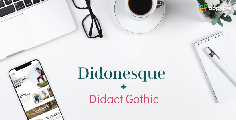 This font combination is the perfect example of the oft-repeated (but controversial) - form meets function. Didonesque is a big serif font that makes quite an impact and serves as a perfect header font.
The contrast brought in by the tall and slim sans serif font Didact Gothic is ideal to bring in the much-needed balance on the page.
This font combination is the perfect example of the oft-repeated (but controversial) - form meets function. Didonesque is a big serif font that makes quite an impact and serves as a perfect header font.
The contrast brought in by the tall and slim sans serif font Didact Gothic is ideal to bring in the much-needed balance on the page.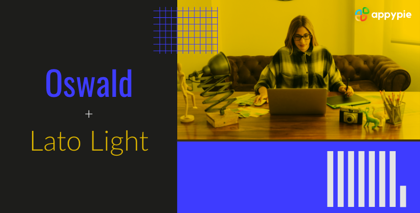 Oswald and Lato Light are two fonts that look like they were designed to work together! The bold, tall, and narrow Oswald font works great as a solid heading font. The Lato Light is broad, but thin and light, making it perfect as a font for the body text. The two fonts work cohesively without taking attention away from one another.
 Ideal for headlines, Quicksand is a thin, lightweight font with a feminine appeal. The thicker, heavy variant works beautifully in minimalistic designs. In perfect contrast to Quicksand, Source Sans Pro is a
 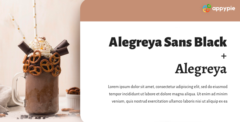 This is an excellent example of a font combination from a font superfamily. It was originally developed for literary purposes, and today, it is perfect for both professional and personal blogs. The bold sans headline looks powerful without taking over the entire page and is balanced perfectly with a serif body font.
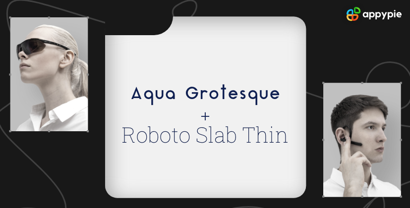 Both these fonts are futuristic in quality and look like they belong in the future. Hence, an excellent choice for brands with a futuristic brand image, for example, software companies, high-tech automobiles, etc.
The body text is refreshingly light, making it a great option for home pages or any other pages with small content sections.
Both these fonts are futuristic in quality and look like they belong in the future. Hence, an excellent choice for brands with a futuristic brand image, for example, software companies, high-tech automobiles, etc.
The body text is refreshingly light, making it a great option for home pages or any other pages with small content sections.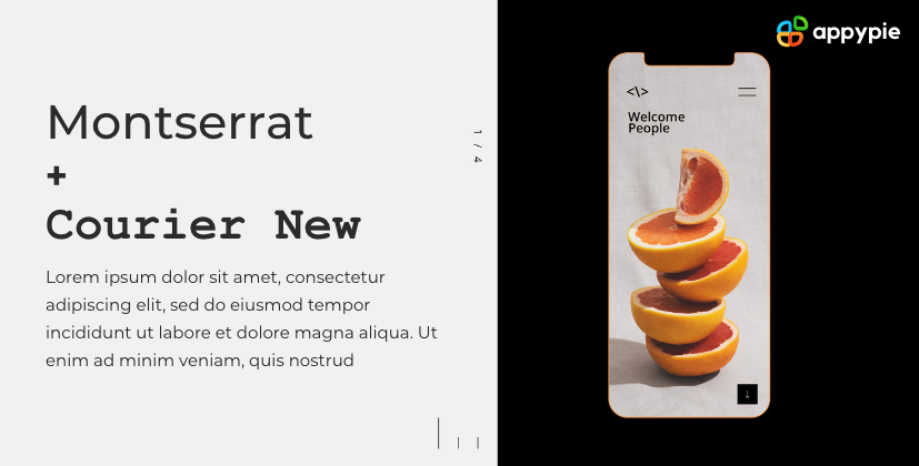 This font combination is an unusual one where Montserrat is a modern Google font designed particularly for the online world and Courier New is an old school typewriter font. On paper, these two fonts should not even work together, but surprisingly they go very well together! The contrast is beautifully demonstrated by the coming together of the modern vibe of the sans serif font Montserrat and the heavy, retro feel of Courier New.
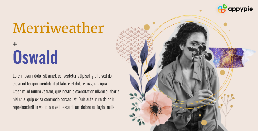 Merriweather has a well-populated superfamily where you can try out variations in weight to make just the impact you desire. The font is impactful, legible, and broad so as to take considerable space. When used in headlines, this serif font attracts visitors' attention without screaming. Oswald is a simple sans serif typeface that is tall and narrow in structure, presenting a refreshing contrast to Merriweather. The legibility of the font makes it great for body text and great to pair with Merriweather.
 Julius Sans One is an all-caps font that is a little lightweight. But, despite the lightweight, the font is a great display font. Archivo Narrow is a more severe-looking font with a geometric shape that works beautifully well in both print and digital formats. Put together, the two present a very smart and professional look.
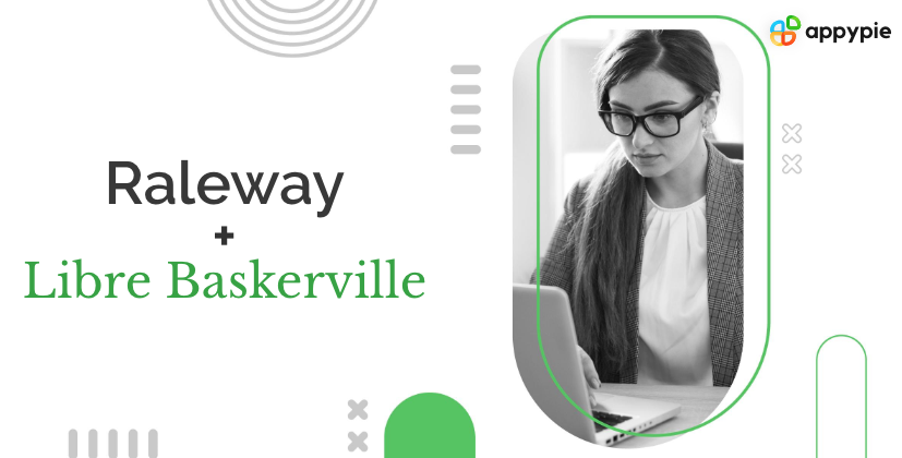 Raleway is the quintessential header font with its stylized letters. Despite being a sans serif font, it has a little bit of a character which makes it stand out. Libre Baskerville, on the other hand, is a serif font with a classic charm and is quite easy on the eyes. A great pairing for most kinds of designs.
This Google font pairing works best for brands with a big personality, blogs with long-form content, and magazine-style content.
Raleway is the quintessential header font with its stylized letters. Despite being a sans serif font, it has a little bit of a character which makes it stand out. Libre Baskerville, on the other hand, is a serif font with a classic charm and is quite easy on the eyes. A great pairing for most kinds of designs.
This Google font pairing works best for brands with a big personality, blogs with long-form content, and magazine-style content. Two fonts from the same typeface superfamily make a winning font pairing for any webpage. The header font Archivo Black is bold and rounded - ideal for its space at the top. The body text - Archivo Narrow goes brilliantly well with the header as the design remains very similar, but the font is lighter and more condensed.
This font combination is potent and can work wonders on portfolios, resumes, flyers, and advertising material.
Two fonts from the same typeface superfamily make a winning font pairing for any webpage. The header font Archivo Black is bold and rounded - ideal for its space at the top. The body text - Archivo Narrow goes brilliantly well with the header as the design remains very similar, but the font is lighter and more condensed.
This font combination is potent and can work wonders on portfolios, resumes, flyers, and advertising material.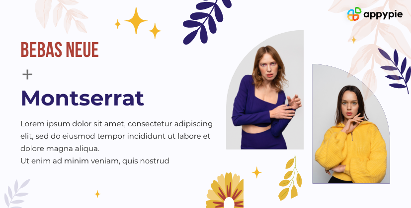 A hot favorite in the design community, Bebas Neue Bold font has a condensed and clean form and is great for headlines. The round form of Montserrat and the narrow form of Bebas Neue Bold fonts go very well together.
The font combination of Bebas and Montserrat looks quite tidy and contemporary.
A hot favorite in the design community, Bebas Neue Bold font has a condensed and clean form and is great for headlines. The round form of Montserrat and the narrow form of Bebas Neue Bold fonts go very well together.
The font combination of Bebas and Montserrat looks quite tidy and contemporary.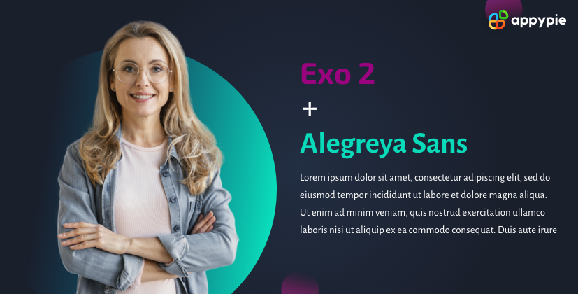 Two fonts that look absolutely gorgeous together - Exo 2 and Alegreya Sans will take your webpage to a whole new level. The futuristic look of Exo 2 grabs the visitors’ attention. Alegreya’s sans serif looks elegant next to it. This font combination is great for futuristic companies including tech, aerospace, and such. The idea is to make sure that it is all readable and legible, while still looking interesting.
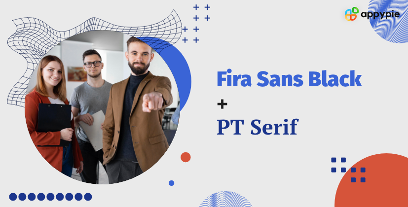 Both Fira Sans and PT Serif fonts are great in their readability and legibility, making them an excellent choice for any kind of website. But the Fira Sansa Black font almost screams for attention, making it perfect for news websites.
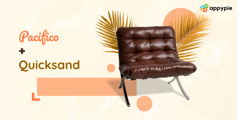 This is one of the most interesting and pleasant font combinations on this list with a tropical undertone. Pacifico is a gorgeous brush font that has a flamboyant soul that works perfectly well in headings. Quicksand, on the other hand, is a sans serif font with rounded terminals and an element of quirk here and there. I’m sure you have noticed the unique descender on the capital ‘Q’! Despite all the flourishes and quirks, the font is legible, and the combination is great for advertising content and creative or design-based websites.
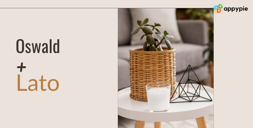 Oswald could be considered a rework of the alternate gothic sans serif font. Lato, a sans serif font, is a whole different story altogether. Lato means summer in Polish and has a warm appeal to it. Both the fonts have big superfamilies, which present you with multiple font pairing options for your website.
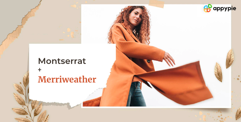 Montserrat was a sans serif font designed particularly for online use and is known for its exemplary legibility and readability. Merriweather is a serif font that matches Montserrat in its legibility. Together, the two fonts look cohesive, and the contrasts between them complement each other quite well.
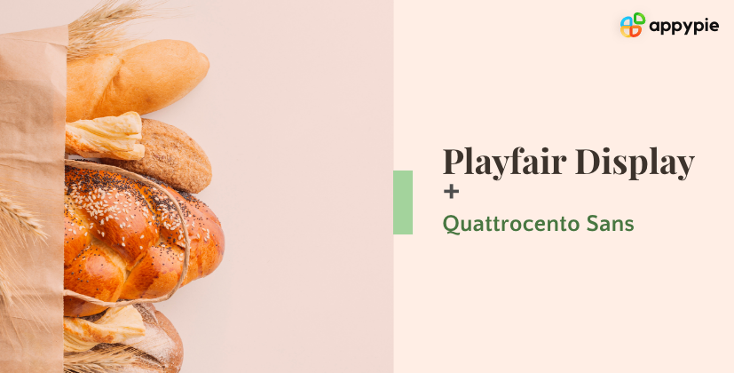 Playfair Display is a dramatic little font that is big on style and impact - it makes for a great header! Quattrocento Sans is a clean-looking font that balances the big personality of the former. The two fonts together make a design look passionate and modern.
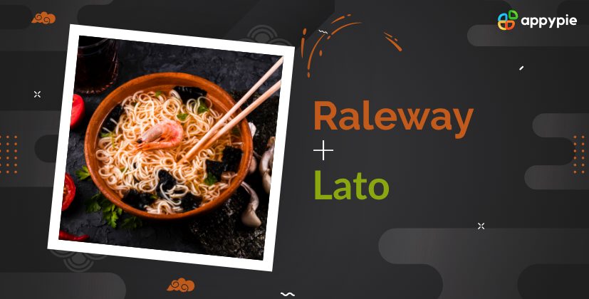 Both the fonts are simple and have matching aesthetics without being too similar. Raleway is a little bigger and more condensed than Lato, making it a great choice for an understated yet impactful header. The thinner and smaller Lato is great for body text that doesn’t take the attention away from the header but still has great legibility.
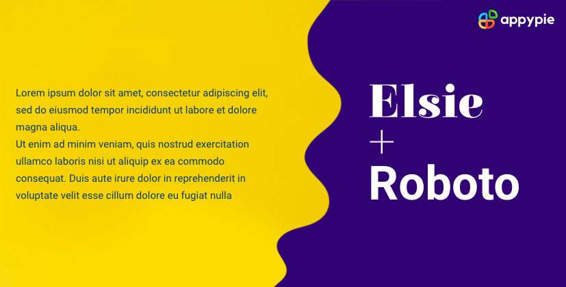 Elsie is a beautiful font that was specially designed for women and has unique flourishes. The serif font is characterized by its flowing edges and has a very delicate look. Elsie needs a simple font to offset its inherent intricacies. Roboto is a clean, straight-laced, no-nonsense sans serif font that doesn’t take away from the charm of the Elsie font header, making it one of the best font combinations.
 As the name suggests, Dancing Script is a script font with a flowy design. The unique look of the font makes it ideal for creative businesses or professionals. A script font pairs best with a simple font. Josefin Sans is a tall thin font and does not take focus away from the header. The combination is harmonious as the hierarchy is clear, and there is no conflict.
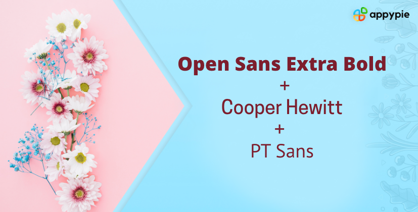 Yes, three can be good company! The robust and bold Open Sans Extra Bold makes for an impressive heading font that immediately grabs the reader’s attention. Cooper Hewitt in all caps is light and legible and is perfect for a subheading or category marker. PT Sans, an easy-to-read sans serif font, is one of the best fonts for body text. All three fonts are devoid of any frills and go very well together. The combination is reminiscent of the newspaper or magazine style of font pairings.
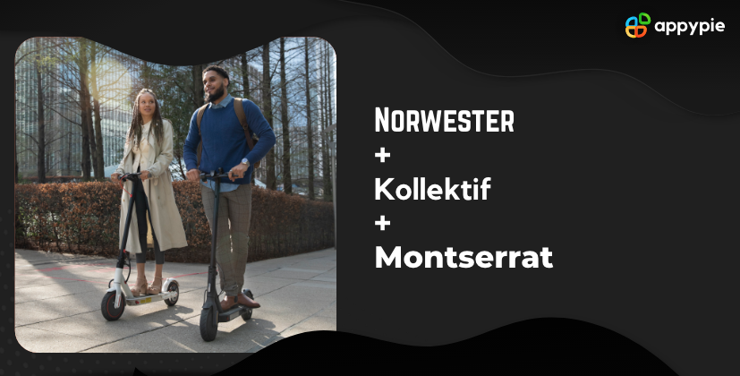 These three fonts, when combined together, bring about a structure and have a geometric look.
Norwester, a geometric font that attracts attention instantly, is great for headings. The three solid and robust fonts put together present a defined hierarchy so that the entire page looks well-structured visually.
These three fonts, when combined together, bring about a structure and have a geometric look.
Norwester, a geometric font that attracts attention instantly, is great for headings. The three solid and robust fonts put together present a defined hierarchy so that the entire page looks well-structured visually.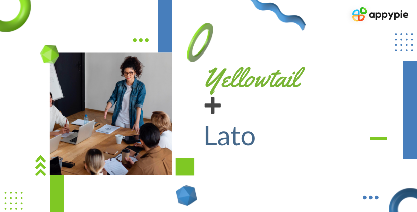 One of the most compact script fonts from Google, Yellowtail is the most neutral and restrained, and it doesn’t over-accentuate. When you use Yellowtail as a header, the crisp look of the sans serif font Lato lends a vibrance to the entire design.
 Phenomena - a bold font with a big personality that has a touch of softness due to its rounded edges, makes for an impactful but attractive heading on invitations, creative portfolios, and even magazines.
Heebo Light is on the other end of the spectrum. A quiet, unassuming font that is easy to read and pleasant on the eyes, Heebo Light makes a perfect companion for Phenomena. The contrast is obvious without being conflicting.
Phenomena - a bold font with a big personality that has a touch of softness due to its rounded edges, makes for an impactful but attractive heading on invitations, creative portfolios, and even magazines.
Heebo Light is on the other end of the spectrum. A quiet, unassuming font that is easy to read and pleasant on the eyes, Heebo Light makes a perfect companion for Phenomena. The contrast is obvious without being conflicting. Two fonts that are simple but have immense versatility - Antonio and Lato Light can be used quite creatively. You can vary the weights and sizes and develop interesting compositions that work great on business cards, flyers, magazines, and even creative professional websites.
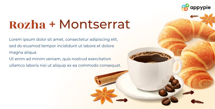 Your choice of fonts is heavily dictated by the final property you are placing it on. There are times, like when you are creating a resume, building a visual portfolio, creating an editorial piece in a magazine, or something professional but with a dash of creativity. This is when the font combination of Rozha and Montserrat works the best!
Rozha is a bold serif font, perfect for a heading. Montserrat is a beautiful contrast that is modern, easy on the eyes, and beautifully legible. The contrast is seamless and almost fluid.
Your choice of fonts is heavily dictated by the final property you are placing it on. There are times, like when you are creating a resume, building a visual portfolio, creating an editorial piece in a magazine, or something professional but with a dash of creativity. This is when the font combination of Rozha and Montserrat works the best!
Rozha is a bold serif font, perfect for a heading. Montserrat is a beautiful contrast that is modern, easy on the eyes, and beautifully legible. The contrast is seamless and almost fluid.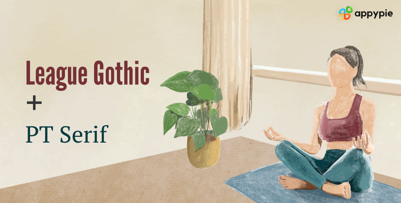 This font combination is the perfect example of how contrasting fonts can make a perfectly balanced and beautiful webpage. The tall and strong League Gothic font goes in a balanced contrast with the rounded PT Serif that is shaped just right!
Two of them, put together, give a very professional and serious vibe without it looking too dull. The combination works incredibly well for finance-related websites.
This font combination is the perfect example of how contrasting fonts can make a perfectly balanced and beautiful webpage. The tall and strong League Gothic font goes in a balanced contrast with the rounded PT Serif that is shaped just right!
Two of them, put together, give a very professional and serious vibe without it looking too dull. The combination works incredibly well for finance-related websites.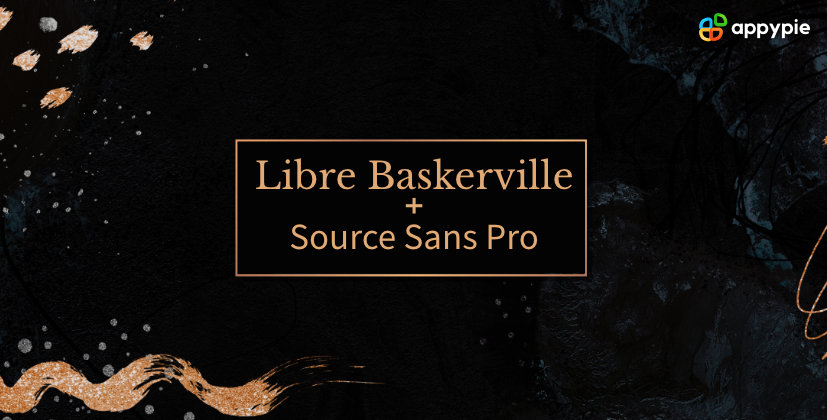 The serif font Libre Baskerville gives off a firm yet delicate vibe. It is great for the companies or individuals who are new to the game, are politely respectful, but will not shy away from challenges that come their way. The combination of Libre Baskerville and Source Sans Pro presents a solid but modern appeal and is being adopted by businesses that represent the underrepresented.
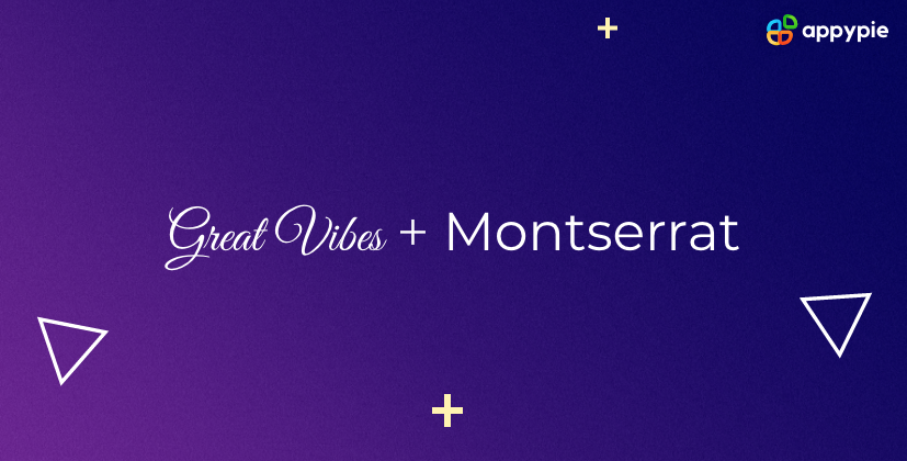 Great Vibes is an elegant script form, and it’s easy to go overboard with it. I wouldn’t advise that, though. As a heading or title on a page, the font looks about perfect, and Montserrat balances it with a clean, modern look and great versatility. This Google font pairing is amazing for powerful brands with a luxurious touch. It also works surprisingly well for wedding invites!
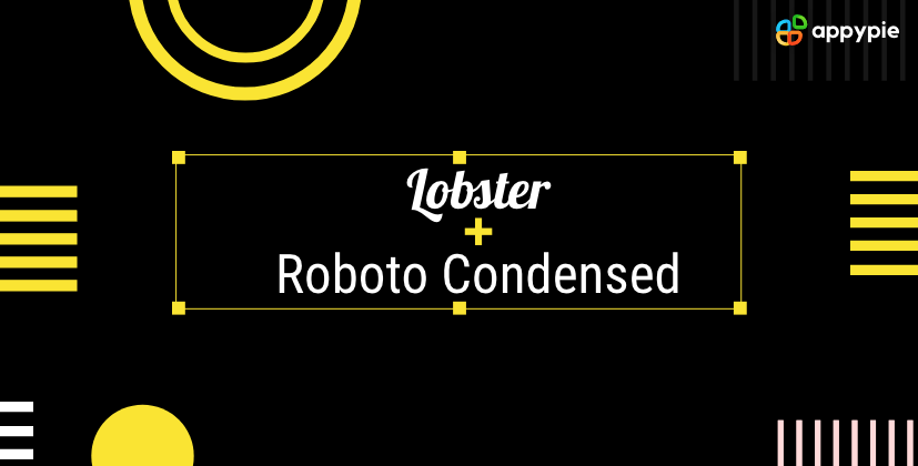 Lobster is a cursive font without all the stigma of a handwriting font. The font is readable and legible. It is more of a regular font with a flair and can help you up the style quotient of any home page without going overboard.
On the other hand, Roboto is very neutral with a restrained quality. The two fonts together make a very balanced look with a dash of fun and some style on the page.
Lobster is a cursive font without all the stigma of a handwriting font. The font is readable and legible. It is more of a regular font with a flair and can help you up the style quotient of any home page without going overboard.
On the other hand, Roboto is very neutral with a restrained quality. The two fonts together make a very balanced look with a dash of fun and some style on the page. Minion Pro is a really popular serif font that sits nicely at the top of any webpage as a heading font. It is stable, impactful without being overpowering, and makes you sit up and take note. Super Grotesk is a whimsically light sans-serif font perfect for body text. Together, the two fonts bring in a modern elegance to the page.
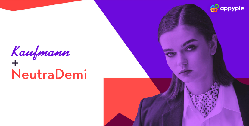 You may not think of putting Kaufmann and NeutraDemi together. Kaufmann is a handwriting font with a lot of flair and curves all through it, and NeutraDemi is full of angles and straight lines. This massive contrast is probably why they work so well together.
How to Generate Fonts Using Appy Pie's AI Font Generator?
There are multiple different font generators available online include some great free font generators. However, with Appy Pie's AI font generator, crafting personalized fonts becomes a breeze through a simple process. This innovative tool combines the power of artificial intelligence with a user-friendly interface and offers customization options to deliver fonts perfectly tailored to your unique design requirements.- Define Your Design Preferences Specifying your design preferences clearly. Choose from various font styles and categories. These preferences serve as your input for the AI font generator, enabling it to comprehend your design objectives and adjust the font accordingly.
- AI Font Generation Once you've provided your design preferences, this font finder utilizes its extensive database of existing fonts and harnesses the capabilities of artificial intelligence to generate unique font designs to match your criteria.
- Personalize and Download The font generator offers various customization options, enabling you to adjust parameters such as stroke thickness, spacing, or curves to match your exact requirements. Once you are satisfied with the final result, you can readily download the font files for immediate integration into your design projects.
Rules For Creating The Best Font Combinations
While rules in the creative realm are taken loosely and often broken or twisted, some basic ones have stood the test of time when it comes to font pairings.Try pairing fonts from the same font superfamily
It is a good idea to choose the best fonts from the same superfamily. In fact, it is a great idea, as all these fonts already have the weights, styles, and classifications that are designed specifically to work well together. While choosing font combinations within the same superfamily, one thing to remember is that they should blend well but not be indistinguishable. Some superfamilies have dozens of font options like thick, thin, serif, sans serif, condensed, and extended. These are perfect for you to start experimenting. You can play around with font sizes and weights to create contrasts and find the perfect font pairing for your website.Pair contrasting fonts, but ensure that there is no conflict
Contrasting fonts, whether of the same superfamily or not, can make your website look beautiful. However, it can be a thin line between contrast and conflict. The fonts you choose must complement one another. It means that even if the chosen fonts look nothing like each other, they should present a cohesive visual image to the website visitor. One foolproof way to do this is by pairing serif and sans-serif fonts together. Another important way to avoid conflict in font combinations is to maintain a clear hierarchy. This could be achieved simply by varying the weights, size, and color of the same typeface. However, when you are using different typefaces, the font combinations become more tricky. So if you are using a bold font burgeoning with personality, it is better to balance it with a more neutral font in the body text. Even while doing this, remember that the font styles should be in harmony.Do not use more than three fonts under any circumstances
When you start looking for the fonts, choose a header font that looks good when blown up and catches the audience’s eye. For the body text, the font you select must be readable and legible so that the visitors can easily consume all the information you put out there. Once you have decided on these two fonts, you can only look for a third font if you feel a strong need for it. However, most of the websites do pretty well with just two fonts.Pay attention to the font size and shape vis-a-vis the purpose of the font
As I mentioned earlier in the post, one of the major reasons for using two different fonts on the same page is to establish a clear content hierarchy. Agreed, in some cases, this can be done by increasing the font of the headline by 10pts, but it isn’t always as effective. Hence, the need to pair different fonts. You can enhance the ability of your header to grab the visitors’ attention by choosing a tall and condensed font. You can balance it by choosing a body text font that is rounded and has more breathing space so that there is a relief and the whole page looks attractive while being easy to read.
Conclusion
Whether you use two fonts or three, it is important to pair them right. Some fonts are naturally meant for headings while others are perfect for body text, and you can always differentiate the subheadings with a third font. To get the font pairing right, it is important to find the balance between the aesthetics, weight, and curves of the fonts you want to use. Now that you have seen it all, it is time to explore AI design tools and create your own font combinations!Related Articles
- How to write an Executive Summary for your Business Plan?
- Connecting NeRFs, Images, and Text
- Top 10 Instagram Font Generator Tools in 2024: Copy and Paste Fonts
- A Comprehensive Guide to Customer Lifecycle Management
- Best Food Logos That Will Leave You Craving More
- Salesforce AWS S3 Integration | How to integrate Salesforce with AWS S3?
- 25 Best Inbound Call Center Software Examples
- 5 Powerful Reasons Why You Need to Use Video Marketing
- The 12 Best Payment Apps for Businesses in 2023
- Best 10 Email Apps for iPhone in 2024