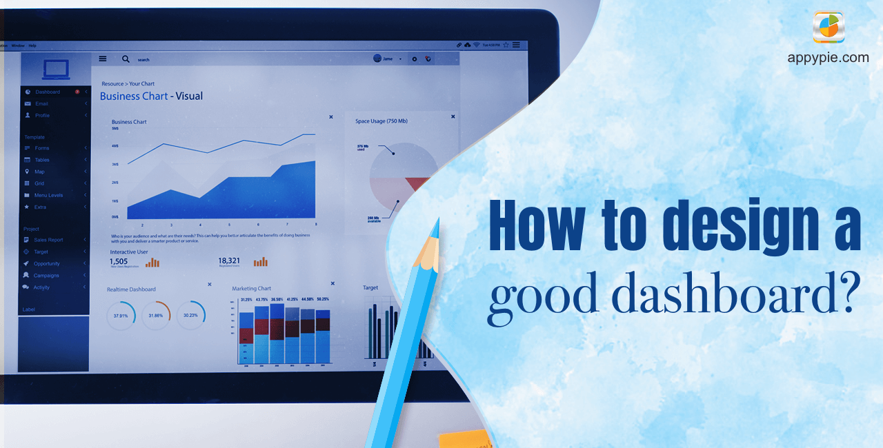
How to design a good dashboard [with Examples]

By Abhinav Girdhar | Last Updated on April 24th, 2024 10:06 am | 4-min read
A dashboard is the first point of contact for users that interact with your website. It won't matter how good your product or service is if it has a dashboard that is difficult to understand. Creating a good dashboard is a difficult assignment for most designers. A lot of research goes into designing a dashboard. However, with the evolution of graphic design, dashboard designs have vastly improved.
Types of Dashboard Designs
One software/service usually has multiple dashboards for its various functionalities. The dashboard that a particular page needs to have comes down to the content that is displayed on it. There is a vast variety of dashboard designs on the internet. However, they can be roughly categorized into 4 unique types.![How to design a good dashboard[with Examples]](https://www.appypie.com/wp-content/uploads/2019/11/Types-of-Dashboard.jpg)
Operational Dashboards
Operational dashboards are used to show the current status of your app/websites. This dashboard design is suited for time-intensive tasks. All operational dashboards are a digital control room. The purpose of an operational dashboard is to show relevant information and data deviations quickly. They are meant to be fast, accurate and efficient. Examples: The dashboard software that assists in day trading, real-time analytics page of Google Analytics, etc. The function is a bigger priority than the form which is why operational dashboards are geared for functionality and are confusing to a normal user. However, professionals can figure it out.Analytical Dashboards
As the name suggests, analytical dashboards are data-centric dashboards meant to manipulate and show relevant data for the user. They are designed to make analysis easier. All analysts work on analytical dashboards. The focus of analytical dashboards is not on immediate action. They are made to provide efficient analysis in a relaxed design scheme. Analytical dashboards can be made beautiful but they still require function as much as an operational dashboard. Analytical dashboards are fairly common and every service/product online has an analytical dashboard.Strategic Dashboards
Strategic dashboards are a more advanced form of analytical dashboards. They are often used to observe ‘trends’ over long periods of time. Strategic dashboards are complex and usually reserved for senior management. They represent many factors that do not exist in analytical dashboards and are complex to design. They are not suited for form and usually are terrible to look at and difficult to design pleasingly. They, however, are extremely efficient for helping decide longterm strategies for a business. Strategic dashboards need to be the most well-designed dashboards in a business setting.Platform dashboards
This is the most common type of dashboard. Found in almost every website, platform dashboards are usually the point of first contact or the first dashboard you see when you log into a product/service account. Platform dashboards are created to be user-friendly & easy-to-use. They may link to a page with other kinds of dashboards but their job is to feel familiar for the user. Platform dashboards are the norm for social media websites and, the login page of most websites where signups are required. They often concentrate on form over function but their functionalities can be designed in a user-friendly way for unmatched balance between form and function. The design philosophy behind platform dashboards is sometimes applied to other dashboards to create beautiful yet functional dashboard designs.
Other Dashboard Designs
Time-in-app dashboards(New Concept)
These dashboards are a recent concept and are currently used only by Facebook and its apps. This dashboard is meant for the users to track the time they’ve spent on their social media account. A user can set limits and monitor their activities. It is an excellent concept in a world that has been taken over by social media. Kudos to Facebook!Tactical Dashboards
These are essentially analytical dashboards designed for the middle management of a business.
Things to remember while designing a dashboard
Accurate use of Information Architecture/Ergonomics
Information architecture is the art/science behind designing user-friendly interfaces. It is recommended that one studies the basics before attempting designing a dashboard. In layman’s terms, information architecture can be translated to the ergonomics of an internet dashboard. The first consideration while designing a dashboard is the ergonomics. Everything that can be considered a priority for the end-user should be within their eye’s reach. For example, a day trader must have the share prices of the commodity he’s viewing right in front of his eyes and everything else related to shares within short reach. An example of excellent information architecture is the home page dashboard of social media websites. Websites like Facebook, Reddit, Tumblr don’t open the website to your profile but rather your timeline/news feed. The philosophy behind it is that you log in to social media to look at your friends, events, etc. and not yourself. However, the profile page icon is always in your periphery since that is the second place you’ll consider going. Ergonomics is 50% of designing dashboards. You could do everything right and still fail if you mess up the ergonomics of a dashboard. It forms the backbone and the basic skeleton of a page. It’s always recommended that before launching a new dashboard, you ask for user feedback. To have good ergonomics, it’s recommended that you stick to the norm of dashboard design based on the industry you’re designing for.Simplistic Design
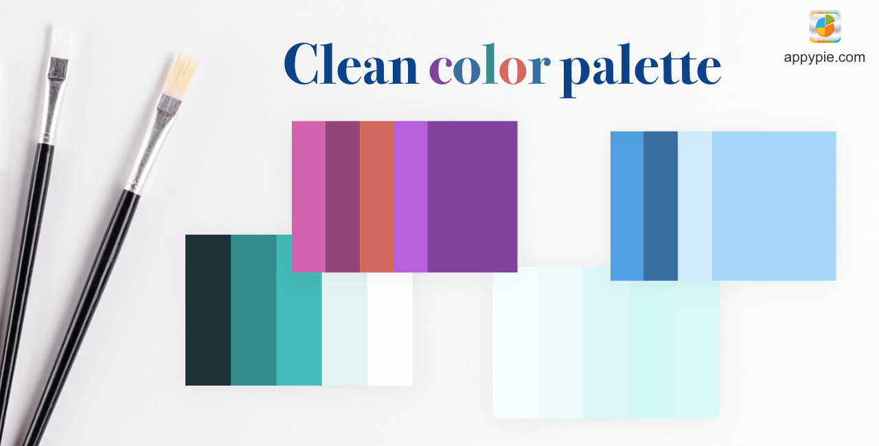
Everyone loves artistic designs. But the simplicity of a dashboard is what makes it great. Dashboard designs aren’t meant to be complicated since users, both consumers and professionals, prefer a simple design over flashy unnecessary blingy webpages. The true challenge of dashboard design is keeping it simple and still making it fashionable. That is done through a clean color palette.Clean Color Palette
A clean color palette is the hardest aspect of graphic designing. It is no different when designing a dashboard. Designing clean color palettes for dashboards is infinitely hard and therefore most designers stick to a clean white & blue palette. However, experimentation is not necessarily a bad thing. This is the creative space where a designer should experiment in a dashboard design A key aspect of choosing a clean color palette lies in keeping gradient shades balanced and contrasts to a minimum. If your dashboard design has graphs a contrast to the rest of the dashboard may be better suited. Light & warm colors are often recommended. A good way to go about the color of a dashboard is to provide a list of pleasing color palettes that a user can choose from.
 A key aspect of choosing a clean color palette lies in keeping gradient shades balanced and contrasts to a minimum. If your dashboard design has graphs a contrast to the rest of the dashboard may be better suited. Light & warm colors are often recommended. A good way to go about the color of a dashboard is to provide a list of pleasing color palettes that a user can choose from.
Related Articles
- 7 Ways to Use Real Estate Marketing Automation
- Top 15 Applications for Freelancers
- Creative Ways to Make Money from Money to Increase Financial Potential
- 11 Telegram Bots to Download Music in 2023
- How to Make a Collage on iPhone: A Step-by-Step Guide
- Hardware Requirements for Large Language Model (LLM) Training
- Top Influencers for 2023 *[Across Categories]
- Best Call-Tracking Software & Apps in 2024
- AI in App Development: Benefits, Risks, and Solutions
- Psychographic Segmentation: The Essential Reading for Beginners