
Designing with Cinnamon Color: Tips and Tricks

Introduction
Cinnamon color, oh sweet cinnamon color! It's the perfect balance between earthy brown and chili pepper. It's the color of warmth, comfort, and nostalgia. The kind of color that instantly gives you a sense of home and coziness. In graphic designing, cinnamon color has gained immense popularity for its ability to create striking visual impact while conveying a sense of groundedness and naturalness. It's a versatile color that can be used in everything from branding to web design to typography. And the best part? It pairs beautifully with a range of colors, from pastels to jewel tones. So, let's dive deep into the world of cinnamon color in graphic designing and unleash its true potential.
Table of Content
- Introduction
- The Significance of Cinnamon Color in the Realm of Graphic Design
- A Comprehensive Guide to Creating Color Palettes with Cinnamon
- The importance of Cinnamon Color in the World of Design
- The Evolution of Cinnamon Color from Antiquity to Modern Times
- Design Harmony with Cinnamon: The Role of Complementary Colors
- Mastering Cinnamon Color Shades: A Guide to HEX Codes
- Enhance Your Design Skills and Craft Stunning Graphics with Appy Pie's AI Image Color Picker
- Conclusion
The Significance of Cinnamon Color in the Realm of Graphic Design
Cinnamon color, a warm and inviting hue that can evoke a range of emotions and sensations, has been making waves in the world of graphic design. From logos to packaging, from web design to advertising, cinnamon color has become an increasingly popular choice for designers looking to create an impact.
One of the reasons cinnamon has become so popular is its versatility. It can be used to create a sense of groundedness and naturalness, as well as a feeling of warmth and comfort. It's the perfect balance between earthy brown and chili pepper color, making it a unique and attention-grabbing color.
Cinnamon color is also associated with creativity and innovation, which makes it an ideal choice for companies looking to stand out in a crowded market. By incorporating cinnamon color into their branding, companies can convey a sense of originality and forward-thinking, while also evoking a feeling of trust and dependability.
Moreover, cinnamon color is a great choice for designers looking to create a cohesive and inviting color palette. It pairs beautifully with a range of colors, including soft pastels like lavender or mint, jewel tones such as emerald green or ruby, and earthy neutrals akin to taupe or slate gray. This means that designers can use cinnamon color as a foundation to build a color scheme around, creating a cohesive and eye-catching design.


A Comprehensive Guide to Creating Color Palettes with Cinnamon
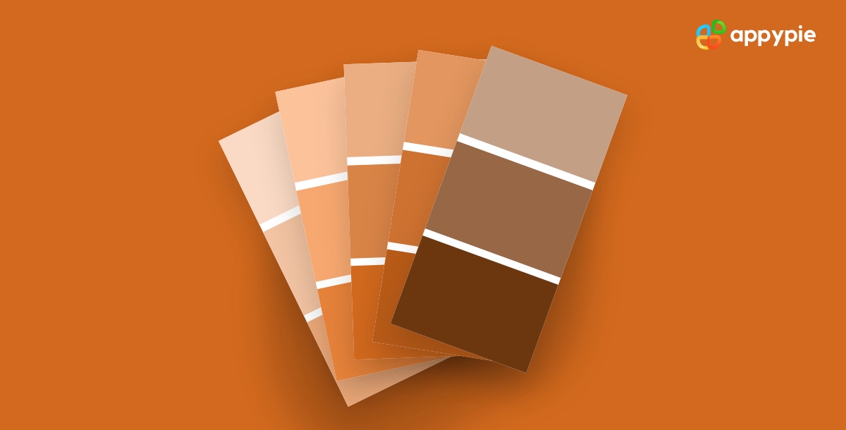
Designing a color palette with cinnamon can be a fun and creative way to add warmth and depth to your designs. With its rich and inviting tones, cinnamon color can create a sense of groundedness and naturalness, making it an ideal choice for a range of design projects.
To create a cohesive color palette with cinnamon, it's important to start by understanding the different shades and tones that can be achieved with this color. Cinnamon can range from a light and creamy beige to a deep and spicy reddish-brown, so it's essential to choose the right shade for your design.
Once you've chosen your cinnamon shade, it's time to start pairing it with other colors. Cinnamon pairs beautifully with a range of colors, including soft pastels, jewel tones, and earthy neutrals. For a more adventurous color palette, try pairing cinnamon with brighter hues, like turquoise or fuchsia.
It's also important to think about the proportion of cinnamon in your color palette. Too much cinnamon can be overwhelming, while too little can make your design feel flat and uninteresting. Experiment with different proportions to find the right balance for your design.
The importance of Cinnamon Color in the World of Design

Cinnamon color is a warm and inviting color that has taken the world of design by storm. This versatile color has become an increasingly popular choice for designers looking to create designs that evoke feelings of comfort, warmth, and groundedness.
One of the reasons cinnamon color has become so popular in design is its ability to convey a sense of naturalness and earthiness. This makes it an ideal choice for design projects that focus on sustainability, wellness, and organic products.
Cinnamon color is also associated with creativity and innovation, which makes it an ideal choice for companies looking to create designs that stand out from the crowd. By incorporating cinnamon color into their branding and design, companies can convey a sense of originality and forward-thinking, while also evoking a feeling of trust and dependability, similar to what is associated with emerald green.
Cinnamon color also pairs beautifully with a range of other colors, from soft pastels to rich jewel tones. This means that designers can use cinnamon color as a foundation to build a color scheme around, creating a cohesive and eye-catching design.
The Evolution of Cinnamon Color from Antiquity to Modern Times
Cinnamon color has a rich history that can be traced back to ancient times. It has been used for a variety of purposes, from traditional medicine to culinary arts, and has remained a popular color choice in design for centuries.
In ancient times, cinnamon was highly valued for its medicinal properties, and was used by healers to treat a variety of ailments. It was also used in religious ceremonies, and its warm and comforting tones were often associated with spiritual well-being.
As time passed, cinnamon became increasingly popular as a spice and was used in a variety of culinary applications. Its distinct flavor and aroma made it a sought-after ingredient in many cultures, and it was soon recognized as a symbol of wealth and luxury.
In the world of design, cinnamon color has also evolved over time. It has been used in a range of design styles, from traditional to modern, and has remained a popular color choice for its warmth, naturalness, and versatility.
Today, colors like cinnamon, charcoal and gray can be found in a range of design applications, from branding and packaging to interior design and fashion. The evolution of these colors particularly cinnamon from ancient times to modern times is a testament to its enduring popularity and versatility in design.
Design Harmony with Cinnamon: The Role of Complementary Colors
Designing with cinnamon color can be an enriching experience. This warm, earthy color can be used in a variety of design applications, from branding and packaging to website design and interior design. But how can you achieve design harmony with cinnamon color? One effective method is through the use of complementary colors.
Complementary colors are colors that are opposite each other on the color wheel. When used together, they create a sense of visual harmony and balance. For cinnamon color, the complementary color is a blue-green hue. By pairing cinnamon with a blue-green color, designers can create a striking and eye-catching color palette that is both warm and cool.
In addition to blue-green, other complementary colors can also be used with cinnamon color, such as soft pinks or pale yellows. These colors can create a more subdued and harmonious palette, perfect for designs that require a more calming and comforting feel.
Design harmony with cinnamon color can also be achieved through the use of analogous colors. Analogous colors are colors that sit next to each other on the color wheel. They create a harmonious and cohesive color scheme, making them an excellent choice for designs that require a sense of unity and balance.
Mastering Cinnamon Color Shades: A Guide to HEX Codes
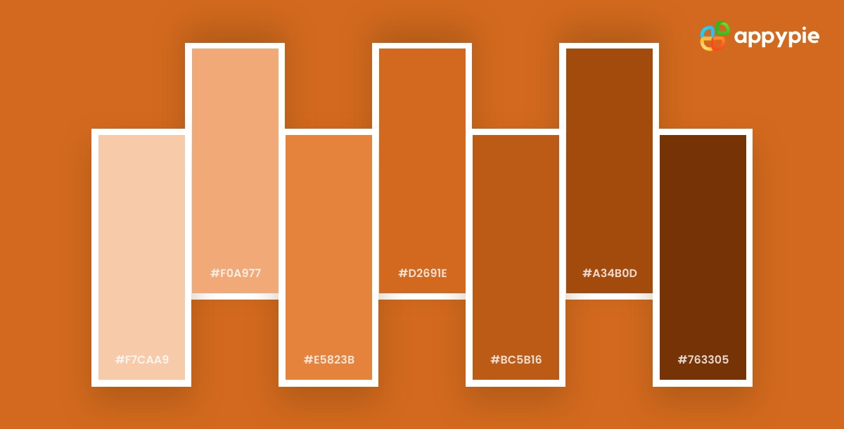
Here's a guide to mastering cinnamon color shades through HEX codes:
- Understanding HEX Codes
- The Cinnamon Color Spectrum
- Lighter Cinnamon Shades
- Medium Cinnamon Shades
- Darker Cinnamon Shades
- Combining Cinnamon Shades
HEX codes are six-digit codes that represent specific colors in digital design. To master cinnamon color shades, you need to first understand how HEX codes work.
The cinnamon color spectrum ranges from light, creamy shades to dark, rich browns. To create the perfect cinnamon color shade, you need to understand the color spectrum and the specific HEX codes that correspond to each shade.
For lighter cinnamon shades, HEX codes that start with "F" are ideal. For example, the HEX code #F5DEB3 is a light, creamy cinnamon shade.
For medium cinnamon shades, HEX codes that start with "D" or "E" are ideal. For example, the HEX code #CD853F is a medium cinnamon shade with a hint of orange.
For darker cinnamon shades, HEX codes that start with "A" or "B" are ideal. For example, the HEX code #8B4513 is a rich, dark cinnamon brown shade.
To create a harmonious color palette with cinnamon shades, it's essential to combine shades that complement each other. This can be achieved through the use of analogous colors or complementary colors.
Enhance Your Design Skills and Craft Stunning Graphics with Appy Pie's AI Image Color Picker
Designing visually appealing graphics can be a daunting task, especially if you're not familiar with color theory. However, with Appy Pie's Image Color Picker, enhancing your design skills and creating gorgeous graphics has never been easier. Here's a step-by-step guide to using Appy Pie's AI Image Color Picker tool to create stunning graphics:
- Choose an Image
- Pick a Color
- Analyze Color Codes
- Preview Your Color Palette
- Save and Export Your Design
Either choose an image from your computer or enter an image URL, and the image will be uploaded to the screen.
You can now pick any color on this image using your mouse pointer.
Once you choose the color, you will have HEX, RGB, HSL, and CMYK codes for the color displayed on your screen.
As you scroll down, you will also get an entire palette curated for you directly from the image!
Save and export your design - Finally, save your color palette and use it in your design. Appy Pie's AI Image Color Picker tool allows you to export your color palette as a PNG or SVG file, making it easy to use in your design software of choice.
With Appy Pie's AI Image Color Picker tool, enhancing your design skills and creating stunning graphics has never been easier. By following these simple steps, you can create a visually appealing color palette that will take your designs to the next level.
Conclusion
Cinnamon color is a versatile and rich color that can be used to create beautiful designs in a wide range of applications. Whether you are creating a brand identity, designing a website, or decorating a room, cinnamon color can add warmth, comfort, and naturalness to your designs. Understanding the various shades of cinnamon and how they can be combined with complementary and analogous colors can help you create stunning color palettes that evoke specific emotions and feelings. With the knowledge and tools provided in this blog, you can take your design skills to the next level and create striking graphics that leave a lasting impression on your audience.
Related Articles
- 5 Best Mobile Scanning and OCR Software in 2023
- Top 7 Integrations to Automate Your Business Workflows
- 49 Best Email Marketing Software & Tools for Small Businesses in 2023
- 65+ Instagram Username Ideas for 2024
- How to Convert Images from JPG to JPEG Format?
- Flower Background: Power of Floral Backgrounds Across Creative Disciplines
- 5 Key Steps to Apply for a Small Business Loan
- Pinterest Marketing: The Ultimate Guide to Boosting Your Brand
- Handling Angry Customers: A Guide to Excellence in Customer Service
- Outsourcing Mobile App Development & Mistakes to Avoid