
How To Select Right Colors For Your Brand?

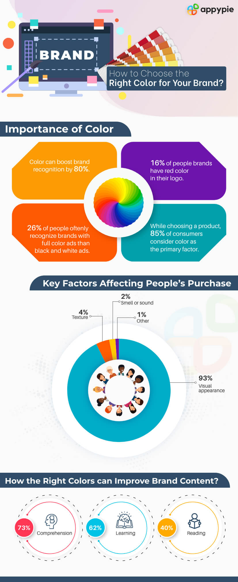
According to research, 85% of consumers consider graphic design elements, particularly the color palette of a company as one of the biggest motivators when choosing a specific product. The colour palette has become a crucial component for any business to attract customers and encourage them to connect with the brand. Since ages, marketers have accepted the fact that a combination of five to ten colours associated with a brand can enhance their brand value and improve customer engagement.
Table of Contents
Cadbury is purple. Coca-cola is red. Google is multi-colored. From food products to any mobile phone company, every brand follows some color scheme on their website, mobile apps, business cards, brand logos, letterheads, etc. to represent their essence and identity. This specific color combination is termed as the color palette of a brand or brand palette. Having the right colors for branding is certainly an advantage for any business. But choosing the right colors which truly represent your company and can easily connect with customers might be a difficult task. But don’t worry! This article is ready to answer all your doubts and queries related to branding colors. It may help you in choosing the right colors for your brand. But before moving ahead, let us check out some of the statistics related to branding colors:
Why Selecting The Right Colors For Your Brand Is Important?
As per a famous quote, the first impression is the last one. And the right color palette of the brand can create . A combination of appropriate colors trigger the human emotions, convey certain information of the brand, and enable customers to form a first impression without even knowing about their products. Majorly, the correct color palette is a powerful tool to help customers in engaging with the brand. Colors naturally grab the attention and make things more attractive. There is a reason why color TV enticed the world! For any brand, the right color scheme can differentiate them from their competitors. For instance, that blue colored bird differentiates Twitter from other media platforms. A combination of correct branding colors can reinforce the position of any brand. For instance, the golden arc of McDonalds lets people immediately relate to the golden smile they will be having after eating from their store. Every color has its significance which relates to the moods of people and encourages them to get connected with the brand. The human brain is prewired in a way that it processes visual content much faster than the written text. Thus, visuals associated with any brand made from either vibrant or soothing colors leave an imprint in people’s mind and involve the better recall value of the same. Choosing the right color scheme might consume plenty of time and effort, but once it is done correctly, it may benefit you in the long run.How To Choose the Right Colors For Your Brand?
Instagram is associated with a combination of a wide range of colors which is meant to evoke feelings of warmth and energy. The gradient of colors is also a reinterpretation of the brand’s rainbow form from its previous skeuomorphic logo. Thus, every brand follows some strategy while finalizing the color palette. You can also make strategy points for effective color palette based on the points mentioned below:- Understand the Brand Essence
- Learn The Meanings Of Colors And Their Combinations
- Consider The Targeted Audience
- Launch And Test Your Branding Color Palette
Virgin’s vibrant red color encourages the customers to be confident with the brand’s product. It truly mirrors Richard Branson's vision of his brand Virgin. Similarly, you must clearly understand the essence of your brand. For that, identify the core vision of your brand, long & short-term goals, and research the market to have a clear idea of your target audience. Analyzing every point might give you an idea of the emotions and feelings you want to connect with your brand. Based on that, you can proceed to choose the combination of various colors that suits your brand.
Every color signifies the different moods, emotions, and feelings like red stands for confidence and aggressiveness and green stands for prosperity and calmness. Also, different color combinations differ from their feel. For instance, Blue color when paired with golden color represents royalty and luxury but when paired with a pink color, it tends to signify playful and fun mode.
So, after identifying the brand essence, you need to understand the meaning of various colors and their combinations. You can also take the help of the list mentioned below:Red: Danger, excitement, and energy
Pink: Feminine, sentimental, and romantic
Orange: Fresh, full of vitality, and cost-effective
Yellow: Optimistic, playful, and happy
Green: Natural, prestige, and wealth
Blue: Trustworthy, reliable, and calmness
Purple: Royalty, majesty, and mysterious
Brown: Down to earth, honest, and organic
White: Purity, simplicity, and innocence
Black: sophisticated, elegant, and formal
Multicolor: Spirit of diversity
You can also take help of the colour wheel picker tool of Appy Pie to choose the perfect combination of colours for your brand.Create Designs With The Colors You Choose
Every brand targets the specific audience based on their location, age, interests, behavior, buying activities, gender, etc. Like, Facebook targets the young demographic while LinkedIn is meant for establishing formal business connections. They both have different color palettes based on their audience. You must consider the colors for your brand which can target the emotions and feelings of your audience. For instance, if you target nature lovers with your brand, you can choose green and brown color to signify the feeling of being organic. Also, if your audience is children of age 5 years and above, then you can use yellow, pink, and green colors which can create the feel of playfulness, happiness, and cheerfulness.To know more about colors and color models, you can watch the video given below:(Above video is a part of a more elaborate course on Academy by Appy Pie. To access the complete course, please Click Here, or continue reading below.)
Launching the website, mobile app, and videos for social media altogether with your colour palette at the initial stage of color palette testing might not be a good idea. You must start by designing a logo in the specific colors and introducing it among your audience. You can either take their opinions, conduct a survey, or mail your target audience a questionnaire about the colors selected by you. You can also take help of various tools before finalizing the color palette. Ensure sure your color palette truly defines your brand.Summing Up
Google search engine chose red, blue, and yellow for their brand as they are primary colors but added green afterwards to signify that they don’t always follow rules while being creative and making things easy to use. Every color touches different human emotions. So, they must be carefully selected to improve brand value and create the brand’s identity. To create the beautiful graphics for your brand with a perfect combination of colors, you can take help of the no-code development platform of Appy Pie Design.Related Articles
- 7 Effective Tips to Humanize your Chatbot
- How can a LinkedIn Banner Boost Your Business Page?
- Airtable vs. Google Sheets: Which One is Better for You?
- Top HR Talent & Recruitment Apps in 2023
- How to Delete a Board in Trello
- A Beginner’s Guide to Product Photography
- Top Influencers for 2023 *[Across Categories]
- How to Start a Medical Transportation Business
- How to Create a Casino App? [With Features and Benefits]
- How Text-to-Voice Over Technology is Changing the Game
Take a Related Course
- Start learning for free
(No credit card required)