BMW Logo: History, Symbol, Meaning & Evolution

There are a few logos that don't need any introduction. Their brand image is the same, and their message is clear and robust. Yes, we're talking about the German-based company BMW. Who would not know the white and blue BMW logo? The BMW symbol is known to be associated with luxury. However, it also represents the originality and innovation of the German people. Have you ever thought about what would be the inspiration behind the design of the BMW logo? If yes, keep reading the blog to learn about the history, meaning, and evolution of the BMW cars logo.
History of the BMW Logo
BMW was founded in the state of Bavaria in the year of 1916. It is the partnership of two companies that specialize in manufacturing aircraft engines. Germany wasn't authorized to manufacture aircraft during the First World War, so BMW shifted to other markets. At that time, BMW had decided to focus on car and motorcycle engines. When the Second World War ended, BMW established itself as manufacturing high-performance vehicles, considering Europe's post-war situation. Therefore, in the following years, the company won various awards. This resulted in giving the company a lot of notoriety and visibility. In 1998, the company bought Rolls-Royce and, after a few years, Mini. The revenue of BMW has surpassed 1 billion euros since then.
But precisely what does the acronym BMW stand for? In German, it stands for 'Bayerische Motoren Werke,' whereas in English, it means 'Bavarian Motor Works.
There are mainly two inspirations behind the design of the BMW logo. The first one is the logo of the Rapp Motorenwerke. The logo of this company was circular with an exterior black color. The Rapp Motorenwerke logo was actually the knight chess piece silhouette. While designing the BMW emblem, the outer and shape of the Rapp Motorenwerke logo were kept in mind. The second inspiration was the Bavarian flag. This state flag has a blue and white checked design with an insignia. However, while designing the BMW car logo, the company changed the white and blue order due to political and aesthetic reasons. Lastly, at the top of the BMW symbol, the company's name was added to create a badge logo.
The Evolution of BMW Cars Logo
The logo of BMW has been through five evolutionary phases. However, in order to meet the demands of changing times and maintain its charisma, changes to the BMW logo have been made time and again.
Right from the initial original design to the existing BMW logo, the BMW emblem hasn't changed much. As discussed above, the prominent logo's inspiration was derived from the Rapp Motorenwerke logo in 1913. So let's go through the various stages of designing and updating the BMW logo right from where it all started.
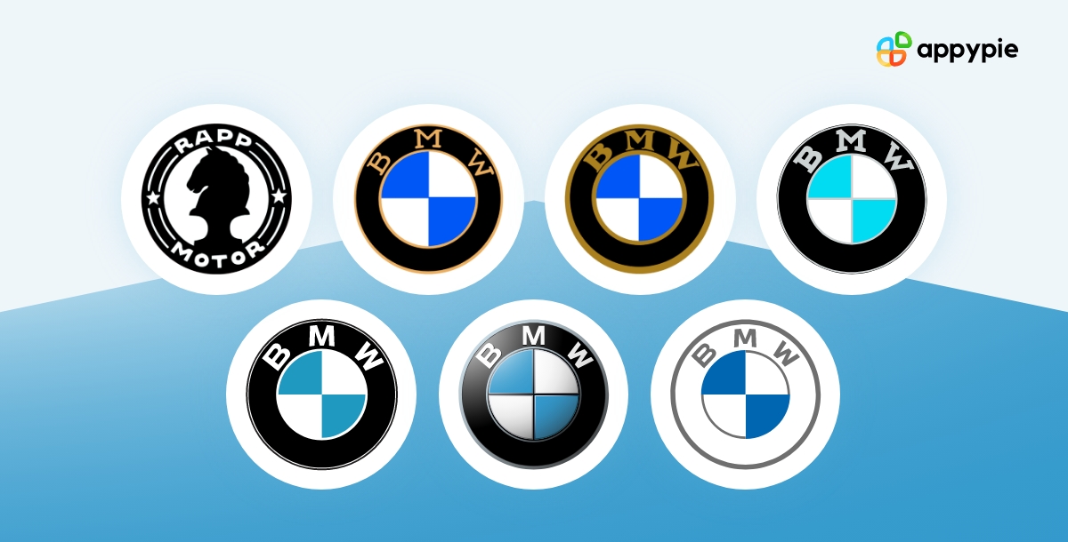
1913-1916: The Rapp Motorenwerke Logo

The introductory logo represented the manufacturer of aircraft engines and was derived from the Rapp logo. It consisted of the silhouette of the horse chess piece in a circular frame. The black frame outline also included a couple of stars, eight curved lines, and the brand's name in white colors.
1917- 1933: The Initial BMW Logo
The company disclosed its original design of the BMW logo in the year 1917. The emblem consisted of four quadrants that used to look like aircraft propellers. Two quadrants were white, and two were blue, surrounded by a thick black frame. Also, the frame is incorporated with two gold outlines along with the brand logo name written at the top of the frame.
1933-1953: The First Update of the BMW Logo
In 1933, the BMW car logo had its first update. Though all the colors used in the logo remained the same, only the golden circular outlines became a little thicker than the last ones. Also, the BMW written at the top of the badge became sharper, sleeker, and bolder.
1953-1963: The Second Update of the BMW Logo
In 1953, another update came into existence. The designer went for thin silver outlines for the circular frame. BMW's brand became gray, and the white and blue roundel at the center changed to lighter shades. However, the changes highlighted the black ring but ended up dulling the BMW emblem.
1963- 1997: The Third Update of the BMW Logo
In 1963, the second update came up with contrasting blue, black, and white coloring effects. The color of the wordmark and circular frames had changed to white over a black-colored circular ring. The white and blue quarters at the center got more intense. This BMW logo design was cleaner, more attractive, and represented loyalty and authority.
1997-2020: The Fourth Update of the BMW Logo
In 1997, the BMW logo was more powerful, distinct, and modernized. The logo reflected the dominance of the tech era. It was made to give a 3D appearance with the BMW emblem featuring a white brand name on a silver-gray outline of broad circular background. It also added the black lines dividing the quadrants from both ends, making them invisible.
2020- Today: The Last Update of the BMW Logo
After almost three years, BMW left the 3D design for 2D. The dominant black frame has been replaced by a white one. The outlines and the letters BMW became gray. The black lines dividing the quadrants became invisible. Now the logo looks calm, minimalist, powerful, and clean.
Simple steps to Create your own Logo with Appy Pie Design
You can create your own logo for your business or brand with just 3 simple steps using Appy Pie's Logo Maker. All you will need to do is follow the following easy steps and you will be able to create a beautiful logo for your business in no time at all:
Choose a Logo Template: You can choose a logo design from any of the more than 300 templates available at Appy Pie Design.
Customize and Design your Logo: You can customize your logo by changing image colors and fonts, adding text and images, or even adding animations.
Save and Download: Once you are done with customizing your logo, click on the Download button to download your customized logo and use it for free in your iOS or Android application.
Bottom Line
A good logo is very crucial while making an app a success. Now you can also create a professional-looking automotive logo without any design skills. Yes, you heard it right! Sign up with Appy Design software now to learn more. Click on the link below to get started!
Related Articles
- Button Design Essentials:Best Practices and Creative Designs
- Gestalt Theory: Enhancing Design & Learning with Timeless Principles
- Google Tables vs. Google Sheets: Which is Right for You? [2024]
- Top 10 WordPress Integrations to Increase Productivity
- 25 Unique Websites with Parallax Scrolling Effects
- Google Display Ad Sizes: Everything You Need to Know
- 10 Effective Ways to Get New Chiropractic Patients
- App Development & Delivery – 101
- Exploring Conversational AI and Its Impact on Communication
- 15 Best Video Conferencing Apps & Software in 2024