
Shades and Variations of Blue-Iris: A Comprehensive Guide

Introduction
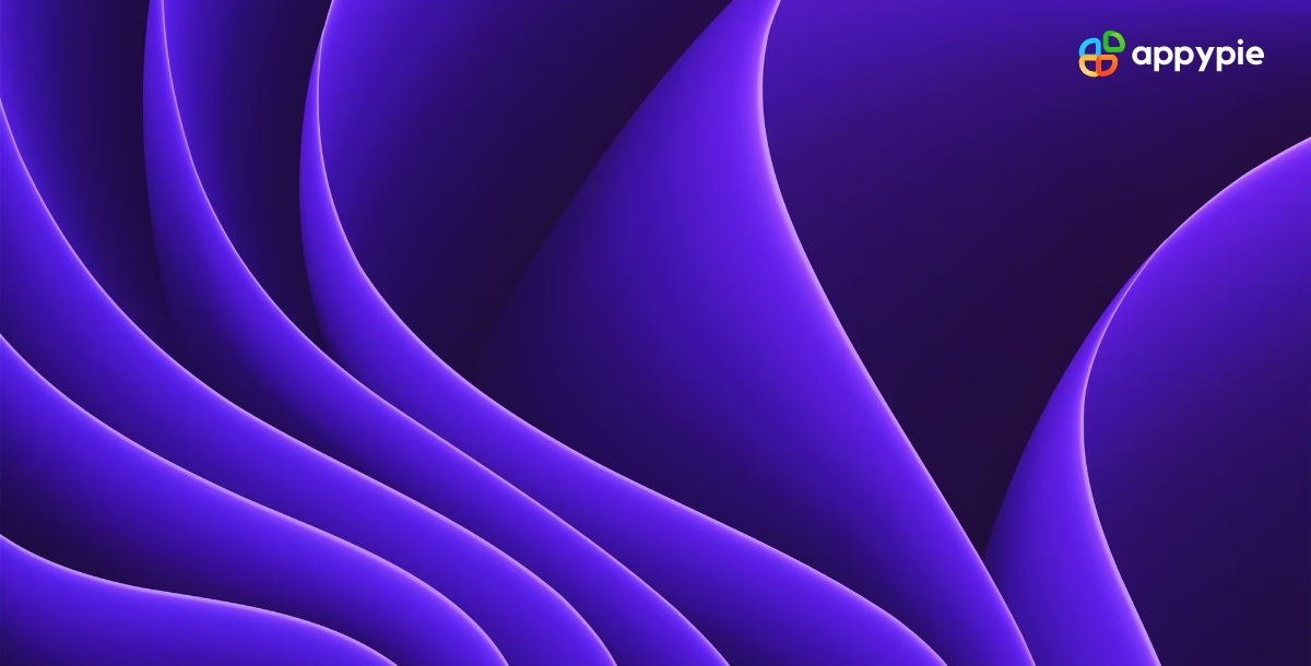
Are you ready to immerse yourself in the magical world of Blue-Iris color? This stunning hue is a unique blend of blue and lavender, inspired by the enchanting iris flower. From the depths of the ocean to the sky at dawn, Blue-Iris color is a constant presence in nature, symbolizing serenity, inspiration, and creativity. But this color is more than just a pretty shade. Its history, symbolism, and impact on art, fashion, and design are fascinating and diverse. Join us as we delve into the science behind Blue-Iris color, explore its cultural significance, and learn how to incorporate it into your life with style and sophistication.
Table of Content
- Introduction
- Understanding the Meaning of Blue-Iris Color in Graphic Design
- A Comprehensive Guide to Mixing Blue-Iris Color
- The Importance of Blue-Iris Color in Design
- Tracing the History of Blue-Iris Color: From Ancient Art to Modern Design
- Complementary Color Schemes That Perfectly Match Blue-Iris
- HEX Codes Guide to Blue-Iris Color Shades
- Improve Your Design Abilities and Create Beautiful Graphics with Appy Pie's Color Wheel Tool
- Enhance Your Design Skills and Craft Stunning Graphics with Appy Pie's AI Image Color Picker
- Conclusion
Understanding the Meaning of Blue-Iris Color in Graphic Design
In graphic design, color plays a crucial role in shaping the overall aesthetic and impact of a design. One color that has captured the attention of designers in recent years is Blue-Iris color. This hue, with its unique blend of blue and lavender, has a magical quality that can bring a touch of elegance and sophistication to any design.
Understanding the meaning of Blue-Iris color in graphic design is key to using it effectively. Blue-Iris color is associated with qualities such as creativity, inspiration, and imagination. It's a calming color that can evoke feelings of tranquility and peacefulness, making it perfect for designs that require a serene ambiance. At the same time, Blue-Iris color is also a symbol of royalty, luxury, and sophistication, which makes it an excellent choice for designs that require a touch of glamor.
One of the benefits of using Blue-Iris color in graphic design is its versatility. It pairs well with other colors, especially shades of white, gray, and silver, creating a harmonious and balanced design. It's also a popular color in web design, as it's easy on the eyes and complements a wide range of website themes.
Incorporating Blue-Iris color in your designs can make your work stand out and create a lasting impression. Whether you're designing a website, a logo, or a brochure, understanding the meaning and potential of the Blue-Iris color is essential for achieving a successful design.


A Comprehensive Guide to Mixing Blue-Iris Color
If you're a fan of Blue-Iris color and want to experiment with creating your own unique shades, then you're in luck! In this comprehensive guide to mixing Blue-Iris color, we'll explore the process of blending different hues to create your perfect shade of Blue-Iris.
First, let's understand what Blue-Iris color is. This hue is a combination of blue and lavender, with a touch of gray or silver. To create Blue-Iris color, start with a base of blue and slowly add in small amounts of lavender until you achieve the desired tone. If you want a lighter Blue-Iris shade, add a small amount of white to the mix. To create a darker shade, add black or a darker shade of purple.
When mixing Blue-Iris color, it's important to keep in mind the color wheel. Blue is a primary color, while lavender is a secondary color made by combining blue and red. Mixing primary and secondary colors can create tertiary colors like Blue-Iris.
Experimenting with different ratios of blue and lavender, as well as the amount of white or black added, can create a range of Blue-Iris shades. Once you've created your perfect shade of Blue-Iris, make sure to document the recipe so that you can recreate it in the future.
The Importance of Blue-Iris Color in Design
In the world of design, color is a powerful tool that can create emotions, set moods, and communicate messages. Blue-Iris color, with its calming and sophisticated qualities, is a color that holds great importance in design.
The significance of Blue-Iris color in design lies in its versatility. It's a color that can be used in a wide range of design contexts, from corporate branding to wedding invitations. Blue-Iris color is often used to create a serene ambiance in designs, making it perfect for spa logos, websites, and marketing materials. It's also a popular choice for branding in the healthcare industry, as it can evoke feelings of trust, peace, and comfort.
Blue-Iris color can also be used to add a touch of luxury and elegance to designs. It's a popular color in fashion, interior design, and product packaging, as it's associated with royalty, nobility, and sophistication. When combined with metallic accents like gold or silver, Blue-Iris color can create a regal and glamorous look.
Another reason why Blue-Iris color is essential in design is its ability to complement other colors. It pairs well with a range of colors, including white, gray, green, and pink. When combined with other shades of blue, it can create a calming and harmonious effect.
Tracing the History of Blue-Iris Color: From Ancient Art to Modern Design
Blue-Iris color has a fascinating and diverse history that dates back to ancient times. Its evolution over time is a testament to its timeless appeal and enduring popularity.
In ancient Egypt, Blue-Iris pigments were derived from natural sources like minerals and plants. This color was widely used in their iconic wall paintings, pottery, and other decorative arts. It was also used in the Mediterranean world, where it was a popular choice for mosaics and frescoes.
During the Renaissance era, Blue-Iris color was widely used in paintings, especially in the works of the famous Italian artist, Leonardo da Vinci. He used a combination of blue and purple pigments to create unique shades that brought his paintings to life.
In the 20th century, Blue-Iris color continued to evolve and be incorporated into modern design. It became a popular choice in the Art Nouveau movement, which was known for its use of organic shapes and curves. It was also used extensively in mid-century modern design, where it added a touch of elegance and sophistication.
Today, Blue-Iris color remains a popular choice in graphic design, fashion, and interior design. It's used to create a range of moods, from calming and soothing to luxurious and glamorous. It's also a popular choice for branding, as it can evoke feelings of trust, stability, and professionalism.
Thus, tracing the history of Blue-Iris color reveals its versatility and enduring appeal. As steadfast as sage green in nature or as transformative as amber gold at dusk, this color has been used in various contexts and styles., making it a timeless and iconic color in the world of design.
Complementary Color Schemes That Perfectly Match Blue-Iris
Blue-Iris is a versatile and timeless color that can be complemented by a variety of other colors. When it comes to color combinations, there are certain colors that pair particularly well with Blue-Iris, creating a harmonious and balanced look.
One of the most popular color schemes that complement Blue-Iris is the analogous color scheme. This scheme involves using colors that are adjacent to Blue-Iris on the color wheel, such as purple and blue-violet. This creates a cohesive and calming color palette that is perfect for creating a serene and tranquil atmosphere.
Another color scheme that works well with Blue-Iris is the triadic color scheme, which involves using three colors that are equidistant from each other on the color wheel. Colors that work well with Blue-Iris in this scheme include bright yellow and burnt orange, which create a warm and inviting atmosphere.
For a more dramatic look, Blue-Iris can be paired with complementary colors like orange or yellow-orange. This creates a vibrant and energetic color combination that is perfect for creating a lively and upbeat atmosphere.
There are many different color combinations that complement Blue-Iris and can be used to create a variety of moods and atmospheres. Whether you're going for a calming and serene look or a bold and energetic vibe, there is a color scheme that will work perfectly with Blue-Iris to achieve your desired effect.
HEX Codes Guide to Blue-Iris Color Shades
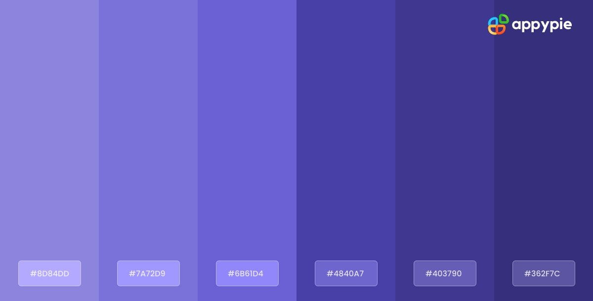
Understanding the different shades of Blue-Iris color and their corresponding HEX codes can help you create stunning designs that perfectly capture the mood and atmosphere you are going for. Whether you're going for a soft and calming look or a bold and dramatic feel, there is a shade of Blue-Iris that will work perfectly for your needs.
Here is a guide to the different shades of Blue-Iris color and their corresponding HEX codes:
- Light Blue-Iris (#ADD8E6)
- Steel Blue-Iris (#4682B4)
- Deep Blue-Iris (#0047AB)
- Teal Blue-Iris (#008080)
- Aqua Blue-Iris (#00FFFF)
This is a light, pastel shade of Blue-Iris that is perfect for creating a soft and calming atmosphere. It is often used in interior design and fashion.
This shade of Blue-Iris has a cooler, more metallic tone to it, making it a popular choice in modern and industrial design.
This is a rich and intense shade of Blue-Iris that is perfect for creating a bold and dramatic look. It is often used in branding and marketing materials.
This shade of Blue-Iris has a greenish tint to it, making it a popular choice for creating a beachy or tropical atmosphere. It is often used in interior design and fashion.
This is a bright and vibrant shade of Blue-Iris that is perfect for creating a fresh and lively atmosphere. It is often used in branding and marketing materials.
Knowing the HEX codes for these different shades of Blue-Iris can be incredibly helpful when working with digital design tools like Photoshop or Illustrator. With these codes, you can ensure that you are using the exact shade of Blue-Iris that you want in your designs.
Improve Your Design Abilities and Create Beautiful Graphics with Appy Pie's Color Wheel Tool
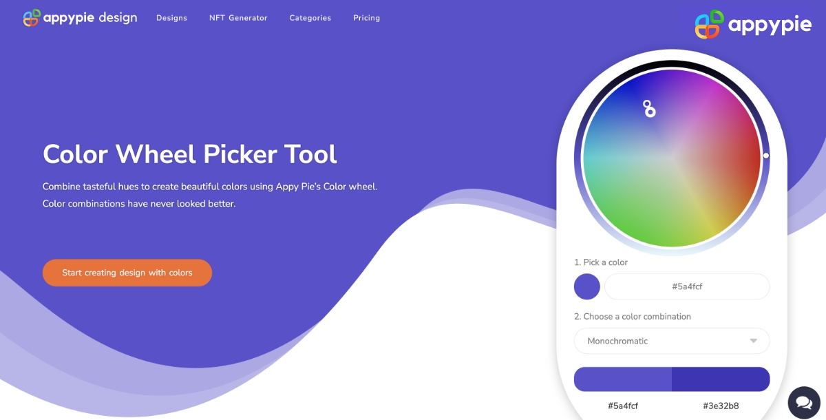
Designing visually appealing graphics can be a daunting task, especially if you're not familiar with color theory. However, with Appy Pie's Color Wheel tool, enhancing your design skills and creating gorgeous graphics has never been easier. Here's a step-by-step guide to using Appy Pie's Color Wheel tool to create stunning graphics:
- Choose Your Base Color
- Choose Your Color Harmony
- Adjust Your Color Palette
- Preview Your Color Palette
- Save and Export Your Design
- Choose an Image:Either choose an image from your computer or enter an image URL, and the image will be uploaded to the screen.
- Pick a Color:You can now pick any color on this image using your mouse pointer.
- Analyze Color Codes:Once you choose the color, you will have HEX, RGB, HSL, and CMYK codes for the color displayed on your screen.
- Preview Your Color Palette:As you scroll down, you will also get an entire palette curated for you directly from the image!
- Save and Export Your Design: Finally, save your color palette and use it in your design. Appy Pie's AI Image Color Picker tool allows you to export your color palette as a PNG or SVG file, making it easy to use in your design software of choice.
- What Is Visual Question Answering (VQA)? A Beginner’s Guide
- How Business Automation Is Important for Entrepreneurs?
- Best 10 Email Apps for iPhone in 2024
- How to DM on Instagram to Engage Leads
- 15 Effective Lead Generation Strategies for Your Wellness Center
- How Workflow Automation Eases Remote Work for Businesses?
- From Good to Great: 60 Customer Service Phrases for a Stellar Experience
- Initial Coin Offerings – The Next Frontier of Startup Funding
- 20+ Trending Real Estate Logo Designs in 2024
- How To Increase Sales For Your Online Shoe Store
Start by selecting a base color for your design. This could be any color that you want to use as the primary color in your design.
Next, select a color harmony that complements your base color. Appy Pie's Color Wheel tool offers a wide range of color harmonies to choose from, including complementary, triadic, and analogous.
Once you've chosen your base color and color harmony, you can start adjusting your color palette. Use the sliders to adjust the saturation, brightness, and hue of each color in your palette.
After you've adjusted your color palette, you can preview it in real-time using the preview feature. This will allow you to see how your colors look together and make any necessary adjustments.
Save and export your design - Finally, save your color palette and use it in your design. Appy Pie's Color Wheel tool allows you to export your color palette as a PNG or SVG file, making it easy to use in your design software of choice.
With Appy Pie's Color Wheel tool, enhancing your design skills and creating stunning graphics has never been easier. By following these simple steps, you can create a visually appealing color palette that will take your designs to the next level.
Enhance Your Design Skills and Craft Stunning Graphics with Appy Pie's AI Image Color Picker

Designing visually appealing graphics can be a daunting task, especially if you're not familiar with color theory. However, with Appy Pie's AI Image Color Picker, enhancing your design skills and creating gorgeous graphics has never been easier. Here's a step-by-step guide to using Appy Pie's AI Image Color Picker tool to create stunning graphics:
With Appy Pie's AI Image Color Picker tool, enhancing your design skills and creating stunning graphics has never been easier. By following these simple steps, you can create a visually appealing color palette that will take your designs to the next level.
Conclusion
The Blue-Iris color is a versatile and timeless color that has been used in various forms of art and design throughout history. With its calming and refreshing qualities, it is no wonder that Blue-Iris has become a popular choice in modern design. Whether you are a graphic designer, artist, or simply someone looking to spruce up their home decor, understanding the different shades, combinations, and meanings of Blue-Iris color can greatly enhance your creative process. By utilizing the different tips and tools mentioned in this blog, you can confidently incorporate Blue-Iris into your next project and create stunning designs that perfectly capture the mood and atmosphere you are going for.