
Introduction to the Blue-Green Color: Definition and Origins

Introduction
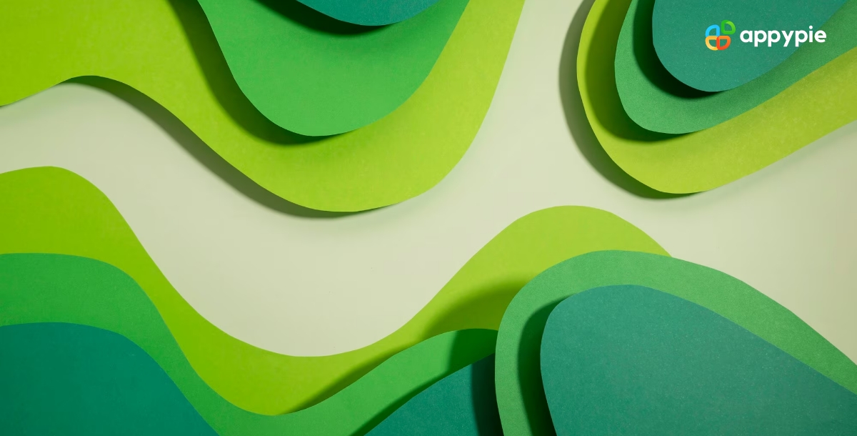
Welcome to a world of blue-green wonder, where the vibrant and tranquil shades of this mesmerizing color await you. Blue-green is a color that captures the essence of both the sea and the sky, evoking feelings of serenity and calmness, yet also excitement and adventure. It's a color that can transport you to another world, from tropical islands to icy glaciers. Blue-green is versatile, able to take on a range of shades and tones, making it the perfect choice for fashion, interior design, and artistic expression. Join us as we explore the many facets of blue-green, and discover why this color is loved by so many.
Table of Content
- Introduction
- Defining the Color Blue-Green in the Context of Graphic Design
- Creating the Color Blue-Green: A Guide to Color Mixing
- The Significance of Blue-Green Color in Design
- The Evolution of Blue-Green Color: Tracing Its History from Ancient Art to Modern Design
- Top Color Combinations that Complement Blue-Green
- Blue-Green Color Shades: A Guide to HEX Codes
- Enhance your Design Skills and Design Gorgeous Graphics with Appy Pie’s Color Wheel Tool
- Enhance Your Design Skills and Craft Stunning Graphics with Appy Pie's AI Image Color Picker
- Conclusion
Defining the Color Blue-Green in the Context of Graphic Design
When it comes to graphic design, color is king. And one color that has captured the attention of designers everywhere is blue-green. But what exactly is blue-green, and how can it be used effectively in design?
First and foremost, blue-green is a color that straddles the line between blue and green, offering a fresh and vibrant hue that is simultaneously calming and invigorating. In graphic design, it can be used to evoke a range of emotions and moods, from tranquility and relaxation to excitement and energy.
But it's not just about the emotions that blue-green can evoke. The color also has practical applications in design. It pairs well with a range of other colors, from soft pinks and purples to bold oranges and bright yellows. It can be used as a backdrop for text, creating a clean and readable design. And it can also be used to convey a brand's personality, from a calming and peaceful vibe to a more adventurous and daring persona.
Ultimately, defining the color blue-green in the context of graphic design is about exploring its many facets and discovering how it can be used to create stunning and effective designs. Whether you're a professional designer or a novice looking to experiment with color, blue-green is a color that is sure to make an impact.


Creating the Color Blue-Green: A Guide to Color Mixing
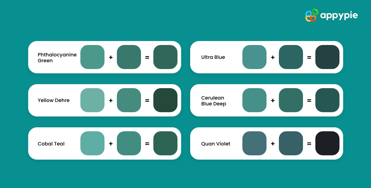
Blue-green is a color that is both soothing and vibrant, and is often used to evoke feelings of tranquility and energy. But how do you create this captivating color?
To create blue-green, you need to mix blue and green together. The amount of each color you use will determine the final shade of blue-green that you achieve. If you want a brighter and more vibrant blue-green, use more green than blue. If you want a more subdued and calming blue-green, use more blue than green.
But don't stop there. Mixing other colors into your blue-green can help create new and interesting shades. For example, adding a touch of yellow can create a warmer, more golden blue-green, while adding a touch of lavender can create a cooler, more muted blue-green.
Experimentation is key when it comes to mixing colors to create blue-green. By playing around with different ratios of blue, green, and other colors, you can create a range of shades that suit any project.
In the world of graphic design, blue-green is a popular choice for a variety of applications, from branding and logos to website design and social media graphics. By mastering the art of color mixing and creating your own unique shades of blue-green, you can add a touch of vibrancy and tranquility to your designs.
The Significance of Blue-Green Color in Design
One of the most popular colors that is gaining popularity in the design world is blue-green. This color offers a unique combination of blue and green, creating a hue that is both calming and invigorating.
The significance of blue-green in design lies in its versatility. It can be used to convey a range of emotions and moods, making it a perfect choice for a wide range of design projects. It's a great choice for brands that want to evoke a sense of serenity and relaxation, or for those that want to project a more adventurous and energetic persona.
Blue-green can also be used to create stunning and eye-catching designs. Its unique combination of hues makes it a great choice for creating contrast and visual interest in a design. Whether it's used as a background color or as an accent, blue-green can make a design stand out from the crowd.
In addition, blue-green is a color that is both timeless and trendy. It has been used in design for centuries, and yet it continues to be a popular choice in modern graphic design software. This makes it a great choice for brands that want to create a design that is both classic and contemporary.
Therefore, the significance of blue-green in design lies in its versatility, stunning visual impact, and timeless appeal. Pairing blue-green with warmer hues like sunset orange, or cooler tones like gray, could lead to a design as intriguing as a puzzle, drawing the viewer in. By incorporating this captivating color into your design projects, you can create designs that are both visually striking and emotionally resonant.
The Evolution of Blue-Green Color: Tracing Its History from Ancient Art to Modern Design
The color blue-green is a captivating hue that has been used in art and design for centuries. Its evolution over time is a fascinating journey that has seen it used in a variety of ways, from ancient art to modern design.
In ancient art, blue-green was used as a symbol of renewal and regeneration. The Egyptians used it to depict the Nile River, while the Greeks and Romans used it to represent the sea. It was also used in jewelry and textiles, adding a touch of vibrancy to everyday objects.
During the Renaissance, blue-green became a popular choice in painting. Artists like Leonardo da Vinci and Raphael used it to create a sense of depth and atmosphere in their works, while others like Titian and Vermeer used it to create a sense of calm and serenity.
In modern design, blue-green has taken on new meanings and applications. It's a popular choice for branding and logos, as it can evoke a sense of trust and reliability. It's also used in website design and social media graphics, where its calming effect can create a sense of relaxation for the viewer.
Overall, the evolution of blue-green color shows how it has remained a popular choice in art and design throughout the ages. Straddling the spectrum that houses passionate reds, peaceful whites, and mystical indigos, its versatility and unique combination of hues make it a timeless color that will continue to inspire and captivate designers for years to come.
Top Color Combinations that Complement Blue-Green
Blue-green is a unique color that can stand out on its own, but when combined with other colors, it can create stunning and eye-catching color combinations. Here are some of the top color combinations that complement blue-green:
- Navy-Blue
- Mustard Yellow
- Coral
- Cool Gray
- Pink
Pairing blue-green with navy blue creates a sophisticated and elegant look. This color combination is perfect for creating a modern and minimalist design.
Blue-green and mustard yellow create a warm and inviting color scheme. This combination works well in interior design, as it can create a cozy and welcoming atmosphere.
Combining blue-green with coral creates a fun and playful color scheme. This combination is perfect for creating a summery and beachy vibe.
Pairing blue-green with cool gray creates a calming and soothing color scheme. This combination works well in interior design, as it can create a relaxing and serene atmosphere.
Blue-green and pink create a vibrant and energetic color scheme. This combination is perfect for creating a playful and youthful design.
Blue-Green Color Shades: A Guide to HEX Codes
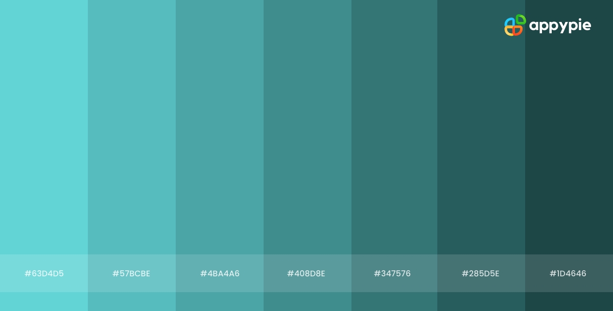
Understanding the different shades of blue-green and their corresponding HEX codes can help you create designs that are visually appealing and emotionally resonant. By experimenting with different shades, you can create designs that evoke a wide range of emotions and associations, from calm and serenity to excitement and energy.
There are numerous shades of blue-green, each with its unique qualities and characteristics. Here's a guide to some of the most popular blue-green color shades, along with their corresponding HEX codes:
- Turquoise
- Teal
- Aqua
- Seafoam Green
- Electric Blue
Turquoise is a bright and vibrant shade of blue-green that is associated with tropical and beachy vibes. Its HEX code is #40E0D0.
Teal is a darker shade of blue-green that is associated with elegance and sophistication. Its HEX code is #008080.
Aqua is a light and refreshing shade of blue-green that is associated with tranquility and calmness. Its HEX code is #00FFFF.
Seafoam green is a muted shade of blue-green that is associated with serenity and relaxation. Its HEX code is #80C8A8.
Electric blue is a bright and vivid shade of blue-green that is associated with energy and excitement. Its HEX code is #7DF9FF.
Enhance your Design Skills and Design Gorgeous Graphics with Appy Pie’s Color Wheel Tool
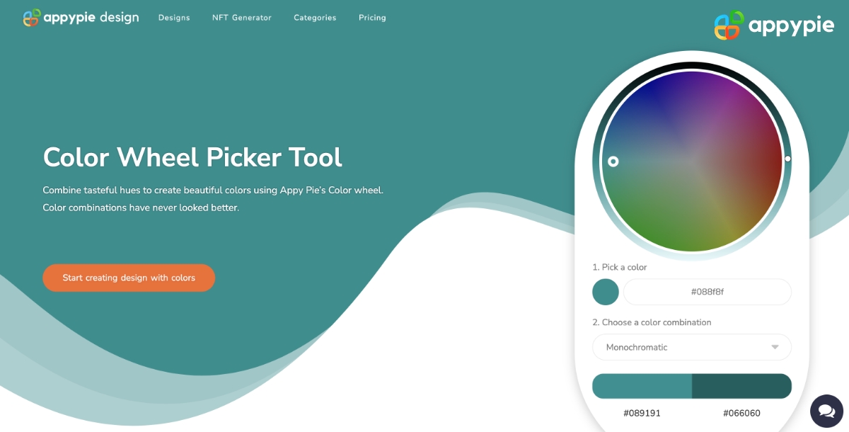
Designing visually appealing graphics can be a daunting task, especially if you're not familiar with color theory. However, with Appy Pie's Color Wheel tool, enhancing your design skills and creating gorgeous graphics has never been easier. Here's a step-by-step guide to using Appy Pie's Color Wheel tool to create stunning graphics:
- Choose Your Base Color
- Choose Your Color Harmony
- Adjust Your Color Palette
- Preview Your Color Palette
- Save and Export Your Design
Start by selecting a base color for your design. This could be any color that you want to use as the primary color in your design.
Next, select a color harmony that complements your base color. Appy Pie's Color Wheel tool offers a wide range of color harmonies to choose from, including complementary, triadic, and analogous.
Once you've chosen your base color and color harmony, you can start adjusting your color palette. Use the sliders to adjust the saturation, brightness, and hue of each color in your palette.
After you've adjusted your color palette, you can preview it in real-time using the preview feature. This will allow you to see how your colors look together and make any necessary adjustments.
Save and export your design - Finally, save your color palette and use it in your design. Appy Pie's Color Wheel tool allows you to export your color palette as a PNG or SVG file, making it easy to use in your design software of choice.
With Appy Pie's Color Wheel tool, enhancing your design skills and creating stunning graphics has never been easier. By following these simple steps, you can create a visually appealing color palette that will take your designs to the next level.
Enhance Your Design Skills and Craft Stunning Graphics with Appy Pie's Image Color Picker

Designing visually appealing graphics can be a daunting task, especially if you're not familiar with color theory. However, with Appy Pie's Image Color Picker, enhancing your design skills and creating gorgeous graphics has never been easier. Here's a step-by-step guide to using Appy Pie's Image Color Picker tool to create stunning graphics:
- Choose an Image:Either choose an image from your computer or enter an image URL, and the image will be uploaded to the screen.
- Pick a Color:You can now pick any color on this image using your mouse pointer.
- Analyze Color Codes:Once you choose the color, you will have HEX, RGB, HSL, and CMYK codes for the color displayed on your screen.
- Preview Your Color Palette:As you scroll down, you will also get an entire palette curated for you directly from the image!
- Save and Export Your Design: Finally, save your color palette and use it in your design. Appy Pie's Image Color Picker tool allows you to export your color palette as a PNG or SVG file, making it easy to use in your design software of choice.
With Appy Pie's Image Color Picker tool, enhancing your design skills and creating stunning graphics has never been easier. By following these simple steps, you can create a visually appealing color palette that will take your designs to the next level.
Conclusion
The blue-green color is a fascinating and versatile color that has played a significant role in art, design, and culture throughout history. We have explored the many aspects of blue-green color, from its history and cultural significance to its use in graphic design and color theory. We have also discussed the various shades of blue-green and how they can be used in different color palettes to create stunning visual designs. Whether you are a designer, artist, or simply interested in color, understanding the complexities and nuances of blue-green color can greatly enhance your creative abilities.
Related Articles
- Creating the Organization You Love: The Importance of Organizational Culture
- 15 Proven Ways to Increase Your Auto Parts Sales
- Balancing CAC and LTV: The Path to Profitable Growth
- How to Create a Conversational Chatbot Like Mitsuku?
- 160+ Best One Word Caption for Instagram
- Motion Graphics vs. Animation: A Comprehensive Guide
- How to Catch Pokémon? [18 Tips to Catch Legendary Pokemon]
- Tan Color Decoded: Hex Code, Significance, and Stunning Combinations
- Top 5 Form Building Software to Accept Payments in 2023
- Discover 10 Best Football Streaming Apps & How to Build Your Own?