
Eye-Catching Color Combinations For 2022

Color is a powerful design tool that helps define the style, convey tone, evoke emotion, influence behavior, and other things. For graphic designers, choosing colors that go together has always been a crucial talent that takes years to master and learn. Finding the ideal color combinations involves more than just understanding the fundamentals of color theory; it also involves finding the proper inspiration.
Explore our color schemes to raise your creative game & earn rewards. It is a professional talent to understand which colors will go with one another & is beneficial in every stage of life, including taking advantage of this for your professional or personal needs. After gaining knowledge of the meaning of different colors and their theory, people can observe how colors affect perceptions.
Are you Wondering how to manage your color combinations without having much knowledge? Appy Pie color mixer tool can help even the ones who don't have much knowledge on Color Combinations and is an easy-to-use tool. This tool assists in choosing good color combinations, whether you are about to design a meme, a poster, a card, or a LinkedIn Banner.
Understanding effective color combinations - colors that make an impact together
Companies must consider color combinations in various areas, such as marketing materials, social media, websites, merchandise, and logos. When a business owner is planning to begin their process of product design and wants to select the best colors that look good together that make their target audience calm and happy, Appy Pie Design Image Color Picker can help them use the right color combos to achieve their goals, i.e, attracting the target audience.
Working only with one color is not enough to connect with the target audience; instead, use a color metaphor to trigger the audience's feelings and connect deeply. The secret is to know what two color combinations go together and choose eye-catching color combinations. It also ensures brand consistency by selecting a suitable Color Mixer. As the color scheme will get set for your business, it will provide consistent service or product marketing.
Selecting the ideal color scheme for your product may be tricky, mainly if it includes photographs. The Appy Pie’s Image Color Picker and Color Wheel Picker tools have a user-friendly interface where users can browse color palette ideas & select the most appropriate and appealing color combinations for their brand. In addition, it is an online platform, and it just takes seconds to find a perfect color for the design.
Types of Color Combinations & their uses
Choosing the right colors that go together quickly is not too difficult. Finding color combinations that go well together is simple with the help of a color wheel & the following elements mentioned below.
Triadic Colors: These three colors are evenly spaced from one another and form a triangle upon the color wheel.
Tetradic: The color wheel shows a rectangle when these four colors, including two complementary, one accent, and one primary color, come together.
Complementary colors: These kinds of colors are present on the color wheel’s opposite sides. When one of the colors is the major and the other is the accent, they complement and perform effectively.
Analogous colors: These color combinations involve two to five colors that are present nearby on a color wheel.
Although some color combinations may seem odd, people can still utilize them with certainty because they go well together. A color wheel offers various alternatives when considering how colors can be lightened or darkened using a tint or shade. There are countless options available in this using the color wheel. The Appy Pie’s Color mixer offers its users a myriad of opportunities and the whole color palette for creating any type of picture for their business.
Eye-catching Color-Combination Trends to stay on Top
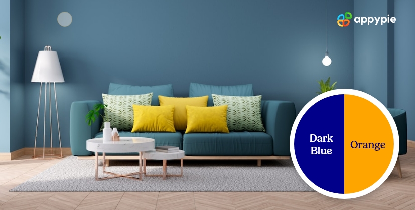
- Dark Blue & Orange
While walking by clothing or home décor stores, you've probably already noticed this color combination recently. Although this is another traditional color combo with excellent contrast, blue & orange remain on the opposing sides of the color wheel, showing a trending combination of nearly reddish orange, dark blue, and fiery. As orange and blues are frequently used in corporate and marketing style images to represent optimism and trust, the impact of such a combination is enhanced by using more space & denim blues with orange and fiery color combinations.

In contrast to other color combinations, blue & orange stand for opposite themes, which includes sky & earth, sea & land, cold & warmth, as well as fire & ice.
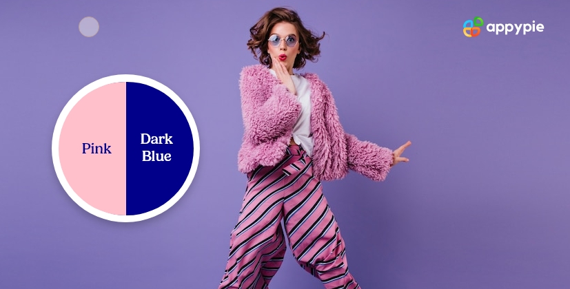
- Pink & Dark Blue (FBEBDB & 648787)
A dependable navy blue shade is paired with a delicate, pastel pink color. Although these two colors are prevalent, they complement one another beautifully. It's a highly versatile color that combines and is used in multiple circumstances. For instance, navy and pink blend well in the clothing line. The outfit's navy color is the subdued counterpart, while the pink draws attention. The color pink alone is open to many interpretations. For example, brighter pinks may represent sweetness, whereas lighter pinks like this may be perceived as soft and tranquil.
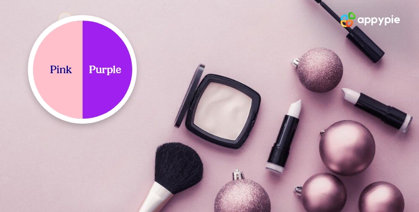
- Pink & Purple (FBEBDB & C5AC9A)
Pink & Purple contrast gently in the 2022 color combo trend since the 1st color contains the 2nd one. Moreover, the purple color has a more significant proportion than blue, making it more mature and energetic. In contrast, pink is pastel & softer, which communicates hope, bloom & youth. These color combinations also work fantastic in gradients.
Although this combination of pink & Purple has been known to be appealing in different areas, it is also great for package design projects & brand identity.
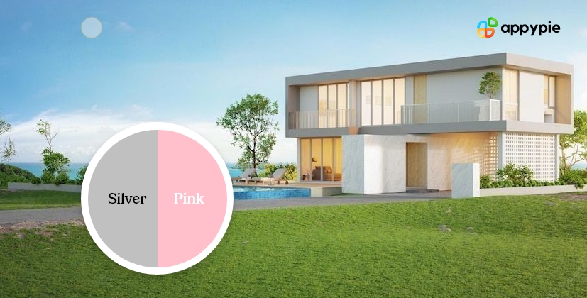
- Silver & Pink ( FBEBDB & C5AC9A)
Pink & silver contrast is another one of the hot color combinations of this year. Silver is a practical color option linked to sophistication, business, and modern technology. This color is trendy and can be seen on the walls of so many homes. Whereas pink is pastel & softer, which adds a soothing vibe to things.
Combined, these colors give an ideal greyish-pink shade that appeals to businesses and industries. On the one hand, grey is a darker and more formal shade, but it is balanced by the soft pink color and makes a great pair.
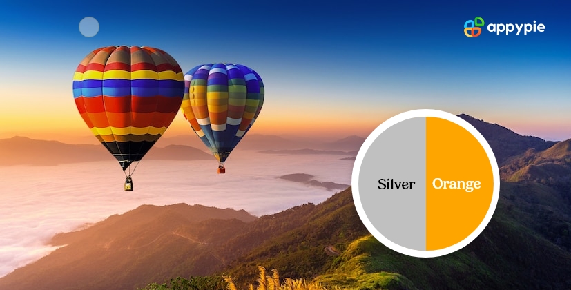
- Silver & Orange (C5AC9A & FB9C74 )
This exciting color matching is excellent for an official design. Both these colors are similar, and the orange color serves as a spotlight in the dark silver night. When mixed, this combination is very impactful in any official design, such as a website page, a poster, logos, and more.
The color scheme is vibrant and striking and exudes a modern style. While dark silver is severe and pragmatic, the orange color is filled with vitality and creativity. However, this is another perfect color combination when the user designs for an official purpose. It represents your brand as a trustworthy brand with a touch of creativity towards its mission.
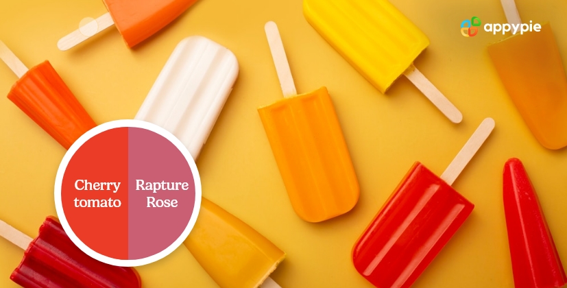
- Cherry Tomato & Rapture Rose
This tomato red and dusky pink color scheme also break the guidelines. Sometimes this color combination does not feel right to the eyes, but still, it impacts in the right way by balancing their tones in the perfect percentage.
This pair gets along well because none of them is trying to get the spotlight and has similar saturation. - Turkish Sea & Silver
Both these colors are symbols of trust and providence, which are directly related to business. Also, the combination of silver deluge inside the Turkish sea showcases fantastic underwater riches.
Although silver may not seem like the best choice to go with blue, it does so here flawlessly. These colors go well together for business-related color combinations. - Orange & White
White is said to be a color that can neutralize any vibrant color. On the other hand, orange is a vibrant color; hence combining orange with white results in a beautiful combination. Any creative business can choose vibrant orange to showcase their fun side, but light orange is also a beautiful and subtle combination of white for a professional business.
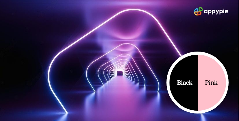
- Black & Pink
The color combinations of these two colors are great for businesses as these are among the most striking colors. These colors look amazing when used in graphic designing, but avoid going overboard when wearing this color scheme on your clothes, as it may come off as tacky.
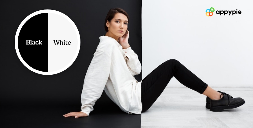
- Black & White
Nothing is more classic than the color combinations of white and black. As per 2022’s trend forecast, the good color combinations list involves black and white on the topmost.
The combination is effective because it produces perfect equilibrium. White is calm and pure, whereas black is dominant and powerful. Their contrasting combination is their strength. - Warm Sand & Turquoise
This combination of turquoise with warm sand is youthful and natural, as well as can be used to create inspirational things. The turquoise color is calming and relates to tropical oceans and sunny skies; it is typically associated with summer.
On the other hand, warm sand is a dull color, so pairing it with tropical turquoise creates a natural balance. The dull warm sand mixed with illuminating turquoise becomes golden and warm. - Sky Blue & White
These two colors are good color combinations and are sophisticated, laid-back, and professional. White only helps to intensify the mood it produces. There aren't many hues that clash with white, but Sky Blue is one of the best.
The color sky blue symbolizes transparency, integrity, and respectability. - Black & Orange
The color scheme is vibrant and striking and exudes a modern style. Orange is passionate and creative, whereas black is practical and serious. Using contrasting colors is one of the most effective techniques of designing; if these light and dark colors are properly blended, they can prove to be highly effective. Hence, black and orange are a great combination to grab the attention of the clients.
 This pair gets along well because none of them is trying to get the spotlight and has similar saturation.
 Although silver may not seem like the best choice to go with blue, it does so here flawlessly. These colors go well together for business-related color combinations.
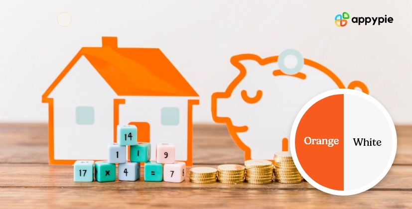
 The combination is effective because it produces perfect equilibrium. White is calm and pure, whereas black is dominant and powerful. Their contrasting combination is their strength.
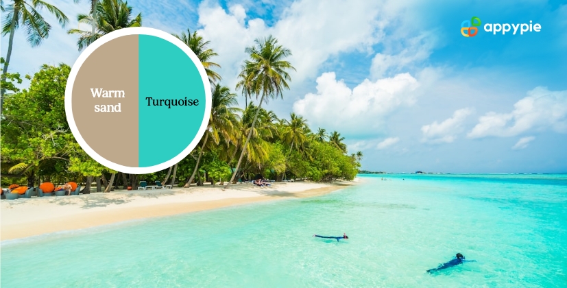 On the other hand, warm sand is a dull color, so pairing it with tropical turquoise creates a natural balance. The dull warm sand mixed with illuminating turquoise becomes golden and warm.
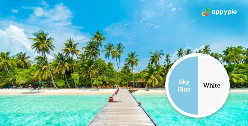 The color sky blue symbolizes transparency, integrity, and respectability.
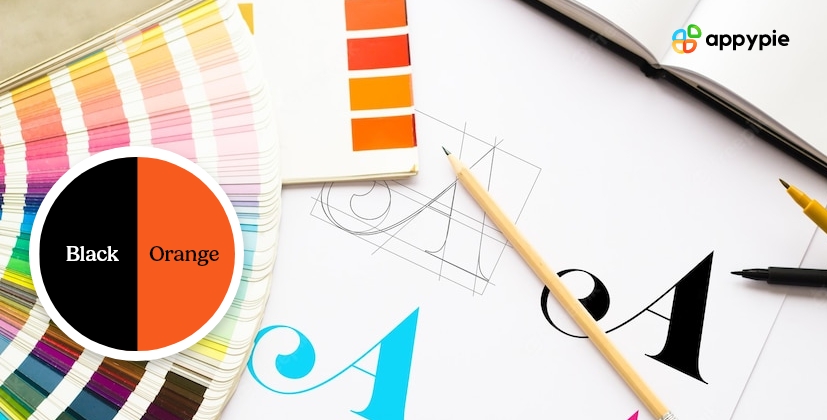
Color Mixing and Combination
Logos are typical examples of color combinations. While creating a logo, symbolism & matching colors are crucial points to consider. This is the most significant element as it is the first visual representation of a brand and gets recognized easily if the right color combinations are chosen to create them. Appy Pie’s color mixer tool enables users to create a custom logo by selecting the most appropriate color combos per their logo. The library of templates is filled with infinite templates, which are editable so that users can customize their logo by adding their custom text and brand colors.
Bottom Line!
Now that you have gone through the list of eye-catching color combinations, it is time to choose how you'll apply these matching colors. The user may be creating a brand's logo, designing a post for social media, painting their walls, redesigning their website, or choosing a new piece of cloth.
No matter what you're creating, Appy Pie Design's color mixer tool provides the right color palette ideas and enables users to choose the right color combinations to get the most appealing color combinations to attract their target audience. It has an easy-to-use interface and super quick tool; you just need to upload an image, pick the most suitable color from the color palette, and then showcase HEX, CMYK, HSL, and RGB codes as per the displayed colors. The image color picker of Appy pie also suggests various options along with their codes which can make your design even more appealing.
Another significant part of Appy Pie's color mixer tool is that it is all free, and anyone can create a professional design without hiring any designer. Its compatibility is fantastic, i.e., the image picker tool is cross-browser compatible and can also be accessed through smartphones.
Related Articles
- 10 Ways Chatbots Can Generate More Leads for Your Electrician Business
- A Beginner’s Guide to AI and Data Analytics
- Customer Trust: Here Are 15 Essential Things You Should Know
- Types of Businesses & How to Start an Online Business
- Why are Leading E-Commerce Companies favoring MOBILE APPS over their Websites?
- A Deep Dive into the Buyer’s Journey
- Proximity in Design: Understanding its Importance and Applications
- Large Language Models: An Introduction to Fine-Tuning and Specialization in LLMs
- 100+ Inspiring WhatsApp Status Quotes: Videos, Images, and Quotes for Every Mood
- How to Install Windows 11 from an ISO File: A Complete Guide